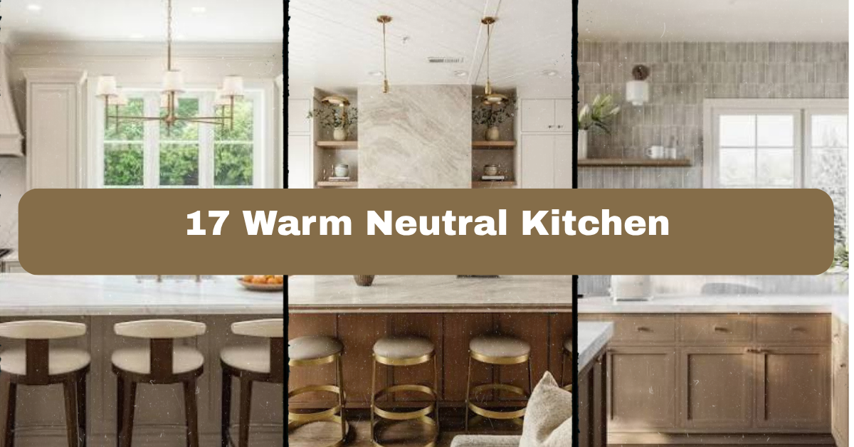
A 17 Warm Neutral Kitchen guide should do more than list pretty colors. I’ll walk you through practical ways to use creamy whites, soft taupes, natural wood, muted greens, and warm metals without making the room feel flat or dated.
Warm neutral kitchens use soft, earthy colors instead of bright white or cool gray. Common choices include ivory, beige, mushroom, taupe, clay, natural oak, walnut, and muted green. These shades create a comfortable kitchen that feels bright, layered, and easy to update.
You’ll also see how to mix finishes, choose the right lighting, and make a neutral kitchen work with your home’s style.
What Makes a Warm Neutral Kitchen?
A warm neutral kitchen feels relaxed because its colors have yellow, red, or brown undertones. Think of linen, sand, oatmeal, baked clay, honey oak, and creamy stone. These shades are gentler than stark white and usually feel more welcoming than blue-gray.
I like this style because it gives you room to change small details later. You can switch cabinet hardware, stools, rugs, or artwork without rebuilding the whole room. The key is layering. Use more than one neutral, then add contrast through texture, wood grain, lighting, and simple decor.
Warm does not mean dark. A kitchen can still feel fresh and open with pale cabinets, light countertops, and plenty of daylight. The goal is balance, not a single color repeated everywhere.
1. Pair Cream Cabinets With Light Oak
Cream cabinets and light oak create one of the easiest warm neutral combinations. The cabinets keep the kitchen bright, while oak adds natural movement and a little golden color. This pairing works well for full-height cabinets, an island base, open shelves, or a wood range hood.
Choose a cream with soft beige undertones instead of a sharp white. For the oak, look for a finish that is matte or low sheen. Too much orange can make the room feel dated. Add a pale quartz countertop with subtle veining, then use brushed brass or aged bronze hardware.
As a quick tip, place a cabinet sample beside your flooring before ordering anything. Colors can look very different under morning and evening light. This idea suits Scandinavian, modern farmhouse, traditional, and California casual homes, so next, let’s add depth with a richer wood tone.
2. Use a Walnut Island as the Focal Point
A walnut island can anchor a soft neutral kitchen without overwhelming it. Its deep brown color adds contrast, while the natural grain keeps the room from feeling formal. Use walnut for the entire island, just the base, or a thick butcher block countertop.
Keep the surrounding cabinets lighter, such as warm white, mushroom, or pale greige. A simple white or cream backsplash will let the walnut stand out. Add counter stools with woven seats or tan leather cushions to repeat the island’s warmth.
If your kitchen is small, use walnut on the island base but choose a lighter countertop. This keeps the center from looking too heavy. I also recommend using the same walnut tone in one other place, such as a cutting board or floating shelf. The look adapts easily to mid-century modern, transitional, rustic, and contemporary homes, and the next idea brings in handmade texture.
3. Add Handmade Tile in a Soft Earth Tone
Handmade-looking tile gives a neutral kitchen character. Choose warm ivory, sand, almond, pale clay, or light mushroom. Slight color changes across the tiles make the backsplash feel crafted instead of mass-produced.
A simple stacked layout feels modern, while a running bond pattern feels more traditional. You can also use a small zellige-style tile for gentle shine. Keep the grout close to the tile color if you want a quiet backdrop. Use contrasting grout only when you want the pattern to stand out.
Before installation, tape several tile samples to the wall and view them at different times of day. Glossy tile reflects more light, while honed tile looks softer. This approach fits Mediterranean, cottage, modern farmhouse, and relaxed coastal kitchens, and now we can compare useful palette combinations.
Warm Neutral Palette Guide
| Palette | Main Cabinet Color | Accent Color | Best Wood Tone | Metal Finish |
|---|---|---|---|---|
| Soft Linen | Creamy white | Light beige | White oak | Brushed brass |
| Earthy Mushroom | Mushroom taupe | Clay brown | Walnut | Aged bronze |
| Quiet Coastal | Warm ivory | Muted sage | Pale oak | Satin nickel |
| Modern Almond | Almond beige | Charcoal brown | Medium oak | Matte black |
| Desert Neutral | Sand beige | Terracotta | Rustic walnut | Antique brass |
4. Choose a Mushroom or Taupe Cabinet Color
Mushroom and taupe cabinets are excellent when you want more color than cream but less contrast than gray. These shades sit comfortably between beige, brown, and soft gray. They can make a large kitchen feel grounded without making it gloomy.
Pair taupe cabinets with a warm white ceiling and backsplash. Add countertops with cream, tan, or soft brown movement rather than icy gray veining. A natural wood hood or open shelf can make the palette feel more personal.
Ask for large paint or finish samples. Small chips often hide undertones, especially in rooms with north-facing windows. If your kitchen lacks natural light, choose a lighter mushroom shade with a slightly creamy base. The style works in traditional, transitional, apartment, and modern kitchens, and the next idea focuses on countertops.
5. Install a Countertop With Gentle Warm Veining
A countertop with soft beige or gold veining can tie the whole kitchen together. Look for quartz, quartzite, granite, or porcelain in a warm white, cream, or light greige background. The best pattern usually has movement, but not so much that it competes with the cabinets.
If your cabinets are busy or heavily grained, choose a quieter countertop. If the cabinets are flat and simple, a little veining adds interest. Carrying the countertop up the wall as a backsplash creates a clean, continuous look, while a separate tile backsplash feels more layered.
Take samples home and place them near your flooring, cabinet color, and hardware. Artificial lighting can change beige into yellow or gray. This countertop strategy works in sleek modern spaces and classic kitchens alike, and next we’ll soften the room with fabric.
6. Layer Linen, Cotton, and Woven Textiles
Textiles make a neutral kitchen feel lived in. Add a linen café curtain, cotton tea towels, a woven runner, or upholstered counter stools in tan, oat, natural flax, or muted olive. These small pieces bring softness to hard surfaces such as stone, tile, and cabinetry.
Use a few related fabrics instead of matching every item. For example, pair a striped linen towel with a plain cotton runner and a rattan stool. Washable materials are the smartest choice near a sink or cooking area.
As a practical tip, keep two sets of textiles on hand so you can wash one while using the other. Avoid very pale rugs if your kitchen gets heavy traffic. This idea works especially well in cottage, farmhouse, coastal, and bohemian homes, and now let’s bring in natural greenery.
7. Use Plants to Add Soft Color
Plants add life without breaking a neutral color scheme. A small potted herb near the window, a trailing plant on an open shelf, or a tall olive tree in an empty corner can make the kitchen feel warmer.
Choose containers in terracotta, cream ceramic, aged stone, or woven baskets. These materials repeat the earthy feeling of the room. If your kitchen has low light, try pothos, snake plants, or herbs placed close to a bright window. Avoid filling every surface. One larger plant often looks better than many tiny pots.
I like using herbs because they are both decorative and useful. Basil, rosemary, and thyme also add scent and texture. This greenery suits modern, rustic, Mediterranean, and coastal kitchens, and the next idea shows how lighting can change every neutral shade.
8. Warm the Room With Layered Lighting
Lighting is one of the most important parts of a warm neutral kitchen. A cream cabinet can look cozy under warm bulbs or dull under cool blue-white bulbs. Use a mix of ceiling lights, under-cabinet lighting, pendants, and decorative lamps when space allows.
Choose bulbs around 2700K to 3000K for a comfortable warm-white glow. Use dimmers so you can create brighter task lighting while cooking and softer light during dinner. Pendants over an island should add shape without blocking sightlines.
A useful rule is to place under-cabinet lights toward the front of the cabinet bottom, not the wall. This sends light onto the counter where you need it. Lighting like this works across every home style, and the table below gives a simple planning guide.
Kitchen Lighting Guide
| Lighting Type | Best Location | Useful Color Temperature | Main Purpose |
|---|---|---|---|
| Recessed ceiling lights | Evenly across work zones | 2700K to 3000K | General light |
| Under-cabinet strips | Front underside of cabinets | 2700K to 3000K | Countertop tasks |
| Island pendants | 30 to 36 inches above counter | 2700K to 3000K | Task light and style |
| Wall sconces | Beside shelves or sink | 2700K to 3000K | Accent lighting |
| Small table lamp | Dry counter or open shelf | 2700K | Evening atmosphere |
9. Add Brushed Brass Hardware Carefully
Brushed brass adds a soft golden note to a neutral kitchen. It looks especially good with cream, taupe, walnut, and natural stone. Choose knobs, pulls, faucets, or light fixtures in a similar finish to create a connected look.
You do not need brass everywhere. A brass faucet and cabinet hardware may be enough. If you mix metals, repeat each finish at least twice. For example, use brushed brass on the faucet and pendants, then matte black on the range and a few shelf brackets.
Avoid highly shiny yellow brass unless you want a more glamorous style. Brushed or aged finishes are easier to live with because fingerprints are less visible. This look works in traditional, transitional, art deco, and modern kitchens, and next we’ll use a rug to add comfort underfoot.
10. Ground the Space With a Washable Runner
A runner adds color, comfort, and pattern without changing permanent finishes. In a warm neutral kitchen, look for faded patterns in rust, cream, tan, olive, tobacco, or soft blue. A vintage-style pattern can hide crumbs and everyday marks better than a solid pale rug.
Measure the walkway before shopping. The runner should leave a visible strip of flooring on both sides and should not block cabinet doors. Add a non-slip pad to keep it secure, especially near the sink or stove.
For busy homes, choose a machine-washable rug made from a low-pile material. A flat weave is easier to clean and less likely to catch on cabinet doors. This idea works with farmhouse, boho, Mediterranean, and contemporary interiors, and the next step is choosing seating that supports the palette.
11. Select Counter Stools in Leather or Natural Fiber
Counter stools are a chance to add warmth at eye level. Tan leather, caramel faux leather, woven rattan, rush seats, and oatmeal fabric all work well with neutral cabinetry. Choose a stool shape that matches the kitchen’s mood.
A simple wood stool feels rustic or Scandinavian. A curved upholstered stool looks softer and more traditional. Black metal legs create contrast in a modern room. Before buying, measure from the floor to the underside of the counter. Most standard counters need stools with seats about 24 to 26 inches high, while bar-height counters need taller seating.
Leave enough space between stools so people can sit comfortably. This furniture choice works across many styles, and now we can make the walls feel more finished with artwork.
12. Hang Art With Earthy, Kitchen-Friendly Colors
Artwork keeps a neutral kitchen from feeling too plain. Choose prints, small paintings, or photographs with colors such as sepia, olive, cream, rust, warm gray, and muted blue. Food illustrations, botanical prints, landscapes, and abstract shapes all work nicely.
Place art away from direct steam and splatter. A wall beside the breakfast table or above a small coffee station is often safer than the area directly behind the cooktop. Use wood, aged brass, or cream frames to repeat other finishes in the room.
For a budget-friendly update, frame a vintage recipe card, textile, or botanical calendar page. Hang pieces at eye level instead of too high above the counter. This idea fits eclectic, traditional, cottage, and modern kitchens, and the chart below can help you choose practical finishes.
Material Comparison for Warm Neutral Kitchens
| Material | Visual Effect | Maintenance | Best Use |
|---|---|---|---|
| Honed quartz | Soft, quiet surface | Low maintenance | Busy family kitchens |
| Natural oak | Light grain and warmth | Needs protection | Shelves, island fronts |
| Walnut | Rich contrast | Moderate care | Island or hood detail |
| Rattan | Casual texture | Keep dry | Stool seats and baskets |
| Handmade ceramic tile | Crafted variation | Easy to clean | Backsplash |
| Aged brass | Soft golden detail | Develops patina | Hardware and lighting |
| Matte porcelain | Calm stone look | Low maintenance | Flooring or backsplash |
13. Build Open Shelves With a Simple Color Story
Open shelves can make a neutral kitchen feel less closed in. Use light oak, walnut, reclaimed wood, or painted shelves that match the cabinets. Style them with a limited mix of cream pottery, wood boards, glass jars, and one or two green plants.
Avoid filling every inch. Leave empty space so the shelves look useful rather than crowded. Place heavier items lower and lighter items higher. Everyday dishes work best because open shelves should not become a display of objects you never use.
As an actionable step, arrange everything on the counter first. Take a photo, remove about one-third of the items, then install or style the shelves. This approach suits farmhouse, Scandinavian, industrial, and cottage kitchens, and next we’ll look at the floor.
14. Choose Flooring With Warm Undertones
Flooring has a big effect on how neutral cabinets look. Warm oak, natural stone, terracotta tile, limestone-look porcelain, and beige-toned luxury vinyl can all support a cozy kitchen. The floor does not need to match the cabinets exactly. In fact, slight contrast usually looks more natural.
If your cabinets are creamy, medium oak flooring adds depth. If the cabinets are walnut, choose a lighter floor to keep the room balanced. For a small kitchen, larger floor tiles can reduce visual breaks and make the space feel calmer.
Always view flooring samples beside cabinet and countertop samples. A floor that looks beige alone may look pink or orange beside another finish. This idea fits rustic, Mediterranean, modern farmhouse, and traditional homes, and now we can use small accents to add personality.
15. Bring in Terracotta and Clay Accents
Terracotta is a strong accent for a warm neutral kitchen because it adds color without becoming loud. Use a clay vase, terracotta planter, utensil crock, pendant shade, or a few tiles behind the range. The warm orange-brown tone looks natural beside cream, sand, olive, and walnut.
A little goes a long way. Choose two or three terracotta pieces and spread them around the room rather than grouping them all together. If the color feels too bright, look for aged terracotta with a dusty, muted finish.
You can also use rust-colored linen or a patterned runner to echo the same shade. This accent works beautifully in desert modern, Spanish, bohemian, and Mediterranean homes, and the next idea adds contrast without losing the calm mood.
16. Use Soft Black for Small, Strong Contrast
Soft black gives a warm neutral kitchen definition. Use it on window frames, pendant cords, shelf brackets, faucets, or one set of cabinet pulls. The contrast helps creamy and beige surfaces look sharper.
Choose matte or satin black for a relaxed appearance. Glossy black feels more formal and shows fingerprints more easily. If your kitchen is small, keep black accents limited to a few clear points rather than using it on every fixture.
Try repeating the color at three levels, such as black pendants, a black picture frame, and dark stool legs. This creates balance without making the room feel harsh. The idea works in modern, industrial, farmhouse, and transitional spaces, and the final design combines several warm neutral layers.
Accent Planning Guide
| Accent | Suggested Amount | Why It Works |
|---|---|---|
| Terracotta | 2 to 4 pieces | Adds earthy color |
| Matte black | 3 repeated points | Creates definition |
| Brushed brass | 2 to 5 related fixtures | Adds gentle shine |
| Olive green | 1 to 3 textiles or plants | Brings natural color |
| Walnut | 1 major feature plus small repeat | Grounds pale finishes |
| Woven texture | 2 to 4 items | Softens hard surfaces |
17. Create a Calm Coffee or Breakfast Corner
A small coffee station or breakfast corner gives your kitchen a personal center. Use a warm wood shelf, a cream cabinet, a compact lamp, or a small café table to define the area. Display only the items you use often, such as mugs, a coffee maker, a sugar bowl, or a basket of napkins.
Choose mugs in related neutral shades rather than one matching set. A mix of cream, tan, speckled ceramic, and soft brown feels collected over time. Add one plant or framed print to make the corner feel intentional.
Keep the station close to an outlet and away from the busiest cooking path. This idea adapts well to apartment kitchens, farmhouse homes, traditional spaces, and modern open-plan rooms. Together, these details create a kitchen that feels warm without looking cluttered.
Tips for Success
- Test every paint, tile, wood, and countertop sample in your actual kitchen.
- Check undertones in both natural daylight and artificial light.
- Use one main neutral, one supporting neutral, and one darker accent.
- Repeat important finishes at least twice so the room feels connected.
- Mix smooth surfaces with rough or woven textures for visual balance.
- Keep countertops mostly clear, especially near the stove and sink.
- Use dimmers and warm-white bulbs to control the mood throughout the day.
Common Mistakes and How to Avoid Them
Using only one beige shade
: A single beige repeated across cabinets, walls, counters, and flooring can look flat. Add contrast through wood grain, tile variation, metal, or a darker accent.
Ignoring undertones
: Beige can lean yellow, pink, green, or gray. Compare samples side by side before making a final choice, and check them under your kitchen lighting.
Adding too many wood tones
: Several unrelated wood colors can make the room feel busy. Choose one main wood and one supporting tone, then repeat them with small accessories.
Choosing style over function
: Delicate rugs, open shelves, and high-maintenance counters may look beautiful but become frustrating. Match materials to how your household actually cooks and cleans.
Making every finish warm and shiny
: Too much brass, gloss, and yellow-toned wood can feel heavy. Balance them with matte surfaces, cream paint, stone, and soft black or muted green.
Overfilling open shelves
: Crowded shelves create visual noise. Keep useful objects on display and leave open space between groups.
Similar Variations
- Warm Scandinavian Kitchen: Cream cabinetry, pale oak, simple lines, and soft woven textiles create a clean but comfortable look.
- Modern Mediterranean Kitchen: Pair warm plaster tones with terracotta, natural stone, walnut, and handmade tile.
- Desert Modern Kitchen: Use sand, clay, muted rust, natural wood, and sculptural lighting for a dry, earthy palette.
- Coastal Neutral Kitchen: Combine warm white, pale oak, linen, sandy beige, and a small amount of faded blue.
- Warm Transitional Kitchen: Mix classic cabinet profiles with taupe paint, stone counters, brass hardware, and modern lighting.
- Organic Modern Kitchen: Use simple shapes, natural materials, warm beige, walnut, greenery, and uncluttered surfaces.
A warm neutral kitchen works best when it feels layered rather than perfectly matched. Start with a comfortable base color, add natural wood, then bring in texture, practical lighting, and a few personal accents.
You do not need to remodel everything at once. Even new hardware, a washable runner, handmade-look tile, or warm artwork can change the feeling of the room and bring your own personality into a 17 Warm Neutral Kitchen.
Leave a Reply