Category: Kitchen

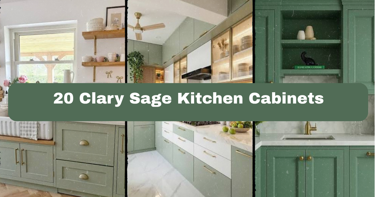
  • 20 Clary Sage Kitchen Cabinets

    20 Clary Sage Kitchen Cabinets

    20 Clary Sage Kitchen Cabinets can make a kitchen feel calm, fresh, and quietly stylish without looking plain or overly trendy. I’ll walk you through color pairings, hardware, lighting, layouts, and decorating tips so you can choose a look that works in your home.

    Clary sage kitchen cabinets are soft gray-green cabinets with a muted, natural appearance. They pair well with white, cream, wood, brass, black, stone, and warm neutral finishes in modern, traditional, farmhouse, coastal, and eclectic kitchens.

    You’ll see ideas for small kitchens, open layouts, two-tone cabinets, islands, backsplashes, and budget-friendly updates. I’ll also share the mistakes I would avoid.

    Understanding the Clary Sage Cabinet Look

    Clary sage sits between green and gray. It has a gentle, dusty quality that feels more relaxed than bright green and warmer than a plain gray. Depending on the light, it may look herbal, silvery, or slightly beige.

    I like this color because it adds personality without taking over the room. It works especially well with natural textures such as oak, rattan, linen, stone, and terracotta. The finish matters, too. A matte surface feels soft and modern, while a satin finish is easier to wipe clean and reflects more light.

    Before choosing a paint, test a large sample on several cabinet doors. Morning light, afternoon sun, and warm evening bulbs can change the color quite a bit.

    1. Pair Clary Sage Cabinets With Warm White Walls

    14 Clary Sage Kitchen Cabinets Ideas for 2026 – Styli Casa
    Credit: stylicasa

    Warm white walls give clary sage cabinets room to stand out while keeping the kitchen bright. Choose an ivory, soft white, or creamy off-white instead of a blue-white. The warmer shade helps the green-gray cabinet color feel welcoming rather than cold.

    For furniture, try a light oak dining table, woven counter stools, or a cream upholstered bench. Add aged brass knobs and simple white trim for a classic finish. A marble-look quartz countertop can connect the pale walls to the cabinets without adding another strong color.

    My practical tip is to place your paint sample beside the wall color before committing. A white that looks creamy in the store may look yellow beside green cabinetry.

    This idea fits farmhouse, traditional, transitional, and Scandinavian kitchens especially well, and the soft wall color leads naturally to a discussion of countertops.

    2. Add a Light Stone Countertop for a Calm Foundation

    Sage Green Backsplash With White Cabinets
    Credit: instagram

    A pale countertop helps clary sage cabinets feel polished and balanced. Consider white quartz with fine gray veining, soapstone with a honed finish, pale limestone, or a warm beige stone. Each choice creates a slightly different mood.

    If your cabinet color has strong gray undertones, use a countertop with soft gray marks. If it looks more earthy, choose cream or taupe veining instead. Keep the backsplash close to the countertop so the room does not become visually busy.

    I would bring cabinet, countertop, and backsplash samples home at the same time. Look at them under both daylight and your kitchen lights. A quick tip is to photograph the samples in different corners of the room. Photos often reveal undertones your eyes miss.

    This approach adapts easily to modern, cottage, coastal, and traditional homes, while the right stone sets up the hardware choice.

    3. Use Aged Brass Hardware for Gentle Contrast

    Sage Green Kitchen Cabinets: 10 Stunning Designs | OPPEIN
    Credit: oppein

    Aged brass adds warmth without creating the sharp contrast of polished gold. It looks beautiful against clary sage because the muted green and soft metal share an old-world, natural quality.

    Choose cup pulls on drawers and simple knobs or bar pulls on doors. For a cleaner modern kitchen, use slim brass handles with straight edges. In a cottage or traditional room, try rounded knobs and bin pulls with a slightly worn finish.

    Do not feel forced to match every metal in the room perfectly. You can use aged brass on the cabinets, a stainless range, and a small amount of black in the lighting. The finishes just need to look intentional.

    Before drilling, tape paper templates to each door and drawer. Test the size and placement from across the room. This idea works in vintage, farmhouse, transitional, and modern kitchens, and it points us toward lighting.

    4. Install Soft, Layered Kitchen Lighting

    🌿 Meet “Clary Sage” — the soft-green shade that’s stealing the spotlight in new builds and renos alike., Sits right between neutral and statement, pairing effortlessly with brushed brass, matte black, ...
    Credit;instagram

    Good lighting changes how clary sage cabinets look. Under-cabinet lights can bring out green undertones, while warm pendant lights make the color appear softer and more earthy.

    Use three layers when possible: ceiling lighting for general brightness, task lighting under the cabinets, and decorative pendants over an island or peninsula. Choose bulbs around 2700K to 3000K for a warm but useful glow. Very warm bulbs can make green cabinets look muddy.

    For pendants, consider aged brass, linen, opal glass, or matte black. Keep the shape simple if the kitchen already has patterned tile or noticeable countertops. I recommend installing under-cabinet lights before the backsplash so the wiring stays hidden.

    This lighting plan suits nearly every home style and helps you judge which color combinations deserve a closer look.

    Useful Palette Combinations

    Cabinet colorWall colorCountertopHardwareOverall mood
    Soft clary sageWarm whiteWhite quartz with gray veinsAged brassBright and classic
    Gray-leaning clary sagePale greigeHoned soapstoneBrushed nickelCalm and modern
    Earthy clary sageCreamBeige quartzOil-rubbed bronzeCozy and traditional
    Deep clary sageLight taupeWarm white quartzMatte blackBold and grounded
    Pale clary sageSoft blue-whiteLight oak butcher blockBrassFresh and coastal

    5. Add a Natural Wood Island

    Renovators Take Note: The Sage Green Kitchen Cabinets Trend Is Here To Stay
    Credit: domino

    A wood island gives clary sage cabinets warmth and texture. White oak, natural maple, walnut, and light ash can all work, but the effect will vary. Oak feels casual and airy. Walnut feels richer and more dramatic.

    You can use wood on the entire island base or add a wood countertop to a painted island. If the room already has wood floors, match the undertone instead of trying to match the exact color. Too many unrelated wood tones can make the kitchen feel scattered.

    Keep the island seating comfortable and practical. Woven stools soften the room, while simple black stools create a stronger modern look. My tip is to tape the island footprint on the floor before ordering it. This helps you check walkway space.

    The combination works in farmhouse, organic modern, rustic, and transitional kitchens, and the island can become the perfect place for a two-tone design.

    6. Create a Two-Tone Cabinet Layout

    29 Clary Sage Kitchen Cabinets That Offer a Breath of Fresh Air
    Credit: Pinterest

    Two-tone cabinets can make a large kitchen feel more balanced. Use clary sage on the lower cabinets and a lighter color on the uppers. This keeps the eye level open while giving the room a grounded base.

    Another option is clary sage cabinets around the perimeter with a wood or darker painted island. If you want a stronger statement, use the color only on the island and keep the wall cabinets cream or white.

    Try to repeat the second cabinet color somewhere else. For example, use white upper cabinets with a white backsplash, or repeat the island wood on open shelving. I would avoid adding a third major cabinet color unless the room is very large.

    This layout fits contemporary, farmhouse, coastal, and transitional homes, and it leads nicely into the question of whether upper cabinets are needed at all.

    7. Replace Some Upper Cabinets With Open Shelves

    New This Week: 8 Kitchens With Gorgeous Green Cabinets
    Credit: Houzz

    Open shelves can make clary sage lower cabinets feel lighter and less enclosed. Use wood shelves for warmth, painted shelves for a seamless look, or metal brackets for an industrial touch.

    Keep the display useful. Stack everyday plates, place mugs on hooks, and add one or two small plants. Too many objects create dust and visual clutter. I prefer shelves near the coffee station or prep area, where the items are easy to reach.

    Install shelves at a practical height and make sure they are anchored into studs or strong wall supports. A narrow shelf may work better than a deep one in a small kitchen. This idea adapts to modern, cottage, rustic, and Scandinavian homes, and the open space gives us a chance to bring in pattern.

    8. Use a Patterned Backsplash With Restraint

    Sage Green Cabinets Tile Pairing Ideas - StoneImpressions Natural Stone Tile
    Credit: StoneImpressions

    A patterned backsplash can add character to clary sage kitchen cabinets, but it should support the cabinet color rather than compete with it. Consider handmade-look white tile, soft green subway tile, small geometric tile, or a restrained floral pattern.

    If the cabinets have a noticeable grain or decorative door shape, keep the tile simple. If the cabinets are flat-panel and plain, you can use more movement in the backsplash. Cream grout will soften the look, while dark grout outlines every tile and creates more contrast.

    Order several tile samples before installation. Place them beside the cabinet in both shadow and direct light. This quick test can save you from choosing a tile that turns too blue or too yellow.

    This idea works across cottage, Mediterranean, modern, and traditional spaces, and the next table can help match materials to the mood you want.

    Material Pairing Guide

    Backsplash materialBest companion finishVisual effectMaintenance note
    Glossy white subway tileBrass hardwareBright and classicEasy to wipe clean
    Handmade-look ceramic tileOak shelvesRelaxed and organicUneven surface needs careful cleaning
    Honed marble tileBrushed nickelSoft and refinedSeal natural stone as directed
    Green glass tileWhite countertopFresh and airyShows fingerprints more easily
    Terracotta-look porcelainBlack hardwareEarthy and boldPorcelain is durable and low-maintenance
    Small cream mosaicWalnut accentsWarm and traditionalMore grout lines to clean

    9. Choose Matte Black Accents for a Modern Edge

    The Ultimate Guide to Rustic Sage Green Kitchen Cabinets | George Cabinetry
    Credit: georgecabinetry

    Matte black can sharpen the softer look of clary sage cabinetry. Use it on cabinet pulls, pendant lights, window frames, faucet details, or dining chairs. The key is repetition. A little black in several places feels designed instead of random.

    Pair black hardware with a pale countertop and simple backsplash. For a stronger look, add a black range hood or dark island stools. Avoid using black on every surface, since too much can make a smaller kitchen feel heavy.

    A practical approach is to begin with two small accents, such as the faucet and cabinet pulls. Live with them for a week before adding more. This idea fits modern, industrial, farmhouse, and eclectic homes, and its contrast makes warm natural details even more noticeable.

    10. Warm the Room With Terracotta and Clay Tones

    22 Stunning Terracotta and Sage Green Kitchen Ideas for a Warm and Inviting Space
    Credit: HomeBunks

    Terracotta, rust, cinnamon, and clay tones make clary sage cabinets feel earthy and welcoming. These colors work well in rugs, planters, dishware, pendant shades, and small pieces of art.

    Use terracotta as an accent, not a second dominant cabinet color. A clay-colored runner beside the island can be enough. You might also place a terracotta vase on open shelves or use handmade ceramic bowls in a warm orange-brown shade.

    Choose a washable runner for busy areas. Look for low-pile styles that do not catch under cabinet doors. I would test the red-orange accessory beside the cabinets before buying several pieces, since some shades can make sage look dull.

    This palette suits Mediterranean, desert modern, boho, rustic, and cottage kitchens, and it naturally brings us to plants and organic decoration.

    11. Bring in Herbs and Greenery

    Sage Green Kitchen Cabinets Brass Hardware Modern Farmhouse
    Credit: instagram

    Plants make a clary sage kitchen feel connected to nature. A small herb garden near a bright window adds both color and function. Rosemary, thyme, basil, and mint can live in simple ceramic pots that echo the cabinet shade.

    For lower-light kitchens, use durable plants such as pothos, snake plants, or artificial stems that look realistic. Avoid crowding the counters around the sink and cooktop. One larger plant often looks cleaner than many tiny pots.

    Use containers in white, terracotta, woven fiber, or natural stone. Add a wood cutting board nearby so the greenery feels part of a larger material story. My tip is to choose plants based on the actual light level, not just the look you want.

    This idea works in coastal, farmhouse, biophilic, boho, and modern kitchens, and the greenery pairs well with a carefully chosen floor.

    12. Ground the Cabinets With Light Wood Flooring

    14 Clary Sage Kitchen Cabinets Ideas for 2026 – Styli Casa
    Credit: Stylicasa

    Light wood floors create a warm base beneath clary sage cabinets. White oak, natural maple, pale bamboo, and wood-look porcelain can all work. The best choice depends on moisture, traffic, and your budget.

    Choose a floor with a neutral or warm undertone. Very orange wood may fight with the green, while a blue-gray floor can make the kitchen feel cold. If you already have dark flooring, use lighter rugs and a pale countertop to keep the room balanced.

    Place sample boards beside the cabinets at different times of day. Also check how the flooring looks next to nearby rooms, especially in an open floor plan. This style fits Scandinavian, farmhouse, organic modern, and traditional homes, and the table below can help with practical flooring decisions.

    Flooring Comparison

    Flooring choiceBest forStrengthsWatch for
    White oak hardwoodDry, open kitchensWarm, natural, repairableCan scratch and needs care
    Luxury vinyl plankBusy family kitchensWater-resistant and budget-friendlyChoose a realistic grain
    Wood-look porcelainHigh-moisture areasDurable and easy to cleanHarder underfoot
    Natural mapleBright traditional kitchensLight color and fine grainMay show dents
    CorkComfortable work zonesSoft and warmNeeds proper sealing
    Slate-look porcelainModern rustic kitchensStrong contrast and durableDark color needs good lighting

    13. Use Glass-Front Doors to Break Up Solid Cabinetry

    31 Rustic Sage Green Cabinets for Cozy Kitchens - Seed Sheets
    Credit: seedsheets

    Glass-front cabinet doors can keep a clary sage kitchen from feeling too solid. Use them on one or two upper cabinets rather than every door. Clear glass gives the most open look, while seeded or reeded glass hides clutter better.

    Display white dishes, clear glasses, wood bowls, or a small collection of ceramics. Keep the interior painted a lighter shade if you want the contents to stand out. Interior cabinet lighting can add a soft glow at night.

    Before ordering glass doors, decide what you will store inside them. They work best when the contents are useful and attractive. This idea adapts to traditional, English cottage, transitional, and modern kitchens, and it makes cabinet organization part of the design.

    14. Add a Banquette in a Cozy Breakfast Nook

    25 Dreamy Sage Green Banquette Ideas: Built-In Dining Nooks We're Obsessed With - KITCHEN GENIUS
    Credit: Pinterest

    A breakfast nook can make a clary sage kitchen feel more personal and lived-in. Try a built-in bench in cream fabric, natural linen, or a washable performance material. Add a round wood table to soften the straight lines of cabinets and counters.

    Use cushions in warm white, muted stripe, small checks, or faded botanical prints. Keep the pattern gentle so it does not compete with the green-gray cabinets. A wall sconce or small pendant can define the nook without taking up table space.

    Measure the seat height carefully before building. A bench that is too high or too deep will quickly become uncomfortable. This idea suits cottage, farmhouse, traditional, and Scandinavian kitchens, and it creates a natural place for the next design detail, window treatments.

    15. Frame the Windows With Linen or Woven Shades

    25 Kitchen Window Treatment Ideas
    Credit: betterhomes&gardens

    Window treatments can soften a kitchen filled with hard surfaces. Linen café curtains, woven bamboo shades, or simple Roman shades work well with clary sage cabinetry.

    Choose cream, natural flax, soft tan, or a subtle stripe. Avoid heavy drapes near sinks and cooktops because they can collect moisture and cooking odors. Woven shades add texture, while linen gives a lighter, more relaxed appearance.

    Hang the shade so it lets in useful daylight while protecting privacy. If the window is beside a sink, choose a moisture-resistant material or a washable fabric. This look adapts to coastal, cottage, farmhouse, and relaxed traditional styles, and it keeps the cabinet color connected to the natural light.

    16. Select a Farmhouse Sink for Classic Character

    14 Clary Sage Kitchen Cabinets Ideas for 2026 – Styli Casa
    Credit: StyliCasa

    A fireclay or porcelain farmhouse sink brings a strong focal point to clary sage cabinets. White is the most flexible choice and creates a crisp contrast. A darker granite composite sink gives a more modern, grounded effect.

    Make sure the sink cabinet and countertop can support the installation. Farmhouse sinks are deep and may require changes to the cabinet front. Choose a faucet with a shape that matches the room. An arched bridge faucet feels traditional, while a simple pull-down faucet looks cleaner and more modern.

    Think about maintenance before choosing the finish. White sinks show marks quickly but are easy to inspect and clean. This feature works in farmhouse, English cottage, traditional, and transitional kitchens, and it leads into a few useful sizing choices.

    Common Kitchen Measurement Guide

    FeatureTypical measurementWhy it matters
    Standard base cabinet depth24 inchesLeaves room for doors and plumbing
    Standard countertop depthAbout 25 to 26 inchesCreates a small front overhang
    Comfortable walkway36 to 42 inchesAllows normal movement
    Two-cook work aisleAbout 42 to 48 inchesReduces crowding
    Pendant height above islandAbout 30 to 36 inches above counterProvides light without blocking views
    Common island depth36 to 48 inchesAllows storage and seating options
    Farmhouse sink widthOften 30 to 36 inchesCheck cabinet size before ordering

    17. Paint the Ceiling a Soft, Warm Neutral

    Elevate Your Space with Sherwin Williams Clary Sage Kitchen Cabinets | Wholesale Cabinet Supply
    Credit: wholesalecabinetsupply

    A painted ceiling can subtly change the mood of a clary sage kitchen. Use a soft cream, pale beige, or very light warm gray when you want the room to feel cozy. A white ceiling creates more contrast and can make the cabinets look greener.

    This is a useful option in kitchens with tall ceilings or dark beams. The ceiling color should be lighter than the walls in most cases, but it does not need to be bright white. Repeat the ceiling tone in the trim, backsplash grout, or window fabric for a connected look.

    Test the paint overhead if possible. Colors often appear stronger on a ceiling because light reflects differently. This technique fits traditional, cottage, rustic, and contemporary kitchens, and it brings us to the impact of cabinet door style.

    18. Choose Flat-Panel Doors for a Clean, Quiet Look

    Elevate Your Space with Sherwin Williams Clary Sage Kitchen Cabinets | Wholesale Cabinet Supply
    Credit: Wholesalecabinetsupply

    Flat-panel cabinet doors keep clary sage at the center of attention. Their simple shape works well when you want the color, countertop, or backsplash to carry the design.

    Use slim pulls, a clean quartz surface, and minimal decoration for a modern kitchen. To make the room warmer, add oak shelves, a woven runner, or a wood island. Flat-panel doors also make small kitchens appear less busy because they have fewer grooves and shadows.

    A practical tip is to request a sample door with the exact paint and finish. The same color can look very different on a smooth slab compared with a detailed shaker door. This idea works in modern, Scandinavian, minimalist, and transitional spaces, and a more detailed door style offers a different kind of charm.

    19. Use Shaker Doors for Timeless Flexibility

    Elevate Your Space with Sherwin Williams Clary Sage Kitchen Cabinets | Wholesale Cabinet Supply
    Credit: wholsalecabinetsupply

    Shaker cabinets are a reliable choice if you want clary sage cabinetry that can change with your decor. The simple frame adds detail without feeling fussy. You can make the room traditional with brass knobs or modern with black bar pulls.

    Pair shaker doors with subway tile, marble-look quartz, wood accents, or a simple plaster-style hood. For a softer cottage look, use cup pulls and glass-front uppers. For a cleaner transitional design, choose consistent hardware and a quiet backsplash.

    Keep the grooves clean with a soft cloth and mild cleaner, since dust can collect along the frame. This style adapts to farmhouse, traditional, coastal, transitional, and modern kitchens, and the final idea focuses on smaller rooms.

    20. Make a Small Kitchen Feel Larger With Clary Sage

    The Best Ways to Use SW Clary Sage for a Refreshing Kitchen | Wholesale Cabinet Supply
    Credit: wholesalecabinetsupply

    Clary sage can work beautifully in a small kitchen when the surrounding finishes stay light. Use the color on lower cabinets, a single wall of cabinetry, or a compact island. Pair it with a pale countertop, reflective backsplash, and simple hardware.

    Use vertical storage to make the most of the room. Add a narrow pantry pullout, rails for utensils, or shelves that reach toward the ceiling. Keep counters mostly clear. One cutting board, a small plant, and a useful bowl may be enough decoration.

    Choose cabinet fronts with simple lines and avoid too many dark accents. A large mirror or glass-front door can also reflect light. This approach fits apartment, galley, modern, cottage, and Scandinavian kitchens, and it completes the set of practical clary sage design ideas.

    Tips for Success

    • Test cabinet samples beside your actual flooring, countertop, and wall color.
    • Check the paint at morning, afternoon, and evening light.
    • Repeat each major finish at least twice so the room feels connected.
    • Use warm bulbs, but make sure work areas are still bright enough for food preparation.
    • Keep the backsplash quieter when the cabinet color has strong green undertones.
    • Choose hardware based on how the doors and drawers feel to use, not just how it looks.
    • Leave enough clearance around islands, stools, appliances, and cabinet doors.

    Common Mistakes and How to Avoid Them

    Choosing a paint from a tiny color chip

    Use a large sample or painted cabinet door and view it in every type of light.

    Mixing too many green undertones

    Compare the cabinet paint with the backsplash, countertop, and nearby wall colors before installation.

    Using only one lighting source

    Layer ceiling fixtures, under-cabinet lights, and decorative lighting for a kitchen that looks good day and night.

    Adding too many accent colors

    Choose one or two supporting colors, such as warm wood and aged brass, instead of filling the room with competing shades.

    Ignoring cabinet hardware scale

    Tape paper templates onto the doors and drawers to test pull length, spacing, and placement.

    Treating open shelves like display storage

    Keep only attractive, useful items on shelves and store less appealing pieces behind closed doors.

    Similar Variations

    • Coastal Sage Kitchen: Pair pale sage cabinets with white walls, light oak, woven textures, and brushed nickel.
    • Modern Organic Sage: Use flat-panel doors, stone countertops, wood accents, and simple black lighting.
    • English Cottage Sage: Add shaker doors, aged brass, floral fabrics, handmade tile, and open shelving.
    • Desert Sage Kitchen: Combine earthy sage with terracotta, clay, warm beige, and natural stone.
    • Scandinavian Sage Kitchen: Keep the palette pale with light wood, clean lines, soft white walls, and minimal hardware.
    • Farmhouse Sage Kitchen: Mix shaker cabinets with a farmhouse sink, butcher block, painted trim, and vintage-inspired lighting.

    Clary sage cabinets are flexible because they sit between color and neutral. They can feel fresh with white, warm with wood, dramatic with black, or earthy with terracotta. I would start with the cabinet sample, then build the countertop, lighting, hardware, and decor around its real undertones.

    The best 20 Clary Sage Kitchen Cabinets ideas are the ones that match your light, layout, daily habits, and favorite materials.
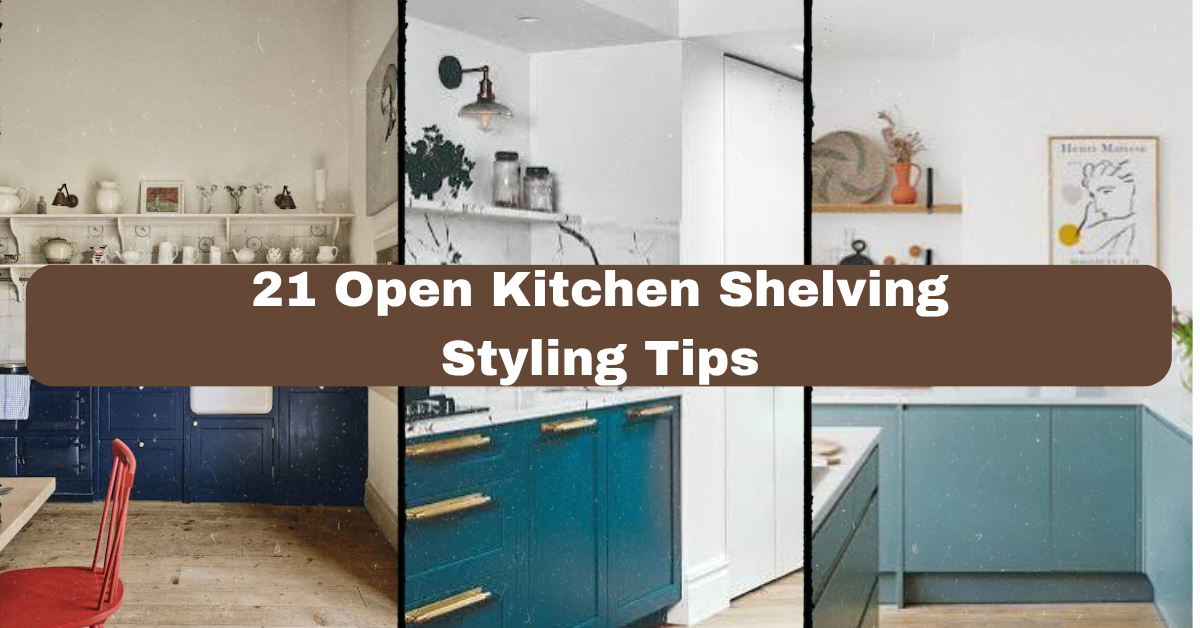
  • 13 Kitchen Open Shelf Styling

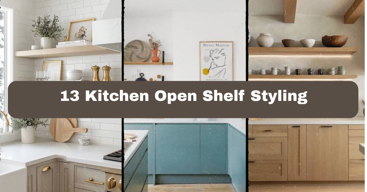
    13 Kitchen Open Shelf Styling

    13 Kitchen Open Shelf Styling can make an ordinary kitchen feel warm, useful, and personal without adding visual clutter.

    The core question is how to style open kitchen shelves attractively and practically. The best approach combines daily dishes, varied heights, natural textures, a limited color palette, useful storage, and enough empty space for the shelves to breathe.

    I’ll walk you through 13 shelf ideas, from simple plate stacks to lighting and seasonal updates. You’ll also get practical sizing guides, color combinations, and easy fixes for common mistakes.

    What Is Kitchen Open Shelf Styling?

    Kitchen open shelf styling means arranging dishes, cookware, food containers, plants, and decorative pieces on wall-mounted shelves in a planned way. The goal is not to fill every inch. It is to make useful items look inviting while keeping the kitchen easy to use.

    I like to think of shelves as a small display area with a job to do. Plates should be easy to grab. Mugs should feel within reach. Decorative items can add charm, but they should not block the things you use every day. A simple color plan helps everything look connected. So do different heights, natural materials, and a little empty space.

    1. Build a Base With Everyday White Dishes

    How To Style Kitchen Shelving | A Blissful Nest
    Credit; ABlissfulNest

    White plates, bowls, and cups create a clean foundation for open shelves. They make the kitchen feel bright and help colorful accents stand out. You do not need a matching dinnerware set. Similar shades of white, cream, and soft gray can look relaxed and collected.

    Stack flat plates in groups of four to eight. Place bowls beside them, then add two or three mugs nearby. Keep the most-used pieces on the lower shelf so they are easy to reach. I also like adding one small wooden bowl or cutting board to stop the display from feeling too plain.

    This idea works in modern, farmhouse, Scandinavian, and traditional kitchens.

    Practical tip: Use shelf liners under ceramic dishes to reduce sliding and protect painted wood.

    Once your base is calm and simple, you can add color without making the shelves feel busy.

    2. Use One Accent Color to Create Order

    Open shelving can look messy when every item has a different color. Choosing one accent shade gives the display a clear visual thread. Try deep green, blue, terracotta, mustard, black, or soft pink.

    Start with neutral dishes, then add the accent color through mugs, vases, cookbooks, or a small piece of art. Repeat that color at least three times. For example, a blue mug, blue book spine, and blue ceramic pitcher will feel more connected than one random blue item.

    I would keep bright colors limited to small pieces. Large blocks of strong color can overpower a narrow kitchen.

    This approach adapts easily to coastal, cottage, modern, and boho homes.

    Practical tip: Lay your chosen items on the counter before placing them on the shelves. Remove anything that does not support the color plan.

    With the palette in place, the next step is adding height and movement.

    3. Mix Tall, Medium, and Low Objects

    22 Kitchen shelving ideas for a sleek and practical storage | Ideal Home
    Credit: IdealHome

    A shelf full of items that are all the same height can look flat. A better arrangement includes tall, medium, and low pieces. This creates a gentle rhythm that draws the eye across the wall.

    Use a tall cutting board, pitcher, vase, or cookbook holder at one end. Add a medium stack of bowls in the center. Finish with a low tray, small jar, or short plant. Avoid placing every tall piece together, or one side may feel heavy.

    I usually begin with the largest items first. Then I fill the gaps with smaller objects. This is faster than starting with tiny decorations and trying to fit large pieces around them.

    This height-based method suits minimalist, rustic, transitional, and eclectic kitchens.

    Practical tip: Take a quick photo from across the room. The camera often shows uneven height better than your eyes do.

    Now that the shelves have movement, you can use texture to make the arrangement feel warmer.

    4. Add Wood for Warmth and Contrast

    Open Shelving Kitchen Ideas That Work With Any Style | FH
    Credit: fancyHouseDesign

    Wooden cutting boards, serving paddles, trays, and bowls bring warmth to open kitchen shelves. They also soften hard materials such as tile, metal, glass, and glossy ceramic. A few wood pieces can make a white kitchen feel less cold.

    Lean two cutting boards against the back wall. Place the larger one behind the smaller one so both shapes remain visible. Add a wooden bowl or tray on the opposite side to balance the display. Choose finishes that are similar, but do not worry if they are not identical.

    Avoid stacking too many boards together. Three or four pieces are usually enough for an average shelf section.

    Wood works well with farmhouse, Japandi, modern rustic, Mediterranean, and traditional styles.

    Practical tip: Keep food-safe boards away from direct splashes and wipe them often with a damp cloth instead of soaking them.

    Texture makes a shelf feel lived in, but the right material mix keeps it from becoming too heavy.

    Quick Material Guide for Open Kitchen Shelves

    MaterialBest visual effectGood companion materialsCare level
    Light woodWarm, casual, naturalWhite ceramic, linen, rattanLow
    Dark woodRich, grounded, dramaticBrass, cream pottery, black metalLow
    RattanAiry, relaxed, coastalGlass, pale wood, blue ceramicLow
    CeramicHandmade, soft, colorfulWood, cotton, stoneMedium
    GlassLight and openMetal, white dishes, greeneryMedium
    MetalClean, industrial, structuredWood, stoneware, leatherLow
    Stone or marbleClassic, substantialBrass, glass, white potteryMedium

    5. Group Items in Small Visual Collections

    How to style open shelving in a kitchen - 8 tips from design pros | Ideal Home
    Credit: IdealHome

    Instead of spreading single objects across the shelf, create small groups. A stack of bowls beside a vase feels more intentional than one bowl placed alone. Grouping also makes the shelves easier to reset after daily use.

    Try arranging items in threes. One group might include a small plant, a mug stack, and a narrow frame. Another could include a pitcher, cutting boards, and a low bowl. The pieces do not need to match. They only need to share a color, material, or purpose.

    Leave a few inches between groups so they do not blend into one long row.

    This strategy works in traditional, maximalist, cottage, and contemporary kitchens.

    Practical tip: Give each group a clear center item. The other pieces should support it rather than compete with it.

    Small groupings create order, and trays can make that order even easier to maintain.

    6. Use Trays to Contain Small Items

    Kitchen shelving ideas – 15 stylish ways to max out on open storage | Real Homes
    Credit: realhomes

    Trays are useful on open shelves because they collect small items into one neat zone. Place olive oil, salt, pepper, and everyday seasonings on a small tray near the cooking area. On another shelf, use a tray for tea tins, sugar, and a honey jar.

    Wooden trays add warmth. Metal trays suit industrial kitchens. Marble or stone trays feel more polished. Choose a tray that is smaller than the shelf depth, leaving room around it.

    Do not use trays for everything. Too many can make the shelves look boxed in. One or two is often enough.

    This idea fits farmhouse, industrial, modern, and vintage kitchen styles.

    Practical tip: Choose trays with a raised edge. They hold bottles safely and make spills easier to manage.

    Once small objects are contained, you can bring in display pieces that add height and personality.

    7. Display Cutting Boards as Functional Art

    The 3 golden rules of organizing open shelving in a kitchen | Homes and Gardens
    Credit: Homesandgardens

    Cutting boards are among the easiest items to style because they are useful and attractive. Their shape adds height, while their natural finish brings a relaxed kitchen feel. Round, paddle, oval, and rectangular boards each create a different look.

    Lean boards against the backsplash or wall instead of laying them flat. Place the tallest board behind a shorter one. Add a ceramic crock, bowl, or small plant beside the group. Keep boards close to the prep area if you use them often.

    Do not display boards that are cracked, stained, or difficult to clean. Open shelves make worn items more noticeable.

    Cutting board displays suit farmhouse, French country, Mediterranean, rustic, and modern kitchens.

    Practical tip: Use clear shelf stops or a narrow ledge to keep leaning boards from sliding forward.

    Functional displays are helpful, but a shelf also needs a little life. Plants are a simple way to add it.

    8. Bring in Greenery That Fits the Kitchen

    How to style open shelving in a kitchen - 8 tips from design pros | Ideal Home
    Credit: IdealHome

    A small plant can make kitchen shelves feel fresh and less rigid. Herbs such as rosemary, thyme, basil, and mint are useful near a sunny window. If your shelves are darker, choose a faux herb, trailing plant, or small low-light option instead.

    Use one plant per shelf section rather than turning the wall into a garden. Small ceramic pots help connect the greenery to your dishes. Woven baskets or terracotta pots create a more relaxed look.

    Keep living plants away from heat, steam, and direct splashes. Water them at the sink, then return them to the shelf after the leaves dry.

    Greenery works in coastal, boho, farmhouse, Scandinavian, and modern kitchens.

    Practical tip: Put a waterproof saucer under every plant pot to protect wood and painted shelves.

    Plants add color and softness. The next table can help you choose a palette that keeps everything balanced.

    Color Palette Combinations for Open Shelves

    Main shelf paletteAccent colorNatural textureOverall feeling
    White and creamSage greenLight woodCalm farmhouse
    White and pale grayNavy blueRattanCoastal and fresh
    Black and whiteTerracottaDark woodModern rustic
    Cream and tanOlive greenLinen and ceramicEarthy and soft
    Pale blue and whiteBrassMarble or light woodClassic coastal
    Warm beigeMatte blackWalnutContemporary and grounded
    Dusty pink and creamBrownWoven basketsGentle vintage

    9. Stand Plates Upright for Shape and Color

    Are Open Plate Racks Replacing Kitchen Cabinets? |
    Credit: :LivingEtc

    Most people stack plates flat, but standing a few upright adds a new shape to the display. Use a plate rack, shallow groove, or secure shelf ledge. Decorative plates with painted edges or handmade patterns can act like wall art while staying useful.

    Place upright plates behind bowls or cups. Keep them grouped in twos, threes, or fours instead of displaying one tiny plate by itself. If the plates have strong patterns, use plain dishes around them.

    Make sure the shelf can support the extra weight. A plate rack should sit firmly and should not wobble when you remove a dish.

    This arrangement fits English cottage, vintage, Mediterranean, farmhouse, and eclectic kitchens.

    Practical tip: Put felt pads beneath the plate rack to prevent scratches and reduce movement.

    Upright plates create a strong backdrop, and the next idea shows how books can add both color and function.

    10. Add Cookbooks With Covers Facing Out

    How to display cookbooks in the kitchen - custom storage ideas and quick-fix styling — Hausmatter
    Credit: Hausmatter

    Cookbooks bring color, personality, and a useful reference point to open shelves. Choose books with covers or spines that support your kitchen palette. A stack of two or three books can raise a small bowl or vase to the right height.

    Keep the books you use often on the lower shelf. Display special editions, vintage cookbooks, or family recipe collections higher up. Mix standing books with horizontal stacks so the lines do not become repetitive.

    Avoid filling an entire shelf with books. They are heavier than they look, and too many can make the arrangement feel like a bookcase.

    Cookbooks work with modern, farmhouse, traditional, industrial, and eclectic interiors.

    Practical tip: Measure shelf depth before buying display books. Oversized cookbooks can stick out and make the wall feel cramped.

    Books tell a story, while glassware can make the same shelves feel lighter and more open.

    11. Let Glassware Add a Light, Airy Layer

    22 Kitchen shelving ideas for a sleek and practical storage | Ideal Home
    Credit: idealhome

    Clear glasses, amber tumblers, green bottles, and ribbed jars add shine without using strong visual weight. They work especially well when your shelves already contain dark wood or colorful ceramics.

    Group glasses by type. Place matching tumblers in a neat row, then add one carafe or pitcher nearby. If you use vintage glassware, repeat its color in a mug, vase, or small bowl. Keep fragile pieces away from the front edge and from areas where cabinet doors may hit them.

    Glass catches natural light, so it can make a small kitchen feel more open. It also helps break up a display made mostly of solid ceramic.

    This idea suits coastal, art deco, modern, vintage, and minimalist kitchens.

    Practical tip: Store your most-used glasses upside down only if the shelf surface is smooth and clean. Otherwise, store them upright to protect delicate rims.

    After adding glass, you can make the shelves feel more personal with one or two meaningful objects.

    12. Include a Small Personal or Vintage Detail

    Design ideas for open shelving in kitchens | House & Garden
    Credit: House&Garden

    Open shelves should look like your kitchen, not a store display. Add one meaningful object, such as a handmade mug, inherited bowl, small framed recipe, pottery piece, or vintage kitchen tool.

    Keep personal items limited. One special object can draw attention. Five unrelated pieces may look cluttered. Place the item where it can be seen but will not be bumped during cooking.

    Choose objects that connect to the rest of the room through color or material. A brass measuring cup can work with brass cabinet pulls. A blue ceramic bowl can echo a nearby rug or pendant light.

    This personal touch adapts to every style, including minimalist and modern kitchens.

    Practical tip: Rotate personal pieces every few months so the shelves feel fresh without buying new decor.

    Meaningful objects give the display character. The final idea focuses on one often-missed detail: lighting.

    Shelf Styling Size and Spacing Guide

    Shelf elementRecommended size or spacingWhy it helps
    Space between grouped items2 to 5 inchesKeeps groups visually separate
    Empty space on each shelfAbout 20% to 30%Prevents a crowded look
    Small plant pot4 to 6 inches wideAdds life without taking over
    Typical cookbook stack2 to 4 booksAdds height without excess weight
    Plate stack4 to 8 platesLooks useful and balanced
    Shelf depth for dishes10 to 12 inchesFits most plates and bowls
    Tall display item10 to 16 inchesCreates a clear height change
    Space above tallest itemAt least 3 inchesKeeps the shelf from feeling tight

    13. Add Under-Shelf or Nearby Lighting

    Where to Hang Open Shelves in the Kitchen
    Credit: Houzz

    Lighting can make open shelves useful after sunset and more attractive during the day. Small LED strips, puck lights, or picture lights can highlight dishes and create a soft evening glow.

    Warm white bulbs around 2700K to 3000K usually feel comfortable in a kitchen. Hide cords when possible, and choose dimmable lighting if you can. Place lights toward the front underside of each shelf so the objects below receive even light.

    Avoid bright blue-white bulbs. They can make ceramic look harsh and make the kitchen feel less welcoming.

    This idea works in modern, industrial, traditional, Scandinavian, and transitional homes.

    Practical tip: Test the light at night before final installation. Reflections on glossy dishes may show you that the fixture needs to move slightly.

    With the lighting finished, your shelves can look good during both busy mornings and quiet evenings.

    Tips for Success

    • Measure the shelf depth before buying dishes, trays, baskets, or decor.
    • Keep heavy stoneware and large cookbooks on shelves with strong brackets.
    • Place daily-use items between waist and eye level whenever possible.
    • Repeat two or three colors so mixed pieces look connected.
    • Leave some wall or shelf surface visible around each group.
    • Wipe dishes and shelf surfaces regularly because open storage collects dust.
    • Keep breakable glassware away from the busiest cooking and serving zones.

    Common Mistakes and How to Avoid Them

    Overfilling every shelf
    Leave clear gaps between groups. Empty space gives the eye a place to rest and makes useful items easier to remove.

    Using too many colors
    Choose a main palette with one or two accent shades. Repeat the accents instead of adding a new color for every object.

    Ignoring item weight
    Check the shelf brackets, wall anchors, and material strength before displaying heavy pottery, stone, or stacks of books.

    Placing decor where it blocks daily tasks
    Move frequently used dishes close to the counter and keep decorative pieces away from prep, sink, and cooking splash zones.

    Making every group symmetrical
    Use balance instead of perfect matching. Pair a tall cutting board on one side with a plant or pitcher on the other, but vary the exact shapes.

    Forgetting maintenance
    Choose washable pieces and leave enough room to remove items. A shelf that is hard to clean will quickly become frustrating.

    Similar Variations

    • Coastal Open Shelving: Uses white dishes, pale blue accents, glassware, rope textures, and light wood.
    • Modern Farmhouse Shelves: Combines simple pottery, black metal brackets, wood boards, neutral colors, and practical storage.
    • Japandi Kitchen Shelving: Favors calm neutrals, clean lines, natural wood, handmade ceramics, and very little clutter.
    • Desert Boho Shelves: Adds terracotta, woven baskets, clay pottery, warm beige tones, and dried grasses.
    • English Cottage Shelves: Mixes floral plates, vintage mugs, cookbooks, copper pieces, and soft painted colors.
    • Industrial Kitchen Shelves: Uses dark wood, steel brackets, clear glass, black dishes, and functional restaurant-style storage.

    Open shelves look best when they balance beauty with daily use. Start with the pieces you already reach for, choose a small color plan, add different heights, and stop before every gap disappears.

    If you style with purpose instead of trying to fill space, your kitchen will feel organized, welcoming, and truly yours through 13 Kitchen Open Shelf Styling.

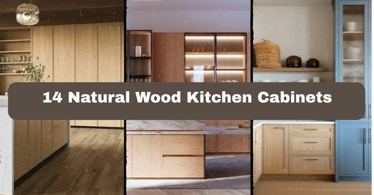
  • 14 Natural Wood Kitchen Cabinets

    14 Natural Wood Kitchen Cabinets

    14 Natural Wood Kitchen Cabinets can make a kitchen feel warm, useful, and connected to the rest of your home. I’ll walk you through 14 practical design ideas, plus color tips, hardware choices, layout advice, and mistakes to avoid.

    What are 14 Natural Wood Kitchen Cabinets? They are fourteen design approaches using wood cabinetry as the main feature, from light oak and walnut to rustic pine. Each approach pairs natural grain with suitable colors, hardware, lighting, and decor.

    You’ll see how small choices can change the whole mood of the room. I’ll also share simple ways to make wood cabinets work in modern, traditional, coastal, and small kitchens.

    What Makes Natural Wood Kitchen Cabinets So Appealing?

    Natural wood cabinets bring texture that painted cabinets cannot quite copy. You can see the grain, knots, and gentle color shifts. That detail makes the kitchen feel less flat and more lived-in.

    I like wood because it can look polished without feeling cold. Light oak creates an airy room, while walnut feels rich and calm. Maple, cherry, ash, and alder each bring a different personality.

    The key is balance. Too much wood can make a room feel dark or busy. The right backsplash, wall color, countertop, lighting, and hardware keep the cabinets looking intentional. Before choosing a finish, look at your kitchen’s natural light and the colors already in nearby rooms.

    1. Pair Light Oak Cabinets With Soft White Walls

    Natural Wood Kitchen Cabinets Design Guide for 2026 | OPPEIN
    Credit: OPPein

    Light oak cabinets are a strong choice when you want a bright kitchen with natural warmth. Their pale golden grain looks clean beside soft white walls, warm ivory tile, or creamy quartz countertops. This combination keeps the room open without making it feel stark.

    I would choose brushed brass or matte black hardware depending on the mood. Brass adds a gentle glow, while black creates sharper contrast. A simple runner in tan, gray, or faded blue can connect the floor to the cabinets.

    For an easy update, paint a sample board before committing to the wall color. Whites can look yellow, gray, or blue next to wood.

    This idea suits Scandinavian, modern farmhouse, minimalist, and coastal homes, and it leads naturally to a slightly moodier wood-and-white pairing.

    2. Create Contrast With Walnut and Pale Counters

    8 Walnut Kitchen Cabinet Ideas 2026
    Credit: BkClandre

    Walnut cabinets have deep brown tones and a noticeable grain. They look especially handsome with pale countertops in marble, quartz, or light soapstone. The bright surface breaks up the darker cabinetry and helps the kitchen feel balanced.

    I like flat-panel walnut doors for a modern kitchen. In a traditional room, raised-panel doors and crown molding make the same wood feel more classic. Keep the backsplash quiet. White handmade tile or a pale stone slab lets the walnut remain the star.

    Choose warm white bulbs so the cabinets do not look gray at night. You can also add open shelves in the same wood, but use them sparingly.

    This approach works in contemporary, mid-century, transitional, and traditional spaces, and the next idea shows how two wood tones can work together.

    3. Mix Two Wood Tones With a Clear Plan

    Mixing Natural Wood and Painted Kitchen Cabinets
    Credit: blockrenovation

    Mixing wood tones can give a kitchen more depth, but random choices may look accidental. I suggest using one main wood for the cabinets and a second, clearly different wood for the island, stools, or shelves. For example, pair pale ash cabinets with a medium walnut island.

    Repeat each tone at least twice. A walnut island can connect to walnut cutting boards or dining chairs. Light oak cabinets can repeat in floating shelves or a nearby console.

    Keep the undertones compatible. Warm woods usually work best with cream, beige, terracotta, and muted green. Cool gray-brown woods pair well with soft gray and blue.

    This method fits modern, rustic, Scandinavian, and collected kitchens, and it sets up the next idea, where the island becomes the room’s visual anchor.

    4. Make a Wood Island the Main Focal Point

    Kitchen Island Live Edge - A Stunning Focal Point for Your Kitchen – ET Woodcrafts
    Credit; ETWoodcrafts

    If full wood cabinetry feels like too much, use natural wood on the island only. This gives you the warmth of wood without covering every wall. A walnut, oak, or reclaimed wood island can become the center of the kitchen.

    Pair it with painted perimeter cabinets in cream, sage, charcoal, or dusty blue. Choose a countertop that bridges both finishes. Warm white quartz often works well, while butcher block creates a more casual look.

    Add comfortable stools with backs if people use the island for meals. Leave enough room for movement, ideally about 36 to 48 inches between the island and surrounding cabinets.

    This design adapts well to farmhouse, transitional, modern, and industrial homes, and the table below can help you choose a balanced wood and paint combination.

    Wood and Paint Pairing Guide

    Main wood cabinet or islandHelpful paint colorsCountertop directionBest overall mood
    Light oakWarm white, pale sage, soft beigeCream quartz or light woodAiry and relaxed
    WalnutIvory, muted blue, warm grayWhite marble-look quartzRich and refined
    MapleMushroom, dusty green, soft navyLight gray quartzCalm and tailored
    Reclaimed pineCream, clay, faded blueHoned soapstone or butcher blockRustic and casual
    White oakSand, charcoal, muted oliveConcrete-look quartzModern and earthy

    5. Add Matte Black Hardware for Clean Contrast

    Ultimate Guide for Wood Cabinets with Black Hardware
    Credit: DecorCabinets

    Natural wood cabinets can look very different when you change the hardware. Matte black pulls and knobs create a crisp outline around each door. They are especially useful when the wood has warm orange or honey tones.

    For a simple look, use straight bar pulls on drawers and small round knobs on doors. In a larger kitchen, longer pulls can make wide drawers easier to use. Keep the finish consistent on the faucet, cabinet hardware, and light fixtures.

    Before drilling, tape paper templates to the doors. Check the spacing from several angles and test the grip with your hand.

    This idea works in modern farmhouse, industrial, contemporary, and transitional kitchens, and the next option offers a softer metal finish.

    6. Warm the Room With Aged Brass Details

    Warm Kitchen Trends 2026: Colors, Woods, and Why White Is Out
    Credit: KitchenCabinetKings

    Aged brass brings a soft, golden glow to natural wood cabinetry. Unlike bright polished brass, it has a quieter finish that hides small fingerprints and blends well with changing wood tones.

    I would use aged brass on cabinet pulls, a faucet, and perhaps two or three pendant lights. Avoid placing brass on every object. The kitchen can start to look overly matched. Add small touches of cream, tan, or muted green to support the warm palette.

    If your cabinets are dark walnut, choose a medium or antique brass. If they are pale oak, a lighter brushed brass may look fresher.

    This approach suits traditional, eclectic, vintage, and modern kitchens, and it flows into the use of handmade surfaces and natural texture.

    7. Use Handmade Tile to Highlight the Wood Grain

    How to Pair Wood Kitchen Cabinets With Tile - StoneImpressions Natural Stone Tile
    Credit; StoneImpressions

    Handmade-look backsplash tile adds gentle variation beside smooth cabinet doors. A cream subway tile, zellige-style tile, or softly irregular square tile can make the kitchen feel crafted rather than mass-produced.

    Keep the grout color close to the tile for a calm surface. A contrasting grout creates more pattern and may compete with a strong wood grain. If the cabinets have knots or dramatic lines, I would choose a simple backsplash shape.

    Install the tile from the countertop to the underside of the upper cabinets. If you have open shelves, continue the tile behind them for a finished appearance.

    This idea fits cottage, Mediterranean, farmhouse, coastal, and transitional homes, and the next design uses stone to create a stronger natural connection.

    8. Combine Wood Cabinets With Natural Stone

    52+ Natural Wood Kitchen Cabinets ( NATURAL LOOK ) Wood Cabinets
    Credit: backsplash

    Wood and stone share an earthy quality, so they often feel right together. Soapstone, limestone, marble, and quartzite can all complement natural wood cabinets. The best choice depends on how much maintenance you are comfortable with.

    For busy kitchens, quartzite or a durable engineered surface may be easier to manage. Soapstone has a soft, dark look and can be oiled for a deeper finish. Marble offers beautiful movement but can stain or etch, so it needs more care.

    Ask to see the full slab beside a cabinet sample. Small samples do not show the full pattern.

    This pairing works in rustic, classic, organic modern, and Mediterranean kitchens, and the chart below compares common countertop choices.

    Countertop Comparison for Wood Cabinets

    MaterialVisual effect beside woodMaintenance levelGood fit for
    QuartzConsistent and easy to coordinateLowBusy family kitchens
    QuartziteNatural movement with strong durabilityMediumHigh-use kitchens
    SoapstoneSoft, dark, and relaxedMediumFarmhouse and rustic rooms
    MarbleBright and richly veinedHighClassic and elegant kitchens
    Butcher blockWarm and casualMedium to highCottage and country kitchens
    Concrete-look surfaceEarthy and modernLow to mediumIndustrial and contemporary rooms

    9. Install Open Shelves Without Making the Room Cluttered

    Style Your Open Kitchen Shelving Like a Pro
    Credit: Houzz

    Open shelves can make natural wood cabinetry feel lighter. They also give you a place to display bowls, mugs, cookbooks, and plants. The trick is to treat the shelves as useful storage, not a place to keep everything.

    Use two or three shelf levels near the sink, coffee station, or range. Store daily items within easy reach. Group objects by color so the display looks calm. Cream ceramics, clear glass, and woven baskets usually work well with wood.

    Choose shelves that match the cabinets or provide a deliberate contrast. Leave some empty space. Crowded shelves make even a large kitchen look messy.

    This works in Scandinavian, cottage, boho, and modern farmhouse spaces, and the next idea adds texture through lighting.

    10. Layer Warm Lighting Against Wood Surfaces

    Pairing Flooring with Cabinetry: How to Avoid Undertone Clashes in Your Design - Fuzion Flooring
    Credit: FuzionFlooring

    Lighting can change the color of wood more than you might expect. Cool bulbs may make warm cabinets look dull, while very yellow bulbs can make honey oak look orange. I usually recommend warm white light around 2700K to 3000K for a comfortable kitchen.

    Use three layers: ceiling lighting for general brightness, under-cabinet lights for work areas, and pendants or wall lights for style. Place under-cabinet strips toward the front edge so they illuminate the counter instead of shining into the backsplash.

    Choose fixtures with finishes that repeat your cabinet hardware. Glass, linen, aged metal, and ceramic shades all work well.

    This lighting plan adapts to nearly any home style, and it prepares the room for the softer textures in the next idea.

    11. Layer a Woven Runner for Warmth and Comfort

    The Best Kitchen Runner Rugs: Designs, Colours, Trends & More
    Credit: FCIlondon

    A woven runner can soften the hard surfaces around a sink or island. It also adds color without changing the cabinets. Look for flatweave wool, washable cotton, or indoor-outdoor fabric if the kitchen gets heavy traffic.

    Choose a pattern that repeats one cabinet or wall color. A faded blue runner works with pale oak and white walls. Terracotta, rust, and cream look good beside walnut or honey-toned wood.

    Measure the walkway first. The rug should sit flat and leave enough visible flooring around the edges. Add a nonslip pad to prevent sliding.

    This idea suits boho, farmhouse, coastal, and traditional kitchens, and the next approach brings in plants and other living details.

    12. Add Greenery and Natural Accessories

    What Color Countertops Goes With Oak Cabinets? 10+ Ideas
    Credit; countryfloors

    Plants make wood cabinets feel even more connected to nature. A small herb pot near a window, a trailing plant on an open shelf, or a large leafy plant in an empty corner can add life without much effort.

    Use containers made from terracotta, stone, ceramic, or woven fiber. Avoid filling every counter with decor. Keep the sink and main prep area clear so the room remains practical.

    If your kitchen has little sunlight, choose a realistic faux plant or place low-light varieties away from the stove. Herbs need enough light and regular watering, so keep them where you will remember them.

    This works in organic modern, cottage, coastal, and rustic homes, and the guide below helps match accessories to common wood finishes.

    Accessory Color Guide by Wood Finish

    Wood finishHelpful accent colorsMaterials that pair wellColors to use carefully
    Pale ashSage, dusty blue, creamLinen, ceramic, light rattanBright orange
    Honey oakOlive, clay, warm whiteTerracotta, aged brass, woolIcy gray
    WalnutIvory, muted teal, blackStone, leather, aged metalToo many dark browns
    CherryCream, olive, soft taupeBrass, marble, woven cottonStrong red accents
    Reclaimed pineFaded blue, charcoal, rustIron, galvanized metal, juteGlossy plastic finishes

    13. Choose Glass Doors for Selective Display

    8 ways to style glass fronted kitchen cabinets | Homes and Gardens
    Credit: HomesAndGardens

    Glass-front cabinet doors can break up a long run of solid wood. They work best on upper cabinets where you want to display attractive dishes, glassware, or cookbooks.

    Clear glass gives the most open look, while seeded or reeded glass hides clutter better. I prefer using glass on only one or two cabinet sections. Too many display doors create visual noise and make cleaning more demanding.

    Keep the contents simple. Group white dishes together, or use one color family with a few wooden boards for contrast. Add interior lighting if the cabinet is deep or dim.

    This idea fits traditional, transitional, English cottage, and modern kitchens, and it leads to a final storage-focused option for smaller spaces.

    14. Use Vertical Storage to Make Wood Cabinets Work Harder

    26 Wooden Kitchen Cabinet Ideas With Natural Charm
    Credit: southernliving

    Natural wood looks best when the kitchen is not overloaded with loose items. Vertical storage helps keep counters clear while making use of narrow wall space. Add a tall pantry cabinet, tray divider, pullout spice rack, or full-height shelf beside the refrigerator.

    In a small kitchen, store baking sheets upright and use drawer organizers for utensils. A narrow cabinet can hold oils, cutting boards, and cleaning supplies. Keep everyday appliances behind doors when possible.

    Choose storage inserts that match your routine instead of buying organizers first. I would list what you use each day, then assign each item a home.

    This practical approach suits small, modern, traditional, and apartment kitchens, and it brings all 14 natural wood cabinet ideas back to daily function.

    Tips for Success

    • Order large wood samples and view them in morning, afternoon, and evening light.
    • Check the cabinet undertone before choosing paint, tile, or countertop colors.
    • Seal or maintain wood surfaces according to the manufacturer’s instructions.
    • Use a vent hood that properly matches the size and power needs of your range.
    • Leave clear walking space around islands, cabinet doors, and appliance handles.
    • Repeat important finishes at least twice, such as using brass on both the faucet and lighting.
    • Keep high-use counters open so beauty does not get in the way of cooking.

    Common Mistakes and How to Avoid Them

    Choosing wood from a tiny sample

    Use a larger door sample or board. Grain and color can look very different across a full cabinet run.

    Mixing too many undertones

    Compare wood, flooring, countertop, and paint chips together. Choose warm or cool supporting colors that agree with the wood.

    Using only one type of lighting

    Add ceiling, task, and accent lighting. A beautiful kitchen can feel dark if the work zones are poorly lit.

    Overfilling open shelves

    Display useful pieces in small groups and leave open space between them. Store less attractive items behind closed doors.

    Ignoring cabinet maintenance

    Ask how the finish handles moisture, heat, and cleaning products. Use soft cloths and avoid harsh cleaners unless the maker approves them.

    Making every feature a focal point

    Let one element lead, such as the island, backsplash, or range hood. Keep the other finishes quieter so the room feels organized.

    Similar Variations

    • Scandinavian Natural Wood: Light oak, simple doors, pale walls, and minimal hardware create a clean, relaxed look.
    • Organic Modern: White oak, stone counters, soft curves, and plants bring in a calm nature-inspired feel.
    • Coastal Wood Kitchen: Pale wood, sandy whites, soft blue, and woven accents create an easy seaside mood.
    • Rustic Farmhouse: Reclaimed timber, apron-front sinks, aged metal, and handmade tile add comfort and character.
    • Mid-Century Wood Kitchen: Walnut or teak, flat doors, simple lighting, and vintage-inspired furniture create a strong retro profile.
    • English Cottage Wood Kitchen: Painted and stained cabinets, glass doors, brass hardware, and floral textiles make the room feel collected.

    Natural wood cabinets give you a flexible foundation, but the surrounding choices determine whether the kitchen feels bright, moody, rustic, polished, or relaxed. Start with the wood tone, then build out the countertop, wall color, lighting, hardware, and textiles one layer at a time.

    I find the best kitchens are not the ones with the most decoration. They are the ones where every material supports the way people live, and that is the real strength of 14 Natural Wood Kitchen Cabinets.

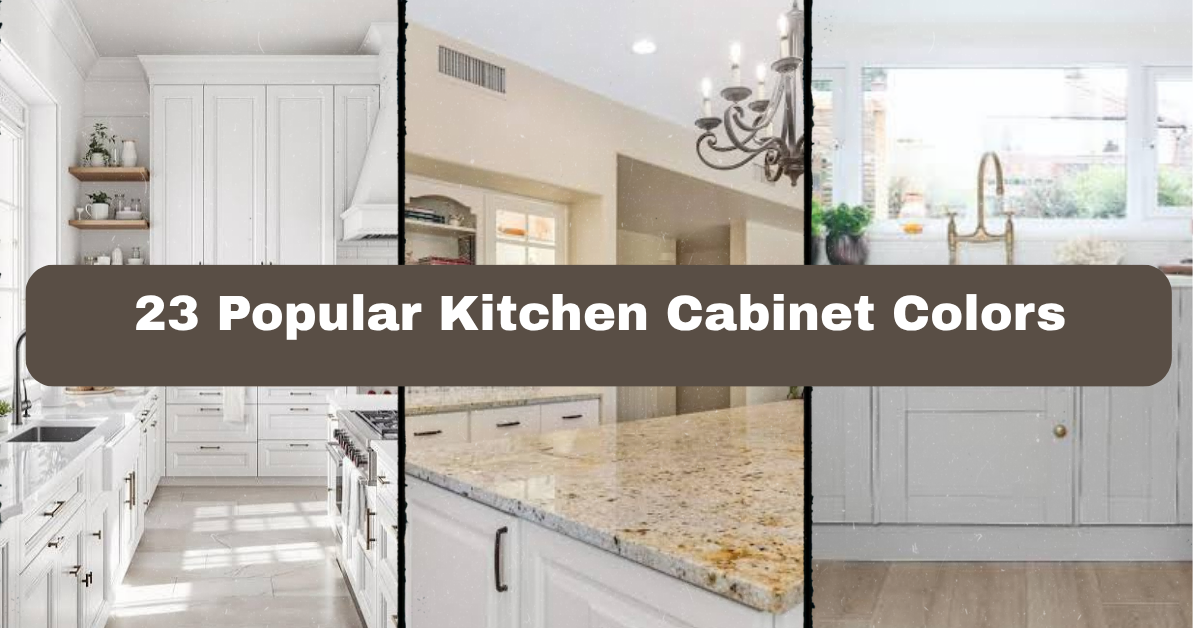
  • 23 Popular Kitchen Cabinet Colors

    23 Popular Kitchen Cabinet Colors

    23 Popular Kitchen Cabinet Colors can help you narrow down a renovation choice without guessing how each shade will look at home. I’ll walk you through the best options, where they work, and how to pair them with floors, counters, hardware, and wall colors.

    The most popular kitchen cabinet colors include white, cream, light gray, charcoal, black, navy, blue-gray, sage, olive, forest green, mint, pale blue, teal, greige, beige, taupe, natural oak, walnut, espresso, terracotta, yellow, blush, and two-tone combinations. The best choice depends on light, room size, style, and countertop color.

    Keep reading, because the right cabinet shade can change the whole mood of your kitchen. I’ll also share simple pairing tips that make the final decision easier.

    Understanding Kitchen Cabinet Color Choices

    Choosing a cabinet color is about more than picking a shade you like. Cabinets cover a large part of the room, so their color affects how big, bright, warm, or modern the kitchen feels.

    I always look at three things first: natural light, countertop tone, and the finish of nearby furniture. A small kitchen may benefit from pale colors, while a large room can handle deep green or black. Wood cabinets bring texture, painted cabinets create a cleaner block of color, and two-tone designs add contrast without making the room feel busy.

    Before you choose, order samples. Look at them in morning light, afternoon light, and under your kitchen bulbs. A color that looks soft in a store may look much darker at home.

    1. Crisp White Cabinets for a Bright, Clean Kitchen

    29 Trendy Kitchen Cabinet Colors for Every Style
    Credit: pinterest

    White cabinets remain popular because they make a kitchen look fresh and open. They reflect light well, which is helpful in a small room or a kitchen with limited windows. Bright white works nicely with marble-look quartz, stainless steel appliances, and chrome or black hardware.

    For furniture, choose warm wood stools or a simple dining table so the room does not feel too cold. Add color through rugs, dishware, plants, or upholstered seating. If you prefer a softer look, select a warm white with a cream or beige undertone instead of a sharp blue-white.

    Use a satin or semi-gloss finish for easier cleaning, but test the sheen before ordering. White cabinets suit modern, farmhouse, Scandinavian, coastal, and traditional homes. Once you decide between cool and warm white, cream offers another gentle option.

    2. Soft Cream Cabinets for a Welcoming Feel

    Best Cream Color for Kitchen Cabinets: Top Cabinet Paint Colors
    Credit: Southwestkitchen

    Cream cabinets add warmth without becoming heavy. They are a good choice if you like the brightness of white but want a softer, more lived-in look. Cream pairs beautifully with butcher block counters, warm quartz, brass pulls, and natural wood floors.

    I like cream in kitchens with older homes because it feels timeless rather than overly new. Add woven baskets, linen window shades, or a wood island to support the relaxed color scheme. Be careful with yellow-heavy cream, especially under warm light. It can look dated or overly golden.

    A practical tip is to compare the cabinet sample beside your backsplash. Cream can clash with blue-white tile, while it blends easily with ivory, tan, beige, and warm gray. This shade works in cottage, traditional, farmhouse, Mediterranean, and transitional kitchens. If cream feels too warm, light gray gives you a cooler alternative.

    3. Pale Gray Cabinets for Calm Contrast

    35 grey kitchen ideas for cabinets, worktops and walls | Ideal Home
    Credit: idealhome

    Pale gray cabinets create a quiet, balanced background. They are less stark than white and usually feel more modern than beige. Pair them with white quartz, light oak floors, brushed nickel hardware, and a simple subway tile backsplash.

    In a gray kitchen, I like adding one warmer element. Try a walnut cutting board, rattan counter stools, or a wood dining table. Without that contrast, the space may feel flat, particularly if the floor and walls are also gray.

    Check the undertone before buying. Blue-gray paint can look crisp in bright daylight but icy at night. Greige-gray shades work better in rooms with warm bulbs. Pale gray adapts well to modern, industrial, coastal, and transitional styles. If you want more drama while keeping the same neutral family, medium gray is the next step.

    4. Medium Gray Cabinets for Balanced Drama

    Grey Kitchen Cabinets Ideas | OPPEIN
    Credit: OPPEIN

    Medium gray cabinets are strong enough to define the kitchen but still easy to live with. They work especially well on a large island, where a deeper color can anchor the room without darkening every wall.

    Pair them with white upper cabinets, pale counters, or a light backsplash. Wood shelves and brass hardware add warmth, while matte black fixtures create a sharper modern look. For furniture, choose natural wood or upholstered stools in oatmeal, tan, or muted blue.

    Use medium gray when you want a noticeable color that will not overpower the room. It looks best when the kitchen has good natural light or lighter flooring. In traditional spaces, choose a warm gray with raised-panel doors. In contemporary rooms, flat-front doors keep the shade sleek. From here, charcoal cabinets bring an even moodier effect.

    Cabinet Color and Light Guide

    Kitchen conditionColors that usually work wellColors to use carefullyHelpful pairing
    Small kitchen with little daylightWhite, cream, pale gray, pale blueBlack, espresso, forest greenLight counters and reflective backsplash
    Large kitchen with strong daylightNavy, charcoal, olive, walnutVery bright white if glare is an issueMatte hardware and warm wood
    Warm southern exposureBlue-gray, sage, soft whiteYellow beige, orange-brownCool stone and brushed nickel
    Cool northern exposureCream, greige, taupe, walnutIcy white, blue-grayBrass, wood, warm lighting
    Open-plan kitchenGreige, natural oak, navy islandHigh-contrast red or bright yellowColors repeated in nearby furniture

    5. Charcoal Cabinets for a Moody Modern Look

    19 Moody and Dramatic Dark Kitchen Cabinet Ideas
    Credit: thespruce

    Charcoal cabinets offer the depth of black without feeling quite as severe. They look polished with white countertops, pale wood flooring, and simple hardware. A charcoal island can also add contrast to an otherwise light kitchen.

    I recommend this color for kitchens with plenty of daylight or strong overhead lighting. In a dark room, use charcoal on the lower cabinets and choose white or light wood above. This keeps the room grounded without making it feel closed in.

    For decoration, add glass doors, open shelving, or a light runner to break up the darker surfaces. Brass handles create a warm, classic touch, while black hardware gives a seamless look. Charcoal works in modern, industrial, transitional, and farmhouse kitchens. If you want the boldest possible neutral, black cabinets make a stronger statement.

    6. Matte Black Cabinets for Strong Contrast

    13 Sophisticated Black Kitchen Cabinet Ideas - Cupboard Ideas
    Credit: ELLEdecor

    Matte black cabinets are dramatic, stylish, and surprisingly flexible. They can make pale counters and light walls stand out while giving the kitchen a tailored appearance. Black works well with white marble-look quartz, concrete counters, oak floors, and warm metal hardware.

    I would not use black on every surface in a small, poorly lit room unless you want a very moody design. Instead, try black base cabinets with white uppers or a black island with natural wood perimeter cabinets. Matte finishes hide some fingerprints, though they still need regular cleaning.

    Add softer elements such as woven stools, plants, wood shelves, or cream-colored textiles. These details keep the room from feeling severe. Black cabinets fit modern, industrial, minimalist, and even traditional kitchens when paired with classic door panels. If you like dark color but want a little more personality, navy is worth considering.

    7. Navy Blue Cabinets for Classic Color

    18 navy kitchen ideas to show how to use this stylish shade | Ideal Home
    Credit; Idealhome

    Navy cabinets bring color while remaining easy to coordinate. The deep blue looks especially attractive with white counters, brass hardware, and warm wood accents. It also works well with light blue or patterned tile when you want a layered color scheme.

    Navy is a smart choice for an island because it creates a focal point without requiring the whole kitchen to be painted. For furniture, use counter stools in tan leather, woven cane, or white-painted wood. Avoid using too many other dark colors, or the room may feel heavy.

    Look at the sample in both sunlight and evening light. Some navy paints turn nearly black at night. In a coastal home, pair navy with white and pale oak. In a traditional kitchen, use framed doors and aged brass. In a modern kitchen, choose slab doors and simple pulls. Blue-gray offers a softer, less formal version of this idea.

    8. Blue-Gray Cabinets for a Relaxed, Airy Room

    Best Blue Gray Kitchen Cabinet Colors | A Blissful Nest
    Credit: ablissfulnest

    Blue-gray cabinets combine the calm feel of blue with the neutrality of gray. The result is restful and easy on the eyes. This shade pairs well with white tile, light counters, nickel hardware, and medium-toned wood floors.

    I especially like blue-gray in kitchens that need color but cannot handle something too intense. Add a cream runner or natural fiber pendant to warm it up. If your counters have strong beige or yellow tones, choose a blue-gray with a little green in it so the colors do not fight.

    Use blue-gray on all the cabinets for a quiet look, or place it on the island for a more subtle update. It suits coastal, cottage, Scandinavian, transitional, and modern homes. A deeper blue with green undertones gives the kitchen a richer, more earthy direction.

    Useful Cabinet Color Pairings

    Cabinet colorCountertop pairingBacksplash pairingHardwareBest accent material
    WhiteCarrara-look quartzWhite subway tileBrass or blackWalnut
    CreamWarm quartz or butcher blockIvory zellige tileAged brassOak
    Pale grayWhite quartzSoft gray ceramicNickelRattan
    NavyWhite marble-look quartzGlossy white tileBrassTan leather
    SageCream quartzHandmade ivory tileAged brassNatural stone
    BlackWhite quartz or concreteWhite, gray, or zellige tileBrass or blackLight oak
    Natural oakSoapstone or white quartzPale green tileBlackLinen

    9. Sage Green Cabinets for Natural Warmth

    Sage green cabinets and warm wood. 🤎🌿 Love the color or too much green? 📸 @royaie_aram_decorative
    Credit: Instagram

    Sage green has become a favorite because it feels colorful but quiet. It brings an outdoor quality into the kitchen without the intensity of emerald or bright lime. Sage looks lovely with cream counters, oak floors, aged brass, and handmade tile.

    I suggest using sage when you want a room that feels relaxed and welcoming. Add a wood island, woven pendant lights, and simple ceramic dishes. For furniture, choose stools in natural cane or warm beige fabric.

    Check the undertone carefully. Some sage shades lean gray, while others lean yellow. The right choice depends on your lighting and flooring. A gray sage suits modern rooms, while a warmer sage fits cottage or farmhouse spaces. It also works in English country, Scandinavian, and transitional homes. Olive green offers a deeper, earthier take on this natural palette.

    10. Olive Green Cabinets for an Earthy Statement

    The Best Olive Green Kitchen Cabinet Ideas and Home Trends
    Credit: decorcabinets

    Olive green cabinets add personality without feeling loud. This muted green pairs beautifully with creamy white, natural stone, terracotta accessories, and dark wood. It is a strong choice for someone who wants color but does not want a bright or trendy look.

    Use olive on the lower cabinets or island if painting the whole kitchen feels like too much. Brass hardware brings out its warmth, while black hardware makes it look more contemporary. Add an oversized cutting board, pottery, or a woven runner to reinforce the organic mood.

    Olive may look muddy in a room with very little light, so test a large sample first. It works well in Mediterranean, modern rustic, traditional, and eclectic homes. Forest green takes this idea further with more depth and a richer jewel-tone effect.

    11. Forest Green Cabinets for Rich Depth

    37 Green Kitchen Cabinet Ideas for a Fresh Start in 2025
    Credit: ELLEdecor

    Forest green cabinets create a bold but grounded kitchen. The color looks striking with pale counters, warm wood, unlacquered brass, and cream walls. It can make a large kitchen feel cozier and give a small island a strong focal point.

    I recommend forest green when the room has good light and enough visual balance. If the cabinets are dark, use a light backsplash and avoid very dark flooring. Glass-front doors or open shelves can also prevent the design from feeling dense.

    For a traditional look, use raised-panel doors and brass knobs. For a modern room, select flat fronts and slim pulls. Forest green suits English country, craftsman, traditional, modern rustic, and eclectic kitchens. If you want something lighter and fresher, mint green brings a softer contrast.

    12. Mint Green Cabinets for a Fresh Vintage Feel

    Light Green Kitchen Cabinet Ideas
    Credit: sweeten

    Mint green cabinets create a cheerful kitchen with a gentle retro touch. The color works best when balanced with warm white, pale wood, cream counters, and simple chrome or brass hardware. It can make the room feel brighter without relying on plain white.

    Mint is especially useful in a breakfast nook, small galley kitchen, or lower cabinet run. Pair it with a white farmhouse table, woven chairs, or painted wood furniture. Keep the backsplash simple so the cabinet color stays in focus.

    Some mint paints look too blue under cool bulbs, so compare samples beside your flooring and lighting. This color works in cottage, vintage, coastal, Scandinavian, and playful modern homes. Pale blue offers a similarly light feeling but with a cooler, more classic character.

    Finish Comparison for Painted Cabinets

    FinishVisual effectCleaning notesBest style match
    MatteSoft, modern, low glareShows some grease; wipe gentlyMinimalist, modern
    SatinMild glow and versatile lookEasier to clean than matteTransitional, family kitchens
    Semi-glossNoticeable shine and strong contrastEasy to wipeTraditional, utility-focused
    High-glossReflective and boldShows smudges and surface flawsContemporary, sleek
    DistressedAged, casual characterTexture can collect dustFarmhouse, cottage
    Natural wood finishShows grain and warmthDepends on protective coatingRustic, Scandinavian, organic modern

    13. Pale Blue Cabinets for Coastal Calm

    Blue kitchen ideas: 10 ways to brighten kitchens with blue | Ideal Home
    Credit: IdealHome

    Pale blue cabinets make a kitchen feel open, relaxed, and airy. They pair naturally with white walls, light oak, marble-look counters, and polished nickel hardware. The color is gentle enough for all the cabinets but also looks lovely on an island.

    To keep the room from looking too themed, skip excessive nautical decorations. Instead, use linen curtains, woven stools, ceramic vases, and a simple striped runner. Choose a dusty blue if you want a more grown-up look, or a brighter powder blue for a cottage kitchen.

    Pale blue works well in coastal, farmhouse, cottage, Scandinavian, and traditional homes. It is also helpful in rooms that need color without visual weight. Teal cabinets create a more saturated and energetic version of blue.

    14. Teal Cabinets for Colorful Character

    5 New Kitchens With Bold, Beautiful Cabinet Colors
    Credit: Houzz

    Teal cabinets combine blue and green for a rich, memorable look. They work best as an island color, a lower cabinet shade, or a feature wall in an otherwise neutral kitchen. White counters and warm wood help keep teal from becoming overwhelming.

    I like teal with brushed brass, matte black, or simple chrome hardware. Use furniture in tan leather, natural oak, or cream fabric to balance the saturated color. Keep other decorative pieces fairly quiet. Too many competing colors can make the kitchen feel restless.

    Teal suits eclectic, modern, mid-century, coastal, and vintage homes. A darker teal can feel elegant, while a lighter teal has a playful quality. If you want a neutral with similar warmth, greige is a reliable next option.

    15. Greige Cabinets for Easy Versatility

    20 Gorgeous Greige Kitchen Cabinets
    Credit: TheSpruce

    Greige blends gray and beige, giving you a neutral that feels both warm and current. It is one of the easiest cabinet colors to pair because it works with white, cream, tan, wood, black, and muted blue.

    Use greige when your kitchen connects to a living or dining room and you need a shade that flows between spaces. Pair it with quartz counters, oak flooring, black window frames, or aged brass fixtures. For furniture, choose a wood table or upholstered stools in oatmeal.

    Greige can look different from room to room. Test it against your backsplash because some versions lean pink, green, or yellow. It suits transitional, modern farmhouse, contemporary, and traditional kitchens. Beige cabinets create an even warmer and softer neutral scheme.

    Cabinet Color Planning by Room Size

    Room size or layoutRecommended cabinet approachCounter and wall suggestionFurniture suggestion
    Small galley kitchenWhite, cream, pale blue, light greigeLight counter and same-color wallsSlim stools, glass pendants
    Medium L-shaped kitchenSage, pale gray, navy islandWhite backsplash with wood accentsTwo-tone wood and painted seating
    Large open kitchenForest green, charcoal, walnut, oliveLight counter to balance depthOversized island stools
    Kitchen with low ceilingsLight upper cabinets, darker lowersVertical backsplash patternLow-profile furniture
    Open-plan kitchen and living roomGreige, oak, cream, soft grayRepeat living-room accent colorMatching wood tones nearby

    16. Beige Cabinets for a Soft, Timeless Base

    Best Beige Kitchen Cabinets | A Blissful Nest
    Credit: ABlissfulnest

    Beige cabinets feel warm, familiar, and easy to decorate around. They pair well with cream walls, limestone-look counters, oak floors, terracotta tile, and bronze hardware. This color is especially useful when you want a comfortable kitchen rather than a sharp, high-contrast one.

    Choose a beige with gray undertones if you prefer a modern look. A golden beige feels more traditional and works nicely with warm wood. Add contrast through black lighting, dark stools, or a patterned backsplash.

    I recommend avoiding beige cabinets with too many yellow accessories. Let the cabinets provide warmth, then add cooler accents such as muted blue dishes or gray textiles. Beige works in traditional, Mediterranean, farmhouse, transitional, and desert-inspired homes. Taupe offers more depth while keeping the same calm neutral feeling.

    17. Taupe Cabinets for Refined Warmth

    The Ultimate Guide to Using Warm Taupe Kitchen Cabinets | George Cabinetry
    Credit: georgecabinetry

    Taupe sits between gray, brown, and beige. It feels understated but has more character than a basic neutral. Taupe cabinets look attractive with creamy white counters, dark bronze hardware, natural stone, and medium-toned wood.

    This shade is a good bridge when your kitchen has both warm and cool features. For example, taupe can connect gray flooring with a walnut dining table. Choose upholstered stools in linen, leather, or textured beige for a polished but comfortable result.

    Taupe may look darker than expected in a room with limited daylight, so order a larger sample. It fits transitional, contemporary, traditional, rustic, and European-inspired kitchens. Natural oak cabinets introduce visible wood grain and a more organic feel.

    18. Natural Oak Cabinets for Texture and Light

    Natural Wood Kitchen Cabinets Design Guide for 2026 | OPPEIN
    Credit: OPPEIN

    Natural oak cabinets bring warmth, grain, and movement to the kitchen. Light oak is especially popular in Scandinavian, modern, and organic designs. It looks fresh with white counters, soft green tile, black pulls, and simple furniture.

    The grain means the cabinets already provide visual texture, so I would keep the backsplash fairly calm. Add linen shades, woven stools, ceramic dishes, or a stone pendant to support the natural mood. Avoid matching every wood item exactly. A little variation makes the room feel collected instead of staged.

    Choose a clear or lightly tinted finish if you want the pale wood to remain visible. Natural oak works in Scandinavian, modern farmhouse, coastal, minimalist, and organic modern kitchens. Walnut brings a darker, richer wood tone for rooms that need more contrast.

    Wood Cabinet Comparison

    Wood colorOverall moodBest counter pairingHardwareGood style matches
    Light oakAiry and naturalWhite quartzBlack or nickelScandinavian, coastal
    Honey oakWarm and familiarCream quartzBrass or bronzeTraditional, farmhouse
    WalnutRich and refinedWhite or soapstoneBrass or blackModern, mid-century
    EspressoDramatic and formalLight quartzSilver or brassContemporary, traditional
    Reclaimed woodRustic and texturedConcrete or stoneBlack ironIndustrial, rustic
    Painted woodClean and flexibleDepends on paint colorCoordinates with shadeNearly any style

    19. Walnut Cabinets for Rich Natural Contrast

    Walnut Kitchen Cabinets: Ideas and Design Tips for 2026 – Emily's Interiors, Inc
    Credit; emily’sinteriors

    Walnut cabinets add depth without the flat look of dark paint. Their natural grain creates interest, while the brown tone makes the kitchen feel warm and substantial. Pair walnut with white quartz, pale stone, cream walls, or muted green tile.

    I like using walnut on a full cabinet wall or island, then keeping the remaining finishes simple. Choose furniture in leather, black metal, or woven materials. Too many dark woods can make the kitchen feel heavy, so balance walnut with light flooring or a bright backsplash.

    A clear finish preserves the grain and lets the wood remain the star. Walnut works in mid-century modern, contemporary, organic modern, and transitional homes. Espresso cabinets provide a darker, more uniform look if you prefer painted-style depth.

    20. Espresso Cabinets for Traditional Drama

    Everything You Need to Know About Espresso Cabinets - CabinetCorp
    Credit: CabinetCorp.

    Espresso cabinets have a deep brown finish that feels formal, cozy, and classic. They pair well with cream counters, beige walls, bronze hardware, and warm tile. This color can make a large kitchen feel more intimate.

    Because espresso absorbs light, use it carefully in small rooms. A lighter backsplash, glass cabinet doors, and under-cabinet lighting help open up the design. Add furniture in cream fabric, medium wood, or tan leather to avoid a completely dark palette.

    Espresso suits traditional, Tuscan, transitional, and lodge-inspired kitchens. It is less flexible than walnut because it offers less visible grain, but it can create a very polished look. Terracotta cabinets are a more unusual option if you want warmth with a clear color statement.

    21. Terracotta Cabinets for Earthy Personality

    The terracotta kitchen trend is the 'it' shade for 2024 | Ideal Home
    Credit: IdealHome

    Terracotta cabinets bring the warm color of clay into the kitchen. The shade can range from dusty orange to deep baked red, so sample testing is essential. It pairs well with cream, olive green, natural wood, aged brass, and handmade tile.

    Use terracotta on an island or lower cabinets if you want a controlled dose of color. Keep the walls and counters quiet, then add pottery, woven baskets, and linen textiles. A pale terracotta feels soft and modern, while a deeper version suits Mediterranean or rustic spaces.

    This color works in Mediterranean, desert modern, eclectic, bohemian, and modern rustic homes. It may not suit every resale plan, but it can make the kitchen feel personal and memorable. Yellow cabinets offer another cheerful direction with a lighter, sunnier mood.

    Color Intensity Guide

    Color intensityCabinet examplesHow to balance itBest use
    Very lightWhite, cream, pale blueAdd wood or dark hardwareSmall or dim kitchens
    Light-mediumSage, pale gray, beigeUse a contrasting islandFull cabinet runs
    MediumGreige, taupe, olive, blue-grayKeep backsplash calmOpen-plan kitchens
    DeepNavy, forest green, charcoal, walnutUse light counters and floorsIslands or large kitchens
    SaturatedTeal, terracotta, yellowRepeat color in small accents onlyFeature cabinets
    High contrastBlack, two-tone combinationsLimit competing patternsModern focal points

    22. Yellow Cabinets for a Cheerful Kitchen

    14 Yellow Kitchen Design Ideas to Brighten Up Your Home
    Credit; betterhomes&gardens

    Yellow cabinets create an upbeat, welcoming atmosphere. Soft buttery yellow works better for everyday kitchens than a bright primary shade. Pair it with white counters, light wood, cream walls, and simple brass or black hardware.

    Use yellow on a small cabinet section, island, or breakfast nook if a full application feels too strong. Balance it with neutral furniture and natural textures. Woven stools, a pale wood table, and plain ceramic dishes keep the room from looking overly playful.

    Test yellow in every kind of light. Warm bulbs can make it appear much stronger at night. This shade works in cottage, farmhouse, vintage, eclectic, and cheerful contemporary homes. Blush cabinets create a softer color statement with a more muted, romantic feeling.

    23. Blush and Two-Tone Cabinets for a Personal Finish

    Two-Tone Kitchen Cabinet Ideas to Inspire Your Renovation
    Credit: blockrenovation

    Blush cabinets add a gentle pink tone that can feel modern, vintage, or surprisingly neutral when kept dusty and muted. Pair blush with white counters, pale oak, cream walls, brass hardware, or soft gray accents. It works best when the rest of the room remains simple.

    A two-tone cabinet design is another smart way to use color. Try white uppers with navy lowers, natural oak with sage, or cream cabinets with a walnut island. This approach gives you contrast without committing every surface to one strong shade.

    Repeat one cabinet color in a rug, vase, artwork, or dining chair so the room feels connected. Blush suits vintage, Parisian, eclectic, and contemporary homes, while two-tone layouts work across modern, farmhouse, coastal, and traditional styles. After comparing samples and lighting, your final choice should feel both attractive and practical.

    Tips for Success

    • Order large paint or laminate samples before making a cabinet decision.
    • View samples beside the countertop, backsplash, floor, and appliance finishes.
    • Check the color in morning, afternoon, and evening light.
    • Use lighter cabinets in dark kitchens unless you intentionally want a moody room.
    • Balance deep colors with bright counters, pale walls, or reflective lighting.
    • Repeat the cabinet color in small accessories, but do not match every item.
    • Choose durable hardware and a wipeable finish, especially for busy family kitchens.

    Common Mistakes and How to Avoid Them

    Choosing from a tiny sample:
    Small chips can hide undertones and make a color seem more neutral than it really is. Test a large sample on more than one wall or cabinet surface.

    Ignoring the countertop undertone:
    A cool gray cabinet may clash with a yellow-beige counter. Place the samples together before deciding.

    Using too many dark finishes:
    Dark cabinets, dark floors, and dark counters can shrink the visual space. Keep at least one major surface light.

    Matching every wood tone:
    Perfectly identical wood can make a room look flat. Mix related tones while keeping the undertones compatible.

    Following a trend without considering the home:
    A color may look great online but feel wrong beside your architecture and furniture. Choose a shade that supports the whole house.

    Forgetting the lighting plan:
    Cabinet color changes under warm bulbs, cool LEDs, and daylight. Install or test your intended bulbs before final approval.

    Similar Variations

    • Coastal Kitchen: Uses white, pale blue, navy, and light oak for an airy, relaxed feel.
    • Modern Farmhouse Kitchen: Blends white, cream, sage, black, and natural wood with practical finishes.
    • Organic Modern Kitchen: Focuses on oak, walnut, greige, olive, stone, and woven materials.
    • English Country Kitchen: Pairs sage, forest green, cream, and warm wood with classic cabinet details.
    • Mediterranean Kitchen: Uses terracotta, beige, olive, walnut, and handmade tile for earthy warmth.
    • Scandinavian Kitchen: Keeps the palette light with white, pale gray, soft blue, and natural oak.

    The best kitchen cabinet color is the one that works with your natural light, counters, flooring, and daily habits. Trends can offer ideas, but your home should guide the final choice.

    Whether you prefer a bright neutral, deep blue, natural wood, or a colorful two-tone design, these 23 Popular Kitchen Cabinet Colors give you a practical place to start.

  • 15 Wood And Cream Kitchen Ideas for a Warm, Timeless Home

    15 Wood And Cream Kitchen Ideas for a Warm, Timeless Home

    15 Wood And Cream Kitchen ideas can help you create a space that feels warm, bright, and easy to live with. I’ll show you how to mix wood tones, cream finishes, lighting, hardware, and decor without making the room look flat or dated.

    A wood and cream kitchen combines natural wood surfaces with cream cabinets, walls, counters, or furnishings. The pairing creates a warm, balanced room that suits modern, traditional, farmhouse, coastal, and transitional homes.

    Keep reading for practical layouts, color combinations, material tips, and small details that make this kitchen style work beautifully.

    What Makes a Wood and Cream Kitchen Work?

    I love this kitchen style because it feels calm without looking plain. Cream adds softness and light, while wood brings texture and a natural sense of warmth. The two materials also give you plenty of room to change your decor later.

    The key is balance. Too much pale cream can make the kitchen feel washed out. Too much dark wood can make it feel heavy. I usually choose one main wood tone, one cream shade, and one small accent color. Black, brass, olive green, terracotta, and soft blue all work well.

    Before choosing finishes, look at your natural light, flooring, cabinet layout, and nearby rooms. A kitchen should feel connected to the rest of the home.

    1. Pair Cream Cabinets With a Warm Oak Island

    20 Cream Kitchen Cabinets That Feel Fresh and New
    Credit; TheSpruce

    Cream perimeter cabinets and a warm oak island create an inviting focal point. The cream cabinets keep the walls looking open, while the wood island adds contrast and gives the room a sturdy, furniture-like center.

    Choose oak with a clear or lightly tinted finish so the grain remains visible. For the cabinets, try a creamy white with a yellow, beige, or soft gray undertone. Avoid pairing a very cool white with orange-toned wood, since the contrast can feel accidental.

    Add simple stools with woven seats or leather cushions. A ceramic bowl, cutting board, and small vase can soften the island without cluttering it. If you have a small kitchen, use wood on the island front and countertop instead of the full island structure.

    This idea fits farmhouse and traditional homes, but slab cabinet doors can make it feel modern. Next, let’s look at a more dramatic way to use wood.

    2. Use Full-Height Wood Cabinets on One Wall

    14 Kitchen cabinet ideas that are both practical and stylish | Ideal Home
    Credit: IdealHome

    A full wall of wood cabinetry can make a kitchen feel rich and custom. It works especially well when the opposite cabinets, walls, or backsplash are cream. The wood wall can hold a refrigerator, pantry, oven, and small appliances, giving the room a clean visual line.

    Walnut creates a deeper, moodier look. White oak feels lighter and more casual. Rift-cut oak has a straighter grain that suits modern kitchens, while knotty oak works well in rustic spaces.

    To keep the wall from looking too solid, add open shelving, glass doors, or a cream range hood. Use one type of hardware throughout, such as aged brass or matte black pulls. Before ordering cabinetry, ask for a full door sample and view it in morning and evening light.

    This approach suits contemporary, mid-century, and rustic homes. If a full wood wall feels like too much, the next idea offers a smaller dose.

    3. Add a Wood Hood Over a Cream Range

    26 Wood Range Hood Ideas for Custom Kitchens - decorcabinets.com
    Credit: decorCabinets

    A wood range hood adds character without requiring many wood cabinets. Place it above a cream, white, or stainless steel range, then repeat the wood tone in shelves, stools, or a nearby island.

    The hood should feel connected to the room. If your floor is medium oak, match or closely relate the hood finish to it. If you use a contrasting wood, keep the rest of the room simple. A smooth plaster-style hood with a wood trim band can look elegant, while a paneled hood feels more traditional.

    Check the hood’s ventilation requirements before choosing its shape. Decorative details should never block proper airflow. I also recommend using a washable finish, especially if the hood sits over a frequently used cooktop.

    This idea adapts easily to farmhouse, English country, modern, and transitional kitchens. Once the main wood feature is in place, the right color palette will bring everything together.

    Wood and Cream Color Palette Guide

    Wood finishCream shadeAccent colorOverall effectBest home styles
    Light white oakWarm ivorySage greenAiry and relaxedScandinavian, coastal
    Natural oakSoft almond creamAged brassComfortable and classicTransitional, farmhouse
    Medium walnutPale linen creamCharcoal blackRich and tailoredModern, mid-century
    Honey oakButtercreamTerracottaSunny and welcomingRustic, Mediterranean
    Dark-stained oakMushroom creamAntique bronzeMoody and elegantTraditional, English country

    4. Choose Cream Quartz With Subtle Veining

    Cream Quartz Countertop | View Our Current Slab Inventory
    Credit: NovTileandStone

    Cream quartz countertops give you a practical surface while keeping the kitchen soft and warm. Look for backgrounds in ivory, biscuit, or light taupe rather than bright white. Gentle beige or gray veining can connect the counters to wood cabinets and flooring.

    Avoid choosing a pattern with too many large, sharp veins if your wood already has strong grain. The room may start to look busy. A quieter countertop lets the natural material stand out.

    For a small kitchen, use the same quartz on the counter and backsplash. This creates a continuous look and can make the room appear larger. Ask to see a large sample beside your cabinet door, since small samples often hide the full pattern.

    This countertop idea works in modern, farmhouse, and traditional rooms. With the surfaces selected, you can add texture through the backsplash.

    5. Install a Handmade-Look Cream Tile Backsplash

    25+ Cream Kitchen Backsplash ( SOFT & WARM ) - Backsplashes
    Credit: backsplash

    A handmade-look cream tile adds gentle texture behind the range and counters. Slight variations in shape, color, and glaze keep the wall from feeling flat. Choose rectangular tile for a calm look, square tile for a classic feel, or narrow zellige-style tile for more movement.

    Use cream grout when you want a blended appearance. A light beige grout gives the tile more definition and is often easier to maintain than bright white grout. For a budget-friendly update, tile only the main work wall and paint the remaining walls a washable warm cream.

    Before installation, lay several tiles together to check the color variation. Some tiles look subtle in a box but much stronger across a full wall.

    This backsplash suits coastal, cottage, farmhouse, and modern kitchens. Next, we’ll use lighting to show off the wood and cream contrast.

    6. Hang Woven Pendants Over the Island

    The heart of the home! 🤍 You can never go wrong with a natural light wood island paired with crisp white shaker cabinets., Question for the comments: Are you a fan of pendant lights over the island, ...
    Credit: Instagram

    Woven pendant lights bring a relaxed, natural layer to a wood and cream kitchen. Rattan, cane, seagrass, and paper cord all work well with pale cabinets and warm wood. Their open texture also casts gentle shadows across the ceiling and island.

    For an island, two or three smaller pendants usually look more balanced than one oversized fixture. Leave enough space between the lights and keep the bottom of the pendants high enough for clear sight lines. A dimmer switch helps you move from bright task lighting to a softer evening mood.

    Choose woven shades with a shape that suits your room. Round shades feel casual, while cone shapes look more tailored. Use warm bulbs around 2700K to keep cream finishes from appearing gray.

    This lighting choice fits coastal, boho, Scandinavian, and farmhouse interiors. Lighting helps, but the floor can make the strongest overall statement.

    Kitchen Lighting and Pendant Size Guide

    Island lengthRecommended pendant countTypical pendant widthSuggested spacing
    48 to 60 inches210 to 14 inches18 to 24 inches apart
    72 inches2 or 312 to 16 inches20 to 26 inches apart
    84 to 96 inches312 to 18 inches22 to 28 inches apart
    108 inches or longer3 to 414 to 20 inchesKeep equal spacing

    These are starting points, not strict rules. Always check the fixture’s installation instructions and the ceiling height.

    7. Continue Wood Flooring Into the Kitchen

    10 wooden kitchen floor ideas that are classic and demure | Ideal Home
    Credit; idealhome

    Wood flooring creates a smooth connection between the kitchen and nearby living spaces. It also makes cream cabinetry feel grounded. If you are installing new flooring, choose planks that work with the cabinet color but do not match it too perfectly.

    For example, pale oak cabinets can pair with medium natural oak floors. Cream cabinets can pair with warm walnut flooring. Matching every wood surface can make the room look like a showroom, so some contrast is helpful.

    Use a durable finish designed for busy areas. Place a washable runner near the sink and cooking zone to catch splashes. If real wood is not practical, quality wood-look porcelain tile can offer a similar appearance with different care needs.

    This flooring approach works across modern, traditional, and open-plan homes. Once the floor is set, a few painted details can add useful contrast.

    8. Paint the Lower Cabinets a Soft Mushroom Cream

    The Best Mushroom Paint Colors for Your Kitchen - The Interior Collective | White countertops with backsplash,
    Credit: Pinterest

    Mushroom cream sits between beige, gray, and ivory. It gives lower cabinets a grounded look while keeping the kitchen bright. Pair it with natural wood shelves, a wood island, or a butcher block work surface.

    This color is especially helpful in kitchens with strong sunlight. Very pale cream can look harsh in bright rooms, while mushroom cream stays softer. In darker rooms, choose a lighter shade with warm undertones.

    Test paint samples on several cabinet doors. Look at them in natural light and under your kitchen lighting. Use a durable cabinet enamel with a satin or semi-gloss finish for easier cleaning.

    Brushed brass hardware adds warmth, while black pulls create a sharper contrast. This look can feel modern with flat doors or traditional with shaker fronts. From here, let’s bring in seating that supports the same natural mood.

    Common Wood Options for Kitchen Details

    Wood typeVisual characterGood usesMaintenance notes
    White oakLight grain, pale tan colorCabinets, shelves, islandsSeal against water near sinks
    WalnutDeep brown, smooth grainIslands, accents, furnitureCan darken slightly over time
    MapleFine grain, light colorCabinets, cutting boardsTakes stains evenly
    AshOpen grain, pale neutral toneShelves, cabinet frontsNeeds a durable clear finish
    Reclaimed woodUneven color and marksShelves, beams, decorSeal carefully and check for pests
    TeakGolden brown and oilyStools, accents, small surfacesWipe spills quickly

    9. Add Cane or Woven-Seat Counter Stools

    Wood And Rattan Upholstered Arm Counter Stools(set of 2) - Bed Bath & Beyond - 44164234
    Credit: BedBath&beyond

    Cane and woven-seat stools add texture without introducing another strong color. Choose frames in oak, walnut, black, or painted cream. A wood frame will blend into the kitchen, while a black frame creates a clear outline against a pale island.

    Comfort matters more than appearance. Select counter-height stools for a standard counter and bar-height stools for a raised bar. Look for a footrest, a stable base, and enough space for knees. Backless stools save visual space, but stools with backs are usually better for long breakfasts and homework sessions.

    Keep the seat material practical. Tight cane, seagrass, and washable woven fabric are easier to live with than delicate open weave near food preparation.

    This idea works in coastal, boho, modern farmhouse, and classic kitchens. Seating adds comfort, and the next detail adds display space.

    10. Style Open Shelves With Cream Ceramics

    The Complete Guide to Design Cream Kitchen Cabinets | George Cabinetry
    Credit; GeorgeCabinetry

    Open wood shelves are a simple way to repeat the kitchen’s natural material. Fill them with cream plates, stoneware mugs, cutting boards, glass jars, and one or two plants. The mix feels collected instead of overly decorated.

    Use items in different heights, but do not fill every inch. Leave some open space so the shelves can breathe. I like grouping three objects together, then leaving a small gap before the next group. Put daily-use items within easy reach and keep fragile pieces higher up.

    Install shelves into wall studs or use proper anchors. Near the stove, remember that grease and dust will collect faster. A shelf farther from the cooktop may be easier to maintain.

    This concept suits Scandinavian, cottage, farmhouse, and modern interiors. For another way to add personality, use the wall behind the shelves as a color feature.

    11. Add a Muted Green or Blue Accent Wall

    Kitchen Accent Color Ideas That Go Beyond White and Gray
    Credit: KitchenCabinetKings

    Wood and cream do not need to stay neutral. A muted sage, dusty blue, olive, or gray-green wall can give the kitchen a gentle point of interest. These colors work because they echo nature and sit comfortably beside warm wood.

    Use the accent color on one wall, the pantry door, the island base, or the inside of glass-front cabinets. Keep the shade slightly gray or dusty if you want a calm appearance. Bright primary colors may overpower the soft materials.

    Test the paint next to your cream cabinet sample and countertop. Some greens turn yellow beside warm cream, while some blues can make cream look tan.

    This idea adapts to coastal, cottage, modern, and Mediterranean homes. A small color accent can set the mood, while the right hardware sharpens the design.

    Hardware Finish Comparison

    Hardware finishWorks best withMood createdCare level
    Aged brassWarm cream, oak, walnutSoft and classicShows some patina
    Polished brassIvory, marble-look quartzBright and decorativeNeeds regular polishing
    Matte blackPale cream, light oakCrisp and modernEasy daily care
    Brushed nickelGray cream, mapleQuiet and practicalResists visible fingerprints
    Oil-rubbed bronzeMushroom cream, dark woodTraditional and richCan show dust
    Antique pewterBeige cream, rustic woodCasual and timewornLow-key appearance

    12. Use a Wood Pantry Door as a Focal Point

    Wood Pantry Doors: Add Warmth and Rustic Charm to Your Kitchen
    Credit: DoorsPlusWindows

    A wood pantry door can add warmth without changing the entire kitchen. Choose a slab door for a modern room, a five-panel door for a traditional kitchen, or a simple glass-and-wood design for a farmhouse look.

    If the kitchen already has several wood tones, stain the door to match the most visible one. If not, let the door introduce a slightly darker tone and repeat it with a cutting board, frame, or stool legs.

    Use a strong hinge and a handle that feels comfortable in your hand. A pocket door can save space in a narrow kitchen, while a sliding barn-style door adds rustic character but needs wall clearance.

    This feature works in compact apartments as well as large open kitchens. Now let’s look at a practical surface that also acts as decor.

    13. Display a Thick Wood Cutting Board Collection

    7 Ways to Style Cutting Boards in the Kitchen
    Credit: betterhomes&gardens

    Large wood cutting boards can make a cream kitchen feel useful and lived in. Lean two or three boards against the backsplash or place them upright in a counter basket. Choose boards with different shapes, such as round, rectangular, and paddle styles.

    Keep the display away from direct heat and areas where raw meat is prepared. Use separate boards for cooking and decoration if you want to avoid frequent washing. Food-safe mineral oil helps protect active boards, but decorative boards may need a different care routine based on their finish.

    Do not crowd the counter. One small ceramic crock, a cutting board stack, and a plant may be enough.

    This detail fits rustic, farmhouse, modern, and traditional kitchens. Small accessories matter, and a simple runner can add another layer without taking up counter space.

    Useful Kitchen Runner Sizes

    Kitchen locationCommon runner sizeBest purpose
    In front of a single sink2 by 3 feetSmall splash and standing zone
    Along a standard counter2.5 by 6 feetDaily cooking comfort
    Galley kitchen walkway2.5 by 8 feetLong visual connection
    In front of a large island3 by 8 feetDefines the work area
    Beside an island with stools2.5 by 6 feetAdds softness without blocking stools

    Use a low-profile, washable rug with a nonslip pad. Make sure doors and drawers open freely above it.

    14. Layer a Neutral Runner With a Subtle Pattern

    The Best Kitchen Runner Rugs: Designs, Colours, Trends & More
    Credit: FCILondon

    A runner can make a wood and cream kitchen feel warmer and more finished. Choose a pattern in cream, tan, faded blue, olive, or charcoal. Small geometric designs work in modern spaces, while faded floral or Persian-inspired patterns suit traditional rooms.

    Avoid a rug that matches the cabinets exactly. A little contrast helps define the floor and keeps the room from blending into one pale block. Flatweave cotton, wool, and washable synthetic rugs are useful choices for busy kitchens.

    Place the runner where you stand most, such as along the sink or island. Add a nonslip pad and check that the edges stay flat. Clean spills quickly, especially on natural fibers.

    This idea works in nearly any home style. For the final design idea, we’ll use greenery to soften the hard surfaces.

    15. Bring in Greenery and Natural Decor

    30 Best Open Shelving Kitchen Ideas for Your Home
    Credit; ThePioneerWoman

    Plants make a cream and wood kitchen feel fresh. Try a small herb pot near a bright window, a trailing plant on an open shelf, or a taller plant in a woven basket at the edge of the room. Green leaves look natural beside oak, walnut, and creamy paint.

    Choose plants based on your light and routine. Rosemary, basil, and thyme need strong light and regular care. A pothos or snake plant may be easier for a busy household. Keep plants away from hot burners and avoid placing soil where it can spill into food preparation areas.

    Add other natural pieces, such as stone bowls, linen towels, ceramic vases, and rattan baskets. Use a few items with purpose rather than filling every surface.

    This finishing layer suits coastal, boho, farmhouse, Scandinavian, and modern kitchens. With the main elements chosen, these final tips will help you keep the design balanced.

    Tips for Success

    • Order large samples of cabinet, countertop, flooring, and backsplash materials before making final choices.
    • Compare wood tones in both daylight and artificial light.
    • Keep the undertones consistent. Warm cream usually works best with warm wood.
    • Repeat each major material at least twice so it feels intentional.
    • Use dimmable lighting with warm bulbs for a softer evening atmosphere.
    • Choose washable rugs and easy-care finishes for busy cooking zones.
    • Leave clear work paths around the island, sink, refrigerator, and range.

    Common Mistakes and How to Avoid Them

    Using too many wood tones
    Choose one main wood and one supporting wood. If you use a third, keep it limited to a small accessory.

    Picking a bright white beside warm cream
    Compare both colors in the same light. Choose creams with related undertones so the difference looks planned.

    Making every surface beige
    Add contrast through black hardware, green paint, darker wood, patterned rugs, or aged metal.

    Ignoring countertop patterns
    Strong veining can compete with noticeable wood grain. Pair bold grain with quieter counters.

    Installing open shelves without considering grease
    Place shelves away from the range when possible. Store washable or frequently used items on them.

    Choosing style over comfort
    Test stools, check lighting glare, and protect standing areas with a supportive runner. A kitchen should be easy to use every day.

    Similar Variations

    • Modern Organic Kitchen: Combines light wood, creamy slab cabinets, simple lighting, and soft natural textures.
    • Warm Scandinavian Kitchen: Uses pale oak, off-white surfaces, clean lines, and minimal decoration.
    • Modern Farmhouse Kitchen: Blends cream shaker cabinets, a wood island, black hardware, and practical vintage accents.
    • Coastal Wood and Cream Kitchen: Adds pale blue, woven lighting, light oak, and relaxed linen details.
    • English Country Kitchen: Uses mushroom cream, painted wood, aged brass, open shelves, and traditional patterns.
    • Desert-Inspired Kitchen: Pairs warm cream and wood with terracotta, clay pottery, woven baskets, and muted olive.

    The best wood and cream kitchen is not the one with the most expensive finishes. It is the one with a clear balance of light, texture, warmth, and practical choices. Start with your cabinet and wood tones, then add lighting, hardware, textiles, and personal pieces slowly.

    When the materials support one another, the room feels welcoming from the first step inside, and these 15 Wood And Cream Kitchen ideas give you a strong place to begin.

  • 17 Two Tone Kitchen Cabinets

    17 Two Tone Kitchen Cabinets

    17 Two Tone Kitchen Cabinets can make a kitchen feel more custom, balanced, and welcoming without requiring a full redesign. I’ve gathered 17 practical color combinations and design ideas to help you choose cabinets that look good and work well every day.

    What are 17 two-tone kitchen cabinet ideas? They are design combinations that use two cabinet colors, finishes, or materials in one kitchen. Common pairings include white and navy, wood and green, black and cream, or a darker island with lighter perimeter cabinets.

    You’ll see ideas for small kitchens, open layouts, farmhouse rooms, modern spaces, and more. I’ll also share simple ways to choose colors, hardware, lighting, and materials that fit together.

    A Quick Primer on Two-Tone Kitchen Cabinets

    Two-tone kitchen cabinets use two different finishes in the same room. Usually, one color covers the upper and lower perimeter cabinets, while a second shade appears on the island. Another option is to use one color on the upper cabinets and another on the lower cabinets.

    I like this style because it adds depth without making the kitchen feel busy. It can also solve practical design problems. A dark island can ground a large room, while pale upper cabinets can make a small kitchen feel more open. Wood adds warmth to painted cabinets, and a bold lower color can make a plain kitchen feel more personal.

    The key is balance. The colors do not need to match exactly, but they should share a connection through the countertop, backsplash, flooring, or hardware.

    1. Pair Warm White Cabinets With a Natural Wood Island

    Warm whites and wood tones might be my favorite kitchen palette ✨🤎 anyone else? Interior Design @colleenrundleinteriors Cabinetry @rockwoodcabinetry Photography @emilykennedyphoto Photo Assist @evelynjkennedy
    Credit: Instagram

    Warm white cabinets create a clean background, while a natural wood island brings in texture and comfort. This pairing works especially well when you want a bright kitchen that still feels relaxed and lived-in.

    Choose an island in oak, walnut, maple, or reclaimed wood. Keep the wood grain visible instead of covering it with a heavy stain. A white quartz countertop can connect both cabinet colors, while woven stools, ceramic jars, and linen window shades add softness.

    For a practical update, use the same wood tone on open shelves or floating shelves near the range. That small repeat makes the island feel connected to the rest of the room.

    This combination fits farmhouse, Scandinavian, transitional, and modern rustic homes. Next, let’s look at a darker pairing for stronger contrast.

    2. Combine Soft Gray With Deep Navy

    Modern Blue and Gray Kitchen Cabinets: Smart Two-Tone Ideas
    Credit: harmonyhomedesign

    Soft gray perimeter cabinets and a deep navy island create a polished but friendly kitchen. Gray keeps the room light, while navy gives the island visual weight. It is a great choice if black feels too harsh.

    Use brushed brass or aged bronze hardware to warm up the cool colors. A white marble-look countertop adds brightness, and a pale blue or white subway backsplash keeps the wall from competing with the cabinets. Choose simple furniture, such as backless wood stools or slim upholstered counter chairs.

    Before painting, test navy samples in morning and evening light. Some blue paints look almost black in shadow.

    This palette suits coastal, classic, transitional, and contemporary kitchens. The next idea uses black in a softer, more balanced way.

    3. Use Black Lower Cabinets and Cream Uppers

    18 Examples of Two-Toned Kitchen Cabinets From Designers
    Credit: HouseBeautiful

    Black lower cabinets can look dramatic, but cream upper cabinets make the overall design feel inviting instead of severe. This is a smart option for kitchens with good natural light and warm flooring.

    Choose a soft cream rather than a bright yellow-white. Pair it with a light countertop, such as quartz with subtle beige veining. Brass knobs, rattan stools, and warm wood cutting boards keep the black from feeling cold. If your kitchen is small, use glass-front upper cabinets or open shelves to break up the darker lower section.

    A practical tip is to use satin or low-sheen black paint. It hides small marks better than a very glossy finish.

    This idea works in modern, vintage, French country, and industrial homes. Now let’s compare colors and materials before moving into bolder combinations.

    Color and Finish Guide for the First Three Ideas

    Cabinet pairingBest countertopHardwareIdeal room feelingMaintenance note
    Warm white and oakWhite quartz or butcher blockMatte black or bronzeBright and welcomingWood needs regular sealing
    Soft gray and navyWhite quartz or pale marbleBrass or brushed nickelCalm and tailoredNavy may show dust in strong light
    Cream and blackBeige quartz or light graniteBrass or bronzeDramatic but warmSatin black is easier to maintain

    4. Mix Sage Green With Light Oak

    Kitchen of the Week: Elegant Style in Green, Gray and Wood
    Credit: Houzz

    Sage green has a quiet, natural quality. When paired with light oak, it creates a kitchen that feels fresh without looking overly trendy. Use sage on the lower cabinets or island and oak on open shelving, an island base, or a tall pantry wall.

    For the rest of the room, choose cream walls and a simple white backsplash. Small touches of terracotta, clay, or woven seagrass add warmth. Keep furniture relaxed with wooden stools and a simple farmhouse table if space allows.

    Try painting a sample board before committing. Sage changes greatly under cool LED bulbs and warm daylight.

    This combination works in cottage, farmhouse, Scandinavian, and organic modern homes. From here, we can move toward a richer green palette.

    5. Create Contrast With Forest Green and Pale Beige

    Modern Modular Kitchen Features Two-tone Cabinetry in Forest Green, Beige. Sleek Wood Cabinets Contrast with Stainless Steel Stock Illustration - Illustration of decor, interior: 402692215
    Credit: Dreamstime

    Forest green cabinets bring a strong connection to nature. Pale beige uppers or tall cabinets soften the color and stop the kitchen from feeling too dark. This pairing looks especially attractive with natural stone and aged metal.

    Use the darker green on the island if you want a focal point. Add a beige backsplash with gentle variation rather than a high-contrast pattern. Counter stools in leather, woven cane, or warm wood support the earthy color scheme.

    A useful tip is to repeat the forest green in only two or three places, such as the island, pendant shades, and a small piece of artwork. Too many green accents can make the room feel themed.

    This palette fits English country, craftsman, rustic, and modern farmhouse styles. Next, we’ll see how two shades of blue can create a layered look.

    6. Layer Pale Blue With Dusty Blue

    11 light blue kitchen ideas for a bright, versatile scheme | Homes and Gardens
    Credit: HomesAndGardens

    Using two related blues creates a gentle, layered kitchen. Try pale blue upper cabinets with dusty blue lower cabinets, or use dusty blue on the island against pale perimeter cabinetry.

    Keep the other finishes simple. White countertops, light oak floors, and nickel hardware help the colors stay airy. For decoration, add blue-and-white pottery, striped seat cushions, or a small framed print. Avoid adding too many unrelated colors.

    Place the deeper blue where you want more visual focus. A kitchen island, window wall, or bank of drawers is usually a good choice.

    This idea works in coastal, traditional, cottage, and relaxed contemporary homes. If you prefer a warmer design, the next pairing may be a better fit.

    7. Blend Terracotta With Warm White

    The terracotta kitchen trend is the 'it' shade for 2024 | Ideal Home
    Credit: IdealHoime

    Terracotta cabinets or a terracotta-colored island can bring a sunbaked, welcoming feeling to the kitchen. Since this is a strong color, warm white cabinets provide needed breathing room.

    Pair the cabinets with creamy quartz, handmade-look backsplash tile, and natural wood accents. Copper or aged brass hardware can reinforce the warm color scheme. For furniture, choose stools with woven seats or simple wood frames rather than shiny metal.

    Use terracotta as an accent first if you are unsure. Painting only the island or a small pantry cabinet lets you test the look without covering the entire kitchen.

    This palette works beautifully in Mediterranean, Southwestern, desert modern, and bohemian homes. Let’s compare warm and cool cabinet options before continuing.

    Paint Color Planning Table

    Main cabinet colorSupporting colorGood accent materialsBest for
    Sage greenLight oakBrass, rattan, limestoneNatural and relaxed kitchens
    Forest greenPale beigeAged bronze, leather, stoneLarge or well-lit kitchens
    Pale blueDusty blueNickel, white oak, ceramicAiry coastal rooms
    TerracottaWarm whiteCopper, clay tile, walnutSunny or warm-toned spaces

    8. Choose Greige and Walnut for a Balanced Look

    Two Tone Kitchen Cabinet Ideas: Best Color Combos & Tips
    Credit: HighlandCabinetry

    Greige sits between gray and beige, so it works with both warm and cool finishes. Add walnut on the island or lower cabinets for a richer contrast. The result feels comfortable, grown-up, and easy to live with.

    Use a light greige on the upper cabinets and a medium or dark walnut below. A creamy countertop will connect the two tones better than a stark white surface. Add black pendant lights, leather stools, and a few green plants for an inviting finish.

    A practical step is to compare your greige sample beside the wood in your actual kitchen. The wrong undertone can make walnut look orange or muddy.

    This pairing suits transitional, mid-century modern, contemporary, and craftsman homes. Next, we’ll use a simple black-and-white scheme with more texture.

    9. Add Texture With White and Charcoal Cabinets

    26 Two-Tone Kitchen Cabinet Ideas That Make a Dazzling Duo
    Credit: Kitchencabinetkings

    White and charcoal cabinets offer strong contrast without the intensity of pure black. Charcoal works well on the island or lower cabinets, while white keeps the walls and upper storage bright.

    Bring in texture through fluted cabinet panels, reeded glass, honed stone, or a handmade backsplash. Choose hardware that fits the mood. Brushed nickel feels cooler and cleaner, while brass makes the room warmer. Keep furniture simple so the cabinet texture remains the star.

    For small kitchens, limit charcoal to one section instead of using it throughout the lower cabinets. This keeps the floor area visually open.

    This design adapts to industrial, modern, transitional, and minimalist homes. The next idea adds color through a single focused feature.

    10. Make the Island the Colorful Centerpiece

    Best Two Tone Kitchen Cabinet Colors | A Blissful Nest
    Credit: ABlissfulNest

    A colorful island is one of the easiest ways to try two-tone kitchen cabinets. Keep the perimeter cabinets white, beige, or pale gray, then paint the island cobalt blue, olive green, plum, or muted teal.

    The island becomes the room’s anchor, so repeat its color carefully. You might use the same shade in a rug pattern, pendant cord, bar stool cushion, or small artwork. Select a countertop with enough contrast to outline the island, but avoid a pattern that fights the paint.

    Before ordering stools, check the island height and knee clearance. Good-looking seating still needs to be comfortable and practical.

    This approach works in nearly any home style because the surrounding materials control the mood. Now we’ll explore a two-tone layout that does not depend on an island.

    11. Separate Upper and Lower Cabinets by Color

    18 Examples of Two-Toned Kitchen Cabinets From Designers
    Credit: Housebeautiful

    Painting upper cabinets a light shade and lower cabinets a darker one creates a clear visual division. This approach works well when the kitchen has no island or when the island is too small to carry a contrasting color.

    Try ivory uppers with olive, navy, gray, or wood lower cabinets. Use a backsplash that sits between the two tones, such as pale stone or soft patterned tile. Keep the floor and countertops fairly quiet to avoid too many horizontal lines.

    For a practical result, use durable cabinet paint on the lower cabinets because they receive more contact from shoes, pets, and cleaning tools.

    This layout works in galley, apartment, cottage, and traditional kitchens. Before choosing the final shades, consider the room’s size and natural light.

    Cabinet Placement and Color Guide

    Kitchen conditionBest darker color locationRecommended lighter colorWhy it works
    Small galley kitchenIsland or lower drawers onlyWarm white or pale grayKeeps the room visually open
    Large open kitchenFull island or perimeter lowersCream, beige, or light blueAdds grounding and structure
    Low natural lightSmall accent zoneWarm white or light greigePrevents a heavy feeling
    High natural lightLower cabinets or tall pantry wallAny soft neutralStrong light can handle deeper shades
    No kitchen islandLower cabinetsLight upper cabinetsCreates contrast without a centerpiece

    12. Pair White Cabinets With Natural Stone

    65 Beautiful White Kitchen Ideas with Timeless Style
    Credit; CountryLivingmagazine

    Natural stone can act as the second tone when you want a subtle two-material design. Keep painted cabinets white or cream, then use stone on the island base, a partial cabinet wall, or a stone-clad range surround.

    Materials such as soapstone, limestone, travertine, and rough-cut quartzite add depth. Match the stone to the cabinet undertone. Warm stone looks best with creamy whites, while cool gray stone pairs well with clean white or pale gray.

    Use wood stools and simple pottery to keep the space from feeling too formal. Seal porous stone as recommended by the supplier.

    This idea suits rustic, Mediterranean, organic modern, and traditional kitchens. Next, we’ll make a compact kitchen feel taller and brighter.

    13. Use Vertical Two-Tone Cabinet Blocks

    Two-Tone Kitchen Cabinets: 22 Color Combinations for 2026
    Credit: Nextdaycabinets

    Instead of dividing colors across the island or cabinet levels, create vertical blocks. For example, use white cabinets around the sink and a dark wood or green cabinet wall around the refrigerator and pantry.

    This method gives a kitchen a custom, built-in appearance. It also helps define work zones. Place the darker color around tall cabinets, where it can look intentional and architectural. Keep countertops and backsplash materials consistent to tie the sections together.

    Measure the wall carefully before choosing the color block. A narrow strip may look accidental, while a full cabinet tower usually feels more planned.

    This design works in modern, European, craftsman, and transitional spaces. We’ll now look at a softer option that uses texture instead of strong paint contrast.

    14. Combine Painted Cabinets With Cane or Rattan Panels

    Two-Toned Kitchen Cabinets: Endless Combinations - Bertch Cabinet, LLC
    Credit; bertchcabinets

    Painted cabinets paired with cane, rattan, or woven mesh panels bring texture into a two-tone kitchen. Use the woven material on a few upper doors, a pantry section, or the island ends. Keep the main cabinet color simple, such as cream, light gray, or muted green.

    The natural fibers work well with wood floors, stone countertops, and linen window treatments. Choose black or brass hardware based on the room’s other fixtures. Do not use woven panels beside a busy backsplash, since both surfaces may compete.

    A practical tip is to use cane only on doors that do not sit directly above the sink or cooktop. Steam and splashes can make natural fibers harder to maintain.

    This variation fits boho, coastal, tropical, and relaxed contemporary homes. One final cabinet idea focuses on a timeless color pairing.

    Material Comparison for Two-Tone Kitchens

    MaterialVisual effectCare needsWorks best with
    OakLight, natural, casualSeal and wipe spills quicklyWhite, sage, navy
    WalnutRich, refined, warmUse gentle cleanerGreige, cream, black
    Cane or rattanAiry, textured, handmadeKeep dry and dust regularlyWhite, beige, green
    SoapstoneMatte, deep, classicOil occasionally if desiredCream, white, wood
    Painted MDFSmooth and consistentTouch up chips as neededAny coordinated color

    15. Try Cream and Muted Black for a Vintage Feel

    Black and Beige Kitchen Ideas | A Blissful Nest
    Credit: ABlissfulNest

    Cream and muted black have a classic look that feels less stark than white and true black. Use cream for most cabinets and muted black for the island, range hood, or lower drawers.

    Add old-fashioned details such as cup pulls, glass cabinet doors, a farmhouse sink, or a simple bridge faucet. Keep the countertops light and select a backsplash with small-scale tile. Wood cutting boards and vintage-style stools add charm without turning the room into a theme.

    Use a black sample with a brown or blue undertone that fits your flooring and lighting. A flat, cold black may feel disconnected from the cream.

    This palette suits vintage, farmhouse, traditional, French country, and modern classic homes. Next, let’s use blue and wood for a fresh but grounded finish.

    16. Mix Deep Blue With Medium-Tone Wood

    25 Navy Kitchen Cabinet Ideas to Refresh Your Space
    Credit: theSpruce

    Deep blue cabinets look especially good beside medium-tone wood, such as oak, ash, or warm maple. Use blue on the lower cabinets and wood on the island, or reverse the arrangement for a stronger wood feature.

    A white or pale gray countertop provides a clean bridge between the two materials. Add brushed brass hardware, woven stools, and a few blue ceramic pieces. Keep the backsplash quiet so the cabinet pairing remains clear.

    Protect wood near the dishwasher and sink with proper sealing. Also, request a sample door if possible because wood grain and stain can vary from one batch to another.

    This combination fits nautical, contemporary, craftsman, and modern farmhouse homes. The last idea is for anyone who wants color without a major commitment.

    17. Use a Small Accent Cabinet in a Bold Color

    30+ Spaces That Show the Versatility of Two-Tone Kitchen Cabinets
    Credit: ELLEdecor

    You do not need two large cabinet sections to create a two-tone effect. Paint a small coffee station, beverage cabinet, pantry door, or open-shelf base in a bold color. Keep the main cabinets neutral.

    Try muted red, teal, mustard, dark green, or dusty rose. Repeat the accent shade in a small rug, artwork, vase, or stool cushion. This approach gives you personality while keeping the kitchen easy to update.

    Start with removable sample paper or a painted foam board. Live with the color for several days before buying paint and hardware.

    This idea works in apartments, rentals with approved updates, eclectic homes, and simple contemporary kitchens. With the main ideas covered, these final tips will help you pull the entire room together.

    Tips for Success

    • Test cabinet colors beside the countertop, backsplash, floor, and major appliances.
    • Choose one dominant cabinet color and use the second as a clear accent.
    • Keep hardware finishes to one or two related metals.
    • Check paint samples in daylight, evening light, and under your kitchen fixtures.
    • Use the same wood tone in at least two places if wood is one of your cabinet finishes.
    • Select washable, durable paint with a finish suited to high-touch surfaces.
    • Plan lighting before finalizing colors, especially for dark islands or lower cabinets.

    Common Mistakes and How to Avoid Them

    Choosing colors from a small screen

    : Order real samples or paint large boards. Online colors often look different under your home’s lighting.

    Using two unrelated undertones

    : Pair warm colors with warm neutrals and cool colors with cool neutrals. If you mix them, add a connecting material such as natural wood or beige stone.

    Making every surface a focal point

    : Let the cabinets, backsplash, and countertop take turns being interesting. Keep at least one or two of them quiet.

    Ignoring the size of the room

    : Use darker colors on a smaller section in compact kitchens. Reserve large dark areas for rooms with strong light and enough visual space.

    Forgetting the cabinet layout

    : Look at where each color starts and ends. A color change in the middle of a narrow cabinet run can look accidental.

    Picking style over daily use

    : Consider fingerprints, cooking splashes, pets, and cleaning habits. A beautiful finish still needs to work for your household.

    Similar Variations

    • Coastal Two-Tone: Combines white, pale blue, driftwood, and nickel for a breezy kitchen.
    • Modern Farmhouse: Uses white, black, sage, or natural oak with simple hardware and practical materials.
    • Organic Modern: Blends muted paint colors, warm wood, stone, and soft organic textures.
    • French Country: Pairs cream, dusty blue, muted green, and aged brass with decorative details.
    • Industrial Two-Tone: Mixes charcoal, white, walnut, metal, and concrete-inspired surfaces.
    • Boho Kitchen: Uses earthy cabinet colors, cane panels, handmade tile, plants, and layered textiles.

    Two-tone cabinets work best when the color change feels intentional. Start with the room’s light, cabinet layout, countertop, and flooring. Then choose a pairing that supports how you actually use the kitchen.

    You do not need the boldest colors to make an impact. Even a warm white kitchen with a wood island or a neutral room with one colorful cabinet can feel carefully designed. Use these 17 Two Tone Kitchen Cabinets as a starting point for a kitchen that feels like yours.

  • 16 L Shaped Kitchen With Island

    16 L Shaped Kitchen With Island

    16 L Shaped Kitchen With Island ideas can help you plan a kitchen that feels open, useful, and welcoming without wasting valuable floor space. I’ll walk you through the best layouts, materials, colors, lighting choices, and storage details so you can make confident design decisions.

    An L-shaped kitchen with an island uses two connected runs of cabinets along adjoining walls, while a separate island adds work surface, storage, seating, or cooking space. The layout suits small, medium, and large kitchens when clear walkways and useful work zones are planned carefully.

    You’ll also learn how to choose the right island size, avoid cramped traffic paths, and give your kitchen a finished look that fits your home.

    Understanding the L-Shaped Kitchen With Island

    I like the L-shaped kitchen because it gives you two strong walls for cabinets and appliances while leaving the middle open. That open center is where the island works its magic. It can hold stools, drawers, a sink, a cooktop, or simply a wide surface for meal prep.

    The key is balance. The island should support the kitchen instead of blocking it. You need enough room to open the oven, load the dishwasher, and walk past someone who is cooking. Your colors and materials matter, too. A small kitchen may need light finishes and slim furniture, while a large room can handle dark cabinets, a chunky island, or dramatic pendant lights.

    Before choosing finishes, think about how you actually use the room. Do you cook every day? Do children do homework at the counter? Do guests gather near the refrigerator? Those answers should guide the design.

    1. Create a Clear Work Triangle

    L Shaped Kitchen Island Ideas
    Credit: instagram

    An L-shaped kitchen already supports a natural work triangle between the refrigerator, sink, and cooking area. The island can strengthen that setup when it is placed carefully. I usually suggest keeping the main cooking appliances on the L-shaped cabinet runs and using the island for prep or serving.

    This arrangement reduces unnecessary steps. You can take food from the refrigerator, wash it at the sink, chop it on the island, and move it to the stove without crossing the whole room.

    Choose durable countertop material for the island, such as quartz, sealed granite, or butcher block. Add a cutting board that fits over part of the sink if counter space is tight.

    For a traditional home, use a furniture-style island. In a modern kitchen, choose flat-panel cabinets with a simple waterfall countertop. Next, let’s look at the walking space that makes this layout comfortable.

    2. Protect the Main Walkways

    20 kitchen island ideas to add stylish seating to your space | Ideal Home
    Credit: idealHome

    The space between the island and the cabinets must feel easy to use. A narrow gap may look fine on a floor plan but become frustrating once drawers, people, and appliance doors are involved.

    Aim for about 42 inches between the island and the main cabinets in a working kitchen. If several people cook together, closer to 48 inches can feel better. In a smaller room, you may need to reduce the island depth rather than squeeze the walkway.

    Use painter’s tape on the floor to mark the proposed island before ordering cabinets. Walk around it with a cabinet door or oven door opened. This simple test can reveal problems early.

    This idea works in every style. A farmhouse kitchen may use a wide painted island, while a small modern kitchen may need a narrow peninsula-like island. Once movement feels right, you can focus on island proportions.

    3. Match the Island to the Room

    L Shaped Kitchen Layouts With Island
    Credit: instagram

    The island should look like it belongs in the kitchen, but it does not need to match every cabinet. I often prefer a slightly different island color or finish because it creates a focal point without making the room feel busy.

    A good island size depends on the room and its purpose. A narrow island may offer prep space and drawers. A deeper island can include seating on one side. If you want a sink or cooktop, allow extra counter space around it for safe and comfortable use.

    Keep the island shape simple. Rectangular designs are easiest to build around, especially in L-shaped rooms. Rounded corners can soften a traditional or coastal kitchen, but they may reduce usable counter space.

    In a modern home, try a solid-color island with a stone top. In a cottage kitchen, use beadboard panels or turned legs. With the island planned, the next step is choosing a color scheme that supports the room.

    Kitchen Island Size Guide

    Island purposeSuggested widthSuggested depthComfortable seating
    Prep surface only24 to 36 inches24 to 30 inchesUsually none
    Prep and storage48 to 72 inches30 to 36 inches1 to 2 stools
    Family seating island72 to 96 inches36 to 42 inches3 to 4 stools
    Island with sink72 inches or more36 to 42 inchesLimited seating
    Island with cooktop84 inches or more42 to 48 inchesBest placed away from cooktop
    Large entertaining island96 inches or more42 to 54 inches4 or more stools

    4. Use Two-Tone Cabinet Colors

    Two tone kitchen cabinet ideas – 10 colour combinations to inspire | Ideal Home
    Credit: Idealhome

    Two-tone cabinets can make an L-shaped kitchen with island feel designed instead of flat. A common approach is one color for the wall cabinets and another for the island. For example, warm white cabinets with a deep green island create contrast without looking harsh.

    You can also use wood on the island and painted cabinets on the walls. This adds texture and warmth. If the kitchen is small, keep the taller wall cabinets light and use color below eye level.

    Stick to two main cabinet colors and one accent finish. Too many shades can make the kitchen look scattered. Repeat the island color in small details, such as bar stools, pendant cords, or a framed print.

    Modern kitchens suit black, white, gray, and natural wood. Traditional rooms work well with cream, navy, sage, or muted blue. Now let’s make sure the backsplash connects all those colors.

    5. Choose a Backsplash That Links the Design

    L Shaped Modern Kitchen Design With Marble Backsplash Tiles
    Credit: Interiorcompany

    The backsplash is a useful place to connect the cabinets, island, counters, and flooring. I prefer choosing the countertop first, then selecting a backsplash that supports it rather than competes with it.

    A soft white subway tile keeps the room calm. Handmade-look tile adds gentle variation. Large porcelain slabs create fewer grout lines and suit a clean modern kitchen. A patterned tile can work behind the range, but use it in a controlled area.

    If your island has a bold color, a simple backsplash may be the better choice. If the cabinets are plain, a soft geometric pattern can add interest.

    Install the backsplash from the countertop to the bottom of the upper cabinets. If the budget allows, take it to the ceiling behind an open shelf or range hood. In a coastal kitchen, try pale blue tile. In a rustic kitchen, consider textured stone. Next, we’ll ground the whole room with the right floor.

    6. Select Flooring That Handles Real Life

    L-Shaped Kitchen Ideas | Design & Planning Tips
    Credit: MagnetKitchens

    Kitchen flooring must handle spills, chair movement, dropped utensils, and daily traffic. Porcelain tile, luxury vinyl plank, sealed wood, and natural stone are common choices. The best option depends on your budget and how much maintenance you want.

    Large floor tiles can make a small kitchen look less busy because they create fewer grout lines. Wood-look flooring adds warmth and works well with white or gray cabinets. If you use real wood, check that it is properly sealed and suited to kitchen conditions.

    Choose a floor tone that contrasts slightly with the cabinets. White cabinets can disappear against a very pale floor, while dark cabinets may make the room feel heavy if the flooring is also dark.

    Use a washable runner near the sink if you want extra comfort. Choose a low-pile style that will not catch under doors. Once the floor is set, lighting can add both function and personality.

    7. Layer the Lighting

    L-Shaped Kitchen Layout: 21 Design Ideas and Tips
    Credit: Kitchencabinetkings

    One ceiling fixture is rarely enough for a busy kitchen. I like using three layers: general lighting, task lighting, and decorative lighting.

    Recessed lights or a flush-mount fixture provide overall brightness. Under-cabinet lights help with chopping and cleaning. Pendant lights above the island add style and make the counter feel like a destination.

    Place pendants so they do not block the view across the room. Two fixtures often suit a medium island, while three may work for a long island. Use warm white bulbs, usually around 2700K to 3000K, for a comfortable home setting. Task areas can use brighter light if needed.

    In a modern kitchen, choose simple glass or metal pendants. A farmhouse space can handle aged brass or lantern shapes. A coastal room may suit woven shades. With light in place, let’s add seating that looks good and feels comfortable.

    Lighting and Seating Reference

    Kitchen featurePractical recommendationBest use
    Under-cabinet lightingLED strips or puck lightsChopping and food prep
    General ceiling lightingRecessed or flush fixturesOverall room brightness
    Island pendantsHang about 30 to 36 inches above the counterIsland task and accent lighting
    Standard counter seatingSeat height around 24 to 26 inches36-inch counter
    Bar-height seatingSeat height around 28 to 30 inches40 to 42-inch counter
    Pendant spacingOften 24 to 36 inches apartEven light over an island
    Warm bulb rangeAbout 2700K to 3000KRelaxed residential feel

    8. Pick Stools for Comfort and Scale

    Kitchen Island Seating Ideas – Everything You Need to Know About Adding Comfort and Style to the Center of Your Space | Homes and Gardens
    Credit: Homesandgardens

    Island stools should fit the counter height, island width, and overall design. A stool that is too tall makes meals uncomfortable. One that is too wide may leave little room for each person.

    For a standard counter, look for counter-height stools rather than bar-height stools. Allow roughly 24 inches of width per seated person. Add stools with backs if people will sit for long meals or homework. Backless stools save visual space but are less comfortable.

    Consider upholstery carefully. Performance fabric, leather, and wipeable vinyl are easier to manage than delicate linen in a busy kitchen. If you have young children, rounded edges and sturdy legs are practical choices.

    Use wood stools in a cottage kitchen, metal stools in an industrial room, or woven seats in a coastal design. When seating is solved, storage becomes the next major priority.

    9. Build Storage Into Every Island Side

    How to Design an L Shaped Kitchen Island
    Credit: NelsonCabinetry

    An island can do far more than hold stools. It can hide deep drawers for pots, shallow drawers for utensils, shelves for cookbooks, and pullouts for trash and recycling.

    I prefer drawers over lower cabinet doors for heavy cookware. Drawers let you see the contents without kneeling or reaching into the back. Put everyday items near the dishwasher and prep tools near the main work surface.

    The seating side may need a false panel or shallow storage to provide legroom. Do not place a drawer where a stool will hit it. Add an outlet if you use small appliances on the island, and check local electrical rules before installation.

    Modern kitchens benefit from clean, handle-free drawers. Traditional kitchens can use framed doors and decorative end panels. Next, we’ll look at how to use the walls above the cabinets without creating clutter.

    10. Add Open Shelving With Restraint

    80 Modern Kitchen Island Ideas to Transform Your Home in 2026
    Credit: ELLEdecor

    Open shelves can make an L-shaped kitchen feel lighter, especially when one wall is filled with upper cabinets. They also provide a place to show attractive dishes, glassware, or small artwork.

    The trick is to keep the display useful. Choose a few repeated colors, such as white ceramics, warm wood, and green glass. Leave some empty space between objects. Crowded shelves quickly become a dust collection zone.

    Place shelves away from the busiest cooking splatter when possible. A shelf near the dining area may stay cleaner than one directly beside the range. Use strong brackets and mount the shelves into studs or approved wall anchors.

    Thick wood shelves work in rustic and farmhouse kitchens. Thin floating shelves suit modern rooms, while painted shelves fit traditional homes. With the walls styled, we can add a softer layer underfoot.

    11. Place a Washable Runner in the Work Zone

    Kitchen Carpet and Rugs: 10 Layouts That Take Spills
    Credit; theRugs

    A runner can bring color and comfort to the hard surfaces of an L-shaped kitchen. It works especially well along the cabinet leg where you stand at the sink or prepare food.

    Choose a low-pile, washable rug that does not catch on cabinet doors. Measure the walkway first. The runner should not block the refrigerator, dishwasher, or pantry door. A rug pad helps prevent sliding and protects the floor.

    For a calm look, choose a faded pattern in colors already found in the room. A bolder rug can energize a kitchen with plain cabinets and counters. Avoid very pale rugs near the sink unless you enjoy frequent cleaning.

    Flat woven runners suit coastal and bohemian homes. Vintage-style patterns work in traditional spaces, and simple geometric designs fit modern kitchens. The final design layer is the set of small details people notice when they enter.

    Material Comparison for Kitchen Finishes

    MaterialMain benefitMaintenance levelGood placement
    QuartzLow maintenance and consistent colorLowIsland and perimeter counters
    GraniteNatural pattern and heat resistanceLow to mediumCounters and island tops
    Butcher blockWarm appearance and easy spot repairMedium to highIsland prep surface
    Porcelain tileDurable and available in many stylesLowFloors and backsplashes
    Natural marbleClassic veining and soft luxuryHighLow-abuse counter areas
    Luxury vinyl plankComfortable and budget-friendlyLowKitchen flooring
    Sealed hardwoodWarm and continuous with nearby roomsMediumOpen-plan flooring
    Stainless steelCommercial look and heat resistanceMediumCounters or appliance zones

    12. Add a Decorative Range Hood

    12 Most Stylish Range Hood Ideas for Your Dream Kitchen
    Credit: Decorilla

    A range hood can become one of the strongest visual features in the room. Instead of treating it as an appliance to hide, use its shape and finish to support your style.

    A plaster hood creates a soft, built-in look. A wood hood adds warmth over painted cabinets. Stainless steel feels professional and suits industrial or modern kitchens. A slim insert hidden inside cabinetry gives a quieter appearance.

    The hood must be sized and vented correctly for the cooking equipment. Follow the appliance manufacturer’s instructions and local building requirements. A beautiful hood that does not remove heat, grease, and moisture well is not a successful choice.

    Repeat the hood material somewhere else, perhaps in a wood shelf or metal hardware. For traditional homes, add trim details. For modern homes, keep the lines plain. Once the main features are in place, hardware can sharpen the design.

    13. Use Hardware to Set the Mood

    L-Shaped Kitchen Layout: 21 Design Ideas and Tips
    Credit: KitchencabinetKings

    Cabinet hardware is small, but it changes the entire feel of an L-shaped kitchen. Long pulls create a modern look and are easy to grip. Small knobs feel classic and work well on upper doors. Mixing knobs and pulls can add a collected appearance.

    Choose a finish that relates to the lighting, faucet, or appliances. Brass adds warmth. Matte black gives strong contrast. Brushed nickel feels quiet and works with many color schemes.

    Do not use too many competing finishes. Two metal finishes can work if one is clearly dominant. Before drilling, make a cardboard template and test the handle position. This prevents expensive mistakes.

    Use aged brass in a traditional or vintage kitchen, black hardware in a modern room, or simple bronze in a rustic space. Next, we’ll use plants and personal items to keep the kitchen from feeling too staged.

    14. Bring in Natural Texture and Personal Decor

    L-Shaped Kitchen Ideas | Design & Planning Tips
    Credit: Magnetkitchens

    A kitchen should look lived in, not like a showroom. Natural texture helps. Add a wooden cutting board, a ceramic bowl, woven baskets, or a small plant near a window.

    Keep decorative pieces away from heat, splashes, and food prep areas. A bowl of fruit on the island is both useful and attractive. A framed recipe card or small piece of art can make the room feel personal without taking up much space.

    Plants such as herbs, pothos, or spider plants can work well if the light is suitable. Avoid placing delicate plants beside a hot range or in a dark corner.

    In a coastal kitchen, use pale wood and woven accents. A boho kitchen can include handmade pottery and patterned textiles. A modern kitchen may need only one sculptural vase. The last idea brings everything together through sightlines and balance.

    Budget Planning for an L-Shaped Kitchen With Island

    Budget areaLower-cost approachMid-range approachHigher-cost approach
    CabinetsStock cabinets and simple hardwareSemi-custom cabinetsCustom built-ins
    CountertopsLaminate or basic solid surfaceQuartz or granitePremium quartzite or custom stone
    IslandFreestanding furniture pieceCabinet island with storageCustom island with sink and specialty storage
    FlooringLuxury vinyl plankPorcelain tile or quality laminateHardwood or natural stone
    LightingSurface fixtures and LED stripsRecessed lights with pendantsLayered smart lighting system
    BacksplashStandard ceramic tileHandmade-look or larger tileFull-height slab or specialty tile
    SeatingBasic wood or metal stoolsUpholstered counter stoolsCustom upholstered or designer stools

    15. Keep the Sightline Open

    Kitchen with Island Layout Ideas | KitchenAid
    Credit: KitchenAid

    The best L-shaped kitchen with island designs feel connected to the rest of the home. The island should not become a visual wall unless you need to hide a messy work area.

    Use a counter height that supports conversation. If the room opens to a living area, keep the island’s outer side attractive because it will be visible from several angles. Decorative end panels, legs, trim, or bookcase storage can make that side look finished.

    Avoid placing a tall cabinet or refrigerator where it blocks the main view unless the room requires it. A low island with simple pendants usually feels more open than a raised two-level counter.

    This works across home styles. Open sightlines suit modern apartments, classic family homes, and relaxed coastal spaces. After the design is finished, a few practical checks will protect the result.

    16. Plan for Cleaning and Maintenance

    L-Shaped Kitchen Layout: 21 Design Ideas and Tips
    Credit: KitchenCabinetKings

    A beautiful kitchen is easier to enjoy when it is simple to clean. Choose finishes based on your daily habits, not just appearance.

    Flat cabinet fronts collect fewer crumbs than heavily carved doors. Light grout may need more care near the range. Honed stone can show marks more quickly than a patterned quartz surface. Matte finishes often hide fingerprints better than high-gloss options.

    Place the trash and recycling pullout near the prep area. Keep a drawer for cleaning cloths close to the sink. Choose a faucet with a pull-down sprayer if you wash large pans often.

    In a traditional kitchen, maintenance-friendly materials can still look classic. In a minimalist kitchen, fewer seams and open surfaces make cleaning faster. With that final practical layer considered, your kitchen plan is much more complete.

    Tips for Success

    • Mark the island footprint with tape before buying cabinets or ordering a countertop.
    • Measure appliance doors, cabinet drawers, and pantry doors in their fully open positions.
    • Keep the refrigerator easy to reach from the dining and living areas.
    • Place the dishwasher close to the sink, but avoid putting it where it blocks the main walkway.
    • Use drawers for pots, pans, plates, and food containers whenever the budget allows.
    • Order cabinet and countertop samples before choosing wall paint.
    • Check pendant height from both standing and seated positions.
    • Choose at least one easy-clean surface near the range and sink.
    • Add outlets where you will actually use appliances, not only where they are easiest to install.
    • Consider how the island looks from the next room, not only from inside the kitchen.

    Common Mistakes and How to Avoid Them

    Choosing an island that is too large
    Measure the walkways first. A smaller island with clear circulation is more useful than a huge island that makes the room difficult to cross.

    Putting the sink or cooktop too close to the island edge
    Leave landing space beside sinks and cooking appliances. You need room to set down hot pans, plates, and groceries.

    Ignoring seating legroom
    Make sure the countertop overhang is deep enough for knees. Check that drawers, supports, and cabinet doors will not interfere with stools.

    Using too many finishes
    Limit the main palette to a few cabinet, counter, floor, and metal finishes. Repeating materials creates a calmer look.

    Forgetting appliance door swings
    Confirm that refrigerator, oven, dishwasher, and pantry doors can open fully without hitting the island or another appliance.

    Relying on one ceiling light
    Layer overhead lighting with under-cabinet LEDs and island pendants. This removes dark work areas and makes the kitchen more inviting.

    Similar Variations

    • Modern L-Shaped Kitchen With Island: Flat-panel cabinets, simple counters, clean hardware, and minimal decoration create a sharp, uncluttered room.
    • Farmhouse L-Shaped Kitchen With Island: Painted cabinets, wood accents, apron-front sinks, and open shelving add a relaxed country feel.
    • Coastal L-Shaped Kitchen With Island: Pale blue, white, light wood, woven stools, and soft natural textures keep the space bright and casual.
    • Industrial L-Shaped Kitchen With Island: Black metal, exposed shelving, concrete-style counters, and stainless steel create an urban edge.
    • Traditional L-Shaped Kitchen With Island: Raised-panel cabinets, decorative trim, classic lighting, and warm stone details give the room a timeless appearance.
    • Scandinavian L-Shaped Kitchen With Island: Light wood, soft white cabinets, simple shapes, and practical storage keep the design airy and comfortable.

    An L-shaped kitchen with an island works best when every part has a job. The island should improve prep, storage, seating, or gathering without stealing the room’s breathing space. Start with measurements, map your work zones, then choose colors and finishes that support how you live.

    When the layout is practical, the details become easier. A smart countertop, well-placed lights, comfortable stools, and a few personal touches can turn an ordinary room into the heart of the home with 16 L Shaped Kitchen With Island.

  • 21 Open Kitchen Shelving Styling Tips

    21 Open Kitchen Shelving Styling Tips

    21 Open Kitchen Shelving Styling Tips can help you turn plain wall storage into a useful, polished part of your kitchen. I’ll walk you through practical choices for shelves, dishes, color, lighting, and everyday use.

    How do you style open kitchen shelves? Choose sturdy shelves, group useful dishes with a few decorative pieces, repeat two or three colors, leave open space, and place frequently used items within easy reach. Balance beauty with safe, practical storage.

    You’ll also learn how to avoid clutter, mix materials, and make open shelving work in modern, farmhouse, coastal, and traditional kitchens.

    What Open Kitchen Shelving Adds to a Room

    Open shelves make a kitchen feel lighter and more open because they do not create a solid wall of cabinet fronts. They also let you see the items you use every day. That can be helpful, but it means the styling needs a little planning.

    I like to think of each shelf as a small display with a job. Plates should be easy to grab. Mugs can add color. Art and plants can bring personality. The trick is to mix practical kitchen storage with just enough decoration.

    Before styling, check the wall, shelf depth, weight limit, and distance from the cooktop or sink. Then choose a simple color story. A calm base makes even a small shelf arrangement look intentional.

    1. Start With a Simple Color Palette

    Design ideas for open shelving in kitchens | House & Garden
    Credit: House&Garden

    Choose two main colors and one small accent color for your open shelves. For example, white dishes, warm wood, and small touches of sage green create a relaxed look. Black, cream, and brass feel sharper and more modern.

    Start by gathering everything you might use. Remove items that clash with the room or rarely serve a purpose. Then keep the strongest pieces and repeat their colors across each shelf.

    A practical tip is to photograph the shelves before you finish. Your phone will show uneven color or crowded spots more clearly than your eyes often do.

    This idea works in any home style. Use soft neutrals for Scandinavian rooms, rich tones for traditional kitchens, or bright accents for eclectic spaces. Next, choose a shelf material that supports your palette.

    2. Match Shelf Material to the Kitchen’s Fixed Features

    How to style open shelving in a kitchen - 8 tips from design pros | Ideal Home
    Credit; idealHome

    Open shelves should relate to something already in the kitchen. Match wood shelves to the floor, island, or cutting boards. Match metal brackets to cabinet pulls, faucets, or light fixtures. This small connection makes the room feel planned.

    Wood adds warmth and hides minor dust. Metal shelves create a clean, industrial look. Thick painted shelves blend well with walls and can make a small kitchen feel less busy.

    Before buying, measure the wall and check how much weight the brackets can hold. Use studs when possible. For dishes, a shelf around 10 to 12 inches deep is often useful, but always measure your own items first.

    Modern kitchens suit slim shelves, while farmhouse rooms look good with chunky wood. In a coastal space, pale oak or painted shelves keep the mood airy. Now let’s make sure the shelves are easy to use.

    3. Keep Everyday Dishes on the Lower Shelves

    How to style open shelving in a kitchen - 8 tips from design pros | Ideal Home
    Credit: IdealHome

    The best open shelving is not only pretty. It saves time. Put plates, bowls, glasses, and everyday mugs on the lower shelves where you can reach them without stretching.

    Keep heavier items low. A stack of dinner plates is safer and easier to lift from a shelf near the counter. Place lighter serving pieces and small decorative objects higher up.

    Try grouping dishes by use rather than by random color. Put breakfast bowls near mugs, or keep plates beside the area where you serve food. This creates a natural kitchen workflow.

    This method fits busy family kitchens, minimalist homes, and even small apartments. In a traditional kitchen, use matching dishes. In a casual cottage kitchen, mix simple ceramic pieces. Next, we’ll create visual balance around those useful items.

    4. Vary Heights and Shapes

    22 Kitchen shelving ideas for a sleek and practical storage | Ideal Home
    Credit: idealHome

    A shelf filled with objects that are all the same height can look flat. Mix tall pitchers, medium bowls, short jars, and low stacks of plates. Different shapes help your eye move across the display.

    Use one tall item as an anchor. A ceramic vase, cutting board, or narrow crock works well. Place shorter objects nearby instead of lining everything up at one level.

    A quick tip is to arrange pieces in small groups of three or five. Odd-numbered groupings often feel more relaxed, but do not force the rule if it makes the shelf less useful.

    This approach works with modern, vintage, farmhouse, and boho decor. Keep shapes clean for a modern room and use handmade or curved forms in a rustic space. The next step is choosing a useful mix of storage and decoration.

    Shelf Styling Size Guide

    ItemUseful shelf positionSuggested quantityPractical note
    Dinner platesLower shelf6 to 10Stack by size and keep weight low
    Cereal or soup bowlsLower or middle shelf4 to 8Nesting shapes save space
    MugsMiddle shelf4 to 6Leave handles visible
    Pitcher or vaseEnd of a shelf1Use as a height anchor
    Cutting boardsBack of shelf2 to 4Lean securely and vary sizes
    Small plantMiddle or upper shelf1 to 2Choose a low-maintenance variety
    Art or framed printUpper shelf1Keep it away from steam and splashes

    5. Mix Useful Items With Decorative Pieces

    Kitchen shelving ideas: 14 ways to boost storage and display space | Homes and Gardens
    Credit: Homesandgardens

    Open shelves can become messy if every object is decorative. They can also feel dull if every item is only practical. Aim for a mix.

    A useful formula is about two-thirds kitchen items and one-third accents. Add a framed recipe card, small vase, candleholder, or sculptural bowl between stacks of dishes. The accents should support the room, not compete with the kitchen.

    I like using decorative pieces that still have a purpose. A large wooden board can serve as art and food prep. A pretty ceramic jar can hold tea bags or wooden spoons.

    This idea adapts easily. Use handmade pottery in a rustic kitchen, simple glass in a modern room, or woven baskets in a coastal space. With the mix in place, we can add texture without making the shelves feel crowded.

    6. Add Texture With Baskets and Woven Containers

    How To Organise Your Kitchen Cupboards With Brilliant Baskets – Blog | The Basket Company
    Credit: ThebasketCompany

    Baskets soften the hard lines of wood, metal, and ceramic. They also hide small items that do not look attractive in open storage. Use one or two baskets for napkins, tea towels, snack packets, or extra utensils.

    Choose baskets that fit the shelf without pressing against the wall or edge. Natural seagrass brings a coastal feeling. Dark wire baskets suit industrial kitchens. Small fabric bins can work in a family-friendly space.

    Do not fill every shelf with baskets. Their texture is strongest when balanced with smooth dishes and clear space.

    A simple tip is to measure the basket opening before shopping. Make sure your hand can reach inside comfortably. Baskets work in farmhouse, boho, coastal, and modern kitchens when their color stays controlled. Next, let’s use books in a practical way.

    7. Stack Cookbooks as Low Display Risers

    HOW TO STYLE OPEN KITCHEN SHELVES - CITRINELIVING
    Credit: CitrineLiving

    Cookbooks add color, personality, and height. Stack two or three books horizontally under a bowl, small plant, or serving piece. The stack becomes a display riser while keeping the books available.

    Choose books with covers that match your palette. If the colors are too strong, turn them so the pages face outward, or use only one colorful book as an accent.

    Avoid tall stacks that become unstable. Keep heavy books on lower shelves, and never place them near water or direct heat. You can also use a cookbook stand on a counter below the shelves.

    This works in traditional, cottage, modern, and eclectic kitchens. Use vintage cookbooks for charm or clean-lined books for a contemporary look. Now we can bring in greenery for a fresher shelf arrangement.

    8. Use Small Plants for a Fresh Accent

    22 Kitchen shelving ideas for a sleek and practical storage | Ideal Home
    Credit: Idealhome

    A small plant can make open kitchen shelving feel alive. Herbs, pothos, spider plants, and small succulents are common choices, but the best plant depends on your light and watering habits.

    Place plants where they will not drip onto dishes or sit too close to the stove. Use a saucer under every pot. If the shelf gets little natural light, choose a low-light plant or use a realistic faux option.

    Repeat the planter color with another kitchen detail, such as a black faucet or terracotta bowl. One or two plants are usually enough. Too many can make the shelf look like a greenhouse.

    Plants fit almost every style. Terracotta works in rustic rooms, white pots suit modern spaces, and woven planters support coastal or boho decor. Before adding more objects, check the balance with a quick shelf audit.

    Styling Budget Tiers

    BudgetSuggested materialsBest purchasesExpected result
    Under $50Existing dishes, thrifted jars, paper printsSmall accents and storage jarsFresh styling without new shelving
    $50 to $150Pine shelves, basic brackets, basketsOne shelf update and texture piecesNoticeable change with modest cost
    $150 to $350Hardwood or painted shelves, ceramic piecesBetter materials and coordinated decorMore polished, lasting display
    $350 and aboveCustom shelves, lighting, quality hardwareBuilt-in look and durable accessoriesFull feature-wall transformation

    9. Leave Deliberate Empty Space

    22 Best Open Kitchen Shelving Ideas and Decor
    Credit: GoodHousekeeping

    Empty space is not wasted space. It gives the eye a place to rest and helps useful items stand out. A packed shelf makes every object look less important.

    Try leaving a few inches between groups. You can also leave one section of a shelf mostly open. This is especially helpful in small kitchens, where too many visible items can make the room feel tight.

    A practical method is to remove one item from each crowded group. Then step back and look from the doorway. If the arrangement still feels full, remove another small piece.

    This works particularly well in minimalist and modern kitchens, but it also helps traditional and farmhouse displays look calmer. Once the shelves can breathe, use grouping to make them easier to read.

    10. Group Items by Function

    Style Your Open Kitchen Shelving Like a Pro
    Credit: Houzz

    Create clear zones instead of scattering similar objects across the wall. Keep coffee mugs near coffee supplies, baking bowls near measuring tools, and serving dishes near the dining area.

    Functional groups make the kitchen faster to use. They also make the styling look more natural because each group has a reason to exist.

    Place the most-used items at shoulder or chest level. Reserve high shelves for pieces used once in a while. If children use the kitchen, keep safe cups and bowls at an easy height.

    This approach suits apartment kitchens, family homes, and open-plan spaces. In a sleek kitchen, use matching groups. In a cottage kitchen, let each group have a little variety. Next, we’ll build depth with layered pieces.

    11. Layer Cutting Boards Behind Dishes

    22 Best Open Shelving Ideas for Your Kitchen
    Credit: CountryLivingMagazine

    Cutting boards are some of the easiest kitchen items to display. Lean two or three boards against the back wall, then place a bowl, jar, or small utensil crock in front.

    Use different sizes, but keep the colors related. A large walnut board beside a pale oak board adds contrast without looking random. Avoid leaning boards where they can slide forward.

    Place a small rubber grip or clear shelf liner under the boards if the surface is slick. Keep wood away from standing water and wipe it regularly.

    Layered boards suit farmhouse, rustic, Mediterranean, and modern kitchens. Choose smooth, simple boards for a contemporary room and worn wood for a country look. With the back layer set, we can add a little art.

    12. Include Small Art or Framed Recipes

    How To Style Kitchen Shelving | A Blissful Nest
    Credit: A blissful nest

    A small piece of art can make shelves feel personal. Try a botanical print, vintage food label, handwritten recipe, or simple line drawing. Lean it against the wall instead of hanging it if you want an easy arrangement to change.

    Keep frames narrow and lightweight. Avoid placing paper art beside the stove, sink, or any area exposed to grease and steam. Glass frames are easy to wipe, but acrylic may be safer on lower shelves.

    Use artwork to repeat a color already found in the room. A green print can connect to plants, while a warm red print can echo a kettle or dish towel.

    This idea works in traditional, eclectic, cottage, and modern kitchens. Keep the art quiet in a minimalist space and more playful in a colorful kitchen. Now let’s compare materials before adding more accessories.

    Open Shelf Material Comparison

    MaterialMain strengthCare needsStyle matchBest use
    Solid woodWarm, durable appearanceSeal and wipe spills quicklyFarmhouse, rustic, traditionalDish storage and display
    BambooLight and renewable-lookingKeep dry and avoid harsh cleanersScandinavian, coastalSmall shelves and light items
    Painted MDFSmooth, affordable finishProtect from chips and waterModern, cottageDecorative storage
    Stainless steelHeat and moisture resistanceShows fingerprintsIndustrial, modernNear sinks or work zones
    Tempered glassVisually light and easy to cleanCheck weight limitsContemporaryDisplaying small dishes
    Iron or steelStrong, graphic lookWatch for rust if finish chipsIndustrial, eclecticBrackets and open frames

    13. Repeat One Metal Finish

    Kitchen Open Shelving Ideas • Neat House. Sweet Home
    Credit: neathousesweethome

    A repeated metal finish ties the shelf display to the rest of the kitchen. If the faucet is brushed brass, use brass brackets or a small brass container. If the room uses matte black hardware, repeat black in a frame or tray.

    You do not need every metal to match perfectly. The goal is connection, not strict uniformity. Still, too many finishes can make a small kitchen look scattered.

    Pick one main metal and one optional supporting finish. Keep the supporting finish limited to a small object, such as a candleholder or picture frame.

    This works in industrial, modern, traditional, and transitional spaces. Warm brass suits classic rooms, while black steel feels crisp and casual. Next, we’ll soften the display with textiles.

    14. Add Folded Towels for Color and Function

    12 Open Kitchen Shelving Ideas to Update Your Space
    Credit: betterhomes&gardens

    A folded kitchen towel brings softness to a shelf full of hard surfaces. Choose cotton or linen towels in a color already used in the room. Fold them neatly and place them in a basket or stack them beside a cutting board.

    Keep towels away from the cooktop and avoid placing damp fabric directly on wood. Rotate them often so the display stays clean and useful.

    Stripes, checks, and simple botanical patterns work well because they add interest without taking over. Solid towels are better if the shelves already contain patterned dishes.

    This tip fits farmhouse, coastal, Scandinavian, and traditional kitchens. Use linen for a relaxed look or crisp cotton for a cleaner style. With textiles added, let’s make the display feel more collected.

    15. Mix New Pieces With Vintage Finds

    Kitchen Shelf Styling Tips (and budget finds!) - Jenna Sue Design
    Credit: jennasuedesign

    A few vintage items can give open shelving character. Look for old crocks, small pitchers, enamel cups, wooden utensils, or glass jars. You do not need a full antique collection. One or two pieces can be enough.

    Check vintage items for cracks, rough edges, lead-based finishes, or signs of mold before using them for food storage. Decorative use is often safer for questionable pieces.

    Balance an aged object with something simple and new. For example, place a vintage pitcher beside plain white bowls. The contrast keeps the arrangement from looking like a themed display.

    This idea suits cottage, farmhouse, traditional, and eclectic kitchens. In a modern home, use one vintage item as a strong focal point. Next, we’ll make the shelves feel wider and more organized.

    16. Use Trays to Contain Small Items

    Kitchen shelving ideas – 15 stylish ways to max out on open storage | Real Homes
    Credit: realHomes

    A tray gives small objects a visual home. Place oils, salt, pepper, and spices on a narrow tray near the cooking area. Use another tray for coffee mugs or tea supplies.

    Choose a tray that leaves room to lift it easily. Wood warms a plain shelf, while metal or acrylic creates a cleaner look. Do not use a tray as an excuse to keep items you never use.

    Keep the tray close to the task it supports. A coffee tray belongs near the kettle, not across the kitchen. Wipe spills quickly, especially on unfinished wood.

    Trays work in every style when their shape and finish fit the room. A round woven tray feels coastal, while a rectangular black tray feels modern. Now we’ll consider lighting, which can change the whole display.

    Shelf Spacing and Placement Guide

    Shelf locationRecommended clearanceItems to storeItems to avoid
    Above a counter16 to 20 inches above work surfacePlates, mugs, jarsVery tall decor
    Above a sink18 to 24 inches above sink areaGlasses, small plantsPaper art without protection
    Near a cooktopFollow appliance instructionsHeat-safe dishesFlammable textiles and plants
    Between upper cabinetsMatch cabinet widthCoordinated dish groupsOversized objects
    High display shelfAt least comfortable viewing heightRarely used serving piecesHeavy stacks
    Lower open shelfKeep clear of splash zonesHeavy cookware, basketsBreakable items in busy paths

    17. Add Under-Shelf Lighting

    Use Hidden Lighting Under Shelves To Create A Dramatic Wall
    Credit: Pinterest

    Under-shelf lighting helps you see dishes and creates a softer kitchen mood at night. Slim LED strip lights or puck lights are common options. Choose warm white light, usually around 2700K to 3000K, for a comfortable home feeling.

    Hide cords along the back edge or use rechargeable lights when wiring is difficult. Test the light before permanently attaching it. You want even illumination, not bright spots shining into your eyes.

    Keep lights away from water unless they are rated for damp areas. Follow the product instructions and ask an electrician for hardwired work.

    This suits modern, transitional, industrial, and traditional kitchens. Concealed strips look sleek, while small visible fixtures can support a vintage style. With lighting handled, let’s make the shelf display easier to maintain.

    18. Choose Easy-Care Decorative Items

    How To Style Open Shelving In Your Kitchen – Bari Decor
    Credit: baridecor

    Open shelves collect dust, so choose items you can wipe or wash. Glazed ceramics, glass jars, metal trays, and washable baskets are usually easier to care for than delicate fabric or highly textured decor.

    Keep rarely used decorative pieces on upper shelves. Store food-contact items in a way that protects them from dust. If you dislike frequent cleaning, use fewer objects and larger pieces.

    Set a regular five-minute shelf reset. Wipe one section, return items to their groups, and remove anything that no longer belongs. Small habits prevent a large cleaning job.

    This works for busy family kitchens and low-maintenance modern homes alike. Traditional spaces can still feel detailed without using fragile accessories. Next, we’ll create a focal point.

    19. Give Each Shelf One Visual Anchor

    28 Genius Open Shelving Kitchen Ideas
    Credit; HouseBeautiful

    A visual anchor is the item your eye notices first. It might be a large pitcher, a colorful serving bowl, a framed print, or a stack of bold plates.

    Place the anchor slightly off center. Then balance it with smaller pieces on the opposite side. Centering every large object can make the shelves feel stiff.

    Choose only one main anchor per shelf section. Several large focal points compete and make the display confusing. If the shelves are long, divide them into two or three small zones.

    This idea works in all styles. Use a sculptural vase in a modern kitchen, a crock in a farmhouse room, or a bright ceramic bowl in a Mediterranean space. Once the focal point is set, we can refine the overall rhythm.

    20. Repeat Shapes Across the Shelves

    How to style open shelving in a kitchen - 8 tips from design pros | Ideal Home
    Credit; idealHome

    Repeating a shape creates unity. Round bowls can echo a round tray. Rectangular frames can relate to stacked plates or straight shelf edges. Curved pitchers can soften a display filled with square containers.

    Look for shapes you already own before shopping. Move similar forms into different shelf groups so they are not all crowded in one spot.

    Keep the repetition subtle. You want the room to feel connected, not overly matched. One repeated shape and one repeated color are often enough.

    This works in minimalist, traditional, coastal, and eclectic kitchens. Clean circles and rectangles suit modern rooms, while irregular handmade shapes feel natural in rustic spaces. Our final idea focuses on changing the shelves with the seasons.

    Style Formula by Kitchen Type

    Kitchen styleShelf materialColor directionDecorative accentsBest overall mood
    ModernBlack metal, glass, pale woodWhite, charcoal, one accentSculptural vase, simple artClean and edited
    FarmhouseReclaimed or stained woodCream, green, warm brownCrocks, baskets, enamelwareRelaxed and useful
    CoastalLight wood, white-painted shelvesWhite, blue, sandWoven trays, glass, shells used lightlyBright and breezy
    TraditionalFinished wood, brass bracketsCream, navy, muted greenChina, framed art, brass piecesPolished and classic
    ScandinavianPale wood, slim bracketsWhite, gray, soft tanSimple ceramics, plantsCalm and functional
    BohoWood, iron, woven materialsTerracotta, cream, oliveTextiles, pottery, plantsLayered and personal

    21. Refresh Small Details by Season

    Kitchen Shelf Styling • 9.8K reels on Instagram
    Credit: Instagram

    You do not need to redesign the whole kitchen four times a year. Change a few small items instead. Try yellow flowers in spring, blue glass in summer, warm wood in fall, and evergreen touches in winter.

    Keep the everyday dishes in place. Swap only towels, plants, art, or one decorative bowl. This saves money and prevents the shelves from becoming overfilled.

    Store seasonal pieces together in a labeled box. Before adding anything, remove one item that no longer fits the current display. That one-in, one-out rule keeps the shelves under control.

    Seasonal touches work with every style. Keep them subtle in a modern kitchen or more layered in a farmhouse and boho room. Now let’s review the habits that make the whole arrangement work.

    Tips for Success

    • Measure shelf depth before buying dishes, baskets, or decor.
    • Use wall studs or proper anchors for heavy open shelves.
    • Keep heavy stacks low and breakable pieces away from busy edges.
    • Repeat colors, materials, or shapes to connect separate shelf sections.
    • Leave open space so the display can breathe.
    • Keep items you use every day at a comfortable height.
    • Wipe shelves and decorative pieces regularly, especially near the stove.
    • Use shelf liner or small grips under objects that slide easily.
    • Test lighting at night before choosing its final position.
    • Remove items that look nice but make the kitchen harder to use.

    Common Mistakes and How to Avoid Them

    Overloading every shelf
    Remove a few pieces and create clear gaps between groups. Open space makes the items you keep look more intentional.

    Storing heavy dishes too high
    Move plates, cast iron, and large bowls to lower shelves. High shelves are better for light decor and rarely used serving pieces.

    Ignoring the cooking zone
    Keep paper, fabric, plants, and delicate finishes away from heat, grease, and splashing water. Use heat-safe materials near the range.

    Using too many colors
    Choose two main colors and one accent. Repeat them across the shelves instead of adding a new color with every object.

    Buying shelves before checking wall support
    Find studs or use anchors rated for the shelf and its contents. A beautiful shelf is not useful if it cannot safely hold your dishes.

    Making the display too precious
    Include items you really use. A kitchen should feel comfortable, not like a store window that no one can touch.

    Similar Variations

    • Modern Open Shelving: Slim shelves, simple dishes, black or brass accents, and very little visual clutter.
    • Farmhouse Open Shelving: Warm wood, white ceramics, woven baskets, crocks, and useful vintage pieces.
    • Coastal Open Shelving: Pale wood, white dishes, blue accents, glass, and light woven textures.
    • Scandinavian Open Shelving: Pale finishes, neutral colors, simple shapes, and practical storage.
    • Boho Open Shelving: Handmade pottery, plants, natural baskets, layered textiles, and warm earthy colors.
    • Traditional Open Shelving: Finished wood, classic dishware, framed art, brass details, and balanced arrangements.

    Open kitchen shelves look best when they support real life. Start with useful dishes, add a clear color plan, then layer in texture, art, plants, and a few personal pieces. The strongest display is edited, safe, and easy to maintain.

    You do not need expensive decor or a perfect collection. A few thoughtful changes can make the wall feel warmer and the kitchen easier to use. Keep these 21 Open Kitchen Shelving Styling Tips nearby as you style, edit, and enjoy your shelves.

  • 18 Kitchen Curtain Ideas Above Sink

    18 Kitchen Curtain Ideas Above Sink

    These 18 Kitchen Curtain Ideas Above Sink will help you choose a window treatment that looks polished, works hard, and fits your daily routine. I’ll cover fabric, sizing, color, privacy, and easy styling choices.

    What curtains work best above a kitchen sink? Café curtains, valances, Roman shades, woven blinds, and washable panels all work well. Choose moisture-resistant fabric, mount the treatment safely away from faucets, and keep enough clearance for opening windows and cleaning.

    You’ll also see ideas for modern, farmhouse, coastal, vintage, and small-kitchen spaces. A few simple measurements can make the final choice much easier.

    A Quick Primer on Kitchen Curtains Above the Sink

    A kitchen sink window needs a curtain that can handle more activity than a bedroom window. Water splashes. Steam rises. Food odors drift through the room. You also need access to the faucet, window latch, and countertop.

    That is why short curtains are so popular here. Café curtains cover the lower half of the window while letting daylight in above. Valances add softness without blocking the view. Roman shades and woven blinds offer better privacy and a clean, tailored look.

    Before I choose a style, I measure the window, check how it opens, and look at nearby cabinets. Then I pick a fabric that can be washed or wiped clean. The best kitchen window treatment should look pretty, but it also needs to work on a busy morning.

    1. Hang a Classic Half-Café Curtain

    Off-white and Gray Curtain Above Kitchen Sink
    Credit: Pinterest

    A half-café curtain covers the lower section of the window and leaves the upper glass open. It is one of the most useful choices for a sink window because it adds privacy without making the kitchen feel dark.

    I like a cotton or cotton-linen blend in white, cream, soft gray, or a small check pattern. Pair it with simple shaker cabinets, a wood countertop, or a slim black faucet. A tension rod works for a rental, while a mounted rod looks more finished.

    Measure the lower half of the glass and add a small allowance for gathering. Wash the fabric before hanging it so you know whether it will shrink.

    This idea fits farmhouse, cottage, traditional, and even modern kitchens when you choose a simple fabric. Next, consider a softer version with a small top accent.

    2. Add a Tailored Valance for Softness

    Brighten Your Kitchen with These Fun Above The Sink Curtain Ideas!
    Credit: Pinterest

    A tailored valance sits across the upper part of the window. It hides the curtain hardware and adds color without hanging near the wet sink area. This is helpful when the counter is narrow or the window opens inward.

    Choose a flat valance for a modern kitchen or a gently gathered one for a traditional room. A muted floral can connect the curtain to dish towels, backsplash tile, or a nearby runner. Keep the pattern controlled if your cabinets already have strong grain or decorative doors.

    For a neat finish, mount the rod several inches above the window frame and let the valance cover the top trim. Avoid a deep drop that blocks too much daylight.

    Valances work across traditional, cottage, country, and transitional homes. If you want more privacy and light control, a Roman shade may be a better next step.

    3. Choose a Water-Resistant Roman Shade

    Curtain Above Kitchen Sink
    Credit: Instagram

    A Roman shade gives a kitchen window a clean, finished appearance. It folds upward in even sections, so it can cover the whole window or stop at the middle. I recommend a washable cotton blend, polyester weave, or treated linen-look fabric near a sink.

    Use a light shade in a small kitchen to reflect daylight. In a larger room, navy, olive, charcoal, or warm terracotta can add contrast. Coordinate the shade with bar stools, cabinet handles, or a painted island.

    Install the shade so the bottom clears the faucet and does not rest on the counter. A cordless design is safer and looks less cluttered.

    This treatment suits modern, transitional, farmhouse, and classic kitchens. Now let’s compare common curtain materials before choosing another style.

    Kitchen Curtain Material Guide

    MaterialBest qualityCleaning methodGood color choicesWatch for
    CottonSoft and easy to sewMachine wash, cool waterWhite, sage, blue, checksCan shrink
    Linen blendRelaxed textureFollow care labelOatmeal, flax, grayWrinkles easily
    PolyesterMoisture and stain resistanceMachine wash or wipeAny colorMay look less natural
    Woven bambooWarm texture and light filteringDust or spot cleanNatural, walnut, blackNot ideal for heavy splashing
    Vinyl-coated fabricEasy wipe-down careDamp clothWhite, cream, grayCan feel less soft
    Sheer polyesterBright, airy lookMachine washWhite, ivory, pale blueOffers limited privacy

    4. Use a Natural Woven Shade

    22 Kitchen Curtain Ideas That Bring Style and Function to Your Cooking Space
    Credit: thecoolist

    A woven shade brings texture to a plain kitchen. Bamboo, grasscloth, rattan, and reed shades can make a white sink wall feel warmer without adding a busy print.

    I would pair a natural shade with flat-panel cabinets, ceramic pottery, wood cutting boards, or a small plant on the sill. For color, keep the rest of the window area calm with ivory, sand, muted green, or warm gray.

    Choose a liner if the window faces a neighbor or receives strong afternoon sun. Also check that the weave can be dusted easily. Near a sink, a tightly woven material is usually easier to maintain than a rough, open weave.

    This look works beautifully in coastal, Japandi, organic modern, rustic, and boho kitchens. From natural texture, we can move to a crisp look with stronger contrast.

    5. Frame the Window with Narrow Side Panels

    You'll Love These Creative Ways to Dress Up a Kitchen Window!
    Credit; Pinterest

    If you want the look of full curtains but need easy sink access, use two narrow side panels. Hang them outside the window frame so they sit away from the faucet and countertop.

    Choose panels that end at the sill, just below the trim, or slightly above the counter. Avoid floor-length curtains in a small kitchen unless the window is far from the sink. White panels suit dark cabinets, while charcoal or deep green panels stand out against light cabinetry.

    Use slim rods and simple rings to keep the arrangement practical. Tiebacks can hold the fabric away from splashes, but avoid bulky decorations that collect grease.

    This approach adapts to traditional, modern farmhouse, transitional, and European-style kitchens. If your window is especially small, the next idea will keep it from feeling crowded.

    6. Try a Mini Café Curtain on a Tension Rod

    Cafe Curtains- 6 Places we added Cafe Curtains - Nesting With Grace
    Credit: NestingWithGrace

    A mini café curtain covers only the lower third or half of a narrow window. It is a smart choice for apartment kitchens, compact galley kitchens, and windows placed close to upper cabinets.

    Use a lightweight cotton or polyester fabric. Small stripes, tiny dots, gingham, or solid ivory can add interest without shrinking the visual size of the window. A tension rod lets you install it without drilling, which is useful for renters.

    Keep the rod snug and check it often. Steam and repeated movement can loosen a poorly fitted rod. Hem the curtain so it stops above the faucet handle and does not brush wet surfaces.

    This design works in cottage, vintage, farmhouse, Scandinavian, and rental kitchens. Next, compare budget levels so you can choose a treatment that matches your project.

    Kitchen Window Treatment Budget Tiers

    Budget levelTypical treatmentWhat to buyBest use
    Under $25Tension rod and ready-made café curtainCotton panel, simple rodRental or quick update
    $25 to $75Valance or lined Roman shadeBetter fabric and mounting hardwareSmall kitchen refresh
    $75 to $175Custom-size woven shade or tailored panelsDurable material and clean fitPermanent home improvement
    $175 and upCustom Roman shade with liningProfessional measurements and premium fabricHigh-end or unusual windows
    Any budgetDIY hemmed fabricFabric remnant and basic rodPersonal pattern or exact size

    7. Install a Crisp White Roller Shade

    Buy Kitchen Friendly Blinds, Shades & Window Treatments | Blinds To Go
    Credit: blindstogo

    A white roller shade gives the window a smooth, uncluttered look. It rolls nearly out of sight when raised, making it useful when you want maximum daylight over the sink.

    Pick a moisture-resistant shade with a simple white cassette or hardware finish. White works with almost every cabinet color, but you can also choose soft gray, beige, or pale blue. Add warmth through a wood cutting board, brass faucet, or woven basket nearby.

    Measure the inside or outside mount carefully. An inside mount creates a sleek appearance, but an outside mount may block more light around the edges.

    This option fits modern, minimalist, Scandinavian, and transitional kitchens. If a plain roller feels too stark, pattern can add personality without overwhelming the room.

    8. Pick a Small-Scale Pattern

    16 Kitchen Curtain Ideas That'll Add Immediate Charm to Your Space
    Credit: ElleDecor

    A patterned curtain can become the small detail that makes the kitchen feel finished. For a sink window, I prefer checks, narrow stripes, tiny florals, or simple geometric prints. Large motifs may look crowded on a small panel.

    Repeat one color from the room. For example, blue in the curtain can connect to blue dishes, a painted island, or backsplash accents. Keep the background light if the kitchen has limited daylight.

    Select a fabric that can handle washing. Before cutting or ordering, check how the pattern will sit at the window and whether the repeat requires extra fabric.

    Small patterns suit farmhouse, cottage, vintage, coastal, and eclectic rooms. Next, we’ll use color blocking for a more modern effect.

    9. Mix Two Solid Colors

    Modern Kitchen Window Curtains & Drapes Ideas I Spiffy Spools
    Credit: spiffyspools

    Color-blocked curtains use two solid fabrics or a contrasting border. Think cream with charcoal, white with olive, or pale blue with natural tan. This creates a designed look without relying on a busy print.

    Use the darker color on the lower section if you are making a café curtain. It can help disguise small water marks and everyday kitchen mess. Keep the upper section lighter to preserve an open feeling.

    Match one color to the cabinets or backsplash and the other to hardware or furniture. A black-and-white treatment works well with black stools and a dark faucet.

    This idea fits contemporary, modern farmhouse, mid-century, and transitional spaces. Let’s look at practical color pairings before moving into more decorative choices.

    Easy Curtain Color Pairings

    Cabinet colorCurtain colorsHardware matchOverall mood
    WhiteSage, navy, flax, blackBrass or blackFresh and balanced
    Light woodCream, clay, soft blueBronze or brassWarm and relaxed
    Dark greenIvory, tan, muted floralBrass or aged bronzeClassic and cozy
    NavyWhite, sand, pale grayNickel or brassCrisp and coastal
    GrayWhite, mustard, dusty blueChrome or blackClean and flexible
    Natural oakTerracotta, olive, creamMatte blackEarthy and modern

    10. Hang a Relaxed Linen Café Curtain

    Why Designers Say You Should Be Hanging Café Curtains Everywhere
    Credit: BetterHomes&gardens

    Linen or linen-look fabric gives a sink window an easy, lived-in feel. It softens hard surfaces such as stone counters, stainless steel appliances, and glossy tile.

    Choose a short panel with a simple rod pocket or small rings. Let the fabric have a little texture, but avoid an oversized puddled hem near the counter. Oatmeal, white, flax, and pale gray are easy to blend with existing furniture.

    If real linen feels too delicate, use a linen-polyester blend. It usually wrinkles less and holds up better to repeated washing. Steam the curtain after laundering for a clean but not overly formal finish.

    This idea works in coastal, farmhouse, French country, Scandinavian, and organic modern kitchens. For a stronger period feel, vintage-inspired fabric offers a different kind of charm.

    11. Use Vintage-Inspired Lace or Eyelet

    Brighten Your Kitchen with These Fun Above The Sink Curtain Ideas!
    Credit: Pinterest

    Lace and eyelet curtains can make a kitchen feel welcoming and nostalgic. They let in plenty of light while giving you a little privacy. Look for small-scale patterns rather than heavy, ornate lace.

    Pair an eyelet café curtain with painted cabinets, ceramic pitchers, open shelving, or antique-style brass hardware. White and ivory are classic, but faded blue or soft butter yellow can feel fresh.

    Wash delicate curtains in a mesh bag and keep them away from direct splashes. If the window is close to the sink, use a short length that ends well above the countertop.

    This treatment suits cottage, vintage, traditional, English country, and shabby-chic kitchens. If lace feels too decorative, the next idea keeps the same softness in a simpler form.

    12. Add a Simple Tie-Up Shade

    20 Kitchen Curtain Ideas You'll Want to Copy
    Credit: TheSpruce

    A tie-up shade is a fabric panel that rolls or folds upward and fastens with fabric ties. It offers a casual alternative to a Roman shade and can be made from one curtain panel.

    Use a solid fabric if the shape is gathered, or choose a small print if the design is flat. White cabinets can handle a brighter tie, such as mustard, teal, or brick red. Natural wood cabinets look good with cream, olive, or muted blue.

    Make sure both ties are even so the shade hangs level. Keep the lower edge above the faucet and check that the fabric does not block the window latch.

    This style works in cottage, farmhouse, coastal, rustic, and relaxed traditional rooms. Here is a quick size guide to help the shade fit correctly.

    Kitchen Curtain Size Guide

    Window measurementCafé curtain widthCafé curtain lengthRod placement
    24 inches wide30 to 36 inches12 to 18 inchesAcross lower glass
    36 inches wide45 to 54 inches18 to 24 inchesAt mid-window
    48 inches wide60 to 72 inches20 to 30 inchesAbove lower half
    60 inches wide75 to 90 inches24 to 36 inchesUse center support
    Narrow 18-inch window22 to 27 inches10 to 16 inchesUse a slim tension rod

    13. Match the Curtain to the Backsplash

    Kitchen window curtain ideas: 10 looks rich in texture and style | Homes and Gardens
    Credit: HomesandGardens

    Instead of matching the cabinets, take color from the backsplash. This can make the sink wall look intentional, especially when the window sits between tile and upper storage.

    For a blue-and-white tile backsplash, try a white café curtain with a blue border. For green zellige tile, choose cream fabric with a soft olive stripe. With busy tile, use a solid curtain so the wall does not feel overloaded.

    Keep decorative items near the window limited. One small vase, soap dispenser, or potted herb is usually enough. Too many objects make cleaning harder.

    This idea adapts to Mediterranean, coastal, traditional, modern, and eclectic kitchens. If your backsplash is plain, hardware can become the main connection instead.

    14. Coordinate with Faucet and Cabinet Hardware

    Kitchen Curtain Ideas: 41 Ideas For A Beautiful Space | Decoist
    Credit: Decoist

    A curtain does not need to match every color in the kitchen. Sometimes repeating the finish of the faucet or cabinet pulls is enough to create a polished look.

    With matte black hardware, try a white curtain with a black stripe. Brass hardware pairs well with warm cream, flax, dusty blue, or muted green. Chrome and nickel look clean beside white, gray, pale blue, and cool beige.

    Choose a simple curtain shape so the hardware detail remains easy to see. Keep the rod finish consistent with the faucet when possible, but mixing metals can work if it appears elsewhere in the room.

    This approach suits modern, transitional, industrial, farmhouse, and classic spaces. Next, we’ll soften a hard-edged kitchen with a floral design.

    15. Bring in a Small Botanical Print

    14 Kitchen Curtain Design Ideas To Lighten & Brighten The Space
    Credit; Homelane

    A botanical curtain adds life to a kitchen without taking up counter space. Choose leaves, herbs, small vines, or delicate flowers. A small print feels calmer above the sink than a large tropical pattern.

    I like botanical curtains with open shelving, white dishes, wood accessories, and simple stone counters. Green, cream, and tan are easy to use, while navy botanical prints offer a sharper contrast.

    Keep the pattern on one window treatment only. If you already have patterned tile or a decorative runner, select a quieter print or a solid curtain with a narrow botanical border.

    This style works in cottage, English country, farmhouse, coastal, and modern organic kitchens. Let’s compare the best options for privacy and daylight before the final ideas.

    Privacy and Light Comparison

    TreatmentDaylight when closedPrivacy levelBest for
    Sheer café curtainHighLow to mediumBright kitchens with distant neighbors
    Half-café curtainHigh above, medium belowMediumStreet-facing lower windows
    Light-filtering Roman shadeMediumMedium to highRooms needing flexible control
    Blackout Roman shadeLowHighStrong sun or close neighbors
    Woven shade with linerLow to mediumHighTexture plus privacy
    Roller shadeMedium to highMedium to highClean, simple kitchens
    Side panelsHighLow unless linedDecorative framing

    16. Use a Coastal Stripe

    Off-white and Gray Curtain Above Kitchen Sink
    Credit: Pinterest

    A striped curtain brings a relaxed coastal feeling to the sink area. Thin blue-and-white stripes feel classic, while wider sand-and-cream stripes look softer and more modern.

    Pair the curtain with light wood stools, woven baskets, white ceramic dishes, and brushed nickel or aged brass hardware. Avoid using too many nautical decorations. One natural accent is enough.

    A café curtain is usually the best shape because it keeps the window open and airy. Choose washable cotton or a cotton blend, especially if the sink gets heavy daily use.

    This idea suits coastal, cottage, farmhouse, and casual contemporary kitchens. If you prefer a bold, modern statement, black-and-white geometry may be a better match.

    17. Try a Black-and-White Geometric Curtain

    Modern Kitchen Curtain Ideas Above Sink
    Credit: Instagram

    A black-and-white geometric curtain can sharpen a simple kitchen. Use checks, narrow diamonds, grids, or clean abstract lines. This works especially well when the room has white cabinets, black fixtures, and minimal decoration.

    Keep the curtain short and the pattern controlled. A café curtain or flat valance will look more current than a heavily gathered panel. Add one or two black accessories, such as a soap pump or picture frame, to repeat the color.

    If the kitchen already has bold flooring or tile, use a smaller pattern or choose a black border instead. The goal is contrast, not visual competition.

    This treatment fits modern, mid-century, industrial, Scandinavian, and contemporary farmhouse kitchens. One final idea uses a removable option for people who like to change their look often.

    18. Hang a Removable Seasonal Curtain

    Kitchen Curtain Ideas Above Sink
    Credit: Pinterest

    A removable curtain lets you refresh the kitchen through the year. Use a light botanical or gingham panel in spring, a blue stripe in summer, a warm plaid in autumn, and a simple cream fabric in winter.

    Keep the curtain shape and rod the same so the change feels organized. Store folded panels in labeled fabric bags to prevent dust and confusion. Choose machine-washable materials and avoid fragile trims near the sink.

    Use seasonal color in small doses. A rust stripe or sage print is often more useful than a highly themed holiday pattern that only works for a few weeks.

    This idea suits farmhouse, cottage, coastal, traditional, and eclectic kitchens. With the design ideas covered, a few practical habits will help your chosen curtain last longer.

    Tips for Success

    • Measure the glass, trim, counter depth, and faucet height before buying fabric.
    • Leave enough space for the window to open without catching the curtain.
    • Choose a washable or wipeable material for areas exposed to water and cooking steam.
    • Keep fabric at least several inches away from a gas burner or other heat source.
    • Use a center support on wide rods to prevent sagging.
    • Select cordless shades when children or pets use the kitchen.
    • Wash or dust the curtain regularly because kitchen fabric collects grease over time.

    Common Mistakes and How to Avoid Them

    Curtain touches the faucet:
    Choose a shorter length or mount the rod higher. The fabric should not rest on wet hardware or the countertop.

    The window looks too dark:
    Use a café curtain, sheer fabric, or light-filtering shade. Cream and white usually reflect more daylight than deep colors.

    The pattern competes with the backsplash:
    Choose a solid curtain or a small-scale print. Let only one nearby element carry the strongest pattern.

    The rod is too short:
    Extend the rod beyond the window frame when using side panels. This helps the panels sit beside the glass instead of covering it.

    The fabric is hard to clean:
    Skip dry-clean-only materials near the sink. Look for cotton blends, polyester, or removable washable panels.

    The curtain blocks the window latch:
    Test the window before final installation. Raise the shade or shift the rod so the latch remains easy to reach.

    Similar Variations

    • Coastal Boho: Mix a white café curtain with woven shades, pale blue accents, and natural baskets.
    • Modern Farmhouse: Use black hardware, a simple gingham panel, white cabinets, and warm wood details.
    • French Country: Try a soft floral, gathered valance, painted cabinetry, and aged brass accents.
    • Japandi Kitchen: Choose a flat linen-look shade in oatmeal, beige, charcoal, or muted green.
    • English Cottage: Layer a small botanical print with open shelving, ceramic dishes, and vintage hardware.
    • Industrial Softened: Pair a striped or solid curtain with black metal, concrete surfaces, and warm wood.

    The best curtain above a kitchen sink is not always the most decorative one. It is the one that fits the window, stays clear of water and heat, supports the room’s colors, and can handle regular cleaning. Start with your privacy needs, then choose the fabric and shape that make everyday use easy.

    With the right measurements and one thoughtful detail, your sink window can become a useful focal point through these 18 Kitchen Curtain Ideas Above Sink.

  • 23 Space Above Kitchen Cabinets

    23 Space Above Kitchen Cabinets

    These 23 Space Above Kitchen Cabinets ideas will help you turn that awkward gap into a useful, polished part of your kitchen. I’ll cover decorating, storage, lighting, color, and safety so you can choose an approach that fits your home.

    What should you do with the space above kitchen cabinets? Use it for balanced decor, practical storage, plants, lighting, or a simple finish that matches the room. Keep items dust-resistant, securely placed, and scaled to the cabinet height.

    The best choice depends on your kitchen’s style, ceiling height, and daily habits. Keep reading to find ideas that look good without creating extra work.

    A Quick Primer on Decorating Above Kitchen Cabinets

    That open strip above your cabinets can feel like a design problem, but I see it as a bonus shelf. It gives you room to add texture, color, storage, or personality without taking up counter space.

    Before decorating, I always check three things: how much vertical room I have, how easy the area is to reach, and whether the kitchen already feels busy. A narrow gap may need one simple detail. A tall gap can handle baskets, artwork, plants, or a layered display.

    I also think about dust. Anything placed near the ceiling needs occasional cleaning. Choose pieces that are easy to lift down, or use the area for items you do not mind wiping. The goal is a finished look, not another chore.

    1. Display Large Woven Baskets for Warm Texture

    How To Organise Your Kitchen Cupboards With Brilliant Baskets – Blog | The Basket Company
    Credit: Thebasketcompany

    Large woven baskets are one of my favorite ways to fill the space above kitchen cabinets. They add shape and warmth while hiding the empty wall line. Their natural fibers work well with white, cream, wood, sage, beige, and soft black kitchens.

    Use baskets in two or three sizes instead of lining up six identical ones. Place the tallest basket near one end and balance it with a shorter pair on the other side. You can also use lidded baskets to hold rarely used linens, serving trays, or seasonal kitchen items.

    Choose baskets with sturdy handles if you plan to move them often. For a practical setup, add a small label inside each basket so you know what is stored there.

    This idea fits farmhouse, boho, coastal, rustic, and modern kitchens when you select the right basket shape and finish. Next, let’s look at a more colorful way to use the same space.

    2. Build a Colorful Collection of Ceramic Pitchers

    Creative Ways to Decorating Above Kitchen Cabinets 2024 - Boss Design Center
    Credit: BossDesignCenter

    Ceramic pitchers bring height, color, and a collected feel to the top of kitchen cabinets. I like using a mix of cream pitchers, blue stoneware, green pottery, or warm terracotta pieces. They do not need to match perfectly. A shared color family will make them feel connected.

    Start with one tall pitcher, then add two or three smaller pieces. Turn some handles toward the room and others slightly sideways. This creates a relaxed display instead of a stiff row.

    Avoid putting valuable or fragile antiques near the edge. A narrow shelf liner with a grip surface can help stop pieces from sliding. Dust the pitchers every few weeks with a soft cloth.

    This arrangement suits traditional, cottage, Mediterranean, and country kitchens especially well. If you prefer a cleaner look, the next idea keeps the display simple and graphic.

    3. Lean Framed Art Against the Wall

    20 Easy Kitchen Wall Decor Ideas From Designer Rooms
    Credit: HouseBeautiful

    Framed art can make the area above cabinets feel like part of the room instead of an unfinished construction detail. Choose prints with kitchen-friendly colors, such as olive, clay, navy, cream, or muted gold.

    Rather than hanging each frame, lean one large piece against the wall. This is easier to change later and avoids unnecessary holes. If you have a wide cabinet run, layer two frames with the larger one behind the smaller one.

    Use lightweight frames when possible. Check that the bottom edge sits fully on the cabinet top, and keep the artwork away from the stove area where grease and heat can cause damage.

    A black-and-white print works in a modern kitchen, while botanical artwork suits traditional and cottage styles. Now let’s use the same display area for something that adds life.

    4. Add Low-Maintenance Plants for Fresh Color

    10 Houseplants That Will Thrive in Your Kitchen
    Credit: theSpruce

    Plants soften hard cabinet lines and bring a natural color into the kitchen. For the space above cabinets, I recommend low-maintenance choices such as artificial eucalyptus, faux trailing ivy, preserved grasses, or dry branches. Live plants often struggle there because the area may be hot, dim, and difficult to water.

    Use one plant at each end of the cabinet run, or place a single leafy arrangement near the center. Keep the containers simple. Matte ceramic pots, woven planters, and aged metal vessels all work well.

    If you choose faux greenery, select stems with varied leaf sizes. Perfectly identical leaves can look flat. Give the plants a quick dusting with a microfiber cloth or a handheld vacuum brush.

    This approach works with modern, boho, farmhouse, and tropical decor. Here is a quick guide to help you choose the right material and color direction.

    Plant and Vessel Pairing Guide

    Kitchen lookPlant or greenery choiceVessel materialBest color pairing
    ModernFaux olive branchesMatte ceramicWhite, charcoal, or olive
    FarmhouseEucalyptus or cotton stemsGalvanized metalCream, sage, and wood
    CoastalPreserved grassesWoven seagrassSand, pale blue, and white
    BohoTrailing faux ivyTerracottaRust, tan, and warm beige
    TraditionalBoxwood ballsPainted ceramicNavy, cream, and soft green
    MinimalistOne sculptural branchBlack stonewareWhite, black, and natural wood

    A few natural details can make the room feel warmer, but storage may be the better answer if your kitchen is short on space.

    5. Use Matching Bins for Hidden Kitchen Storage

    How to Fill the Space Above Kitchen Cabinets | Houzz AU
    Credit: Houzz

    The top of your cabinets can hold items you use only once in a while. Matching bins make that storage look intentional. Try them for holiday dishes, extra table linens, picnic supplies, or backup serving pieces.

    Choose bins with a firm shape so they do not sag. Measure the cabinet depth before shopping. A bin that sticks out even a little can look messy and become a safety risk.

    Keep everyday items somewhere easier to reach. The above-cabinet zone is best for things you use monthly or less. Add simple labels on the front or inside edge. Neutral canvas, rattan, wood, and black wire bins all offer different looks.

    This idea works in rental kitchens, farmhouse homes, and busy family spaces. When storage is not your main need, you can make the area feel more custom with architectural trim.

    6. Install a Simple Wood Valance or Crown Detail

    Cabinet Moulding 101: Everything You Need to Know
    Credit: decorCabinets

    A wood valance can visually connect the cabinets to the ceiling and make the kitchen feel more finished. You might use a narrow stained board, a painted trim strip, or crown molding that matches the existing cabinet design.

    This works best when the upper gap is short and you want a built-in appearance. If the gap is tall, use trim only at the top and leave enough space for a small display below.

    Before installing anything, check for cabinet doors, ventilation, and lighting wires. In a rental, use removable trim or skip permanent changes. Paint the wood the same color as the cabinets for a seamless look, or stain it to match nearby flooring.

    Traditional kitchens benefit from detailed molding, while modern rooms look better with flat, square-edged trim. Next, we’ll bring in a softer decorative layer.

    7. Layer a Vintage Tray Collection

    11 Creative Ways to Style the Space Above Your Kitchen Cabinets
    Credit: GoodHouseKeeping

    Vintage trays add pattern without making the area feel crowded. Wood trays, brass serving trays, woven trays, and painted metal pieces can lean against the wall above the cabinets.

    Group three or five trays by shape or color. Large round trays create a strong focal point, while rectangular trays help fill a long horizontal space. You can place a small vase or bowl in front of the group to add depth.

    Make sure every tray rests securely. If the cabinet top is slippery, use clear museum gel or small non-slip pads. Avoid placing valuable pieces directly over a busy cooking area where smoke and grease collect.

    This idea suits vintage, cottage, farmhouse, Mediterranean, and eclectic kitchens. If you want a more useful display, try showing items you already use for serving.

    8. Arrange Attractive Serving Boards and Platters

    How to organise kitchen cupboards: 23 expert tricks | Ideal Home
    Credit: IdealHome

    Wood cutting boards, marble boards, and decorative platters can look beautiful above kitchen cabinets. They also make sense in the room, which keeps the decor from feeling random.

    Lean boards in a small group. Place the largest one in back, then add a medium board and a smaller round platter in front. Choose boards with different shapes but similar tones. A mix of walnut, pale oak, and cream ceramic can feel warm and layered.

    Only display boards that are clean and fully dry. Do not place food-contact surfaces where they can collect grease unless you plan to wash them before use. Add rubber pads behind them to prevent sliding.

    This display fits rustic, Scandinavian, modern farmhouse, and classic kitchens. Here is a useful size guide before you start arranging.

    Serving Board Size Guide

    Cabinet gap widthRecommended display sizeSuggested number of piecesArrangement
    24 to 36 inches10 to 16 inches wide2 to 3One tall board with smaller layers
    37 to 60 inches16 to 28 inches wide3 to 5Two grouped displays
    61 to 84 inches24 to 40 inches wide5 to 7Large center piece with side groups
    More than 84 inches30 to 48 inches wide6 to 10Repeat a balanced pattern
    Gap under 8 inches highPieces under 6 inches tall1 to 3Flat boards or shallow trays
    Gap over 18 inches highPieces 12 to 24 inches tall3 to 7Layered vertical display

    Knowing the available space prevents the most common problem: buying decor that is too small to be seen or too large to sit safely.

    9. Create a Small Coffee or Tea Station

    This is why you need a kitchen coffee station in your home | Ideal Home
    Credit: IdealHome

    If you have a wide, low gap above the cabinets, use it to support a coffee or tea theme. Display a few labeled tins, a framed coffee print, a small tray, or decorative mugs. Keep the display focused so it does not look like a shop shelf.

    A black metal sign with white lettering works in a modern farmhouse kitchen. Blue-and-white jars feel more traditional. Wooden labels and woven baskets suit a relaxed cottage space.

    Do not store coffee beans or tea where heat and moisture can affect freshness. Use the area for empty display tins and rarely used mugs instead. Keep heavy ceramic pieces away from the front edge.

    This idea works best in kitchens with a breakfast nook or beverage station nearby. For another theme-based option, think about your favorite travel memories.

    10. Display Travel Souvenirs with a Common Theme

    22 Ideas for Decorating Above Kitchen Cabinets
    Credit: CountryLivingmagazine

    The space above cabinets is a good place for a small collection of travel objects. Try hand-painted bowls, woven baskets, ceramic tiles, wooden figures, or small pottery pieces from places you have visited.

    The key is editing. Choose items with a shared color or material so the display feels intentional. For example, a collection of blue ceramics can tell a story without creating visual clutter.

    Place fragile souvenirs farther back and secure them with clear display putty. Keep the collection away from the stove, especially if the pieces have porous surfaces that are difficult to clean.

    This approach fits eclectic, Mediterranean, global, and bohemian kitchens. If your collection is growing, a restrained color palette can keep it under control.

    11. Keep the Display Monochromatic

    5 Ways to Enhance the "Dead Space" Above Kitchen Cabinets | Livingetc
    Credit: Livingetc

    A monochromatic arrangement uses one main color in several shades. White ceramic pieces, cream baskets, black frames, or green glass can all create a calm and polished look.

    I like this option when the kitchen already has busy countertops, patterned tile, or strong cabinet color. Use varied shapes to keep the display interesting. A white vase, ribbed bowl, smooth pitcher, and matte frame will not look flat even though they share a color.

    Start by removing anything that does not fit the chosen palette. Then add one natural material, such as wood or woven fiber, for contrast.

    This method adapts easily to minimalist, modern, coastal, and traditional homes. When one color feels too quiet, the next idea brings in a controlled pattern.

    12. Add Pattern with Decorative Wallpaper

    10 kitchen wallpaper decor ideas to spruce up your space | Ideal Home
    Credit: Idealhome

    Wallpaper can turn the wall above cabinets into a clear design feature. You can use a small removable panel, peel-and-stick wallpaper, or a painted pattern if the area is easy to reach.

    Choose a pattern that supports the kitchen rather than competing with it. Small botanical prints, subtle stripes, quiet geometric shapes, and soft block prints are good choices. Large, busy patterns may feel overwhelming in a narrow space.

    Measure carefully before cutting. Clean the wall first, and test a small piece to make sure the adhesive will remove safely. Avoid wallpaper near direct heat, steam, or water splashes.

    This idea fits cottage, retro, maximalist, and modern kitchens depending on the print. The palette table below can help you pair the wall treatment with cabinet colors.

    Cabinet and Accent Palette Combinations

    Cabinet colorWall or wallpaper colorAccent materialOverall effect
    WhiteSage and creamNatural woodSoft cottage
    NavyWarm white and pale blueBrassClassic coastal
    Natural oakTerracotta and sandBlack metalEarthy modern
    CharcoalWhite and muted greenMarbleClean and dramatic
    Light grayDusty blue and beigeAged brassCalm traditional
    CreamRust and oliveWoven fiberWarm farmhouse
    BlackBlush, white, or tanLight oakModern and balanced

    A small amount of pattern can make a big difference, but lighting can change the mood even more.

    13. Add Warm LED Strip Lighting

    How to Use LED Strip Lights in Your Kitchen - Placement, Installation & Design Tips | Simple Lighting
    Credit: simplelighting

    LED strip lighting can make the space above cabinets glow at night. It is especially helpful when the cabinet tops are dark or when the kitchen connects to a dining or living area.

    Use warm white bulbs around 2700K to 3000K for a cozy effect. Choose a dimmable kit with a remote or wall control. Hide the strip behind a small lip or near the back edge so you see the light, not the hardware.

    Do not run cords across cabinet doors or near hot appliances. If you are unsure about wiring, use a plug-in kit or ask an electrician to install a safe outlet.

    This works with modern, transitional, contemporary, and traditional kitchens. Lighting is useful, but reflective objects can create a similar glow without adding electricity.

    14. Use Glass and Brass for a Soft Reflective Display

    The Benefits of Why Glass-Fronted Cabinets Add Style & Functionality to the Kitchen - Planet Furniture
    Credit: planetfurniture

    Glass jars, brass bowls, and small mirrored frames catch light and add polish above kitchen cabinets. This combination looks refined without needing many objects.

    Group reflective pieces with matte items so the arrangement does not become too shiny. For example, pair a brass bowl with a wooden board and a cream vase. A few amber glass bottles can add warmth to a white kitchen.

    Keep glass pieces away from the front edge. Use clear gel or soft pads under bowls and jars. Avoid placing anything fragile where a cabinet door may bump it.

    This idea suits art deco, traditional, transitional, and modern kitchens. If you prefer a more relaxed feeling, natural fibers offer a softer alternative.

    15. Hang a Narrow Textile or Tapestry

    14 Ideas for Decorating Space Above Kitchen Cabinets - How to Design Spot Above Kitchen Cabinets
    Credit: HouseBeautiful

    A narrow textile can add movement and color to an otherwise hard, straight cabinet line. Try a woven wall hanging, a striped runner, a small kilim, or a fabric panel mounted on a slim dowel.

    Keep the textile far from the stove and other heat sources. Choose washable cotton or tightly woven fabric if the kitchen is used heavily. A textile should hang neatly, not pool behind the cabinets or touch hot surfaces.

    Use colors pulled from your backsplash, runner, or dining chairs. A rust-and-cream textile warms a neutral room, while blue and sand feel coastal.

    This method works especially well in boho, global, rustic, and casual kitchens. For a cleaner and more permanent look, consider a horizontal sign or message board.

    16. Add a Long Horizontal Sign

    What Do You Do With That Awkward Space Above Your Kitchen Cabinets? - Emily Henderson
    Credit: emilyhenderson

    A long sign fills the empty space without requiring many small decorations. Choose a simple word, family name, kitchen illustration, or quiet phrase. Keep the lettering easy to read from across the room.

    The sign should be wide enough to relate to the cabinet run but not so wide that it touches the walls. As a general rule, aim for about two-thirds to three-quarters of the available width. Place it toward the back and secure it with small mounting strips or museum gel.

    Avoid signs with too many words. One short phrase usually looks more polished than a crowded message.

    This idea fits farmhouse, industrial, vintage, and contemporary kitchens. Here are some practical size and budget ranges to guide your shopping.

    Decor Size and Budget Guide

    Project typeTypical sizeUseful materialsPractical budget range
    Small framed print8 by 10 to 12 by 16 inchesWood, metal, acrylic$15 to $60
    Large framed art18 by 24 to 30 by 40 inchesCanvas or wood$40 to $180
    Woven basket group10 to 18 inches tallSeagrass or rattan$30 to $150
    LED cabinet lighting6 to 16 feetWarm white LED strip$20 to $100
    Decorative sign24 to 48 inches wideWood or metal$25 to $120
    Wallpaper panel10 to 36 inches highPeel-and-stick vinyl$20 to $100
    Crown molding detailCabinet-run lengthPainted wood or MDF$50 to $400

    Prices vary by store and finish, but these ranges can help you set a realistic project limit before buying.

    17. Create a Cookbook and Kitchen Library Display

    Book Storage Ideas For Small Spaces | Apartment Therapy
    Credit: apartmenttherapy

    A few attractive cookbooks can make the space feel useful and personal. Choose books with colorful spines, then stack them horizontally beside a small bowl or framed recipe card.

    Only use books you do not need every day. The top of the cabinets is not convenient for regular cooking reference. Keep stacks short and stable. Three to five books per pile is usually enough.

    You can also display vintage food magazines, recipe binders, or a small wooden cookbook stand. Keep paper away from steam and grease, especially above a range.

    This idea suits traditional, cottage, farmhouse, and eclectic kitchens. If books feel too heavy, the next option uses lighter decorative objects.

    18. Arrange Oversized Wooden Letters or Numbers

    How to Decorate Above Kitchen Cabinets: 40 Creative Ideas
    Credit: dr.Cabinet

    Large wooden letters can add a personal touch without filling the entire cabinet top. Use initials, a family name, a meaningful date, or a short word such as “gather.”

    Choose letters that are at least 8 inches tall when the ceiling gap is large enough. Smaller letters may disappear from view. Place them near one end and balance them with a vase, basket, or framed piece.

    Select a finish that supports the room. White letters look clean, stained wood feels rustic, and black metal works in an industrial kitchen. Secure tall letters so they cannot tip forward.

    This idea works in farmhouse, industrial, rustic, and personalized family kitchens. When you want to avoid words completely, sculptural objects provide the same height.

    19. Use Sculptural Objects for a Modern Look

    Creative Ways to Decorating Above Kitchen Cabinets 2024 - Boss Design Center
    Credit: bossDesigncenter

    Sculptural decor gives the cabinet top a clean, artistic feel. Look for ceramic arches, simple stone forms, oversized bowls, abstract wooden shapes, or matte metal objects.

    Use one larger object as the anchor, then add two smaller forms. Leave breathing room between them. Modern decorating depends on spacing as much as the objects themselves.

    Choose finishes that contrast with the cabinets. A black sculpture stands out against white cabinetry, while pale stone looks strong against dark cabinets. Wipe smooth surfaces often because dust shows easily.

    This style works in modern, minimalist, contemporary, and Scandinavian kitchens. If you want the same clean effect with a stronger connection to food, display simple bowls and vessels.

    20. Group Wooden Bowls and Stoneware Vessels

    How To Decorate On Top Of Kitchen Cabinets-Modern Farmhouse
    Credit: ThePondsfarmhouse

    A collection of bowls adds soft curves to a kitchen filled with straight cabinet doors. Mix wooden bowls, stoneware vessels, and shallow ceramic dishes in related colors.

    Stack two or three bowls, then place a taller vessel beside them. Keep the largest pieces toward the back. Warm wood tones look good with white cabinets, while gray stoneware balances colorful kitchens.

    Do not use cracked or unstable pieces in a high display. Add non-slip shelf pads underneath, especially if the cabinet surface is glossy. Keep the arrangement low enough that it does not block crown molding or ceiling vents.

    This idea works with Scandinavian, rustic, farmhouse, coastal, and transitional rooms. A few planning numbers can make any display safer and easier to balance.

    Spacing and Safety Guide

    DetailRecommended starting point
    Space between grouped objects2 to 5 inches
    Distance from cabinet front edgeAt least 2 inches
    Height of tallest decor in a low gapLeave 1 to 2 inches below ceiling
    Weight for an easy-to-lift itemUnder 8 pounds
    Safe access toolStable step stool with locking feet
    Cleaning schedule near cooking areaEvery 2 to 4 weeks
    Non-slip pad thicknessAbout 1/16 to 1/8 inch

    These are practical starting points, not strict rules. Always adjust for your cabinet depth, ceiling height, and household needs.

    21. Repeat a Backsplash Color Above the Cabinets

    Kitchen Backsplash Ideas: 5 Best Designs for a 2026 Remodel
    Credit: Sweeten

    Repeating a backsplash color makes the kitchen feel connected from counter to ceiling. You might use blue vases, green plants, black frames, or terracotta pottery that echoes the tile.

    Choose two or three objects in the accent color rather than covering the whole area. The repeated shade should act as a thread through the room.

    For example, if your backsplash has blue details, add one blue pitcher, one small framed print, and a blue bowl. Keep the rest neutral so the color stands out.

    This works in almost any home style because the method depends on color, not a particular decor trend. If your kitchen lacks a strong accent shade, neutral texture can create the same unity.

    22. Use One Long Run of Neutral Texture

    47 small kitchen ideas to inspire a compact cooking space | Ideal Home
    Credit: Idealhome

    A single long run of neutral texture can make the space look finished with very little clutter. Try a row of matching rattan baskets, pale wood boxes, linen-covered bins, or simple cream pottery.

    This is a good option when you like calm rooms and do not want a collection on display. Keep the shapes consistent, but vary the size slightly so the row does not feel mechanical.

    Neutral does not have to mean plain. Look for ribbed ceramic, woven patterns, wood grain, or subtle canvas texture. Clean each item before placing it, especially if it came from storage.

    This approach suits minimalist, Scandinavian, coastal, transitional, and modern farmhouse kitchens. For the simplest possible solution, you can also leave the space intentionally open.

    23. Leave the Space Empty and Finish It Cleanly

    5 Ways to Enhance the "Dead Space" Above Kitchen Cabinets | Livingetc
    Credit: Livingetc

    You do not have to decorate above kitchen cabinets. Sometimes the best answer is a clean, empty gap. This works when the cabinets reach close to the ceiling, the kitchen has strong lighting, or the room already contains plenty of detail.

    Clean the wall and cabinet tops carefully. Paint the area the same color as the surrounding wall or cabinets so it looks intentional. If the gap feels unfinished, add a narrow trim piece or a smooth soffit instead of loose decor.

    This option reduces dust and keeps the room visually quiet. It works especially well in modern, minimalist, contemporary, and small kitchens.

    Before choosing an empty look, stand across the room and view the cabinets from normal eye level. If the gap disappears, you have probably found the right solution.

    Tips for Success

    • Measure the gap height, depth, and total cabinet width before buying anything.
    • Keep the heaviest items toward the back and away from cabinet edges.
    • Use non-slip pads, museum gel, or removable mounting strips where needed.
    • Repeat one or two colors from the backsplash, flooring, textiles, or nearby dining area.
    • Group objects in odd numbers, but do not force a group if one piece looks better alone.
    • Leave some empty space between collections so the display can breathe.
    • Clean the area before decorating, then set a reminder to dust it every few weeks.
    • Use a stable step stool instead of standing on a chair when arranging or cleaning.
    • Avoid fabric, paper, and faux greenery near direct heat from a range or oven vent.
    • Step back often while decorating. The view from across the kitchen matters most.

    Common Mistakes and How to Avoid Them

    Using many tiny objects: Small pieces often disappear above the cabinets and create a cluttered look. Replace them with fewer, larger items that can be seen from across the room.

    Ignoring the cabinet depth: Decor that hangs over the front edge can look unstable and may get knocked down. Measure the depth, then choose pieces that sit fully on the cabinet top.

    Blocking cabinet doors or vents: Tall baskets and artwork can interfere with doors, crown molding, or ventilation. Open every nearby cabinet before finalizing the arrangement.

    Mixing too many styles: A basket, a shiny statue, bright signs, and formal art may compete with each other. Pick one main style and add only a few contrasting details.

    Displaying items that are hard to clean: Deep grooves, open fabric, and fragile paper collect dust and grease. Choose smooth, washable, or removable pieces for busy cooking areas.

    Creating a perfectly even row: Equal spacing and identical heights can make the display feel stiff. Vary the height and shape while keeping the color palette connected.

    Similar Variations

    • Modern Minimalist: Uses one or two sculptural objects, soft neutrals, and plenty of empty space.
    • Coastal Cottage: Combines pale blue, white ceramics, seagrass baskets, and light wood.
    • Desert Boho: Adds terracotta, woven texture, dried grasses, and warm sandy colors.
    • French Country: Uses vintage pitchers, soft florals, aged metal, and creamy painted finishes.
    • Industrial Kitchen: Mixes black metal, reclaimed wood, simple signage, and charcoal accents.
    • Scandinavian Calm: Focuses on pale wood, white pottery, clean shapes, and a very limited palette.

    The space above your cabinets should support the kitchen, not compete with it. Start with the practical needs of the room, choose a clear color direction, and use fewer pieces than you think you need. A safe, balanced display will always look better than a crowded shelf.

    Whether you add baskets, plants, art, lighting, or nothing at all, the right choice is the one that makes your kitchen feel finished and easier to live in. Use these 23 Space Above Kitchen Cabinets ideas as a flexible starting point.