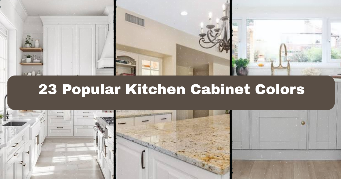
23 Popular Kitchen Cabinet Colors can help you narrow down a renovation choice without guessing how each shade will look at home. I’ll walk you through the best options, where they work, and how to pair them with floors, counters, hardware, and wall colors.
The most popular kitchen cabinet colors include white, cream, light gray, charcoal, black, navy, blue-gray, sage, olive, forest green, mint, pale blue, teal, greige, beige, taupe, natural oak, walnut, espresso, terracotta, yellow, blush, and two-tone combinations. The best choice depends on light, room size, style, and countertop color.
Keep reading, because the right cabinet shade can change the whole mood of your kitchen. I’ll also share simple pairing tips that make the final decision easier.
Understanding Kitchen Cabinet Color Choices
Choosing a cabinet color is about more than picking a shade you like. Cabinets cover a large part of the room, so their color affects how big, bright, warm, or modern the kitchen feels.
I always look at three things first: natural light, countertop tone, and the finish of nearby furniture. A small kitchen may benefit from pale colors, while a large room can handle deep green or black. Wood cabinets bring texture, painted cabinets create a cleaner block of color, and two-tone designs add contrast without making the room feel busy.
Before you choose, order samples. Look at them in morning light, afternoon light, and under your kitchen bulbs. A color that looks soft in a store may look much darker at home.
1. Crisp White Cabinets for a Bright, Clean Kitchen
White cabinets remain popular because they make a kitchen look fresh and open. They reflect light well, which is helpful in a small room or a kitchen with limited windows. Bright white works nicely with marble-look quartz, stainless steel appliances, and chrome or black hardware.
For furniture, choose warm wood stools or a simple dining table so the room does not feel too cold. Add color through rugs, dishware, plants, or upholstered seating. If you prefer a softer look, select a warm white with a cream or beige undertone instead of a sharp blue-white.
Use a satin or semi-gloss finish for easier cleaning, but test the sheen before ordering. White cabinets suit modern, farmhouse, Scandinavian, coastal, and traditional homes. Once you decide between cool and warm white, cream offers another gentle option.
2. Soft Cream Cabinets for a Welcoming Feel
Cream cabinets add warmth without becoming heavy. They are a good choice if you like the brightness of white but want a softer, more lived-in look. Cream pairs beautifully with butcher block counters, warm quartz, brass pulls, and natural wood floors.
I like cream in kitchens with older homes because it feels timeless rather than overly new. Add woven baskets, linen window shades, or a wood island to support the relaxed color scheme. Be careful with yellow-heavy cream, especially under warm light. It can look dated or overly golden.
A practical tip is to compare the cabinet sample beside your backsplash. Cream can clash with blue-white tile, while it blends easily with ivory, tan, beige, and warm gray. This shade works in cottage, traditional, farmhouse, Mediterranean, and transitional kitchens. If cream feels too warm, light gray gives you a cooler alternative.
3. Pale Gray Cabinets for Calm Contrast
Pale gray cabinets create a quiet, balanced background. They are less stark than white and usually feel more modern than beige. Pair them with white quartz, light oak floors, brushed nickel hardware, and a simple subway tile backsplash.
In a gray kitchen, I like adding one warmer element. Try a walnut cutting board, rattan counter stools, or a wood dining table. Without that contrast, the space may feel flat, particularly if the floor and walls are also gray.
Check the undertone before buying. Blue-gray paint can look crisp in bright daylight but icy at night. Greige-gray shades work better in rooms with warm bulbs. Pale gray adapts well to modern, industrial, coastal, and transitional styles. If you want more drama while keeping the same neutral family, medium gray is the next step.
4. Medium Gray Cabinets for Balanced Drama
Medium gray cabinets are strong enough to define the kitchen but still easy to live with. They work especially well on a large island, where a deeper color can anchor the room without darkening every wall.
Pair them with white upper cabinets, pale counters, or a light backsplash. Wood shelves and brass hardware add warmth, while matte black fixtures create a sharper modern look. For furniture, choose natural wood or upholstered stools in oatmeal, tan, or muted blue.
Use medium gray when you want a noticeable color that will not overpower the room. It looks best when the kitchen has good natural light or lighter flooring. In traditional spaces, choose a warm gray with raised-panel doors. In contemporary rooms, flat-front doors keep the shade sleek. From here, charcoal cabinets bring an even moodier effect.
Cabinet Color and Light Guide
| Kitchen condition | Colors that usually work well | Colors to use carefully | Helpful pairing |
|---|---|---|---|
| Small kitchen with little daylight | White, cream, pale gray, pale blue | Black, espresso, forest green | Light counters and reflective backsplash |
| Large kitchen with strong daylight | Navy, charcoal, olive, walnut | Very bright white if glare is an issue | Matte hardware and warm wood |
| Warm southern exposure | Blue-gray, sage, soft white | Yellow beige, orange-brown | Cool stone and brushed nickel |
| Cool northern exposure | Cream, greige, taupe, walnut | Icy white, blue-gray | Brass, wood, warm lighting |
| Open-plan kitchen | Greige, natural oak, navy island | High-contrast red or bright yellow | Colors repeated in nearby furniture |
5. Charcoal Cabinets for a Moody Modern Look
Charcoal cabinets offer the depth of black without feeling quite as severe. They look polished with white countertops, pale wood flooring, and simple hardware. A charcoal island can also add contrast to an otherwise light kitchen.
I recommend this color for kitchens with plenty of daylight or strong overhead lighting. In a dark room, use charcoal on the lower cabinets and choose white or light wood above. This keeps the room grounded without making it feel closed in.
For decoration, add glass doors, open shelving, or a light runner to break up the darker surfaces. Brass handles create a warm, classic touch, while black hardware gives a seamless look. Charcoal works in modern, industrial, transitional, and farmhouse kitchens. If you want the boldest possible neutral, black cabinets make a stronger statement.
6. Matte Black Cabinets for Strong Contrast
Matte black cabinets are dramatic, stylish, and surprisingly flexible. They can make pale counters and light walls stand out while giving the kitchen a tailored appearance. Black works well with white marble-look quartz, concrete counters, oak floors, and warm metal hardware.
I would not use black on every surface in a small, poorly lit room unless you want a very moody design. Instead, try black base cabinets with white uppers or a black island with natural wood perimeter cabinets. Matte finishes hide some fingerprints, though they still need regular cleaning.
Add softer elements such as woven stools, plants, wood shelves, or cream-colored textiles. These details keep the room from feeling severe. Black cabinets fit modern, industrial, minimalist, and even traditional kitchens when paired with classic door panels. If you like dark color but want a little more personality, navy is worth considering.
7. Navy Blue Cabinets for Classic Color
Navy cabinets bring color while remaining easy to coordinate. The deep blue looks especially attractive with white counters, brass hardware, and warm wood accents. It also works well with light blue or patterned tile when you want a layered color scheme.
Navy is a smart choice for an island because it creates a focal point without requiring the whole kitchen to be painted. For furniture, use counter stools in tan leather, woven cane, or white-painted wood. Avoid using too many other dark colors, or the room may feel heavy.
Look at the sample in both sunlight and evening light. Some navy paints turn nearly black at night. In a coastal home, pair navy with white and pale oak. In a traditional kitchen, use framed doors and aged brass. In a modern kitchen, choose slab doors and simple pulls. Blue-gray offers a softer, less formal version of this idea.
8. Blue-Gray Cabinets for a Relaxed, Airy Room
Blue-gray cabinets combine the calm feel of blue with the neutrality of gray. The result is restful and easy on the eyes. This shade pairs well with white tile, light counters, nickel hardware, and medium-toned wood floors.
I especially like blue-gray in kitchens that need color but cannot handle something too intense. Add a cream runner or natural fiber pendant to warm it up. If your counters have strong beige or yellow tones, choose a blue-gray with a little green in it so the colors do not fight.
Use blue-gray on all the cabinets for a quiet look, or place it on the island for a more subtle update. It suits coastal, cottage, Scandinavian, transitional, and modern homes. A deeper blue with green undertones gives the kitchen a richer, more earthy direction.
Useful Cabinet Color Pairings
| Cabinet color | Countertop pairing | Backsplash pairing | Hardware | Best accent material |
|---|---|---|---|---|
| White | Carrara-look quartz | White subway tile | Brass or black | Walnut |
| Cream | Warm quartz or butcher block | Ivory zellige tile | Aged brass | Oak |
| Pale gray | White quartz | Soft gray ceramic | Nickel | Rattan |
| Navy | White marble-look quartz | Glossy white tile | Brass | Tan leather |
| Sage | Cream quartz | Handmade ivory tile | Aged brass | Natural stone |
| Black | White quartz or concrete | White, gray, or zellige tile | Brass or black | Light oak |
| Natural oak | Soapstone or white quartz | Pale green tile | Black | Linen |
9. Sage Green Cabinets for Natural Warmth
Sage green has become a favorite because it feels colorful but quiet. It brings an outdoor quality into the kitchen without the intensity of emerald or bright lime. Sage looks lovely with cream counters, oak floors, aged brass, and handmade tile.
I suggest using sage when you want a room that feels relaxed and welcoming. Add a wood island, woven pendant lights, and simple ceramic dishes. For furniture, choose stools in natural cane or warm beige fabric.
Check the undertone carefully. Some sage shades lean gray, while others lean yellow. The right choice depends on your lighting and flooring. A gray sage suits modern rooms, while a warmer sage fits cottage or farmhouse spaces. It also works in English country, Scandinavian, and transitional homes. Olive green offers a deeper, earthier take on this natural palette.
10. Olive Green Cabinets for an Earthy Statement
Olive green cabinets add personality without feeling loud. This muted green pairs beautifully with creamy white, natural stone, terracotta accessories, and dark wood. It is a strong choice for someone who wants color but does not want a bright or trendy look.
Use olive on the lower cabinets or island if painting the whole kitchen feels like too much. Brass hardware brings out its warmth, while black hardware makes it look more contemporary. Add an oversized cutting board, pottery, or a woven runner to reinforce the organic mood.
Olive may look muddy in a room with very little light, so test a large sample first. It works well in Mediterranean, modern rustic, traditional, and eclectic homes. Forest green takes this idea further with more depth and a richer jewel-tone effect.
11. Forest Green Cabinets for Rich Depth
Forest green cabinets create a bold but grounded kitchen. The color looks striking with pale counters, warm wood, unlacquered brass, and cream walls. It can make a large kitchen feel cozier and give a small island a strong focal point.
I recommend forest green when the room has good light and enough visual balance. If the cabinets are dark, use a light backsplash and avoid very dark flooring. Glass-front doors or open shelves can also prevent the design from feeling dense.
For a traditional look, use raised-panel doors and brass knobs. For a modern room, select flat fronts and slim pulls. Forest green suits English country, craftsman, traditional, modern rustic, and eclectic kitchens. If you want something lighter and fresher, mint green brings a softer contrast.
12. Mint Green Cabinets for a Fresh Vintage Feel
Mint green cabinets create a cheerful kitchen with a gentle retro touch. The color works best when balanced with warm white, pale wood, cream counters, and simple chrome or brass hardware. It can make the room feel brighter without relying on plain white.
Mint is especially useful in a breakfast nook, small galley kitchen, or lower cabinet run. Pair it with a white farmhouse table, woven chairs, or painted wood furniture. Keep the backsplash simple so the cabinet color stays in focus.
Some mint paints look too blue under cool bulbs, so compare samples beside your flooring and lighting. This color works in cottage, vintage, coastal, Scandinavian, and playful modern homes. Pale blue offers a similarly light feeling but with a cooler, more classic character.
Finish Comparison for Painted Cabinets
| Finish | Visual effect | Cleaning notes | Best style match |
|---|---|---|---|
| Matte | Soft, modern, low glare | Shows some grease; wipe gently | Minimalist, modern |
| Satin | Mild glow and versatile look | Easier to clean than matte | Transitional, family kitchens |
| Semi-gloss | Noticeable shine and strong contrast | Easy to wipe | Traditional, utility-focused |
| High-gloss | Reflective and bold | Shows smudges and surface flaws | Contemporary, sleek |
| Distressed | Aged, casual character | Texture can collect dust | Farmhouse, cottage |
| Natural wood finish | Shows grain and warmth | Depends on protective coating | Rustic, Scandinavian, organic modern |
13. Pale Blue Cabinets for Coastal Calm
Pale blue cabinets make a kitchen feel open, relaxed, and airy. They pair naturally with white walls, light oak, marble-look counters, and polished nickel hardware. The color is gentle enough for all the cabinets but also looks lovely on an island.
To keep the room from looking too themed, skip excessive nautical decorations. Instead, use linen curtains, woven stools, ceramic vases, and a simple striped runner. Choose a dusty blue if you want a more grown-up look, or a brighter powder blue for a cottage kitchen.
Pale blue works well in coastal, farmhouse, cottage, Scandinavian, and traditional homes. It is also helpful in rooms that need color without visual weight. Teal cabinets create a more saturated and energetic version of blue.
14. Teal Cabinets for Colorful Character
Teal cabinets combine blue and green for a rich, memorable look. They work best as an island color, a lower cabinet shade, or a feature wall in an otherwise neutral kitchen. White counters and warm wood help keep teal from becoming overwhelming.
I like teal with brushed brass, matte black, or simple chrome hardware. Use furniture in tan leather, natural oak, or cream fabric to balance the saturated color. Keep other decorative pieces fairly quiet. Too many competing colors can make the kitchen feel restless.
Teal suits eclectic, modern, mid-century, coastal, and vintage homes. A darker teal can feel elegant, while a lighter teal has a playful quality. If you want a neutral with similar warmth, greige is a reliable next option.
15. Greige Cabinets for Easy Versatility
Greige blends gray and beige, giving you a neutral that feels both warm and current. It is one of the easiest cabinet colors to pair because it works with white, cream, tan, wood, black, and muted blue.
Use greige when your kitchen connects to a living or dining room and you need a shade that flows between spaces. Pair it with quartz counters, oak flooring, black window frames, or aged brass fixtures. For furniture, choose a wood table or upholstered stools in oatmeal.
Greige can look different from room to room. Test it against your backsplash because some versions lean pink, green, or yellow. It suits transitional, modern farmhouse, contemporary, and traditional kitchens. Beige cabinets create an even warmer and softer neutral scheme.
Cabinet Color Planning by Room Size
| Room size or layout | Recommended cabinet approach | Counter and wall suggestion | Furniture suggestion |
|---|---|---|---|
| Small galley kitchen | White, cream, pale blue, light greige | Light counter and same-color walls | Slim stools, glass pendants |
| Medium L-shaped kitchen | Sage, pale gray, navy island | White backsplash with wood accents | Two-tone wood and painted seating |
| Large open kitchen | Forest green, charcoal, walnut, olive | Light counter to balance depth | Oversized island stools |
| Kitchen with low ceilings | Light upper cabinets, darker lowers | Vertical backsplash pattern | Low-profile furniture |
| Open-plan kitchen and living room | Greige, oak, cream, soft gray | Repeat living-room accent color | Matching wood tones nearby |
16. Beige Cabinets for a Soft, Timeless Base
Beige cabinets feel warm, familiar, and easy to decorate around. They pair well with cream walls, limestone-look counters, oak floors, terracotta tile, and bronze hardware. This color is especially useful when you want a comfortable kitchen rather than a sharp, high-contrast one.
Choose a beige with gray undertones if you prefer a modern look. A golden beige feels more traditional and works nicely with warm wood. Add contrast through black lighting, dark stools, or a patterned backsplash.
I recommend avoiding beige cabinets with too many yellow accessories. Let the cabinets provide warmth, then add cooler accents such as muted blue dishes or gray textiles. Beige works in traditional, Mediterranean, farmhouse, transitional, and desert-inspired homes. Taupe offers more depth while keeping the same calm neutral feeling.
17. Taupe Cabinets for Refined Warmth
Taupe sits between gray, brown, and beige. It feels understated but has more character than a basic neutral. Taupe cabinets look attractive with creamy white counters, dark bronze hardware, natural stone, and medium-toned wood.
This shade is a good bridge when your kitchen has both warm and cool features. For example, taupe can connect gray flooring with a walnut dining table. Choose upholstered stools in linen, leather, or textured beige for a polished but comfortable result.
Taupe may look darker than expected in a room with limited daylight, so order a larger sample. It fits transitional, contemporary, traditional, rustic, and European-inspired kitchens. Natural oak cabinets introduce visible wood grain and a more organic feel.
18. Natural Oak Cabinets for Texture and Light
Natural oak cabinets bring warmth, grain, and movement to the kitchen. Light oak is especially popular in Scandinavian, modern, and organic designs. It looks fresh with white counters, soft green tile, black pulls, and simple furniture.
The grain means the cabinets already provide visual texture, so I would keep the backsplash fairly calm. Add linen shades, woven stools, ceramic dishes, or a stone pendant to support the natural mood. Avoid matching every wood item exactly. A little variation makes the room feel collected instead of staged.
Choose a clear or lightly tinted finish if you want the pale wood to remain visible. Natural oak works in Scandinavian, modern farmhouse, coastal, minimalist, and organic modern kitchens. Walnut brings a darker, richer wood tone for rooms that need more contrast.
Wood Cabinet Comparison
| Wood color | Overall mood | Best counter pairing | Hardware | Good style matches |
|---|---|---|---|---|
| Light oak | Airy and natural | White quartz | Black or nickel | Scandinavian, coastal |
| Honey oak | Warm and familiar | Cream quartz | Brass or bronze | Traditional, farmhouse |
| Walnut | Rich and refined | White or soapstone | Brass or black | Modern, mid-century |
| Espresso | Dramatic and formal | Light quartz | Silver or brass | Contemporary, traditional |
| Reclaimed wood | Rustic and textured | Concrete or stone | Black iron | Industrial, rustic |
| Painted wood | Clean and flexible | Depends on paint color | Coordinates with shade | Nearly any style |
19. Walnut Cabinets for Rich Natural Contrast
Walnut cabinets add depth without the flat look of dark paint. Their natural grain creates interest, while the brown tone makes the kitchen feel warm and substantial. Pair walnut with white quartz, pale stone, cream walls, or muted green tile.
I like using walnut on a full cabinet wall or island, then keeping the remaining finishes simple. Choose furniture in leather, black metal, or woven materials. Too many dark woods can make the kitchen feel heavy, so balance walnut with light flooring or a bright backsplash.
A clear finish preserves the grain and lets the wood remain the star. Walnut works in mid-century modern, contemporary, organic modern, and transitional homes. Espresso cabinets provide a darker, more uniform look if you prefer painted-style depth.
20. Espresso Cabinets for Traditional Drama
Espresso cabinets have a deep brown finish that feels formal, cozy, and classic. They pair well with cream counters, beige walls, bronze hardware, and warm tile. This color can make a large kitchen feel more intimate.
Because espresso absorbs light, use it carefully in small rooms. A lighter backsplash, glass cabinet doors, and under-cabinet lighting help open up the design. Add furniture in cream fabric, medium wood, or tan leather to avoid a completely dark palette.
Espresso suits traditional, Tuscan, transitional, and lodge-inspired kitchens. It is less flexible than walnut because it offers less visible grain, but it can create a very polished look. Terracotta cabinets are a more unusual option if you want warmth with a clear color statement.
21. Terracotta Cabinets for Earthy Personality
Terracotta cabinets bring the warm color of clay into the kitchen. The shade can range from dusty orange to deep baked red, so sample testing is essential. It pairs well with cream, olive green, natural wood, aged brass, and handmade tile.
Use terracotta on an island or lower cabinets if you want a controlled dose of color. Keep the walls and counters quiet, then add pottery, woven baskets, and linen textiles. A pale terracotta feels soft and modern, while a deeper version suits Mediterranean or rustic spaces.
This color works in Mediterranean, desert modern, eclectic, bohemian, and modern rustic homes. It may not suit every resale plan, but it can make the kitchen feel personal and memorable. Yellow cabinets offer another cheerful direction with a lighter, sunnier mood.
Color Intensity Guide
| Color intensity | Cabinet examples | How to balance it | Best use |
|---|---|---|---|
| Very light | White, cream, pale blue | Add wood or dark hardware | Small or dim kitchens |
| Light-medium | Sage, pale gray, beige | Use a contrasting island | Full cabinet runs |
| Medium | Greige, taupe, olive, blue-gray | Keep backsplash calm | Open-plan kitchens |
| Deep | Navy, forest green, charcoal, walnut | Use light counters and floors | Islands or large kitchens |
| Saturated | Teal, terracotta, yellow | Repeat color in small accents only | Feature cabinets |
| High contrast | Black, two-tone combinations | Limit competing patterns | Modern focal points |
22. Yellow Cabinets for a Cheerful Kitchen
Yellow cabinets create an upbeat, welcoming atmosphere. Soft buttery yellow works better for everyday kitchens than a bright primary shade. Pair it with white counters, light wood, cream walls, and simple brass or black hardware.
Use yellow on a small cabinet section, island, or breakfast nook if a full application feels too strong. Balance it with neutral furniture and natural textures. Woven stools, a pale wood table, and plain ceramic dishes keep the room from looking overly playful.
Test yellow in every kind of light. Warm bulbs can make it appear much stronger at night. This shade works in cottage, farmhouse, vintage, eclectic, and cheerful contemporary homes. Blush cabinets create a softer color statement with a more muted, romantic feeling.
23. Blush and Two-Tone Cabinets for a Personal Finish
Blush cabinets add a gentle pink tone that can feel modern, vintage, or surprisingly neutral when kept dusty and muted. Pair blush with white counters, pale oak, cream walls, brass hardware, or soft gray accents. It works best when the rest of the room remains simple.
A two-tone cabinet design is another smart way to use color. Try white uppers with navy lowers, natural oak with sage, or cream cabinets with a walnut island. This approach gives you contrast without committing every surface to one strong shade.
Repeat one cabinet color in a rug, vase, artwork, or dining chair so the room feels connected. Blush suits vintage, Parisian, eclectic, and contemporary homes, while two-tone layouts work across modern, farmhouse, coastal, and traditional styles. After comparing samples and lighting, your final choice should feel both attractive and practical.
Tips for Success
- Order large paint or laminate samples before making a cabinet decision.
- View samples beside the countertop, backsplash, floor, and appliance finishes.
- Check the color in morning, afternoon, and evening light.
- Use lighter cabinets in dark kitchens unless you intentionally want a moody room.
- Balance deep colors with bright counters, pale walls, or reflective lighting.
- Repeat the cabinet color in small accessories, but do not match every item.
- Choose durable hardware and a wipeable finish, especially for busy family kitchens.
Common Mistakes and How to Avoid Them
Choosing from a tiny sample:
Small chips can hide undertones and make a color seem more neutral than it really is. Test a large sample on more than one wall or cabinet surface.
Ignoring the countertop undertone:
A cool gray cabinet may clash with a yellow-beige counter. Place the samples together before deciding.
Using too many dark finishes:
Dark cabinets, dark floors, and dark counters can shrink the visual space. Keep at least one major surface light.
Matching every wood tone:
Perfectly identical wood can make a room look flat. Mix related tones while keeping the undertones compatible.
Following a trend without considering the home:
A color may look great online but feel wrong beside your architecture and furniture. Choose a shade that supports the whole house.
Forgetting the lighting plan:
Cabinet color changes under warm bulbs, cool LEDs, and daylight. Install or test your intended bulbs before final approval.
Similar Variations
- Coastal Kitchen: Uses white, pale blue, navy, and light oak for an airy, relaxed feel.
- Modern Farmhouse Kitchen: Blends white, cream, sage, black, and natural wood with practical finishes.
- Organic Modern Kitchen: Focuses on oak, walnut, greige, olive, stone, and woven materials.
- English Country Kitchen: Pairs sage, forest green, cream, and warm wood with classic cabinet details.
- Mediterranean Kitchen: Uses terracotta, beige, olive, walnut, and handmade tile for earthy warmth.
- Scandinavian Kitchen: Keeps the palette light with white, pale gray, soft blue, and natural oak.
The best kitchen cabinet color is the one that works with your natural light, counters, flooring, and daily habits. Trends can offer ideas, but your home should guide the final choice.
Whether you prefer a bright neutral, deep blue, natural wood, or a colorful two-tone design, these 23 Popular Kitchen Cabinet Colors give you a practical place to start.
Leave a Reply