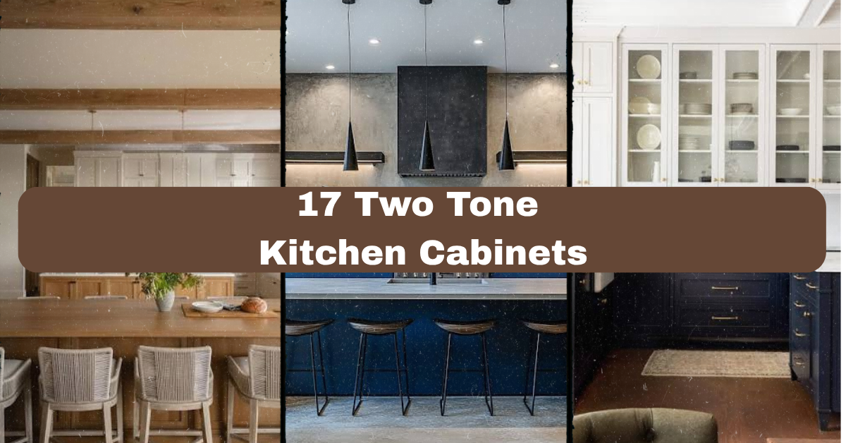
17 Two Tone Kitchen Cabinets can make a kitchen feel more custom, balanced, and welcoming without requiring a full redesign. I’ve gathered 17 practical color combinations and design ideas to help you choose cabinets that look good and work well every day.
What are 17 two-tone kitchen cabinet ideas? They are design combinations that use two cabinet colors, finishes, or materials in one kitchen. Common pairings include white and navy, wood and green, black and cream, or a darker island with lighter perimeter cabinets.
You’ll see ideas for small kitchens, open layouts, farmhouse rooms, modern spaces, and more. I’ll also share simple ways to choose colors, hardware, lighting, and materials that fit together.
A Quick Primer on Two-Tone Kitchen Cabinets
Two-tone kitchen cabinets use two different finishes in the same room. Usually, one color covers the upper and lower perimeter cabinets, while a second shade appears on the island. Another option is to use one color on the upper cabinets and another on the lower cabinets.
I like this style because it adds depth without making the kitchen feel busy. It can also solve practical design problems. A dark island can ground a large room, while pale upper cabinets can make a small kitchen feel more open. Wood adds warmth to painted cabinets, and a bold lower color can make a plain kitchen feel more personal.
The key is balance. The colors do not need to match exactly, but they should share a connection through the countertop, backsplash, flooring, or hardware.
1. Pair Warm White Cabinets With a Natural Wood Island
Warm white cabinets create a clean background, while a natural wood island brings in texture and comfort. This pairing works especially well when you want a bright kitchen that still feels relaxed and lived-in.
Choose an island in oak, walnut, maple, or reclaimed wood. Keep the wood grain visible instead of covering it with a heavy stain. A white quartz countertop can connect both cabinet colors, while woven stools, ceramic jars, and linen window shades add softness.
For a practical update, use the same wood tone on open shelves or floating shelves near the range. That small repeat makes the island feel connected to the rest of the room.
This combination fits farmhouse, Scandinavian, transitional, and modern rustic homes. Next, let’s look at a darker pairing for stronger contrast.
2. Combine Soft Gray With Deep Navy
Soft gray perimeter cabinets and a deep navy island create a polished but friendly kitchen. Gray keeps the room light, while navy gives the island visual weight. It is a great choice if black feels too harsh.
Use brushed brass or aged bronze hardware to warm up the cool colors. A white marble-look countertop adds brightness, and a pale blue or white subway backsplash keeps the wall from competing with the cabinets. Choose simple furniture, such as backless wood stools or slim upholstered counter chairs.
Before painting, test navy samples in morning and evening light. Some blue paints look almost black in shadow.
This palette suits coastal, classic, transitional, and contemporary kitchens. The next idea uses black in a softer, more balanced way.
3. Use Black Lower Cabinets and Cream Uppers
Black lower cabinets can look dramatic, but cream upper cabinets make the overall design feel inviting instead of severe. This is a smart option for kitchens with good natural light and warm flooring.
Choose a soft cream rather than a bright yellow-white. Pair it with a light countertop, such as quartz with subtle beige veining. Brass knobs, rattan stools, and warm wood cutting boards keep the black from feeling cold. If your kitchen is small, use glass-front upper cabinets or open shelves to break up the darker lower section.
A practical tip is to use satin or low-sheen black paint. It hides small marks better than a very glossy finish.
This idea works in modern, vintage, French country, and industrial homes. Now let’s compare colors and materials before moving into bolder combinations.
Color and Finish Guide for the First Three Ideas
| Cabinet pairing | Best countertop | Hardware | Ideal room feeling | Maintenance note |
|---|---|---|---|---|
| Warm white and oak | White quartz or butcher block | Matte black or bronze | Bright and welcoming | Wood needs regular sealing |
| Soft gray and navy | White quartz or pale marble | Brass or brushed nickel | Calm and tailored | Navy may show dust in strong light |
| Cream and black | Beige quartz or light granite | Brass or bronze | Dramatic but warm | Satin black is easier to maintain |
4. Mix Sage Green With Light Oak
Sage green has a quiet, natural quality. When paired with light oak, it creates a kitchen that feels fresh without looking overly trendy. Use sage on the lower cabinets or island and oak on open shelving, an island base, or a tall pantry wall.
For the rest of the room, choose cream walls and a simple white backsplash. Small touches of terracotta, clay, or woven seagrass add warmth. Keep furniture relaxed with wooden stools and a simple farmhouse table if space allows.
Try painting a sample board before committing. Sage changes greatly under cool LED bulbs and warm daylight.
This combination works in cottage, farmhouse, Scandinavian, and organic modern homes. From here, we can move toward a richer green palette.
5. Create Contrast With Forest Green and Pale Beige
Forest green cabinets bring a strong connection to nature. Pale beige uppers or tall cabinets soften the color and stop the kitchen from feeling too dark. This pairing looks especially attractive with natural stone and aged metal.
Use the darker green on the island if you want a focal point. Add a beige backsplash with gentle variation rather than a high-contrast pattern. Counter stools in leather, woven cane, or warm wood support the earthy color scheme.
A useful tip is to repeat the forest green in only two or three places, such as the island, pendant shades, and a small piece of artwork. Too many green accents can make the room feel themed.
This palette fits English country, craftsman, rustic, and modern farmhouse styles. Next, we’ll see how two shades of blue can create a layered look.
6. Layer Pale Blue With Dusty Blue
Using two related blues creates a gentle, layered kitchen. Try pale blue upper cabinets with dusty blue lower cabinets, or use dusty blue on the island against pale perimeter cabinetry.
Keep the other finishes simple. White countertops, light oak floors, and nickel hardware help the colors stay airy. For decoration, add blue-and-white pottery, striped seat cushions, or a small framed print. Avoid adding too many unrelated colors.
Place the deeper blue where you want more visual focus. A kitchen island, window wall, or bank of drawers is usually a good choice.
This idea works in coastal, traditional, cottage, and relaxed contemporary homes. If you prefer a warmer design, the next pairing may be a better fit.
7. Blend Terracotta With Warm White
Terracotta cabinets or a terracotta-colored island can bring a sunbaked, welcoming feeling to the kitchen. Since this is a strong color, warm white cabinets provide needed breathing room.
Pair the cabinets with creamy quartz, handmade-look backsplash tile, and natural wood accents. Copper or aged brass hardware can reinforce the warm color scheme. For furniture, choose stools with woven seats or simple wood frames rather than shiny metal.
Use terracotta as an accent first if you are unsure. Painting only the island or a small pantry cabinet lets you test the look without covering the entire kitchen.
This palette works beautifully in Mediterranean, Southwestern, desert modern, and bohemian homes. Let’s compare warm and cool cabinet options before continuing.
Paint Color Planning Table
| Main cabinet color | Supporting color | Good accent materials | Best for |
|---|---|---|---|
| Sage green | Light oak | Brass, rattan, limestone | Natural and relaxed kitchens |
| Forest green | Pale beige | Aged bronze, leather, stone | Large or well-lit kitchens |
| Pale blue | Dusty blue | Nickel, white oak, ceramic | Airy coastal rooms |
| Terracotta | Warm white | Copper, clay tile, walnut | Sunny or warm-toned spaces |
8. Choose Greige and Walnut for a Balanced Look
Greige sits between gray and beige, so it works with both warm and cool finishes. Add walnut on the island or lower cabinets for a richer contrast. The result feels comfortable, grown-up, and easy to live with.
Use a light greige on the upper cabinets and a medium or dark walnut below. A creamy countertop will connect the two tones better than a stark white surface. Add black pendant lights, leather stools, and a few green plants for an inviting finish.
A practical step is to compare your greige sample beside the wood in your actual kitchen. The wrong undertone can make walnut look orange or muddy.
This pairing suits transitional, mid-century modern, contemporary, and craftsman homes. Next, we’ll use a simple black-and-white scheme with more texture.
9. Add Texture With White and Charcoal Cabinets
White and charcoal cabinets offer strong contrast without the intensity of pure black. Charcoal works well on the island or lower cabinets, while white keeps the walls and upper storage bright.
Bring in texture through fluted cabinet panels, reeded glass, honed stone, or a handmade backsplash. Choose hardware that fits the mood. Brushed nickel feels cooler and cleaner, while brass makes the room warmer. Keep furniture simple so the cabinet texture remains the star.
For small kitchens, limit charcoal to one section instead of using it throughout the lower cabinets. This keeps the floor area visually open.
This design adapts to industrial, modern, transitional, and minimalist homes. The next idea adds color through a single focused feature.
10. Make the Island the Colorful Centerpiece
A colorful island is one of the easiest ways to try two-tone kitchen cabinets. Keep the perimeter cabinets white, beige, or pale gray, then paint the island cobalt blue, olive green, plum, or muted teal.
The island becomes the room’s anchor, so repeat its color carefully. You might use the same shade in a rug pattern, pendant cord, bar stool cushion, or small artwork. Select a countertop with enough contrast to outline the island, but avoid a pattern that fights the paint.
Before ordering stools, check the island height and knee clearance. Good-looking seating still needs to be comfortable and practical.
This approach works in nearly any home style because the surrounding materials control the mood. Now we’ll explore a two-tone layout that does not depend on an island.
11. Separate Upper and Lower Cabinets by Color
Painting upper cabinets a light shade and lower cabinets a darker one creates a clear visual division. This approach works well when the kitchen has no island or when the island is too small to carry a contrasting color.
Try ivory uppers with olive, navy, gray, or wood lower cabinets. Use a backsplash that sits between the two tones, such as pale stone or soft patterned tile. Keep the floor and countertops fairly quiet to avoid too many horizontal lines.
For a practical result, use durable cabinet paint on the lower cabinets because they receive more contact from shoes, pets, and cleaning tools.
This layout works in galley, apartment, cottage, and traditional kitchens. Before choosing the final shades, consider the room’s size and natural light.
Cabinet Placement and Color Guide
| Kitchen condition | Best darker color location | Recommended lighter color | Why it works |
|---|---|---|---|
| Small galley kitchen | Island or lower drawers only | Warm white or pale gray | Keeps the room visually open |
| Large open kitchen | Full island or perimeter lowers | Cream, beige, or light blue | Adds grounding and structure |
| Low natural light | Small accent zone | Warm white or light greige | Prevents a heavy feeling |
| High natural light | Lower cabinets or tall pantry wall | Any soft neutral | Strong light can handle deeper shades |
| No kitchen island | Lower cabinets | Light upper cabinets | Creates contrast without a centerpiece |
12. Pair White Cabinets With Natural Stone
Natural stone can act as the second tone when you want a subtle two-material design. Keep painted cabinets white or cream, then use stone on the island base, a partial cabinet wall, or a stone-clad range surround.
Materials such as soapstone, limestone, travertine, and rough-cut quartzite add depth. Match the stone to the cabinet undertone. Warm stone looks best with creamy whites, while cool gray stone pairs well with clean white or pale gray.
Use wood stools and simple pottery to keep the space from feeling too formal. Seal porous stone as recommended by the supplier.
This idea suits rustic, Mediterranean, organic modern, and traditional kitchens. Next, we’ll make a compact kitchen feel taller and brighter.
13. Use Vertical Two-Tone Cabinet Blocks
Instead of dividing colors across the island or cabinet levels, create vertical blocks. For example, use white cabinets around the sink and a dark wood or green cabinet wall around the refrigerator and pantry.
This method gives a kitchen a custom, built-in appearance. It also helps define work zones. Place the darker color around tall cabinets, where it can look intentional and architectural. Keep countertops and backsplash materials consistent to tie the sections together.
Measure the wall carefully before choosing the color block. A narrow strip may look accidental, while a full cabinet tower usually feels more planned.
This design works in modern, European, craftsman, and transitional spaces. We’ll now look at a softer option that uses texture instead of strong paint contrast.
14. Combine Painted Cabinets With Cane or Rattan Panels
Painted cabinets paired with cane, rattan, or woven mesh panels bring texture into a two-tone kitchen. Use the woven material on a few upper doors, a pantry section, or the island ends. Keep the main cabinet color simple, such as cream, light gray, or muted green.
The natural fibers work well with wood floors, stone countertops, and linen window treatments. Choose black or brass hardware based on the room’s other fixtures. Do not use woven panels beside a busy backsplash, since both surfaces may compete.
A practical tip is to use cane only on doors that do not sit directly above the sink or cooktop. Steam and splashes can make natural fibers harder to maintain.
This variation fits boho, coastal, tropical, and relaxed contemporary homes. One final cabinet idea focuses on a timeless color pairing.
Material Comparison for Two-Tone Kitchens
| Material | Visual effect | Care needs | Works best with |
|---|---|---|---|
| Oak | Light, natural, casual | Seal and wipe spills quickly | White, sage, navy |
| Walnut | Rich, refined, warm | Use gentle cleaner | Greige, cream, black |
| Cane or rattan | Airy, textured, handmade | Keep dry and dust regularly | White, beige, green |
| Soapstone | Matte, deep, classic | Oil occasionally if desired | Cream, white, wood |
| Painted MDF | Smooth and consistent | Touch up chips as needed | Any coordinated color |
15. Try Cream and Muted Black for a Vintage Feel
Cream and muted black have a classic look that feels less stark than white and true black. Use cream for most cabinets and muted black for the island, range hood, or lower drawers.
Add old-fashioned details such as cup pulls, glass cabinet doors, a farmhouse sink, or a simple bridge faucet. Keep the countertops light and select a backsplash with small-scale tile. Wood cutting boards and vintage-style stools add charm without turning the room into a theme.
Use a black sample with a brown or blue undertone that fits your flooring and lighting. A flat, cold black may feel disconnected from the cream.
This palette suits vintage, farmhouse, traditional, French country, and modern classic homes. Next, let’s use blue and wood for a fresh but grounded finish.
16. Mix Deep Blue With Medium-Tone Wood
Deep blue cabinets look especially good beside medium-tone wood, such as oak, ash, or warm maple. Use blue on the lower cabinets and wood on the island, or reverse the arrangement for a stronger wood feature.
A white or pale gray countertop provides a clean bridge between the two materials. Add brushed brass hardware, woven stools, and a few blue ceramic pieces. Keep the backsplash quiet so the cabinet pairing remains clear.
Protect wood near the dishwasher and sink with proper sealing. Also, request a sample door if possible because wood grain and stain can vary from one batch to another.
This combination fits nautical, contemporary, craftsman, and modern farmhouse homes. The last idea is for anyone who wants color without a major commitment.
17. Use a Small Accent Cabinet in a Bold Color
You do not need two large cabinet sections to create a two-tone effect. Paint a small coffee station, beverage cabinet, pantry door, or open-shelf base in a bold color. Keep the main cabinets neutral.
Try muted red, teal, mustard, dark green, or dusty rose. Repeat the accent shade in a small rug, artwork, vase, or stool cushion. This approach gives you personality while keeping the kitchen easy to update.
Start with removable sample paper or a painted foam board. Live with the color for several days before buying paint and hardware.
This idea works in apartments, rentals with approved updates, eclectic homes, and simple contemporary kitchens. With the main ideas covered, these final tips will help you pull the entire room together.
Tips for Success
- Test cabinet colors beside the countertop, backsplash, floor, and major appliances.
- Choose one dominant cabinet color and use the second as a clear accent.
- Keep hardware finishes to one or two related metals.
- Check paint samples in daylight, evening light, and under your kitchen fixtures.
- Use the same wood tone in at least two places if wood is one of your cabinet finishes.
- Select washable, durable paint with a finish suited to high-touch surfaces.
- Plan lighting before finalizing colors, especially for dark islands or lower cabinets.
Common Mistakes and How to Avoid Them
Choosing colors from a small screen
: Order real samples or paint large boards. Online colors often look different under your home’s lighting.
Using two unrelated undertones
: Pair warm colors with warm neutrals and cool colors with cool neutrals. If you mix them, add a connecting material such as natural wood or beige stone.
Making every surface a focal point
: Let the cabinets, backsplash, and countertop take turns being interesting. Keep at least one or two of them quiet.
Ignoring the size of the room
: Use darker colors on a smaller section in compact kitchens. Reserve large dark areas for rooms with strong light and enough visual space.
Forgetting the cabinet layout
: Look at where each color starts and ends. A color change in the middle of a narrow cabinet run can look accidental.
Picking style over daily use
: Consider fingerprints, cooking splashes, pets, and cleaning habits. A beautiful finish still needs to work for your household.
Similar Variations
- Coastal Two-Tone: Combines white, pale blue, driftwood, and nickel for a breezy kitchen.
- Modern Farmhouse: Uses white, black, sage, or natural oak with simple hardware and practical materials.
- Organic Modern: Blends muted paint colors, warm wood, stone, and soft organic textures.
- French Country: Pairs cream, dusty blue, muted green, and aged brass with decorative details.
- Industrial Two-Tone: Mixes charcoal, white, walnut, metal, and concrete-inspired surfaces.
- Boho Kitchen: Uses earthy cabinet colors, cane panels, handmade tile, plants, and layered textiles.
Two-tone cabinets work best when the color change feels intentional. Start with the room’s light, cabinet layout, countertop, and flooring. Then choose a pairing that supports how you actually use the kitchen.
You do not need the boldest colors to make an impact. Even a warm white kitchen with a wood island or a neutral room with one colorful cabinet can feel carefully designed. Use these 17 Two Tone Kitchen Cabinets as a starting point for a kitchen that feels like yours.
Leave a Reply