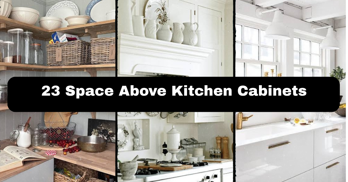
These 23 Space Above Kitchen Cabinets ideas will help you turn that awkward gap into a useful, polished part of your kitchen. I’ll cover decorating, storage, lighting, color, and safety so you can choose an approach that fits your home.
What should you do with the space above kitchen cabinets? Use it for balanced decor, practical storage, plants, lighting, or a simple finish that matches the room. Keep items dust-resistant, securely placed, and scaled to the cabinet height.
The best choice depends on your kitchen’s style, ceiling height, and daily habits. Keep reading to find ideas that look good without creating extra work.
A Quick Primer on Decorating Above Kitchen Cabinets
That open strip above your cabinets can feel like a design problem, but I see it as a bonus shelf. It gives you room to add texture, color, storage, or personality without taking up counter space.
Before decorating, I always check three things: how much vertical room I have, how easy the area is to reach, and whether the kitchen already feels busy. A narrow gap may need one simple detail. A tall gap can handle baskets, artwork, plants, or a layered display.
I also think about dust. Anything placed near the ceiling needs occasional cleaning. Choose pieces that are easy to lift down, or use the area for items you do not mind wiping. The goal is a finished look, not another chore.
1. Display Large Woven Baskets for Warm Texture
Large woven baskets are one of my favorite ways to fill the space above kitchen cabinets. They add shape and warmth while hiding the empty wall line. Their natural fibers work well with white, cream, wood, sage, beige, and soft black kitchens.
Use baskets in two or three sizes instead of lining up six identical ones. Place the tallest basket near one end and balance it with a shorter pair on the other side. You can also use lidded baskets to hold rarely used linens, serving trays, or seasonal kitchen items.
Choose baskets with sturdy handles if you plan to move them often. For a practical setup, add a small label inside each basket so you know what is stored there.
This idea fits farmhouse, boho, coastal, rustic, and modern kitchens when you select the right basket shape and finish. Next, let’s look at a more colorful way to use the same space.
2. Build a Colorful Collection of Ceramic Pitchers
Ceramic pitchers bring height, color, and a collected feel to the top of kitchen cabinets. I like using a mix of cream pitchers, blue stoneware, green pottery, or warm terracotta pieces. They do not need to match perfectly. A shared color family will make them feel connected.
Start with one tall pitcher, then add two or three smaller pieces. Turn some handles toward the room and others slightly sideways. This creates a relaxed display instead of a stiff row.
Avoid putting valuable or fragile antiques near the edge. A narrow shelf liner with a grip surface can help stop pieces from sliding. Dust the pitchers every few weeks with a soft cloth.
This arrangement suits traditional, cottage, Mediterranean, and country kitchens especially well. If you prefer a cleaner look, the next idea keeps the display simple and graphic.
3. Lean Framed Art Against the Wall
Framed art can make the area above cabinets feel like part of the room instead of an unfinished construction detail. Choose prints with kitchen-friendly colors, such as olive, clay, navy, cream, or muted gold.
Rather than hanging each frame, lean one large piece against the wall. This is easier to change later and avoids unnecessary holes. If you have a wide cabinet run, layer two frames with the larger one behind the smaller one.
Use lightweight frames when possible. Check that the bottom edge sits fully on the cabinet top, and keep the artwork away from the stove area where grease and heat can cause damage.
A black-and-white print works in a modern kitchen, while botanical artwork suits traditional and cottage styles. Now let’s use the same display area for something that adds life.
4. Add Low-Maintenance Plants for Fresh Color
Plants soften hard cabinet lines and bring a natural color into the kitchen. For the space above cabinets, I recommend low-maintenance choices such as artificial eucalyptus, faux trailing ivy, preserved grasses, or dry branches. Live plants often struggle there because the area may be hot, dim, and difficult to water.
Use one plant at each end of the cabinet run, or place a single leafy arrangement near the center. Keep the containers simple. Matte ceramic pots, woven planters, and aged metal vessels all work well.
If you choose faux greenery, select stems with varied leaf sizes. Perfectly identical leaves can look flat. Give the plants a quick dusting with a microfiber cloth or a handheld vacuum brush.
This approach works with modern, boho, farmhouse, and tropical decor. Here is a quick guide to help you choose the right material and color direction.
Plant and Vessel Pairing Guide
| Kitchen look | Plant or greenery choice | Vessel material | Best color pairing |
|---|---|---|---|
| Modern | Faux olive branches | Matte ceramic | White, charcoal, or olive |
| Farmhouse | Eucalyptus or cotton stems | Galvanized metal | Cream, sage, and wood |
| Coastal | Preserved grasses | Woven seagrass | Sand, pale blue, and white |
| Boho | Trailing faux ivy | Terracotta | Rust, tan, and warm beige |
| Traditional | Boxwood balls | Painted ceramic | Navy, cream, and soft green |
| Minimalist | One sculptural branch | Black stoneware | White, black, and natural wood |
A few natural details can make the room feel warmer, but storage may be the better answer if your kitchen is short on space.
5. Use Matching Bins for Hidden Kitchen Storage
The top of your cabinets can hold items you use only once in a while. Matching bins make that storage look intentional. Try them for holiday dishes, extra table linens, picnic supplies, or backup serving pieces.
Choose bins with a firm shape so they do not sag. Measure the cabinet depth before shopping. A bin that sticks out even a little can look messy and become a safety risk.
Keep everyday items somewhere easier to reach. The above-cabinet zone is best for things you use monthly or less. Add simple labels on the front or inside edge. Neutral canvas, rattan, wood, and black wire bins all offer different looks.
This idea works in rental kitchens, farmhouse homes, and busy family spaces. When storage is not your main need, you can make the area feel more custom with architectural trim.
6. Install a Simple Wood Valance or Crown Detail
A wood valance can visually connect the cabinets to the ceiling and make the kitchen feel more finished. You might use a narrow stained board, a painted trim strip, or crown molding that matches the existing cabinet design.
This works best when the upper gap is short and you want a built-in appearance. If the gap is tall, use trim only at the top and leave enough space for a small display below.
Before installing anything, check for cabinet doors, ventilation, and lighting wires. In a rental, use removable trim or skip permanent changes. Paint the wood the same color as the cabinets for a seamless look, or stain it to match nearby flooring.
Traditional kitchens benefit from detailed molding, while modern rooms look better with flat, square-edged trim. Next, we’ll bring in a softer decorative layer.
7. Layer a Vintage Tray Collection
Vintage trays add pattern without making the area feel crowded. Wood trays, brass serving trays, woven trays, and painted metal pieces can lean against the wall above the cabinets.
Group three or five trays by shape or color. Large round trays create a strong focal point, while rectangular trays help fill a long horizontal space. You can place a small vase or bowl in front of the group to add depth.
Make sure every tray rests securely. If the cabinet top is slippery, use clear museum gel or small non-slip pads. Avoid placing valuable pieces directly over a busy cooking area where smoke and grease collect.
This idea suits vintage, cottage, farmhouse, Mediterranean, and eclectic kitchens. If you want a more useful display, try showing items you already use for serving.
8. Arrange Attractive Serving Boards and Platters
Wood cutting boards, marble boards, and decorative platters can look beautiful above kitchen cabinets. They also make sense in the room, which keeps the decor from feeling random.
Lean boards in a small group. Place the largest one in back, then add a medium board and a smaller round platter in front. Choose boards with different shapes but similar tones. A mix of walnut, pale oak, and cream ceramic can feel warm and layered.
Only display boards that are clean and fully dry. Do not place food-contact surfaces where they can collect grease unless you plan to wash them before use. Add rubber pads behind them to prevent sliding.
This display fits rustic, Scandinavian, modern farmhouse, and classic kitchens. Here is a useful size guide before you start arranging.
Serving Board Size Guide
| Cabinet gap width | Recommended display size | Suggested number of pieces | Arrangement |
|---|---|---|---|
| 24 to 36 inches | 10 to 16 inches wide | 2 to 3 | One tall board with smaller layers |
| 37 to 60 inches | 16 to 28 inches wide | 3 to 5 | Two grouped displays |
| 61 to 84 inches | 24 to 40 inches wide | 5 to 7 | Large center piece with side groups |
| More than 84 inches | 30 to 48 inches wide | 6 to 10 | Repeat a balanced pattern |
| Gap under 8 inches high | Pieces under 6 inches tall | 1 to 3 | Flat boards or shallow trays |
| Gap over 18 inches high | Pieces 12 to 24 inches tall | 3 to 7 | Layered vertical display |
Knowing the available space prevents the most common problem: buying decor that is too small to be seen or too large to sit safely.
9. Create a Small Coffee or Tea Station
If you have a wide, low gap above the cabinets, use it to support a coffee or tea theme. Display a few labeled tins, a framed coffee print, a small tray, or decorative mugs. Keep the display focused so it does not look like a shop shelf.
A black metal sign with white lettering works in a modern farmhouse kitchen. Blue-and-white jars feel more traditional. Wooden labels and woven baskets suit a relaxed cottage space.
Do not store coffee beans or tea where heat and moisture can affect freshness. Use the area for empty display tins and rarely used mugs instead. Keep heavy ceramic pieces away from the front edge.
This idea works best in kitchens with a breakfast nook or beverage station nearby. For another theme-based option, think about your favorite travel memories.
10. Display Travel Souvenirs with a Common Theme
The space above cabinets is a good place for a small collection of travel objects. Try hand-painted bowls, woven baskets, ceramic tiles, wooden figures, or small pottery pieces from places you have visited.
The key is editing. Choose items with a shared color or material so the display feels intentional. For example, a collection of blue ceramics can tell a story without creating visual clutter.
Place fragile souvenirs farther back and secure them with clear display putty. Keep the collection away from the stove, especially if the pieces have porous surfaces that are difficult to clean.
This approach fits eclectic, Mediterranean, global, and bohemian kitchens. If your collection is growing, a restrained color palette can keep it under control.
11. Keep the Display Monochromatic
A monochromatic arrangement uses one main color in several shades. White ceramic pieces, cream baskets, black frames, or green glass can all create a calm and polished look.
I like this option when the kitchen already has busy countertops, patterned tile, or strong cabinet color. Use varied shapes to keep the display interesting. A white vase, ribbed bowl, smooth pitcher, and matte frame will not look flat even though they share a color.
Start by removing anything that does not fit the chosen palette. Then add one natural material, such as wood or woven fiber, for contrast.
This method adapts easily to minimalist, modern, coastal, and traditional homes. When one color feels too quiet, the next idea brings in a controlled pattern.
12. Add Pattern with Decorative Wallpaper
Wallpaper can turn the wall above cabinets into a clear design feature. You can use a small removable panel, peel-and-stick wallpaper, or a painted pattern if the area is easy to reach.
Choose a pattern that supports the kitchen rather than competing with it. Small botanical prints, subtle stripes, quiet geometric shapes, and soft block prints are good choices. Large, busy patterns may feel overwhelming in a narrow space.
Measure carefully before cutting. Clean the wall first, and test a small piece to make sure the adhesive will remove safely. Avoid wallpaper near direct heat, steam, or water splashes.
This idea fits cottage, retro, maximalist, and modern kitchens depending on the print. The palette table below can help you pair the wall treatment with cabinet colors.
Cabinet and Accent Palette Combinations
| Cabinet color | Wall or wallpaper color | Accent material | Overall effect |
|---|---|---|---|
| White | Sage and cream | Natural wood | Soft cottage |
| Navy | Warm white and pale blue | Brass | Classic coastal |
| Natural oak | Terracotta and sand | Black metal | Earthy modern |
| Charcoal | White and muted green | Marble | Clean and dramatic |
| Light gray | Dusty blue and beige | Aged brass | Calm traditional |
| Cream | Rust and olive | Woven fiber | Warm farmhouse |
| Black | Blush, white, or tan | Light oak | Modern and balanced |
A small amount of pattern can make a big difference, but lighting can change the mood even more.
13. Add Warm LED Strip Lighting
LED strip lighting can make the space above cabinets glow at night. It is especially helpful when the cabinet tops are dark or when the kitchen connects to a dining or living area.
Use warm white bulbs around 2700K to 3000K for a cozy effect. Choose a dimmable kit with a remote or wall control. Hide the strip behind a small lip or near the back edge so you see the light, not the hardware.
Do not run cords across cabinet doors or near hot appliances. If you are unsure about wiring, use a plug-in kit or ask an electrician to install a safe outlet.
This works with modern, transitional, contemporary, and traditional kitchens. Lighting is useful, but reflective objects can create a similar glow without adding electricity.
14. Use Glass and Brass for a Soft Reflective Display
Glass jars, brass bowls, and small mirrored frames catch light and add polish above kitchen cabinets. This combination looks refined without needing many objects.
Group reflective pieces with matte items so the arrangement does not become too shiny. For example, pair a brass bowl with a wooden board and a cream vase. A few amber glass bottles can add warmth to a white kitchen.
Keep glass pieces away from the front edge. Use clear gel or soft pads under bowls and jars. Avoid placing anything fragile where a cabinet door may bump it.
This idea suits art deco, traditional, transitional, and modern kitchens. If you prefer a more relaxed feeling, natural fibers offer a softer alternative.
15. Hang a Narrow Textile or Tapestry
A narrow textile can add movement and color to an otherwise hard, straight cabinet line. Try a woven wall hanging, a striped runner, a small kilim, or a fabric panel mounted on a slim dowel.
Keep the textile far from the stove and other heat sources. Choose washable cotton or tightly woven fabric if the kitchen is used heavily. A textile should hang neatly, not pool behind the cabinets or touch hot surfaces.
Use colors pulled from your backsplash, runner, or dining chairs. A rust-and-cream textile warms a neutral room, while blue and sand feel coastal.
This method works especially well in boho, global, rustic, and casual kitchens. For a cleaner and more permanent look, consider a horizontal sign or message board.
16. Add a Long Horizontal Sign
A long sign fills the empty space without requiring many small decorations. Choose a simple word, family name, kitchen illustration, or quiet phrase. Keep the lettering easy to read from across the room.
The sign should be wide enough to relate to the cabinet run but not so wide that it touches the walls. As a general rule, aim for about two-thirds to three-quarters of the available width. Place it toward the back and secure it with small mounting strips or museum gel.
Avoid signs with too many words. One short phrase usually looks more polished than a crowded message.
This idea fits farmhouse, industrial, vintage, and contemporary kitchens. Here are some practical size and budget ranges to guide your shopping.
Decor Size and Budget Guide
| Project type | Typical size | Useful materials | Practical budget range |
|---|---|---|---|
| Small framed print | 8 by 10 to 12 by 16 inches | Wood, metal, acrylic | $15 to $60 |
| Large framed art | 18 by 24 to 30 by 40 inches | Canvas or wood | $40 to $180 |
| Woven basket group | 10 to 18 inches tall | Seagrass or rattan | $30 to $150 |
| LED cabinet lighting | 6 to 16 feet | Warm white LED strip | $20 to $100 |
| Decorative sign | 24 to 48 inches wide | Wood or metal | $25 to $120 |
| Wallpaper panel | 10 to 36 inches high | Peel-and-stick vinyl | $20 to $100 |
| Crown molding detail | Cabinet-run length | Painted wood or MDF | $50 to $400 |
Prices vary by store and finish, but these ranges can help you set a realistic project limit before buying.
17. Create a Cookbook and Kitchen Library Display
A few attractive cookbooks can make the space feel useful and personal. Choose books with colorful spines, then stack them horizontally beside a small bowl or framed recipe card.
Only use books you do not need every day. The top of the cabinets is not convenient for regular cooking reference. Keep stacks short and stable. Three to five books per pile is usually enough.
You can also display vintage food magazines, recipe binders, or a small wooden cookbook stand. Keep paper away from steam and grease, especially above a range.
This idea suits traditional, cottage, farmhouse, and eclectic kitchens. If books feel too heavy, the next option uses lighter decorative objects.
18. Arrange Oversized Wooden Letters or Numbers
Large wooden letters can add a personal touch without filling the entire cabinet top. Use initials, a family name, a meaningful date, or a short word such as “gather.”
Choose letters that are at least 8 inches tall when the ceiling gap is large enough. Smaller letters may disappear from view. Place them near one end and balance them with a vase, basket, or framed piece.
Select a finish that supports the room. White letters look clean, stained wood feels rustic, and black metal works in an industrial kitchen. Secure tall letters so they cannot tip forward.
This idea works in farmhouse, industrial, rustic, and personalized family kitchens. When you want to avoid words completely, sculptural objects provide the same height.
19. Use Sculptural Objects for a Modern Look
Sculptural decor gives the cabinet top a clean, artistic feel. Look for ceramic arches, simple stone forms, oversized bowls, abstract wooden shapes, or matte metal objects.
Use one larger object as the anchor, then add two smaller forms. Leave breathing room between them. Modern decorating depends on spacing as much as the objects themselves.
Choose finishes that contrast with the cabinets. A black sculpture stands out against white cabinetry, while pale stone looks strong against dark cabinets. Wipe smooth surfaces often because dust shows easily.
This style works in modern, minimalist, contemporary, and Scandinavian kitchens. If you want the same clean effect with a stronger connection to food, display simple bowls and vessels.
20. Group Wooden Bowls and Stoneware Vessels
A collection of bowls adds soft curves to a kitchen filled with straight cabinet doors. Mix wooden bowls, stoneware vessels, and shallow ceramic dishes in related colors.
Stack two or three bowls, then place a taller vessel beside them. Keep the largest pieces toward the back. Warm wood tones look good with white cabinets, while gray stoneware balances colorful kitchens.
Do not use cracked or unstable pieces in a high display. Add non-slip shelf pads underneath, especially if the cabinet surface is glossy. Keep the arrangement low enough that it does not block crown molding or ceiling vents.
This idea works with Scandinavian, rustic, farmhouse, coastal, and transitional rooms. A few planning numbers can make any display safer and easier to balance.
Spacing and Safety Guide
| Detail | Recommended starting point |
|---|---|
| Space between grouped objects | 2 to 5 inches |
| Distance from cabinet front edge | At least 2 inches |
| Height of tallest decor in a low gap | Leave 1 to 2 inches below ceiling |
| Weight for an easy-to-lift item | Under 8 pounds |
| Safe access tool | Stable step stool with locking feet |
| Cleaning schedule near cooking area | Every 2 to 4 weeks |
| Non-slip pad thickness | About 1/16 to 1/8 inch |
These are practical starting points, not strict rules. Always adjust for your cabinet depth, ceiling height, and household needs.
21. Repeat a Backsplash Color Above the Cabinets
Repeating a backsplash color makes the kitchen feel connected from counter to ceiling. You might use blue vases, green plants, black frames, or terracotta pottery that echoes the tile.
Choose two or three objects in the accent color rather than covering the whole area. The repeated shade should act as a thread through the room.
For example, if your backsplash has blue details, add one blue pitcher, one small framed print, and a blue bowl. Keep the rest neutral so the color stands out.
This works in almost any home style because the method depends on color, not a particular decor trend. If your kitchen lacks a strong accent shade, neutral texture can create the same unity.
22. Use One Long Run of Neutral Texture
A single long run of neutral texture can make the space look finished with very little clutter. Try a row of matching rattan baskets, pale wood boxes, linen-covered bins, or simple cream pottery.
This is a good option when you like calm rooms and do not want a collection on display. Keep the shapes consistent, but vary the size slightly so the row does not feel mechanical.
Neutral does not have to mean plain. Look for ribbed ceramic, woven patterns, wood grain, or subtle canvas texture. Clean each item before placing it, especially if it came from storage.
This approach suits minimalist, Scandinavian, coastal, transitional, and modern farmhouse kitchens. For the simplest possible solution, you can also leave the space intentionally open.
23. Leave the Space Empty and Finish It Cleanly
You do not have to decorate above kitchen cabinets. Sometimes the best answer is a clean, empty gap. This works when the cabinets reach close to the ceiling, the kitchen has strong lighting, or the room already contains plenty of detail.
Clean the wall and cabinet tops carefully. Paint the area the same color as the surrounding wall or cabinets so it looks intentional. If the gap feels unfinished, add a narrow trim piece or a smooth soffit instead of loose decor.
This option reduces dust and keeps the room visually quiet. It works especially well in modern, minimalist, contemporary, and small kitchens.
Before choosing an empty look, stand across the room and view the cabinets from normal eye level. If the gap disappears, you have probably found the right solution.
Tips for Success
- Measure the gap height, depth, and total cabinet width before buying anything.
- Keep the heaviest items toward the back and away from cabinet edges.
- Use non-slip pads, museum gel, or removable mounting strips where needed.
- Repeat one or two colors from the backsplash, flooring, textiles, or nearby dining area.
- Group objects in odd numbers, but do not force a group if one piece looks better alone.
- Leave some empty space between collections so the display can breathe.
- Clean the area before decorating, then set a reminder to dust it every few weeks.
- Use a stable step stool instead of standing on a chair when arranging or cleaning.
- Avoid fabric, paper, and faux greenery near direct heat from a range or oven vent.
- Step back often while decorating. The view from across the kitchen matters most.
Common Mistakes and How to Avoid Them
Using many tiny objects: Small pieces often disappear above the cabinets and create a cluttered look. Replace them with fewer, larger items that can be seen from across the room.
Ignoring the cabinet depth: Decor that hangs over the front edge can look unstable and may get knocked down. Measure the depth, then choose pieces that sit fully on the cabinet top.
Blocking cabinet doors or vents: Tall baskets and artwork can interfere with doors, crown molding, or ventilation. Open every nearby cabinet before finalizing the arrangement.
Mixing too many styles: A basket, a shiny statue, bright signs, and formal art may compete with each other. Pick one main style and add only a few contrasting details.
Displaying items that are hard to clean: Deep grooves, open fabric, and fragile paper collect dust and grease. Choose smooth, washable, or removable pieces for busy cooking areas.
Creating a perfectly even row: Equal spacing and identical heights can make the display feel stiff. Vary the height and shape while keeping the color palette connected.
Similar Variations
- Modern Minimalist: Uses one or two sculptural objects, soft neutrals, and plenty of empty space.
- Coastal Cottage: Combines pale blue, white ceramics, seagrass baskets, and light wood.
- Desert Boho: Adds terracotta, woven texture, dried grasses, and warm sandy colors.
- French Country: Uses vintage pitchers, soft florals, aged metal, and creamy painted finishes.
- Industrial Kitchen: Mixes black metal, reclaimed wood, simple signage, and charcoal accents.
- Scandinavian Calm: Focuses on pale wood, white pottery, clean shapes, and a very limited palette.
The space above your cabinets should support the kitchen, not compete with it. Start with the practical needs of the room, choose a clear color direction, and use fewer pieces than you think you need. A safe, balanced display will always look better than a crowded shelf.
Whether you add baskets, plants, art, lighting, or nothing at all, the right choice is the one that makes your kitchen feel finished and easier to live in. Use these 23 Space Above Kitchen Cabinets ideas as a flexible starting point.