
If you’ve been scrolling through pins and mood boards trying to figure out how to make a 21 blue living room feel put-together instead of overwhelming, you’re in the right spot. I’ve dug through what actually works in real homes, not just staged photos, and I’m laying it all out here. By the end of this, you’ll know exactly how to pull it off without hiring a designer.
A blue living room is a space where blue serves as the dominant or accent color across walls, furniture, and decor. It works because blue is calming, pairs with nearly every metal and wood tone, and adapts to any design style from coastal to modern farmhouse.
Stick around, because I’m about to show you 21 specific ways to bring blue into your living room without it looking like a paint sample exploded.
Why Blue Living Rooms Never Really Go Out of Style
I’ve always thought blue gets a bad reputation as “cold” or “moody.” Honestly, that’s only true if you pick the wrong shade or skip the warm-up materials like wood and brass. Blue is actually one of the most flexible colors you can use in a living room. It goes light and airy with pale sky tones, or deep and dramatic with navy and indigo. It works with white trim, tan leather, gold hardware, even black accents. That’s why designers keep coming back to it decade after decade. It’s not a trend. It’s a foundation color that just keeps reinventing itself.
1. Start With a Navy Accent Wall

Painting one wall navy instead of the whole room gives you drama without commitment. It’s the easiest way to test if you love deep blue before painting everything. Pick the wall behind your sofa or the one your eye hits first when you walk in.
Practical tip: Use a matte or eggshell finish so the wall doesn’t look shiny under lamp light.
This works in modern homes with clean furniture lines, but it also softens up nicely in traditional rooms with crown molding. Once that wall is in, you’ll want furniture that doesn’t fight with it, which brings us to the next idea.
2. Choose a Neutral Sofa as Your Anchor
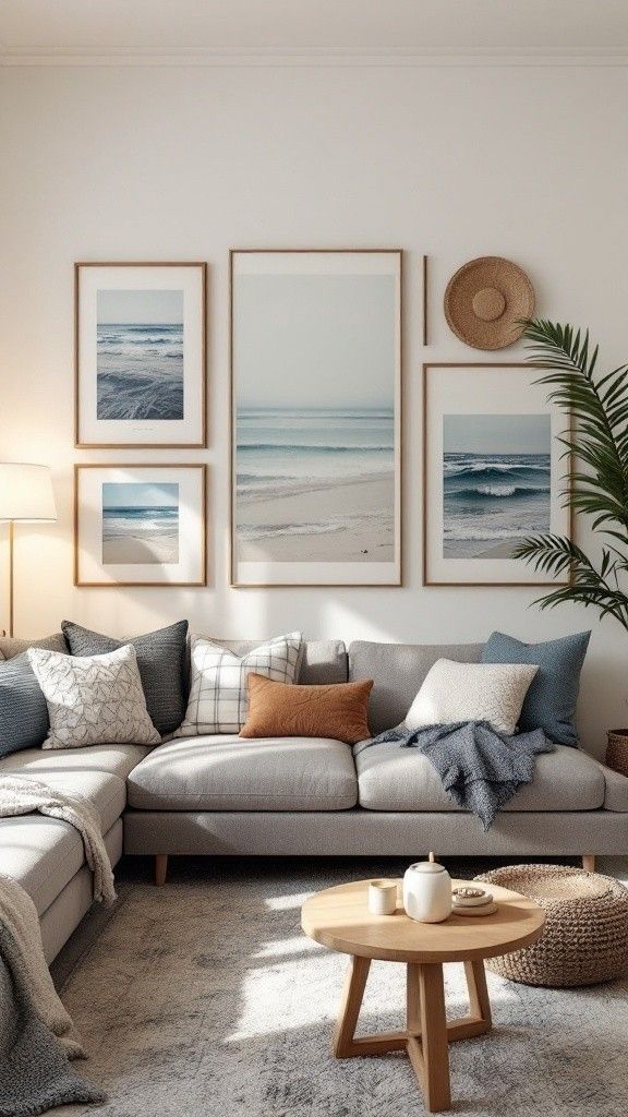
A blue living room needs a resting point for the eyes. A cream, beige, or light gray sofa gives the blue walls or accents room to breathe. If you go bold with blue walls, don’t double down with a blue couch too, unless you’re going for a monochrome look on purpose.
Practical tip: Stick to performance fabric if you have kids or pets. It saves you from a ruined sofa in six months.
Coastal homes love a linen-look neutral sofa, while modern spaces lean toward a structured gray velvet. Once your sofa is settled, layering in texture is your next move.
3. Layer Textures With Woven and Knit Throws
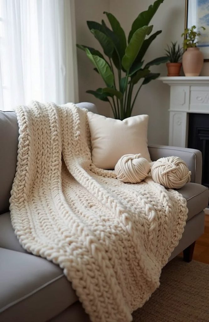
Blue can look flat if everything is smooth and painted. Adding a chunky knit throw or a woven basket-weave pillow breaks that up. Texture is what makes a room feel lived-in instead of staged.
Practical tip: Mix at least three textures in one seating area, like a smooth leather chair, a woven rug, and a fuzzy throw.
This trick works in every style. Farmhouse rooms use chunky wool, while modern rooms use flat-weave cotton. Speaking of rugs, let’s talk about how that plays into your blue color scheme.
4. Ground the Room With a Patterned Rug

A rug ties your blue walls or furniture to the floor. Go with a pattern that includes navy, white, and maybe a hint of rust or mustard to warm things up. A solid blue rug can work too, but patterned rugs hide stains better and add visual interest.
Practical tip: Size your rug so all four legs of your sofa sit on it, or at least the front two.
Traditional homes do well with Persian-style rugs in navy and cream. Modern spaces look great with geometric block patterns. Now that the floor is set, let’s figure out which blue shade actually fits your room’s light.
Blue Shade Guide by Room Lighting
| Room Light Type | Best Blue Shade | Why It Works |
|---|---|---|
| North-facing (cooler light) | Warm navy or teal-blue | Balances cool daylight, avoids looking gray |
| South-facing (warm, bright light) | Cornflower or sky blue | Stays light and airy, won’t feel dark |
| East-facing (morning light) | Soft periwinkle | Gentle in early light, doesn’t overwhelm |
| West-facing (evening light) | Deep indigo | Handles strong afternoon sun without washing out |
| Low natural light rooms | Pale powder blue | Reflects available light instead of absorbing it |
5. Bring in Brass or Gold Hardware

Cool blue needs a warm metal to keep it from feeling icy. Brass lamp bases, gold picture frames, or antique bronze curtain rods do the trick. This small swap makes a huge difference in how “finished” the room feels.
Practical tip: Match your metal finishes across at least three items in the room so it looks intentional, not random.
Modern farmhouse rooms love aged brass, while contemporary spaces do well with polished gold. Once your metals are locked in, it’s time to think about window treatments.
6. Hang Curtains in a Soft Blue-White Stripe
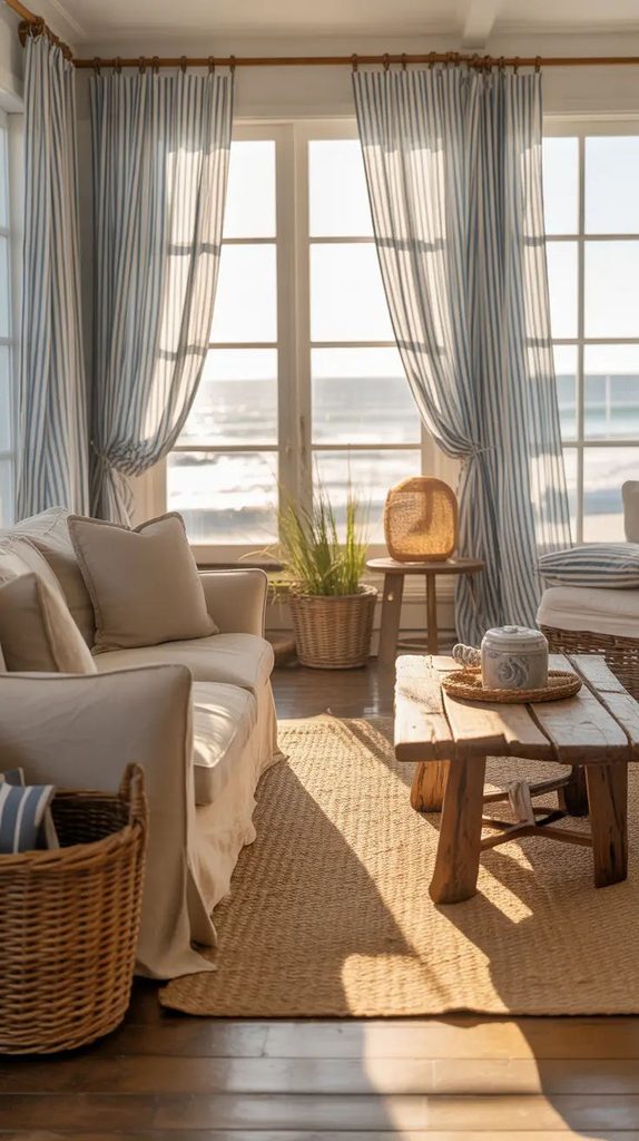
Solid white curtains are fine, but a subtle stripe pulls the wall color down into the window area, tying the whole room together. Blue and white stripes feel classic without looking dated.
Practical tip: Hang curtain rods a few inches above the window frame to make ceilings feel taller.
Coastal and nautical-style rooms practically require this look. Traditional rooms benefit too, especially with pleated panels. Now let’s talk about the wood tones that hold this whole room together.
7. Pair Blue With Warm Wood Furniture

Cool colors like blue need contrast, and warm wood is the easiest fix. A walnut coffee table or oak console cuts through the blue and adds richness. Avoid gray-washed wood here, since two cool tones together can feel flat.
Practical tip: Choose one dominant wood tone and repeat it in at least two pieces, like a coffee table and a side table.
Scandinavian rooms use light oak for a fresh look, while traditional spaces lean into darker walnut or mahogany. With your furniture wood settled, let’s add some greenery.
8. Add Greenery to Soften the Blue

Plants bring life into a blue room that might otherwise feel a little cool or formal. A fiddle leaf fig, snake plant, or even simple eucalyptus stems in a vase adds a natural, organic contrast.
Practical tip: Use a terracotta or woven planter to add warmth, since a white pot can feel too clinical next to blue walls.
Bohemian rooms go heavy on plants with lots of variety, while minimalist spaces do well with just one or two statement plants. Speaking of statement pieces, let’s talk artwork next.
9. Choose Artwork With Warm Undertones

If your walls are blue, your art shouldn’t be all blue too. Look for pieces with mustard, terracotta, or blush accents to create contrast. Abstract art with warm color splashes against a blue wall looks intentional and gallery-worthy.
Practical tip: Hang art at eye level, roughly 57 inches from the floor to the center of the piece.
Modern rooms like large abstract canvases, while traditional rooms favor framed landscapes or botanical prints. Once your walls have personality, it’s time to think about lighting.
10. Use Warm-Toned Lighting, Not Cool White Bulbs

Cool LED bulbs make blue walls feel sterile and almost clinical. Warm bulbs, in the 2700K to 3000K range, make blue feel cozy instead of cold. This is one of the cheapest fixes that makes the biggest difference.
Practical tip: Swap all your bulbs to the same warm temperature so the lighting feels consistent across lamps and overhead fixtures.
This trick matters no matter your style, from farmhouse to modern industrial. With the lighting sorted, let’s talk about how to layer blue in smaller doses if you’re nervous about going all in.
11. Try Blue in Small Doses With Accent Pillows
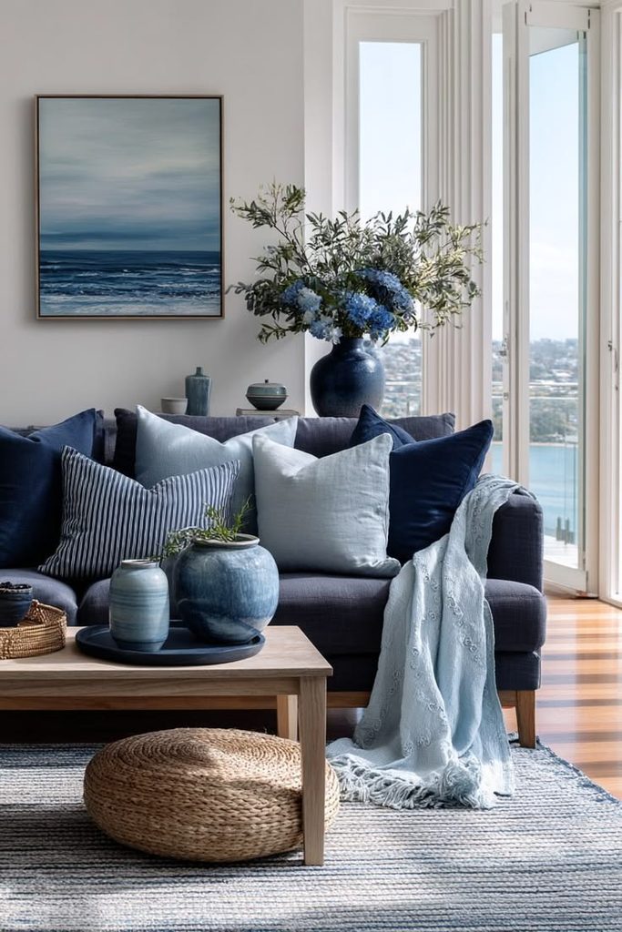
If painting a whole wall feels like too much, start with pillows. A few navy or cornflower pillows on a neutral sofa let you test the waters. You can swap them out seasonally too, which keeps the room feeling fresh.
Practical tip: Mix pillow sizes, like one 20-inch square and one lumbar pillow, for a layered look instead of matching pairs.
This works especially well in rental homes or apartments where painting isn’t an option. Once you’re comfortable with pillows, ceramics are the next easy step.
12. Display Blue and White Ceramics on Shelves
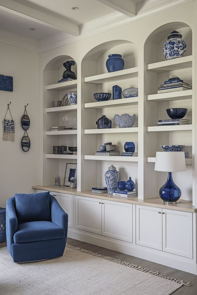
Ginger jars, vases, or simple bowls in blue and white patterns add a classic touch. This works especially well on bookshelves or a mantel where you want a pop of color without repainting anything.
Practical tip: Group ceramics in odd numbers, like three or five, for a more natural-looking display.
Traditional and coastal homes both love this look. Modern rooms can use solid blue ceramics instead of patterned ones for a cleaner feel. Now let’s zoom out and talk about the ceiling.
13. Paint the Ceiling a Pale Blue for a “Sky” Effect
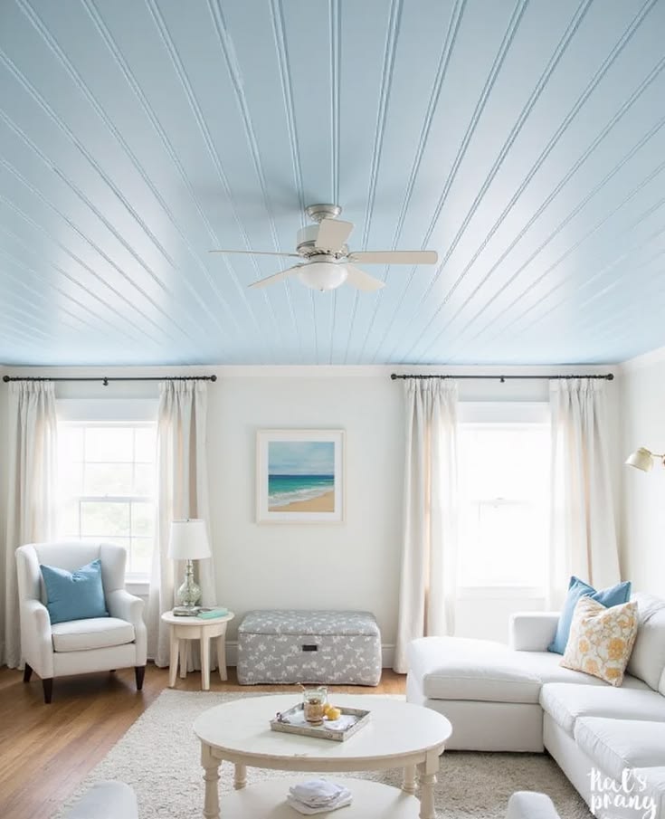
This one surprises people, but a pale blue ceiling makes a room feel bigger and airier. It’s called a “haint blue” trick in southern homes, originally used on porch ceilings. Bringing it indoors softens the whole room.
Practical tip: Use a shade two to three tones lighter than your wall color so the ceiling doesn’t feel heavy.
Southern and coastal homes use this constantly. Modern rooms can try it too, especially with white trim to keep things crisp. Speaking of trim, let’s cover that next.
14. Keep Trim and Molding Crisp White

White trim against blue walls creates definition and keeps the room from feeling like a solid color block. This contrast is what makes blue rooms photograph so well.
Practical tip: Use a semi-gloss finish on trim so it reflects light and stands out from the matte wall color.
Traditional homes with detailed molding benefit the most here, but even simple baseboards in modern homes look sharper with this contrast. Now let’s talk about how blue works with black accents.
15. Add Black Accents for Modern Edge
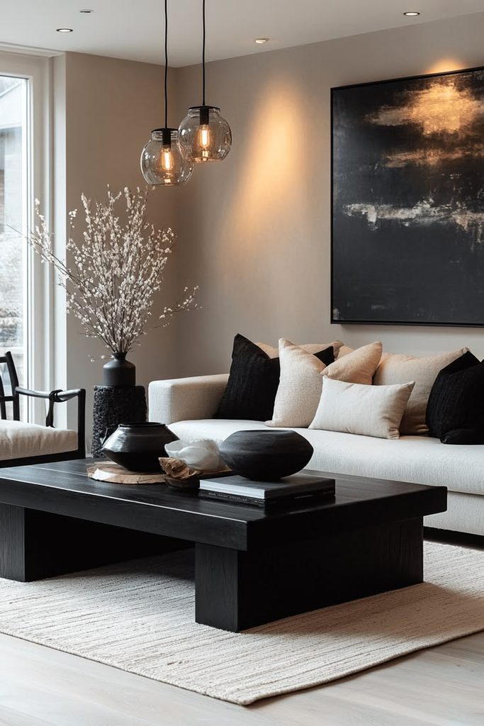
A few black accents, like a matte black lamp or picture frames, give a blue room a more modern, grounded feel. Too much black can feel harsh, so use it sparingly.
Practical tip: Stick to the “rule of three,” using black in exactly three spots like a light fixture, a frame, and a small tray.
This works best in modern or transitional homes. Coastal rooms usually skip black altogether in favor of warmer tones. Let’s move on to how fabric choice changes the whole feel of the room.
Fabric and Texture Combos for Blue Living Rooms
| Fabric Type | Best Paired With | Style Vibe |
|---|---|---|
| Linen | Light blue walls | Relaxed coastal |
| Velvet | Deep navy accents | Moody modern glam |
| Boucle | Powder blue | Soft contemporary |
| Leather | Indigo or teal | Rugged traditional |
| Cotton canvas | Cornflower blue | Casual farmhouse |
16. Mix in Rattan or Wicker Furniture

Rattan chairs or a wicker side table bring texture and warmth that blue rooms often need. This combo is huge in coastal and boho spaces because it feels natural, not stiff.
Practical tip: Pair rattan with a cushion in a solid neutral fabric so the chair doesn’t feel too busy next to patterned pillows.
Coastal homes lean hard into this. Even modern rooms can use one rattan piece as a textural break from all the smooth surfaces. Next, let’s talk about how blue works on cabinetry, not just walls.
17. Paint Built-In Shelving or Cabinets Blue
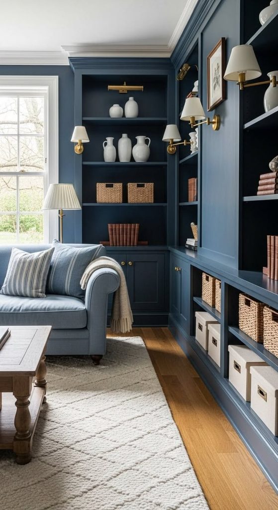
If you have built-in bookshelves or a media cabinet, painting just that piece blue instead of the whole wall gives you color without commitment. It also makes the shelving feel like a designed feature instead of an afterthought.
Practical tip: Use a durable enamel paint on cabinetry since it gets touched more than wall paint.
Traditional homes with built-ins do this beautifully. Modern homes can apply the same idea to a media console instead. Now let’s talk about layering multiple blue shades together.
18. Layer Multiple Shades of Blue in One Room

Using only one shade of blue can look flat. Try mixing navy pillows, a powder blue rug, and a teal throw for depth. This “tonal layering” trick is what makes designer rooms feel rich instead of matchy.
Practical tip: Pick three blue shades max so the room doesn’t feel chaotic.
This works in every style, but modern rooms tend to keep it to two shades for a cleaner look, while eclectic rooms can go wild with four or five.
19. Use Blue in Window Shutters or Panel Doors

If you have French doors or interior shutters, painting them blue instead of white adds architectural interest without touching the main walls. It’s a subtle but noticeable design move.
Practical tip: Use the same blue as one of your accent pieces so it feels connected to the rest of the room.
Traditional and cottage-style homes use this often. Modern homes can apply it to sliding barn doors instead. Let’s wrap up the main ideas with a fun accent piece option.
20. Add a Blue Velvet Accent Chair

One bold chair in blue velvet can do more for a room than an entire wall of paint. It’s a commitment-free way to bring in color, and velvet adds a slightly luxe feel.
Practical tip: Place the chair at an angle to the sofa instead of directly across, so it feels more natural and less like a showroom setup.
Glam and modern rooms love this move. Traditional rooms can use a wingback chair in blue velvet for the same effect with a classic twist.
21. Bring Blue Into Your Curtains With a Bold Print

Instead of solid curtains, try a bold floral or geometric print with blue as the dominant color. This works especially well if your walls are neutral and you want the “color moment” to come from the window treatments instead.
Practical tip: Match the print’s secondary color, like green or coral, to at least one other item in the room, such as a pillow or vase.
Bohemian and eclectic rooms thrive on this look. Even minimalist rooms can use a single muted blue print for a quiet pop of pattern.
Tips for Success
- Test paint samples on your wall at different times of day before committing, since blue shifts a lot under natural versus artificial light.
- Keep at least 60% of your room neutral if you’re nervous about going too bold with blue.
- Use the same blue family across a few items instead of scattering unrelated shades randomly.
- Don’t skip warm materials like wood, brass, or leather, since they keep blue from feeling cold.
- Photograph your room in progress and check it in black and white to make sure the contrast levels feel balanced.
- Buy fabric swatches before ordering furniture, since blue can look totally different in person than on a screen.
Common Mistakes and How to Avoid Them
All-cool-tone room
: Fix it by adding at least two warm materials, like wood or brass, so the room doesn’t feel sterile.
Matching blue exactly everywhere
: Fix it by using varying shades of blue instead of one single tone repeated on every surface.
Ignoring natural light direction
: Fix it by choosing warmer blues for cooler rooms and cooler blues for warmer, sunnier rooms.
Overdoing patterns
: Fix it by picking one bold pattern as the star and keeping everything else solid or subtle.
Skipping texture
: Fix it by adding at least three different textures, like wool, linen, and wood, so the room doesn’t feel flat.
Forgetting a focal point
: Fix it by choosing one item, like an accent wall or a statement chair, to be the star instead of spreading blue evenly with no hierarchy.
Similar Variations
- Coastal Blue Living Room: Lighter blues paired with white, rattan, and natural textures for a beachy feel.
- Navy and Brass Traditional Room: Deep navy walls with polished brass fixtures for a classic, formal look.
- Scandinavian Blue Living Room: Pale blue with light wood and minimal decor for a clean, airy vibe.
- Bohemian Blue Living Room: Mixed blue patterns, plants, and rattan furniture for an eclectic feel.
- Moody Indigo Living Room: Deep indigo walls paired with black accents and warm lighting for a dramatic look.
- Blue and Terracotta Living Room: Blue paired with warm clay tones for a balanced, earthy color scheme.
Pulling together a great blue living room really comes down to balance. You need contrast, texture, and the right mix of warm and cool elements so the space feels calm instead of cold. Start small if you’re nervous, maybe with pillows or a rug, then build up to bigger commitments like an accent wall or painted cabinetry.
At the end of the day, a well-planned 21 Blue Living Room isn’t about following every single idea on this list. It’s about picking the handful that fit your space, your light, and your style, then letting the rest of the room support that color instead of fighting it.
Leave a Reply