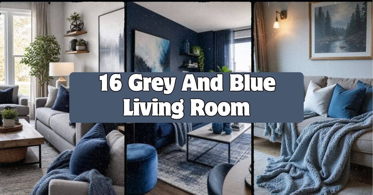
If you’re hunting for the best 16 grey and blue living room ideas out there, I’ve got you covered with everything I’ve learned from years of obsessing over color palettes and furniture layouts. I’ve tested these combos in my own space and researched what actually works, so you’re getting the real deal here, not just pretty pictures with no substance.
A grey and blue living room combines cool neutral grey tones with calming blue accents to create a balanced, sophisticated space that feels both modern and cozy. This color pairing works because grey acts as a quiet backdrop while blue adds depth, personality, and a touch of drama without overwhelming the room.
Stick around because I’m about to walk you through 16 specific ways to pull this color combo together, plus some mistakes I’ve made so you don’t have to repeat them.
Why Grey And Blue Just Works Together
Here’s the thing about grey and blue. They’re basically best friends in the color world. Grey is that chill neutral that never asks for attention, and blue brings just enough personality to keep things interesting. I think that’s why designers keep coming back to this combo year after year.
What I love most is how flexible it is. You can go moody and dramatic with navy and charcoal, or keep it light and airy with dove grey and powder blue. Either way, it feels intentional. It’s not a trendy pairing that’ll look dated in two years. It’s more like a classic pair of jeans. Always works, never goes out of style.
1. Anchor The Room With A Charcoal Grey Sofa

Start big. Your sofa sets the tone for everything else in the room. A charcoal grey sofa gives you a solid, grounded base that won’t show every little stain or shadow. It also makes colorful throw pillows and blankets pop way more than a lighter couch would.
My tip: go with a performance fabric if you have kids or pets. It’ll save your sanity later. Pair the charcoal sofa with lighter grey walls so the room doesn’t feel like a cave.
This idea works in almost any style. Traditional homes can pair it with wood accents, while modern spaces can keep the lines clean and minimal. Once your sofa’s in place, you’ll want to think about what goes on the walls behind it.
2. Paint An Accent Wall In Deep Navy Blue

One wall in deep navy can completely transform a grey living room. It adds instant depth and makes the space feel more designed instead of accidental. I usually recommend picking the wall that gets the least natural light, since darker colors absorb light and can make bright walls feel more balanced.
Practical tip: test the paint color at different times of day before committing. Navy can look almost black in dim light and vibrant blue in full sun.
Coastal homes love this move paired with white trim. Modern homes tend to skip the trim altogether for a sleeker look. Once that wall is painted, your furniture placement becomes even more important.
3. Layer A Chunky Knit Throw Blanket

Small details matter just as much as big furniture choices. A chunky knit throw in a soft blue or oatmeal grey adds texture that photos just can’t capture. It makes the room feel touchable and lived-in instead of staged.
Drape it over the arm of your sofa or fold it at the end for a boutique hotel vibe. I always tell people to buy at least two throws in slightly different shades. It creates depth without looking matchy.
This works beautifully in farmhouse and coastal spaces, but even a sleek modern room needs one cozy element like this. Speaking of texture, let’s talk about what goes on your floor next.
4. Add A Blue And Grey Patterned Area Rug
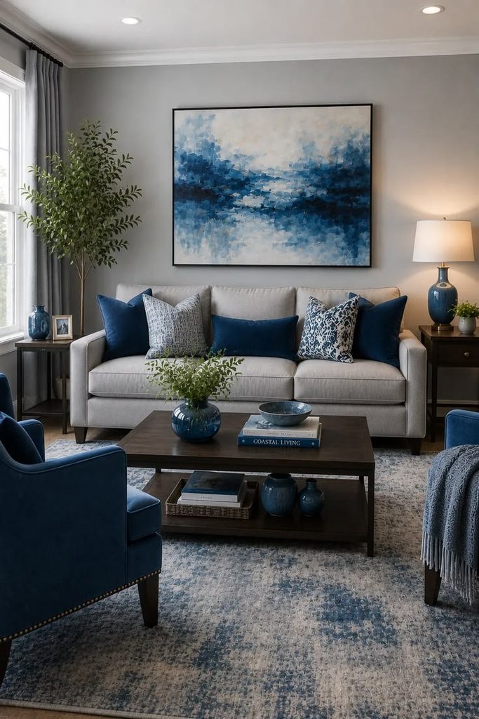
Your rug ties the whole room together, literally. A patterned rug in blue and grey tones grounds your furniture and adds visual interest without competing with your walls or sofa. Geometric patterns work great in modern spaces, while a faded Persian-style rug fits more traditional rooms.
Tip: size matters more than people think. Your rug should be big enough that at least the front legs of your furniture sit on it.
Rug Size Guide By Room Dimension
| Living Room Size | Recommended Rug Size | Furniture Placement |
|---|---|---|
| Small (10×10 ft) | 6×9 ft | Front legs on rug |
| Medium (12×15 ft) | 8×10 ft | All furniture legs on rug |
| Large (15×18 ft) | 9×12 ft | Fully anchors seating area |
| Extra Large (18×20+ ft) | 10×14 ft | Multiple furniture groupings |
Once your rug is down, you’ll notice how much easier it becomes to layer in other decor pieces.
5. Choose Brass Or Gold Hardware For Warmth

Cool tones like grey and blue can sometimes feel a little chilly on their own. Warm metal accents fix that instantly. Brass lamp bases, gold picture frames, or even a gold-rimmed mirror add warmth and keep the room from feeling flat.
My honest tip: don’t go overboard. Pick two or three spots for metallic accents so it feels curated, not scattered randomly.
This trick works in every style category, from glam to industrial. It’s basically a cheat code for making any cool color scheme feel more inviting. Now let’s look at where you can really have fun with pattern.
6. Mix Patterned Throw Pillows In Coordinating Blues

Pillows are the easiest and cheapest way to experiment with pattern and color. Grab a few in different blue shades, some solid and some patterned, like stripes or subtle florals. This keeps your grey sofa from looking boring while still feeling cohesive.
Tip: stick to an odd number of pillows, like three or five, for a more natural-looking arrangement instead of a stiff, symmetrical one.
Traditional homes might lean toward toile or plaid patterns, while coastal spaces do better with stripes and nautical motifs. Once your pillows are sorted, think about what’s hanging above your seating area.
7. Hang Artwork With Blue Tones To Tie The Room Together

Art isn’t just decoration. It’s a color anchor. Choosing pieces with blue undertones, whether abstract paintings or ocean photography, pulls the whole color scheme up onto your walls and ties everything together visually.
Practical tip: hang art at eye level, roughly 57 inches from the floor to the center of the piece. This is the standard gallery height and it just looks right.
Modern homes can go abstract, traditional homes might prefer landscape paintings, and coastal rooms almost always look better with something ocean-inspired. Speaking of walls, let’s talk about texture beyond just paint.
8. Add Wood Tones To Balance The Cool Colors

Grey and blue are both cool colors, so without warmth, a room can feel sterile fast. Wood furniture, whether it’s a coffee table, side table, or floating shelves, adds that missing warmth and keeps things grounded.
I always suggest medium-toned wood like oak or walnut rather than anything too orange or too dark. It bridges the gap between cool and warm without clashing.
Wood Tone Comparison For Grey And Blue Rooms
| Wood Tone | Best Paired With | Style Fit |
|---|---|---|
| Light Oak | Powder blue, dove grey | Scandinavian, coastal |
| Walnut | Navy, charcoal | Modern, transitional |
| Reclaimed Barnwood | Slate blue, warm grey | Farmhouse, rustic |
| Espresso | Cobalt, steel grey | Contemporary, glam |
This wood-warmth trick works no matter what style you’re going for. It’s honestly one of the most overlooked tips I give people. Now let’s get into curtains and window treatments.
9. Hang Blue Curtains In A Soft, Sheer Fabric

Curtains frame your whole room, so don’t skip this step. Soft blue sheers let light filter through while still adding color to your windows. They feel airy instead of heavy, which is great if your room already has a lot of grey.
Tip: hang your curtain rod a few inches above the window frame and wider than the window itself. It makes ceilings look taller and windows look bigger.
Coastal and modern farmhouse styles love this light, breezy look. If you prefer more drama, swap sheers for heavier navy blackout curtains instead. Now, let’s talk about lighting fixtures themselves.
10. Install A Statement Pendant Light In Matte Black Or Blue

Lighting fixtures are functional art. A pendant light in matte black or deep blue glass adds a focal point to your ceiling that ties into your color scheme without taking up floor space.
My tip: measure your ceiling height first. Pendants should hang about 30 inches above your coffee table if it’s centered in a seating area.
This idea shines in modern and industrial spaces especially, though a blue glass pendant can soften things up for more traditional rooms too. Once your lighting’s sorted, accent chairs are the next big decision.
11. Add An Accent Chair In A Contrasting Blue Fabric

A single accent chair in a bold blue, think cobalt or teal, gives your grey sofa a partner instead of a competitor. It breaks up the monotony of an all-grey seating area and gives your eyes somewhere fun to land.
Practical tip: choose a chair with visible wooden legs if your sofa is heavy and upholstered. It keeps the room from feeling too bulky.
Traditional rooms do great with a wingback chair in blue velvet, while modern spaces might choose something with clean, angular lines. Let’s move on to how you can use plants to soften all this color.
12. Bring In Greenery To Soften The Cool Palette

Plants add life, literally, to a grey and blue room. The green tones create a natural contrast against cool colors and keep the space from feeling too monochrome or sterile.
I always recommend low-maintenance plants like snake plants or pothos if you don’t have a great track record with houseplants. Group a few different heights together near your window for the best visual impact.
This works in literally every design style without exception. Plants are pretty much universal. Now, let’s talk about how blankets and pillows aren’t the only soft textiles you need.
13. Use A Grey Ottoman As A Flexible Centerpiece
An ottoman does double duty as extra seating and a footrest, and a grey one keeps things neutral while still fitting your color scheme. Choose one with a tray top or add a large wooden tray on top so you can use it as a coffee table too.
Tip: pick an ottoman with a slightly different texture than your sofa, like a woven or nubby fabric, so it doesn’t blend in too much and disappear visually.
This piece is incredibly versatile. Coastal homes might choose a rope-wrapped base, while modern homes prefer smooth leather or velvet. Next, let’s chat about mirrors.
14. Hang A Large Mirror With A Blue Or Metallic Frame
Mirrors bounce light around and make any room feel bigger, which is especially helpful if your grey and blue palette leans on the darker side. A mirror with a blue-painted frame or a warm metallic edge adds style while doing this practical job.
Practical tip: place your mirror across from a window, not directly beside it, so it reflects the most natural light back into the room.
Traditional rooms look great with an ornate framed mirror, while modern spaces prefer something simple and geometric. Now let’s talk about a detail people often forget: your ceiling.
15. Consider A Light Blue Ceiling For Subtle Drama
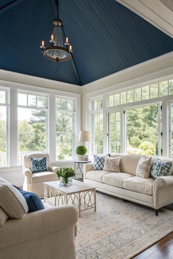
This one surprises people, but painting your ceiling a soft, muted blue adds so much character without overwhelming the room. It’s sometimes called a “haint blue” ceiling, and it draws the eye upward in a really pleasant way.
Tip: keep your ceiling color a few shades lighter than your walls so the room doesn’t feel like it’s closing in on you.
This works especially well in traditional and coastal homes, though I’ve seen modern spaces pull it off too with a more slate-toned blue. Last but not least, let’s finish up with your final layering touch.
16. Finish With Books And Objects In Blue Spines Or Accents
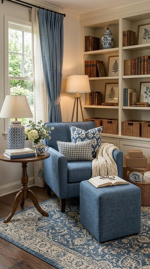
This is my favorite final touch. Style your bookshelves or coffee table with a few books that have blue spines or covers. It’s such a small detail, but it ties everything together in a way that feels natural instead of forced.
Practical tip: stack some books horizontally and stand others vertically for visual variety. Add a small object like a vase or bowl on top of the horizontal stack.
Every single design style can use this trick, from minimalist to maximalist. It’s a low-cost, high-impact way to finish your room.
Tips for Success
- Test paint swatches on your actual walls, not just paint chips, since lighting changes everything
- Balance cool grey and blue tones with at least one warm element, like wood or brass
- Don’t be afraid of pattern mixing as long as your colors stay in the same family
- Layer textures like velvet, wood, and knit fabrics so the room doesn’t feel one-dimensional
- Keep your biggest furniture pieces neutral and save bold blue for accents you can swap out easily
- Natural light changes how blue looks throughout the day, so view your choices at different times
- Leave some breathing room. Not every surface needs decor
Common Mistakes and How to Avoid Them
Too Much Grey, Not Enough Blue
: The room ends up feeling flat and lifeless. Fix this by adding blue in at least three spots: pillows, art, and one larger piece like a rug or chair.
Ignoring Warm Tones Completely
: An all-cool palette can feel cold and uninviting. Add wood furniture or brass accents to balance things out.
Choosing The Wrong Blue Shade For Your Lighting
: A blue that looks great in a store might look totally different in your home. Always test samples in your actual room before buying furniture or paint.
Overdoing Pattern Everywhere
: Too many patterns competing for attention creates visual chaos. Stick to one dominant pattern and keep everything else solid or subtle.
Skipping Texture Variety
: A room with only smooth fabrics feels boring, even with great colors. Mix in knits, wood, and woven materials for depth.
Forgetting The Ceiling And Floor
: People focus so much on walls and furniture that they forget these two huge surfaces. Don’t skip rugs or ceiling color as design opportunities.
Similar Variations
- Navy And Cream Living Room – Swaps grey for cream, creating a softer, more traditional feel with the same blue anchor
- Coastal Blue And White Living Room – Leans fully nautical with white walls, blue accents, and natural fiber textures
- Charcoal And Teal Living Room – A moodier, more dramatic take using deeper, richer color saturation
- Slate Blue Farmhouse Living Room – Combines rustic wood elements with muted blue tones for a cozy, country feel
- Grey And Yellow Living Room – Uses yellow instead of blue for a warmer, more energetic contrast against grey
- Blue And Beige Transitional Living Room – Blends traditional and modern styles with a softer, warmer neutral base
I’ve walked you through sixteen solid ways to make grey and blue work together in your living room, and honestly, the best approach is picking a handful of these ideas rather than trying to cram all of them into one space. Start with your big furniture pieces, get the color balance right between cool and warm tones, and then have fun layering in the smaller details like pillows, art, and plants. Whatever direction you take, a 16 grey and blue living room approach gives you a flexible, timeless foundation that you can keep tweaking for years to come.
Leave a Reply