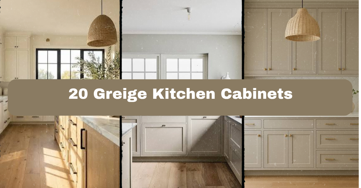
20 Greige Kitchen Cabinets can make a kitchen feel warm, calm, and polished without looking too gray or too beige. I’ll walk you through the best ways to use them, from counters and hardware to lighting, rugs, and room style.
What are 20 Greige Kitchen Cabinets? They are kitchen cabinets in a balanced gray-beige color, shown through 20 decorating ideas. Greige works with warm wood, white, black, brass, stone, and many kitchen styles.
Greige is one of those colors that changes with the light. In the morning, it may look soft and beige. At night, it can seem cooler and grayer. That flexibility is what makes greige kitchen cabinets so useful. I can pair them with crisp white walls, natural wood floors, bold tile, or simple black accents.
Before choosing a paint color, I always check the room’s lighting and fixed finishes. A cool gray floor can make some greige shades look tan, while warm bulbs can make them look deeper. The ideas below will help you build a kitchen that feels balanced rather than muddy.
1. Pair Greige Cabinets With a Bright White Countertop
A white countertop gives greige cabinets a clean, fresh edge. I especially like this combination when the kitchen has limited natural light. Quartz with soft gray veining works well because it connects the cabinet color to the counter without creating a harsh contrast. For a warmer look, choose a white surface with cream or taupe veins.
Keep the backsplash simple if the counter has strong movement. A plain white subway tile or small matte tile lets the cabinets remain the star. As a practical step, place cabinet and counter samples beside your windows before ordering anything.
This pairing fits modern, farmhouse, transitional, and coastal kitchens. Next, I would bring in wood to keep all that white from feeling too cold.
2. Add Natural Wood for Warmth and Texture
Greige cabinets look beautiful beside oak, walnut, ash, and reclaimed wood. The wood adds a natural note that helps the gray-beige color feel less flat. Try a butcher block island, wood floating shelves, a dining table, or simple stools with woven seats.
I prefer one main wood tone and one smaller supporting wood detail. Too many competing stains can make the kitchen look scattered. For an easy update, replace a few open shelves or add a wood cutting board display near the range.
Light oak suits Scandinavian and coastal rooms. Medium walnut works in mid-century and modern spaces. Reclaimed wood supports farmhouse and rustic designs. Once the wood is in place, black hardware can sharpen the whole palette.
3. Use Matte Black Hardware for Clean Contrast
Black pulls and knobs give greige kitchen cabinets a crisp outline. They are especially helpful when the cabinet color is pale or when the room needs more visual weight. I like simple bar pulls on drawers and round knobs on doors, but mixing those two shapes still feels neat and planned.
Choose a finish with a soft, low-shine surface rather than a bright glossy black. Measure each existing hole before buying replacement hardware. For new cabinets, use cardboard to test pull lengths and placement at full scale.
This look fits modern, industrial, farmhouse, and transitional homes. If black begins to feel too strong, repeat it in only two or three places, such as the faucet, pendant lights, and cabinet hardware. From there, warm metal offers a gentler direction.
4. Mix in Aged Brass for a Softer Accent
Aged brass brings warmth to greige without the sharp contrast of black. It looks especially inviting on cabinet pulls, a faucet, or small pendant lights. I would avoid using several bright gold finishes together because they can make the kitchen feel flashy. A brushed or antique brass finish is easier to live with.
Pair aged brass with creamy walls, warm white counters, or medium wood floors. You can also repeat the finish in picture frames or a small tray. Order one hardware sample first, since brass tones vary widely from yellow gold to muted bronze.
Aged brass suits traditional, Parisian, cottage, and modern kitchens. If you are comparing finishes, this quick guide can help you decide how much contrast you want.
Hardware finish guide
| Finish | Visual effect | Best cabinet pairing | Maintenance note |
|---|---|---|---|
| Matte black | Strong, graphic contrast | Light to medium greige | Shows dust but hides small water spots |
| Brushed brass | Warm and polished | Light greige and white counters | Wipe with a soft cloth; avoid abrasive cleaner |
| Aged brass | Soft, vintage warmth | Medium greige and wood | Natural variation is part of the look |
| Satin nickel | Cool, quiet contrast | Gray-leaning greige | Easy to coordinate with stainless appliances |
| Oil-rubbed bronze | Deep, rustic accent | Beige-leaning greige | Best in traditional or farmhouse kitchens |
Now that the cabinet hardware has direction, the backsplash can add pattern without making the room feel busy.
5. Install a Handmade-Look Tile Backsplash
A handmade-look backsplash adds gentle texture to smooth greige cabinets. Look for ceramic tile with slight color variation, uneven edges, or a soft glaze. White, cream, pale sage, and dusty blue are all useful choices. I like a simple rectangular tile installed in a stacked layout for a modern room, or a running-bond layout for a more classic feel.
Choose grout carefully. Warm white grout blends with creamy tile, while light gray grout highlights the pattern. Before installation, tape several tile samples to the wall and view them in daylight and evening light.
This idea adapts well to coastal, cottage, traditional, and contemporary kitchens. With the backsplash selected, lighting becomes the next tool for controlling how greige looks at different times of day.
6. Layer Lighting at Three Different Levels
Good lighting can change the entire appearance of greige cabinets. I use three layers: ceiling fixtures for general light, under-cabinet lighting for work areas, and pendants or sconces for visual interest. Warm bulbs around 2700K to 3000K usually make greige feel comfortable without turning it orange.
Install under-cabinet strips toward the front edge so the counter receives even light. For pendants, leave enough clearance above the island for safe movement and clear sight lines. Dimmable fixtures give you more control during meals and entertaining.
This layered plan works in modern, rustic, traditional, and small apartment kitchens. Once the lighting is right, a carefully chosen island can give the room a strong center.
7. Choose a Contrasting Island Color
A contrasting island can make greige cabinets feel custom and collected. Deep navy, forest green, charcoal, natural wood, and even a darker greige can work well. I would keep the perimeter cabinets lighter so the island feels like furniture rather than a heavy block.
Match the island color to something already in the kitchen, such as the floor, backsplash, or window trim. Paint a large sample board instead of judging a tiny swatch. If you have a narrow kitchen, use a low-contrast island so the room does not feel divided.
This approach suits transitional, farmhouse, coastal, and modern homes. After choosing the island, I would look down at the floor because its undertone can make or break the cabinet color.
8. Balance the Cabinets With Warm Flooring
Warm flooring helps greige cabinets feel grounded. Oak planks, medium-tone wood, cork, terracotta tile, and warm stone can all support a gray-beige palette. If you already have cool flooring, bring warmth in through a runner, stools, baskets, and wood accessories instead of replacing the floor immediately.
I always compare a cabinet sample directly against the floor. Look for a shared undertone, even if the colors are not identical. For a practical test, view both samples with the kitchen lights on and off.
Warm floors suit farmhouse, traditional, Mediterranean, and Scandinavian rooms. These color relationships are easier to compare in a simple palette chart.
Cabinet and flooring combinations
| Cabinet direction | Flooring choice | Supporting colors | Overall mood |
|---|---|---|---|
| Light, warm greige | Natural white oak | Cream, sage, aged brass | Soft and welcoming |
| Medium neutral greige | Medium oak | White, black, tan leather | Balanced and transitional |
| Gray-leaning greige | Pale ash wood | Blue-gray, charcoal, nickel | Calm and modern |
| Beige-leaning greige | Terracotta tile | Olive, ivory, bronze | Earthy and Mediterranean |
| Deep greige | Light oak or limestone | Warm white, walnut, brass | Dramatic but comfortable |
With the floor supporting the cabinets, the next step is choosing a wall color that does not fight their undertones.
9. Paint the Walls a Soft, Warm White
Warm white walls create a quiet backdrop for greige kitchen cabinets. Shades with cream, linen, or barely-there beige undertones usually work better than icy whites. The goal is not to make every surface the same color. It is to create gentle differences that the eye can understand.
I recommend testing at least three large paint samples. Place them beside the cabinet, backsplash, counter, and trim. A wall color that looks perfect in a store may turn yellow or gray at home.
This treatment works across coastal, farmhouse, classic, and minimalist styles. If you prefer more color, a muted green wall is another calm option that leads naturally into the next idea.
10. Bring in Muted Green for an Earthy Kitchen
Muted green and greige make a relaxed, nature-inspired pair. Consider sage walls, olive bar stools, eucalyptus branches, or green ceramic dishes. The colors work because both are softened and slightly dusty. Neither one demands all the attention.
Use green in small amounts first. A runner, pendant shade, or open-shelf display can test the idea before you repaint. Keep the countertop fairly quiet if you add a strong green backsplash or island.
This combination fits cottage, English country, organic modern, and farmhouse kitchens. If green is not your style, soft blue offers a cooler but equally peaceful alternative.
11. Add Soft Blue for a Coastal Mood
Soft blue gives greige cabinets a light coastal feeling without turning the room into a theme. Try blue-gray backsplash tile, pale blue counter stools, or a washable striped runner. I like blue with white oak, brushed nickel, and simple linen window shades.
Avoid using bright turquoise unless you want a more playful beach look. Dusty blue and slate blue are easier to blend with the neutral cabinet color. As a practical tip, repeat the blue at least twice so it feels intentional.
This palette adapts to coastal, cottage, Scandinavian, and transitional homes. After adding a cool accent, natural fibers can keep the kitchen feeling warm and comfortable.
12. Layer Woven Textures and Natural Fibers
Woven textures add life to a kitchen filled with painted cabinets. Try rattan stools, a jute runner, seagrass baskets, linen café curtains, or woven pendant shades. These pieces soften the hard surfaces of stone, tile, metal, and cabinetry.
Choose washable or easy-clean materials near the sink and cooking area. A flat-weave cotton runner may be more practical than thick jute if spills happen often. Keep the texture varied but not excessive. One basket, one runner, and one woven light can be enough.
This idea works in coastal, boho, farmhouse, and organic modern kitchens. The following material guide can help you choose textures that match your cleaning needs.
Natural texture comparison
| Material | Best use | Strength | Watch for |
|---|---|---|---|
| Flat-weave cotton | Runner or small mat | Often washable and lightweight | Can shift without a rug pad |
| Jute | Decorative runner or basket | Warm, earthy texture | Absorbs moisture and stains |
| Rattan | Chairs or pendant shades | Light and relaxed | Needs dusting in open kitchens |
| Seagrass | Baskets and trays | Strong, structured weave | Can shed small fibers |
| Linen | Curtains or seat cushions | Soft, airy appearance | Wrinkles and may need careful washing |
Now that the room has texture, open shelving can provide a place to show useful and beautiful pieces.
13. Add One or Two Open Shelves
Open shelves break up a long run of greige cabinetry. They also give you space to display everyday dishes, cutting boards, jars, and small plants. I suggest using one material, such as oak or walnut, to connect the shelves with the floor or island.
Do not fill every inch. Leave some open space so the display can breathe. Group items by color and height, then keep the most-used pieces within easy reach. Secure shelves properly into wall studs, especially when storing plates or cookware.
This idea fits modern, farmhouse, rustic, and Scandinavian kitchens. If you prefer hidden storage, glass-front doors can offer a similar lighter effect with less visual clutter.
14. Use Glass-Front Cabinets for a Lighter Look
Glass-front cabinet doors make greige cabinetry feel less solid. Clear glass is useful for neatly arranged dishes, while ribbed or seeded glass hides minor clutter. I often use glass doors on just one cabinet section rather than across the whole kitchen.
Choose items that repeat the room’s colors, such as cream ceramics, wood bowls, or green glassware. Add interior lighting only if the cabinet has enough depth and safe wiring access. Keep shelves spaced so plates and bowls do not look cramped.
Glass-front doors work in traditional, transitional, cottage, and modern kitchens. They lighten the upper cabinets, and a few carefully selected decorative pieces can add a personal layer next.
15. Display Handmade Ceramics and Simple Art
Handmade ceramics bring character to a neutral kitchen. Try a shallow bowl, a tall vase, a stoneware pitcher, or a small framed print. Choose pieces in cream, clay, olive, blue, or charcoal so they connect with the cabinet palette.
I like to display useful objects instead of filling counters with decoration. A beautiful bowl can hold fruit, while a ceramic utensil crock keeps tools nearby. Leave space around each item to make cleaning easier and prevent the counters from feeling crowded.
This approach suits eclectic, cottage, rustic, and modern homes. Once the decorative pieces are chosen, a rug can add color and comfort underfoot.
16. Anchor the Room With a Washable Runner
A runner adds softness, pattern, and color to a kitchen with greige cabinets. Choose a washable style in muted red, blue, olive, tan, or charcoal. Vintage-inspired patterns are forgiving because small crumbs and marks do not stand out as much as they would on a solid pale rug.
Measure the walkway before shopping. Leave a few inches of floor visible along the edges, and use a non-slip pad. Keep the rug away from the stove if it has loose fibers or a slippery backing.
This idea works in farmhouse, traditional, boho, and apartment kitchens. Here is a quick sizing guide for common kitchen layouts.
Kitchen runner sizing guide
| Kitchen area | Suggested rug size | Placement advice |
|---|---|---|
| Narrow galley walkway | 2.5 by 6 feet | Center it between cabinet runs |
| Standard sink area | 2.5 by 5 feet | Place it in front of the sink and dishwasher |
| Long galley kitchen | 2.5 by 8 feet | Keep ends clear of doors and appliances |
| Island work zone | 3 by 5 feet | Use only if it does not block stools |
| Open kitchen transition | 3 by 7 feet | Align the long edge with the main traffic path |
With the floor softened, the final design choices can focus on function, storage, and the details that make the kitchen feel finished.
17. Select Counter Stools That Repeat the Palette
Counter stools can tie greige cabinets to the rest of the home. Wood stools add warmth, black metal stools add contrast, and upholstered stools bring comfort. I prefer backs and footrests for islands used during long breakfasts or homework sessions.
Check the island height before ordering. Counter-height seating usually needs a seat around 24 to 26 inches high, while bar-height seating is taller. Leave enough elbow room between stools so people can sit comfortably.
This choice works in modern, farmhouse, industrial, and traditional rooms. After the stools are set, window treatments can add softness without taking up valuable floor space.
18. Dress Windows With Simple Linen Shades
Linen or linen-look shades soften hard cabinet lines and control glare. Natural white, flax, oatmeal, and light gray are safe choices with greige. Roman shades give a tailored look, while café curtains create a more casual cottage feeling.
Mount shades high enough to make the window look taller, but keep fabric away from burners and wet sink areas. Choose a washable blend if the window is close to food preparation. Order a fabric sample before committing because linen can look much warmer in direct sunlight.
This treatment suits coastal, cottage, Scandinavian, and traditional kitchens. With the window handled, small metal and wood accents can finish the room without adding clutter.
19. Repeat Small Finishes Across the Kitchen
A cohesive kitchen repeats its main finishes in small, useful ways. If you choose aged brass hardware, echo it in the faucet, pendant canopy, or framed artwork. If you use black pulls, repeat black in the light fixture or stool legs. Wood shelves can connect to a cutting board or serving tray.
I aim for two or three repeated finishes, not a dozen. Before buying accessories, make a short list of the materials already in the room. This prevents random purchases that look unrelated.
The method fits every style because repetition creates order in modern, traditional, rustic, and eclectic spaces. One final choice remains: how to make the greige cabinets work in a small kitchen.
20. Keep a Small Kitchen Light and Uncluttered
Greige cabinets can look especially good in a small kitchen when the palette stays controlled. Choose a lighter greige, a simple backsplash, slim hardware, and one reflective surface, such as a polished counter or glass door. Use vertical storage for trays, cutting boards, and baking sheets.
Avoid filling the counters just because they are available. Keep only daily-use items near the work zones. Under-cabinet lights can also make a compact kitchen feel larger and safer at night.
This plan works in small modern flats, cottage kitchens, classic homes, and narrow galley layouts. Once the main choices are made, these practical tips can help you pull everything together.
Tips for Success
- Test greige paint beside the countertop, floor, backsplash, and trim before buying cabinet paint.
- Check samples in morning, afternoon, and evening light.
- Choose bulbs between 2700K and 3000K for a warm, comfortable glow.
- Limit the room to two or three main metal finishes.
- Use large sample boards instead of judging tiny paint chips.
- Keep strong patterns to one main area, such as the backsplash or runner.
- Seal natural stone and follow the care instructions for wood counters.
Common Mistakes and How to Avoid Them
Cool white paint
: Cool white can make greige cabinets look yellow or muddy. Test a warm white or a neutral white beside the cabinets first.
Too many beige tones
: Beige walls, tan counters, brown floors, and cream tile can blend into one dull mass. Add contrast with white, charcoal, muted green, black, or natural wood.
Ignoring the undertone
: A gray-leaning greige may clash with a strongly yellow floor. Compare all fixed finishes together before choosing the cabinet shade.
Using only overhead lighting
: One ceiling fixture creates shadows and can make cabinet color look uneven. Add under-cabinet lights and a dimmable fixture over the island.
Overloading open shelves
: Crowded shelves make a kitchen look messy quickly. Display useful objects in small groups and leave visible wall space between them.
Choosing style over comfort
: Beautiful stools or rugs are not helpful if they are hard to clean or unsafe near heat. Select washable fabrics, stable seating, and clear walking paths.
Similar Variations
- Warm Greige Farmhouse: Combine greige cabinets with oak, apron-front sinks, aged brass, and simple shiplap.
- Coastal Greige: Add pale blue, white oak, woven textures, and soft nickel hardware.
- Modern Organic Greige: Use slab doors, limestone, black accents, and handmade wood pieces.
- Greige English Cottage: Mix framed cabinets with floral accents, aged metals, and softly patterned tile.
- Industrial Greige: Pair the cabinets with concrete, black steel, exposed lighting, and reclaimed wood.
- Scandinavian Greige: Keep the palette light with pale floors, simple hardware, clean lines, and minimal decoration.
Greige cabinets are flexible, but they still need support from the rest of the room. Look at undertones first, then build around light, texture, hardware, and practical materials. A few strong choices will look better than a kitchen packed with competing finishes.
I would start with three samples: the cabinet color, the countertop, and the floor. View them together, make notes, and only then choose tile, paint, and hardware. That simple process can save money and help your finished space feel intentional. Use these ideas to create your own beautiful version of 20 Greige Kitchen Cabinets.
Leave a Reply