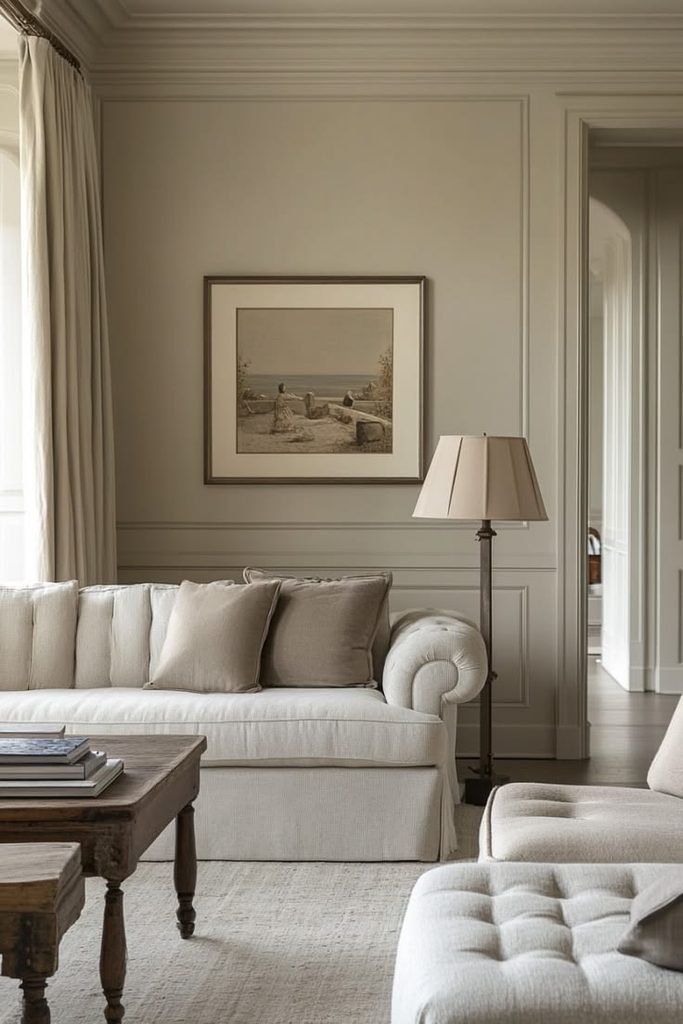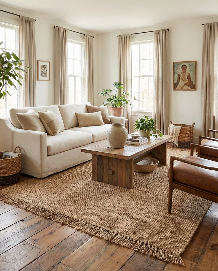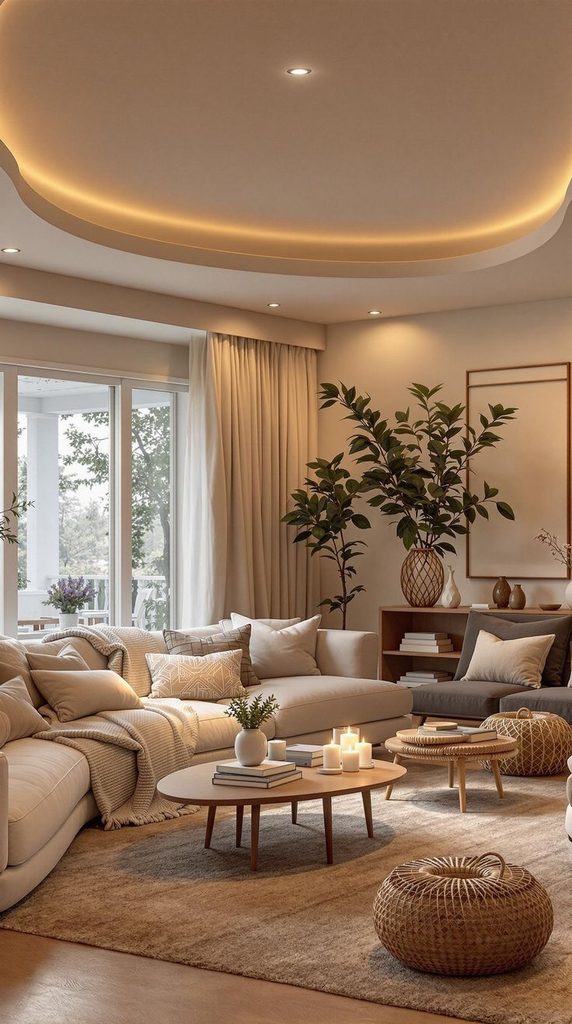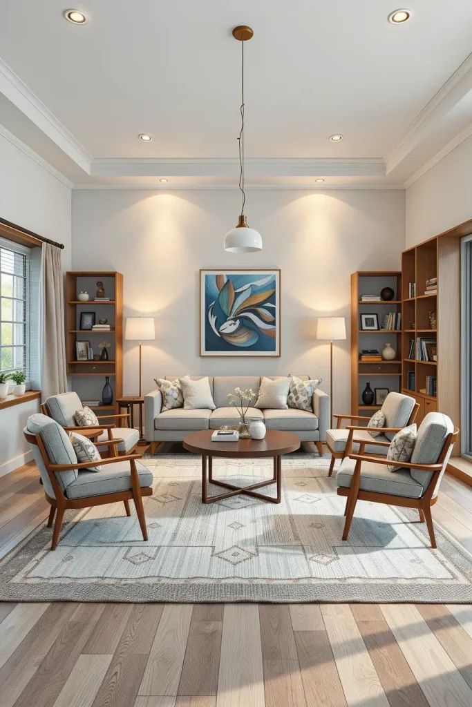
Blog

  • 14 Simple Living Room Ideas That Actually Make Your Space Feel Bigger and Calmer

    14 Simple Living Room Ideas That Actually Make Your Space Feel Bigger and Calmer

    I’ve spent way too many weekends flipping through design magazines, so let me save you the trouble: this list of 14 simple living room ideas is probably the most straightforward, no-fluff guide you’ll find on making your space feel clean and put-together without spending a fortune.

    A simple living room is a space designed with fewer decorative items, a limited color palette, and functional furniture that prioritizes comfort and clarity over clutter. This style focuses on open floor space, muted tones, and purposeful decor choices.

    Stick around, because I’m about to walk you through 14 actual ideas you can copy this weekend, plus a few mistakes I made so you don’t have to.

    What Does “Simple Living Room” Even Mean?

    Okay, so here’s the thing. “Simple” doesn’t mean boring or empty. It just means every piece in the room earns its spot. No random knick-knacks. No furniture you don’t use. Think of it like packing a suitcase for a trip. You only bring what you’ll actually wear.

    A simple living room usually leans on neutral colors, natural materials, and clean lines. But it’s not one strict style. You can do simple and cozy, simple and modern, or simple and traditional. The goal is breathing room, both literally and visually. Once you get the hang of it, your whole house feels calmer.

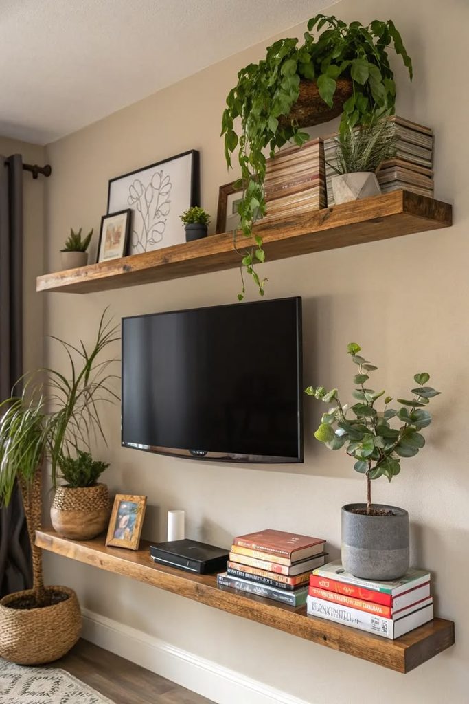
    1. Start With a Neutral Color Base

    18 Neutral Living Room Ideas with a Touch of Wow
    Credit: Bhg

    Pick two or three neutral colors and build everything around them. Think warm whites, soft greiges, or muted tans. This isn’t about being flashy. It’s about creating a backdrop that never fights for attention.

    Paint your walls one shade, keep your big furniture (couch, rug) in a complementary neutral, and save color for small accents like pillows or a throw blanket. This trick alone makes rooms feel twice as big.

    Quick tip: Test paint swatches at different times of day before committing. Morning light and evening light change colors more than you’d think.

    This idea works everywhere, from farmhouse to mid-century modern. It’s basically the foundation for the next 13 ideas, so let’s build on it.

    2. Choose Furniture With Clean, Simple Lines

    20 Modern Living Room Ideas For 2026 | Furniture & Choice
    Credit: Furniture and Choice

    Chunky, ornate furniture pieces add visual noise fast. Swap them for pieces with straight edges, simple legs, and minimal detailing. A sofa without tufting. A coffee table without carved trim.

    This doesn’t mean cheap or cold. Wood grain, soft fabric, and rounded corners still bring warmth. You just want shapes that don’t scream for attention.

    Actionable tip: Before buying new furniture, sketch your room’s shape on paper first. Simple furniture only works if it fits the space without crowding it.

    Modern homes go sleek and low-profile. Traditional homes can still keep simple lines but add slightly curved arms or classic wood tones. Once your furniture speaks the same visual language, it’s time to think about what’s underfoot.

    3. Layer One Simple, Low-Pattern Rug

    5 Ways to Layer Rugs for a Cozy, Stylish Look | Kudenrugs
    Credit: Kuden

    A rug grounds the whole room, but a busy, loud rug undoes all your simple color work. Go with a rug that has subtle texture instead of bold patterns. Think a woven jute rug, a solid wool rug, or one with a very faint geometric print.

    Size matters here too. A rug that’s too small makes your furniture look like it’s floating.

    Rug Size Guide by Room Dimension

    Room SizeRecommended Rug SizeFurniture Placement
    8×10 ft5×7 ftFront legs of sofa on rug
    10×12 ft8×10 ftAll furniture legs on rug
    12×15 ft9×12 ftAll furniture legs on rug
    14×16 ft10×14 ftAll furniture legs on rug, walking path around edges

    Practical tip: Always size up if you’re stuck between two options. A rug too big feels intentional. A rug too small feels like a mistake.

    Coastal rooms love natural fiber rugs. Modern spaces prefer flat-weave solids. Either way, once your floor feels settled, your eye naturally moves up to the walls.

    4. Keep Wall Decor to One Focal Point

    Expert Eye: 7 Ways to Create a Focal Point in the Living Room | Houzz NZ
    Credit: Houzz

    Instead of covering every wall with frames and shelves, pick one wall and make it count. A big piece of art. A large mirror. One statement item, nothing more.

    This single move instantly makes a room feel less cluttered. Your eyes get a place to rest instead of bouncing around trying to process ten different things at once.

    Tip: Hang your focal piece at eye level, roughly 57 to 60 inches from the floor to the center of the piece.

    Traditional homes might use a large framed painting. Modern homes might go with an oversized clock or abstract print. Coastal homes often choose a big woven wall hanging. Once that wall is set, the rest of your walls can stay mostly bare, which brings us to lighting.

    5. Let Natural Light Lead the Room

    Genius Tricks for Lightening Up a Dark Room, According to Designers
    Credit: Elle Decor

    Simple living rooms breathe better with more light. Skip heavy drapes and go with sheer curtains or simple linen panels that let sunlight filter through.

    If your windows are small, keep window treatments minimal or skip them completely. Mirrors placed across from windows also bounce light around the room, making it feel bigger without adding a single extra light fixture.

    Quick tip: Trim any outdoor plants blocking your windows. It’s free and instantly brightens a room.

    Modern farmhouse styles love white linen curtains. Minimalist spaces sometimes skip curtains entirely. Once natural light is doing its job during the day, you’ll want backup lighting for the evening, which is next on the list.

    6. Add Layered Lighting, Not Just One Overhead Fixture

    Light Layering: Mastering the Art of Illuminating Your Space with Style
    Credit: Decorilla

    One ceiling light isn’t enough. Simple rooms actually need more thoughtful lighting, not less. Add a floor lamp, a table lamp, and maybe one small accent light.

    This layering creates depth and mood. It also means you’re not stuck with one harsh light source that makes the whole room feel flat.

    Tip: Use warm bulbs, around 2700K to 3000K, for a cozy glow instead of a stark white light.

    Lighting Layer Breakdown

    Light TypePurposeSuggested Placement
    Ambient (overhead)General room brightnessCeiling fixture or recessed lights
    Task lightingReading, workingFloor lamp near seating
    Accent lightingHighlighting decorSmall lamp on shelf or console

    Traditional rooms often use brass lamp bases. Coastal rooms lean toward woven or rattan lamp shades. Once your lighting layers are set, let’s talk about what sits on your coffee table.

    7. Style Your Coffee Table With Just Three Items

    41 Best Coffee Table Decor Ideas - How To Decorate a Coffee Table
    Credit: Elle Decor

    A coffee table covered in stuff feels messy fast. Stick to a simple rule: one stack of books, one small tray or bowl, and one organic touch like a small plant or candle.

    This “rule of three” keeps your table looking curated instead of cluttered, and it’s way easier to maintain day to day.

    Tip: Rotate your coffee table items seasonally. Swap the candle for a small pumpkin in fall, or a bowl of lemons in summer.

    Modern homes might use a marble tray and a single sculptural object. Traditional homes might swap in a silver tray and leather-bound books. Once your table is styled, your seating arrangement is the next thing to check.

    8. Arrange Seating to Encourage Conversation

    Expert Eye: 7 Ways to Arrange a Living Room for Conversation | Houzz AU
    Credit: Houzz

    Simple doesn’t mean stiff. Arrange your sofa and chairs so people can actually talk to each other without shouting across the room. A sofa facing two chairs, with a coffee table in between, works in almost any space.

    Avoid pushing all your furniture against the walls. Pulling seating slightly inward, even a foot or two, makes the room feel more intentional and cozy.

    Tip: Leave at least 30 inches of walking space between furniture pieces so the room doesn’t feel cramped.

    This idea barely changes across styles. Whether you’re going coastal, modern, or traditional, good conversation flow is universal. Once seating is set, let’s talk textures.

    9. Mix in Natural Textures Like Wood, Linen, and Wool

    15 Natural Living Room Ideas with Wood and Organic Elements | Wisal
    Credit: Wisal

    Simple color palettes can feel a little flat without texture. This is where natural materials come in. A wood coffee table, a linen throw pillow, a wool blanket draped over the sofa arm.

    These textures add warmth without adding visual clutter, because they work with your neutral colors instead of against them.

    Tip: Stick to three textures max per room so it doesn’t start feeling busy again.

    Coastal rooms lean into rattan and jute. Scandinavian spaces favor light wood and wool. Modern farmhouse mixes raw wood with soft linen. Once your textures are balanced, greenery is the next easy win.

    10. Add Just One or Two Plants, Not a Jungle

    Gorgeous Houseplants That Will Thrive in Your Living Room
    Credit: MyDomaine

    Plants bring life into a room, but too many turn simple into cluttered fast. Pick one larger floor plant, like a fiddle leaf fig or snake plant, and maybe one smaller tabletop plant.

    Real or faux both work here. The goal is a touch of green, not a greenhouse.

    Tip: Place your floor plant in an empty corner to fill dead space without crowding your furniture.

    Modern rooms often go with sculptural plants like snake plants. Traditional rooms might prefer a classic ficus. Coastal spaces lean toward palms. Once your greenery is placed, let’s simplify your shelves next.

    11. Edit Your Shelves Down to Essentials

    Living room bookshelf ideas: 10 smart living room bookshelves | Homes and Gardens
    Credit: Homes and Gardens

    Bookshelves and display shelves are clutter magnets. The fix is simple: pull everything off, then only put back what you actually love or use. Group items in threes, and leave visible empty space between groupings.

    Empty space on a shelf isn’t wasted space. It’s what makes the items you do display actually stand out.

    Tip: For every ten items you remove, only put five back. That 50% rule keeps shelves from creeping back into chaos.

    Traditional homes might keep a few family photos and books. Modern homes often display one sculptural object per shelf. Once your shelves are edited, your throw pillows deserve the same treatment.

    12. Limit Throw Pillows to Two or Three Per Seat

    48 Living Room Layout Ideas That Make the Most of Your Space
    Credit: Bhg

    Piling ten pillows on a couch looks cozy in photos but annoying in real life. Stick to two or three pillows per seating spot, in coordinating (not matching) colors and textures.

    This keeps your sofa functional. You want a place to actually sit, not a pillow fort you have to rearrange every time someone visits.

    Tip: Choose one solid color, one subtle pattern, and one textured pillow for the sweet spot between simple and interesting.

    Coastal rooms might use striped and linen pillows. Modern rooms often stick to solid, geometric shapes. Traditional rooms might add one patterned pillow with piped edges. Once your pillows are sorted, storage is your next quiet hero.

    13. Hide Clutter With Closed Storage

    20 Genius Living Room Storage Ideas Declutter and Impress | Sharps
    Credit: Sharps

    Simple rooms need somewhere to hide the mess of daily life. Baskets, closed cabinets, and ottomans with storage inside all work great. Remote controls, chargers, mail, all of it can disappear into a basket by the sofa.

    This is honestly the secret weapon of every simple living room I’ve ever seen in person. It looks calm because the clutter has a home.

    Tip: Use one large woven basket near your seating area as a catch-all for blankets and remotes.

    Coastal and farmhouse styles love woven baskets. Modern spaces prefer sleek cabinets with hidden handles. Once your storage is sorted, the last idea ties everything together.

    14. Stick to One Cohesive Metal Finish

    Stylish Green and Gold Living Room Ideas | 42 Design Images
    Credit: Fancy house design

    This one’s small but it makes a huge difference. Pick one metal finish, brass, black, or brushed nickel, and use it across your lamp bases, picture frames, and hardware.

    Mixing five different metals throughout a room creates visual chaos, even if everything else is simple. One consistent finish ties the whole space together in a way that feels expensive, even on a budget.

    Tip: If you already own mixed metals, spray paint smaller items like frames to match your main finish.

    Modern rooms often go with matte black. Traditional and coastal rooms lean toward brushed brass or nickel. With all 14 ideas in place, your living room should already feel calmer and more collected.

    Tips for Success

    • Start with one room zone at a time instead of trying to overhaul everything in one weekend.
    • Buy furniture with function in mind first, looks second. A simple room only works if it’s actually livable.
    • Set a “one in, one out” rule for decor so clutter doesn’t creep back in over time.
    • Photograph your room before and after changes. It’s easier to spot chaos in a photo than in person.
    • Shop secondhand for big furniture pieces. Simple lines are easy to find at thrift stores and estate sales.
    • Give new layouts two full weeks before deciding if they work. First impressions of a new setup aren’t always accurate.

    Common Mistakes and How to Avoid Them

    Overbuying decor items
    : Buy less than you think you need, then live with the space for a month before adding anything else.

    Choosing trendy colors over timeless neutrals
    : Stick to warm whites, soft grays, or muted tans as your base, and save trends for small, swappable accents.

    Skipping a rug because the room feels “done”
    : A properly sized rug anchors furniture and makes a room feel finished, so don’t skip this step even in a simple space.

    Mixing too many wood tones
    : Pick one dominant wood tone and stick with it across your furniture pieces for a cohesive look.

    Forgetting about lighting layers
    : Add at least two light sources beyond your ceiling fixture so the room doesn’t feel flat at night.

    Ignoring furniture scale
    : Measure your room before buying anything, since oversized furniture in a small space instantly kills the simple, open feeling you’re going for.

    Similar Variations

    • Scandinavian Minimalist – Focuses on light wood, white walls, and cozy textiles for a bright, airy feel.
    • Coastal Simple – Uses natural fibers, blues and whites, and beachy textures like rattan and linen.
    • Modern Farmhouse Simple – Mixes raw wood, black metal accents, and soft neutral fabrics.
    • Japandi Living Room – Blends Japanese minimalism with Scandinavian warmth through low furniture and natural materials.
    • Warm Minimalist – Keeps the clean lines of minimalism but adds more texture and warm tones to avoid feeling cold.
    • Traditional Simple – Uses classic furniture shapes but strips back heavy patterns and excess ornamentation.

    Getting a calm, collected living room doesn’t take a huge budget or a total gut renovation. It just takes some editing, a little patience, and a willingness to say no to extra stuff you don’t actually need. Once you start applying even a handful of these changes, you’ll notice your space feels lighter and easier to relax in. And honestly, that’s the whole point of trying out these 14 simple living room ideas in the first place.
  • 20 Lighting Tips Living Room Ideas That Actually Work

    20 Lighting Tips Living Room Ideas That Actually Work

    I’ve spent way too many nights staring at my living room wondering why it felt like a dentist’s waiting room, so I put together these 20 lighting tips living room ideas after testing what actually works and what just looks good in a magazine. This isn’t theory. This is stuff I’ve tried, tweaked, and sometimes ripped out of the wall in frustration.

    What are the best lighting tips for a living room? The best living room lighting combines three light types: ambient (overhead), task (reading lamps), and accent (highlighting art or shelves). Layer these with dimmers, warm bulbs (2700K-3000K), and varied fixture heights for a room that feels balanced, not flat or harsh.

    Stick around, because I’m about to show you the exact mistakes I made (and fixed) so you don’t have to learn the hard way.

    Why Lighting Makes or Breaks Your Living Room

    Here’s the thing nobody tells you: furniture and paint colors get all the credit, but lighting does the heavy lifting. A gorgeous couch under one harsh overhead bulb still looks sad. I learned this when I moved into my first apartment and had exactly one ceiling fixture. The whole room felt like an interrogation room. Once I started layering different light sources, everything changed. Same furniture, same walls, totally different vibe. Lighting isn’t just about seeing where your feet are. It’s mood, it’s function, it’s the difference between a room you want to sit in and one you rush through.

    1. Layer Three Types of Light in Every Room

    Light Layering: Mastering the Art of Illuminating Your Space with Style
    Credit: Decorilla

    You need ambient, task, and accent lighting working together, not just one ceiling fixture doing all the work. Ambient light fills the room generally, think overhead fixtures or recessed lights. Task lighting helps you read, work, or do close-up stuff, like a floor lamp next to your reading chair. Accent lighting highlights something specific, like a piece of art or a bookshelf.

    My tip: start with ambient, then add one task light and one accent light minimum. Modern homes often skip fussy chandeliers for clean flush-mounts, while traditional spaces love layered sconces and table lamps. Coastal rooms lean into natural light plus soft linen shades. Once you’ve got your three layers sorted, it’s time to think about temperature.

    2. Choose Warm Bulbs Over Cool White Ones

    Warm White vs Cool White Lights: What's the Difference? | Crompton
    Credit: Crompton

    Bulb color temperature changes everything about how a room feels. Cool white bulbs (4000K and up) make living rooms feel clinical, like a hospital hallway. Warm bulbs (2700K to 3000K) create that cozy, golden glow most people actually want in a living space.

    Check the packaging next time you buy bulbs. It’ll list the Kelvin temperature right there. My actionable tip: buy a few different temperatures and test them in your actual room before committing to a whole set. Farmhouse and traditional styles practically demand warm light, while modern minimalist spaces sometimes use slightly cooler tones for a crisp look. Once your bulbs match your vibe, dimmers become your next best friend.

    3. Install Dimmer Switches on Every Fixture You Can

    Are Dimmer Switches Actually Worth It? Experts Decide | Livingetc
    Credit: Livingetc

    Dimmers changed my whole relationship with my living room. Full brightness for cleaning and game night. Low and moody for movies or hanging out. One switch, endless options.

    Installing a dimmer is a weekend project, not a renovation. Most hardware stores sell simple swap-in dimmer switches for under twenty bucks. Just make sure your bulbs are dimmable (LED packaging will say so). This tip works in literally any style home, from ultra-modern lofts to cozy cottage living rooms. Now that you can control brightness, let’s talk about where the light actually comes from.

    4. Add Floor Lamps in Empty Corners

    22 Empty Corner in Living Room Ideas You'll Want to Try Before Moving Furniture Again
    Credit: The Coolist

    Empty corners are lighting opportunities, not just dead space. A floor lamp tucked into a bare corner does double duty: it fills the room with light and makes an awkward empty spot feel intentional.

    I like arc floor lamps near seating areas and tall skinny ones in tighter corners. Pick a shade color that complements your walls, not just your furniture. Practical tip: place one within arm’s reach of your favorite chair so you’re not stretching across the room to flip a switch. Boho and mid-century modern rooms both love a statement floor lamp with visual texture. Speaking of statement pieces, let’s move up to the ceiling.

    5. Hang a Pendant Light Instead of a Basic Flush Mount

    18 Living Room Ceiling Lighting Ideas For The Perfect Ambiance
    Credit: Hunker

    Swapping a boring flush-mount ceiling fixture for a pendant light instantly upgrades the whole room’s personality. Pendants hang lower, draw the eye, and act like a piece of jewelry for your ceiling.

    Make sure you’ve got enough ceiling height, generally at least eight feet, so nobody’s bonking their head. Go for a pendant with some visual weight if your living room is large, and something more delicate for smaller spaces. Actionable tip: measure your room’s width and height before shopping so you don’t end up with something too small (a common rookie mistake). Industrial and modern farmhouse styles practically live for a good pendant light. Next, let’s tackle the reading nook nobody’s lighting properly.

    6. Set Up a Proper Reading Light Near Your Favorite Seat

    10 Living Room Lighting Ideas That Are Pretty and Functional
    Credit: BHg

    If you’ve got a spot where you actually read or scroll your phone, it needs its own dedicated light. Overhead lighting alone creates shadows and eye strain when you’re trying to focus on a page or screen.

    A simple table lamp or adjustable floor lamp positioned slightly behind and above your shoulder works best. This avoids glare while still giving you enough light to see clearly. My tip: look for lamps with adjustable arms or heads so you can redirect the light as needed. Traditional rooms often use brass or bronze reading lamps, while Scandinavian spaces keep it simple with wood and white shades. Now let’s talk about the fixtures on your walls.

    7. Add Wall Sconces for Soft, Even Light

    The 20 Best Living Room Wall Lighting Ideas | Lightopia
    Credit: Lightopia

    Wall sconces do something ceiling lights can’t: they wash light evenly across a wall without creating that single bright hot spot in the middle of the room. They’re especially great flanking a fireplace or on either side of a media console.

    Sconces free up floor and table space too, since they don’t need furniture to sit on. Practical tip: install them at eye level when seated, roughly 60 to 66 inches from the floor, so the glow feels natural instead of glaring. Traditional and transitional homes use sconces constantly, but even modern spaces are catching on with sleek, minimal sconce designs. Once your walls are covered, don’t forget the shelves.

    Lighting Fixture Comparison by Room Size

    Fixture TypeBest Room SizeAverage Cost RangeLight Coverage
    Flush MountSmall (under 150 sq ft)$30-$100Even, general glow
    Pendant LightMedium to Large (150-300 sq ft)$80-$400Focused, dramatic
    Floor LampAny size, corner filler$40-$250Localized, warm pool
    Wall Sconce (pair)Medium to Large$60-$300 totalEven wall wash
    Table LampAny size, side table use$25-$150Soft, localized
    Recessed Lighting (per can)Large (300+ sq ft)$75-$150 installedBroad, even ambient

    8. Use LED Strip Lights Behind Your TV or Shelving

    33 LED Strip Ideas To Transform Your Space Fast
    Credit: Woody wall

    This one feels like a cheat code. LED strip lights stuck behind your TV or along the back of open shelving creates a soft glow that reduces eye strain during movie nights and makes your shelves look like a display case instead of a cluttered mess.

    They’re cheap, usually under thirty dollars, and stick on with adhesive backing. Most come with remotes so you can change colors or just stick with warm white. Actionable tip: measure the back of your TV or shelf before ordering so you get the right length strip. Modern and eclectic living rooms both love this trick, since it feels a little unexpected without being over the top. Speaking of unexpected, let’s talk about candles for a second.

    9. Bring In Candles for Flexible, No-Wiring Ambiance

    How to choose lighting for a small living room | Ideal Home
    Credit: Ideal Home

    Not everything needs an electrician. Candles add warm, flickering light with zero installation required. Cluster a few different heights on your coffee table or mantel for an instant mood boost during dinner parties or quiet nights in.

    I keep a mix of pillar candles and tea lights around so I can adjust the amount of light depending on the occasion. Safety tip: always place candles away from curtains or anything flammable, and never leave them burning unattended. This trick fits every single design style, from farmhouse to glam to coastal, because candlelight is universally cozy. Now let’s get into something a little more technical: smart bulbs.

    10. Switch to Smart Bulbs for Total Control

    Smart Switches in Modern Home Lighting
    Credit: Wipro

    Smart bulbs let you control brightness, color, and even scheduling from your phone. I can dim my living room lights from the couch without getting up, which sounds lazy but honestly it’s just smart living.

    Brands like these connect to apps where you can set warm light for evenings and brighter light for daytime automatically. Practical tip: start with just two or three smart bulbs in your most-used fixtures before converting your whole house, since they cost more than regular bulbs. This upgrade works in any style home because it’s invisible tech hiding inside a regular-looking bulb. Next, let’s think about where natural light fits into all this.

    11. Maximize Natural Light Before Adding Artificial Light

    8 Ways to Increase Natural Light in Your Home
    Credit: Bhg

    Before you buy a single lamp, figure out how your natural light behaves throughout the day. A living room that gets strong afternoon sun needs different artificial lighting than one that’s dim by 3pm.

    Sheer curtains let light filter in softly without blasting your room, while heavier drapes block it out for movie watching. Practical tip: track your room’s light at 9am, noon, and 6pm for one day so you know exactly when you’ll need extra lamps turned on. Coastal and Scandinavian homes maximize natural light with minimal window treatments, while traditional homes often layer sheers under heavier curtains. Once you know your natural light pattern, mirrors become a genius trick.

    12. Place a Mirror to Bounce Light Around the Room

    Living room mirror ideas – 10 ways to add light and style | Livingetc
    Credit: Livingetc

    Mirrors reflect both natural and artificial light, making a room feel brighter and bigger without adding a single new fixture. Hang one across from a window or near a lamp to double the light’s reach.

    I put a large mirror on the wall opposite my main window and the room instantly felt twice as bright in the mornings. Practical tip: avoid hanging mirrors directly across from a TV screen, since they’ll create annoying glare. This works in literally every design style since mirrors are basically decor chameleons. Now, let’s talk about dimmable ceiling fans with lights, because they’re everywhere and often done wrong.

    13. Upgrade Your Ceiling Fan Light Kit

    Ceiling Fan Ideas – Hunter Fan
    Credit: Hunter Fan

    If your living room has a ceiling fan with a built-in light, don’t ignore it. Those stock light kits are often weak, single-bulb setups that barely light a small room, let alone a large one.

    Swap the light kit for one with multiple bulbs or a brighter LED panel. Practical tip: check your fan’s wattage limit before buying replacement bulbs so you don’t overload the fixture. This upgrade matters most in ranch-style and mid-century homes where ceiling fans are common living room fixtures. Now let’s zoom into accent lighting for art and shelves specifically.

    14. Use Picture Lights to Highlight Art

    Decorative Lighting Ideas to Display Your Artwork – Juniper Print Shop
    Credit: Juniper

    A dedicated picture light mounted above a piece of art turns it into a focal point instead of just something hanging on the wall. These slim fixtures direct light downward onto the piece without flooding the whole room.

    They’re a small detail, but they make a huge difference in how “finished” a room looks. Practical tip: choose a picture light with a warm bulb so you don’t wash out the colors in your art. Traditional and gallery-style living rooms use these constantly, but even modern spaces benefit from one well-placed picture light over a statement piece. Let’s talk about something people forget entirely: outdoor-adjacent light through doors.

    15. Add Under-Cabinet or Under-Shelf Lighting

    How to Install LED Shelf Lighting in a Living Room? - Flexfire LEDs
    Credit: Flexfire

    If you’ve got built-in cabinets or open shelving in your living room, tuck small LED puck lights or strips underneath. This creates a soft glow that highlights books, decor, or glassware while adding another light layer to the room.

    It’s a subtle touch, but it adds depth. Practical tip: battery-operated puck lights are great if you don’t want to deal with wiring, and most last months on a single charge. Built-in shelving in craftsman and traditional homes especially benefits from this warm, tucked-away glow. Now, let’s talk about something a lot of people overlook: light bulb wattage per room size.

    Recommended Lumens by Living Room Size

    Room Size (sq ft)Total Lumens NeededExample Bulb Combo
    100-1501,500-2,2503 lamps at 500-750 lumens each
    150-2502,250-3,7501 pendant + 2 floor lamps
    250-3503,750-5,250Recessed lights + 2 table lamps
    350+5,250+Recessed lights + pendant + multiple lamps

    16. Match Lamp Shade Color to Your Wall Tone

    Mixing and matching lampshades for visual impact: 7 interior design ti
    Credit: Pooky

    The color of your lampshade actually changes the color of light hitting your walls. A white shade throws neutral light, while a cream or amber shade warms everything up even more.

    If your walls are already warm-toned, a warm shade doubles down on cozy. If they’re cool gray or blue, a warm shade can balance things out nicely. Practical tip: hold the shade up against your wall paint swatch before buying to see how they interact. Coastal homes often go with white or natural linen shades, while traditional spaces lean into deeper amber and gold tones. Next, let’s talk about track lighting for open-concept spaces.

    17. Install Track Lighting for Flexible Direction

    Transform Your East London Home with Stylish and Efficient LED Track L – Future Light - LED Lights South Africa
    Credit: Future Light

    Track lighting lets you point individual lights exactly where you need them, which is huge in open-concept living rooms that flow into dining or kitchen areas. You can highlight an art wall, brighten a reading corner, and light a walkway all from one track.

    It’s more flexible than fixed recessed lighting since you can adjust the heads anytime. Practical tip: go with adjustable LED heads so you can change brightness and angle without swapping bulbs. Modern and industrial living rooms use track lighting the most, since it fits that exposed, adjustable aesthetic. Now let’s cover a detail that’s easy to skip: light switch placement.

    18. Group Light Switches for Easy Control

    Dimmer Switches for Living Rooms: Complete Guide | Simple Lighting
    Credit: Simple Lighting

    If you’ve got five different light sources but the switches are scattered across three walls, that’s a problem. Group your switches or use smart plugs so you can control multiple lights from one spot without walking around the room flipping things on one by one.

    Smart plugs are a cheap fix if rewiring isn’t an option. Practical tip: a $15 smart plug on your floor lamp means you can turn it on from your phone before you even walk in the door. This tip matters in every style home since convenience isn’t tied to aesthetics. Let’s wrap up the technical stuff with color-changing bulbs.

    19. Try Color-Changing Bulbs for Movie Nights or Parties

    8 Living Room Light Ideas For Your Home – BlissLights
    Credit: Bliss Light

    Color-changing smart bulbs let you shift your living room from bright white daytime light to deep blue or purple party vibes in seconds. It sounds gimmicky until you actually use it during a movie night or a get-together.

    Most apps let you save preset scenes so you’re not fiddling with settings every time. Practical tip: keep these in secondary fixtures like floor lamps rather than your main light source, so you always have a neutral option too. This works especially well in eclectic and modern homes that already embrace bold personality. Finally, let’s talk about the simplest tip of all.

    20. Turn Off One Light Source at a Time to Test the Mood

    Living room lighting ideas to add style and a cosy ambiance | Ideal Home
    Credit: Ideal Home

    This sounds too simple to matter, but it works. Once you’ve layered in several light sources, turn them off one at a time and watch how the room’s mood shifts. You’ll quickly figure out which combo feels best for movie night versus a dinner party versus just relaxing solo.

    This costs nothing and takes five minutes. Practical tip: do this test at night when it’s dark outside so you’re seeing the true effect of your artificial lighting without natural light interfering. Every single home style benefits from this test, because it’s less about decor and more about understanding your own space.

    Tips for Success

    • Buy a few bulbs of different color temperatures before committing to a whole set for the room
    • Install at least one dimmer switch on your main ambient light source
    • Keep a lamp within reach of every seating area so nobody’s stretching across the room
    • Test your lighting setup after dark, not just during the day when natural light hides flaws
    • Mix fixture heights (floor, table, ceiling) instead of putting everything at eye level
    • Don’t skip picture lights or accent lighting just because they feel like an extra step
    • Keep spare warm-white bulbs on hand so a burnout doesn’t leave you stuck with a mismatched fixture

    Common Mistakes and How to Avoid Them

    Relying on one overhead light for the whole room
    : Add at least two more light sources, like a floor lamp and a table lamp, to break up harsh shadows and create depth.

    Using cool white bulbs in a cozy living room
    : Swap to 2700K-3000K warm bulbs, which feel more inviting and match most living room color schemes.

    Skipping dimmers because they seem like a hassle
    : Install basic swap-in dimmer switches, most take under thirty minutes and cost less than dinner out.

    Placing lamps too far from seating areas
    : Position every lamp within arm’s reach of where people actually sit or read.

    Ignoring natural light patterns
    : Track how sunlight moves through your room for one full day before buying new fixtures, so you’re not overspending on lights you don’t need.

    Choosing a pendant light that’s too small for the room
    : Measure your ceiling height and room width first, then size your fixture up rather than down.

    Similar Variations

    • Task-Focused Lighting – Prioritizes reading lamps and desk-style lighting over ambient mood lighting, great for home offices doubling as living rooms
    • Smart Home Lighting Setup – Built entirely around app-controlled bulbs and voice assistants for total remote control
    • Minimalist Lighting Scheme – Uses fewer fixtures with higher quality, focusing on one or two statement pieces instead of layering many sources
    • Candlelit Cozy Corner – Skips electric accent lighting almost entirely in favor of candle clusters and warm natural light
    • Gallery Wall Lighting – Centers the whole plan around picture lights and track lighting to showcase art collections
    • Outdoor-Indoor Flow Lighting – Matches indoor living room lighting temperature and style to adjoining patio or sunroom fixtures for a seamless transition

    Getting your living room lighting right isn’t about buying the fanciest fixtures or spending a fortune. It’s about layering different light sources, picking the right bulb temperature, and paying attention to how your specific room actually behaves throughout the day. Small changes, like adding a dimmer or swapping a cool bulb for a warm one, make a bigger difference than most people expect.

    I hope these 20 lighting tips living room ideas give you a clear starting point, whether you’re working with a tiny apartment or a big open-concept space. Start with one or two changes, see how they feel, and build from there.

  • 23 Green Couch Living Room Ideas That Actually Work

    23 Green Couch Living Room Ideas That Actually Work

    If you’re hunting for real, workable 23 green couch living room ideas, you’ve landed in the right spot. I’ve pulled together the most useful, practical options out there so you don’t have to scroll through a hundred blurry Pinterest boards to find something you can actually copy.

    A green couch living room is a space built around a green sofa as the main color anchor, paired with complementary wall colors, textures, and accents. Green couches work because the shade is neutral enough to pair with almost any palette, from warm earth tones to cool blues.

    Stick around and I’ll walk you through more than 20 ways to make a green couch look like it belongs in a magazine, not a thrift store guess.

    What Makes a Green Couch Living Room Work So Well

    I’ll be honest, I used to think green couches were risky. Too bold. Too “guess I’m stuck with this now.” But once I started looking closer, I realized green is actually one of the easiest colors to build a room around. It’s basically nature’s neutral. Think grass, trees, moss, sage fields. Your eyes already know how to handle it.

    The trick isn’t avoiding green. It’s picking the right shade and giving it the right partners. Dark forest green feels moody and rich. Sage feels calm and airy. Emerald feels bold and a little glam. Once you pick your lane, everything else falls into place a lot faster than you’d think.

    1. Pair a Sage Green Couch With Warm Wood Tones

    Credit: PlusMood

    Sage green and warm wood are basically best friends. The soft, muted green calms down the room while the wood adds warmth so it doesn’t feel cold or clinical. Go for a light oak coffee table or a walnut media console to balance the sage’s cooler undertone.

    Actionable tip: Stick to one dominant wood tone in the room. Mixing oak, walnut, and mahogany in the same space makes it look unplanned.

    This combo shines in Scandinavian and modern farmhouse homes especially. Add cream throw pillows and a jute rug to finish the look. Once you’ve got the wood and green talking to each other, you can start layering in metal accents to add a little shine without overwhelming the softness.

    2. Add Brass or Gold Accents for a Touch of Glam

    Story Pin image
    Credit: Homyzee

    Green and gold together just feel expensive. It’s not new information, but it works every single time. A brass floor lamp, gold picture frames, or a gilded mirror next to a deep emerald couch instantly makes the room feel more polished.

    Practical tip: Start with just two gold pieces. A lamp and a mirror is plenty. Too much gold competes with the couch instead of supporting it.

    This idea fits traditional and glam-style living rooms best, though a few brass accents can sneak into modern spaces too without looking out of place. Once your metallics are set, think about how your wall color will either boost or clash with that shine.

    3. Choose a Neutral Wall Color to Let the Couch Shine

    15 Green Living Room Ideas To Reinvigorate Your Space | Furniture & Choice
    Credit: Furniture and Choice

    If your couch is the star, your walls shouldn’t compete for attention. Soft whites, warm greige, or light beige walls give a green couch room to breathe. This is the safest, most flexible route if you’re nervous about color mixing.

    Tip: Test paint swatches at different times of day. Lighting changes how a neutral wall looks against green fabric more than people expect.

    This works in basically every style, from coastal to modern minimalist. Once your walls are settled, you’ll want to think about what goes on the floor, since that’s the next biggest color block in the room.

    Wall Color Pairings for Green Couches

    Couch ShadeBest Wall ColorMood Created
    Sage GreenWarm WhiteSoft, calm, airy
    Emerald GreenCharcoal GrayBold, dramatic
    Forest GreenCreamCozy, traditional
    Olive GreenTerracottaEarthy, warm
    Mint GreenLight GrayFresh, modern

    4. Layer a Neutral Rug to Ground the Space

    Dark Green Sofa Living Room Ideas: Planned Look, Not Heavy
    Credit: Fancy House Design

    A big green couch needs a rug underneath it that doesn’t fight for attention. Jute, tan wool, or a soft ivory rug all work great. The rug’s job here is simple: tie the furniture together and add texture without adding more color chaos.

    Tip: Your rug should extend at least a few inches past the edges of your couch so the room doesn’t look choppy.

    Coastal and boho living rooms love a jute or seagrass rug with a green couch. Traditional rooms lean toward a patterned wool rug in muted tones. Once your rug is settled, throw pillows are the next easy win.

    5. Mix Textured Throw Pillows in Complementary Colors

    Which Color Goes with Green Sofa? - Mojo Boutique
    Credit: Mojo Boutique

    Pillows are the cheapest way to change the personality of a green couch without repainting anything. Mustard, blush pink, navy, and cream all pair beautifully with green. Mixing textures like linen, velvet, and knit adds depth too.

    Tip: Use an odd number of pillows, usually three or five, for a more natural, less staged look.

    Bohemian rooms can go wild with pattern mixing here. Modern rooms should stick to two colors max and simple textures. After pillows, a good throw blanket adds one more layer of coziness.

    6. Add a Chunky Knit Throw Blanket for Coziness

    Check Out Cuddle Blanket and Sofa Ideas for Winter Nights
    Credit: Povision

    A cream or oatmeal-colored chunky knit blanket draped over the arm of a green couch makes the whole room feel more lived-in and warm. It’s a small detail, but it softens the look of the couch instantly.

    Tip: Fold the blanket loosely instead of perfectly. A slightly messy drape looks more natural than a stiff, folded square.

    This works especially well in farmhouse and Scandinavian spaces, where texture matters more than pattern. Coastal rooms can swap the knit for a lighter cotton throw. Speaking of texture, let’s talk about what you put on the walls next.

    7. Hang Botanical or Nature-Inspired Art

    Botanical Wall Art Decor: A Complete Guide to Nature-Inspired Interior
    Credit: Rossetti Art

    Since green already pulls from nature, leaning into botanical prints or landscape art on the walls just makes sense. Think framed leaf prints, watercolor florals, or simple line-art trees. It reinforces the calm, natural vibe without overdoing the theme.

    Tip: Keep frame colors consistent, black, gold, or natural wood, so the wall doesn’t look like a random collection.

    Modern homes look great with abstract botanical prints, while traditional homes prefer classic framed florals. Once your art is up, lighting becomes the next thing to think about.

    8. Use Warm Lighting to Soften Cool Green Tones

    45 Olive Green Sofa Living Room Ideas 2026 for a Modern Organic Luxury Look | Wisal
    Credit: Wisal

    Cooler green shades, like mint or sage, can feel a little sterile under harsh white lighting. Warm bulbs (around 2700K) fix that fast. A floor lamp with a linen shade or a couple of table lamps can completely change how the couch reads in the room.

    Tip: Avoid daylight bulbs (5000K+) near a green couch. They wash out the warmth and make the green look flat.

    This tip matters across every style, but it’s especially important in small apartments where natural light is limited. After lighting, let’s talk about what other furniture pieces work best around your couch.

    9. Choose a Light-Colored Coffee Table to Balance the Room

    24 Green Living Room Ideas with Refreshing Style
    Credit: Bhg

    If your green couch is dark or bold, a light coffee table keeps the room from feeling heavy. Whitewashed wood, glass-top tables, or light rattan all work well. It’s a simple contrast trick that makes a big visual difference.

    Tip: Round coffee tables soften a room with a lot of straight lines, like a boxy couch and rectangular rug.

    Coastal and boho spaces love rattan or wicker coffee tables paired with green sofas. Modern rooms often go with glass or marble instead. Next, let’s think bigger picture with accent chairs.

    10. Add an Accent Chair in a Contrasting Color

    Modern Living Room Design With Green Sofa And Yellow Accent Chair
    Credit: Interior Company

    One accent chair in mustard, terracotta, or even a soft pink can make a green couch pop instead of dominating the whole room. It also gives you a second seating option that doesn’t feel matchy-matchy.

    Tip: Pick a chair fabric that echoes one of your throw pillow colors so the room feels connected, not random.

    Mid-century modern rooms do this beautifully with a bold, sculptural chair. Traditional rooms might choose a wingback chair in a muted tone instead. Once seating is sorted, curtains are the next detail worth nailing down.

    11. Choose Curtains That Complement, Not Match

    Green Couch Living Room Ideas — 5 Ways to Style Around a Sofa | Livingetc
    Credit: Livingetc

    Curtains don’t need to match your couch exactly. In fact, they usually shouldn’t. Soft linen in cream, taupe, or even a dusty blue works great with most green shades. The goal is complementing the couch, not blending into it.

    Tip: Hang curtains close to the ceiling, not right above the window frame. It makes the whole room feel taller.

    Farmhouse rooms love simple white linen panels. Traditional rooms might add a subtle pattern or trim detail instead. With curtains settled, let’s look at how plants tie everything together.

    12. Bring in Real or Faux Plants for a Natural Echo

    How to Decorate a Living Room with Plants: 25 Amazing Ideas
    Credit: TLC

    Plants next to a green couch aren’t overkill, they’re reinforcement. A big fiddle leaf fig, a trailing pothos, or a simple snake plant adds life and connects the couch color back to something organic and real.

    Tip: Vary plant heights. One tall plant in a corner and one smaller one on a shelf looks way more intentional than two plants of the same size.

    This works in literally every design style, though boho and Scandinavian rooms tend to go heaviest on greenery. Once your plants are placed, it’s worth thinking about how patterns show up elsewhere in the room.

    Budget Tiers for Styling a Green Couch Living Room

    Budget LevelWhat You GetEstimated Cost
    Low ($50-150)New pillows, a throw blanket, small plant$50-150
    Mid ($300-700)Rug, coffee table, wall art, lighting$300-700
    High ($1000+)Accent chair, new curtains, statement lighting$1000-2500

    13. Introduce Pattern Through an Area Rug or Curtains

    How to Style Green Carpet Rugs in Your Living Room
    Credit: FCI London

    If your pillows and walls are mostly solid colors, a patterned rug or curtain panel adds visual interest without clutter. Geometric patterns feel modern, while floral or paisley patterns lean traditional.

    Tip: Only introduce one strong pattern per room feature. A patterned rug and patterned curtains together usually feels too busy.

    Bohemian rooms can layer multiple patterned rugs for a more eclectic feel. Minimalist rooms should stick to one subtle pattern, if any. Now let’s talk about a design choice a lot of people skip: the ceiling.

    14. Don’t Ignore the Ceiling: Try a Painted Accent

    45 Olive Green Sofa Living Room Ideas 2026 for a Modern Organic Luxury Look | Wisal
    Credit: Wisal

    A painted ceiling in a soft cream or even a deep, moody color can make a green couch room feel intentional and finished. It’s an unexpected detail that a lot of people forget about entirely.

    Tip: If you’re nervous about a bold ceiling color, start with just an accent nook or a small alcove instead of the whole room.

    Traditional and eclectic homes tend to embrace bold ceiling colors more than modern spaces do. Once the ceiling’s handled, let’s circle back to fabric choices for the couch itself.

    15. Pick the Right Couch Fabric for Your Lifestyle

    Green sofa living room ideas: a shade-by-shade colour guide – Swyft
    Credit: Swyft

    Velvet green couches look luxurious but show fingerprints and pet hair more easily. Performance fabric or linen blends are more forgiving for families and pet owners. The fabric choice changes both the look and the day-to-day upkeep.

    Tip: If you have kids or pets, ask for a stain-resistant or performance fabric option specifically, not just “durable.”

    Glam and traditional rooms often go for velvet. Family-friendly and coastal homes tend to pick performance fabric instead. Speaking of families, let’s talk layout next.

    16. Arrange Furniture to Keep the Couch as the Focal Point

    15 Green Living Room Ideas To Reinvigorate Your Space | Furniture & Choice
    Credit: Furniture and choice

    Everything else in the room, chairs, rugs, tables, should support the couch, not compete with it. Angle chairs slightly toward the sofa and keep the coffee table centered in front of it.

    Tip: Leave at least 14 to 18 inches between the coffee table and the couch for comfortable legroom.

    Open-concept modern homes benefit from this the most, since sightlines matter more in bigger spaces. Smaller traditional rooms may need to prioritize walking paths over perfect symmetry. Next, let’s talk about mixing metals and materials.

    17. Mix Matte and Shiny Finishes for Depth

    Dark Green Sofa Living Room Ideas: Planned Look, Not Heavy
    Credit: Fancy House Design

    A room full of matte finishes can look a little flat. Mixing in something shiny, a glass vase, a mirrored tray, a polished lamp base, adds depth next to a green couch without adding more color.

    Tip: Aim for a 70/30 split, mostly matte finishes with a few shiny accents scattered around.

    Modern and glam rooms lean into shine more heavily. Farmhouse and cottage-style rooms keep it mostly matte with just one or two shiny pieces. Now let’s look at a smaller detail that makes a bigger difference than people expect: hardware.

    18. Coordinate Hardware and Fixtures With Your Metal Accents

    Stylish Green and Gold Living Room Ideas | 42 Design Images
    Credit: Fancy house Design

    If you’ve got gold lamps, don’t mix in silver door handles or chrome light fixtures nearby. Keeping metal finishes consistent throughout the room ties everything together in a way that feels planned instead of accidental.

    Tip: Walk through the room and list every metal finish you see. If you’ve got more than two, it’s time to simplify.

    This matters most in open-concept spaces where the living room flows into the kitchen or hallway. Closed-off traditional rooms have a bit more flexibility here. Let’s move on to something a lot of people overlook: scale.

    19. Match Couch Size to Room Size Correctly

    15 Green Living Room Ideas To Reinvigorate Your Space | Furniture & Choice
    Credit: Furniture and Choice

    A giant green sectional in a small room swallows the space whole. A tiny loveseat in a huge room looks lost. Getting the scale right matters just as much as getting the color right.

    Actionable tip: Measure your room and leave at least 30 inches of walking space around the couch before buying anything.

    Couch Size Guide by Room Size

    Room SizeRecommended Couch TypeApprox. Width
    Small (under 150 sq ft)Loveseat or apartment sofa60-72 inches
    Medium (150-250 sq ft)Standard 3-seat sofa78-84 inches
    Large (250+ sq ft)Sectional or two sofas90-120+ inches

    Coastal and modern homes often favor sleek, lower-profile couches. Traditional homes lean toward deeper, more overstuffed shapes. Now let’s talk about one final layer: seasonal styling.

    20. Swap Accents Seasonally to Keep the Room Feeling Fresh

    24 Green Living Room Ideas with Refreshing Style
    Credit: Bhg

    You don’t need to repaint or buy new furniture every season. Swapping pillow covers, a throw blanket, or a few candles can shift the whole feel of a green couch room from cozy winter to bright summer in an afternoon.

    Tip: Store off-season decor in a labeled bin so swapping takes minutes, not hours.

    This trick works in every design style since it’s about accessories, not structure. It’s a low-cost way to keep the room feeling new without a full redesign.

    21. Use a Gallery Wall to Add Personality Above the Couch

    How to decorate the wall above your sofa ( 19+ Chic & Creative Ideas You Must See ) — ASHLINA KAPOSTA
    Credit: Ashlina

    A gallery wall behind a green couch gives the eye somewhere to travel and adds personal touches that a single piece of art can’t. Mix frame sizes, but keep a common thread, like color palette or frame finish, so it doesn’t feel random.

    Tip: Lay out your frames on the floor first before hanging anything. It saves you from a wall full of nail holes.

    Eclectic and traditional homes go big with gallery walls. Modern homes tend to keep it simpler, maybe three larger pieces instead of ten small ones.

    22. Add a Statement Light Fixture Overhead

    Dark Green Sofa Living Room Ideas: Planned Look, Not Heavy
    Credit: Fancy House Design

    A bold pendant light or a sculptural chandelier above the seating area draws the eye upward and gives the room another focal point besides the couch. It’s a detail that makes a room feel designed, not just furnished.

    Tip: Hang pendant lights so the bottom sits about 30 inches above the coffee table for the right proportion.

    Modern and glam rooms benefit most from a statement fixture. Farmhouse rooms might opt for something simpler, like a woven pendant instead.

    23. Balance Cool Green With Warm Skin-Tone Neutrals

    25 Green Sofa Living Room Ideas for a Pop of Color
    Credit: The Spruce

    This one’s subtle but real: pairing green with warm neutrals like terracotta, camel, or rust makes the room feel more balanced and human, less like a showroom. It softens green’s coolness in a way that feels intentional.

    Tip: Add at least one warm-toned accent within arm’s reach of the couch, like a throw or a small side table.

    This works across nearly every style and is an easy final touch once everything else in the room is already in place.

    Tips for Success

    • Test fabric swatches next to your actual wall paint before buying anything big
    • Keep a consistent metal finish throughout the room for a cohesive look
    • Don’t be afraid of a bold green couch, it’s more flexible than people think
    • Layer textures instead of relying only on color for visual interest
    • Leave breathing room between furniture pieces so the space doesn’t feel cramped
    • Update small accents seasonally instead of committing to permanent changes
    • Photograph the room in daytime and nighttime lighting to check how colors shift

    Common Mistakes and How to Avoid Them

    Matching everything too closely
    : Green couch, green pillows, green rug creates a flat, one-note room. Break it up with contrasting neutrals or warm accent colors instead.

    Ignoring natural light direction
    : A north-facing room makes cool greens look colder. Add warm lighting and warm-toned accents to balance it out.

    Overcrowding with too many patterns
    : Multiple bold patterns competing at once feels chaotic. Stick to one dominant pattern and keep the rest simple.

    Choosing the wrong couch size for the room
    : An oversized sectional in a small space kills the flow. Measure your room before shopping, not after.

    Forgetting about fabric durability
    : A velvet couch in a high-traffic household with kids or pets wears out fast. Choose performance fabric if that’s your situation.

    Skipping the ceiling and lighting details
    : Focusing only on furniture and ignoring lighting or ceiling color leaves the room feeling unfinished.

    Similar Variations

    • Sage Green Boho Living Room – A softer, more muted green paired with rattan, macrame, and warm earth tones.
    • Emerald Glam Living Room – Bold emerald couch paired with gold accents, velvet textures, and mirrored surfaces.
    • Coastal Green Living Room – Light seafoam or mint green couch paired with white walls, jute rugs, and natural light.
    • Forest Green Traditional Living Room – Deep, moody green paired with rich wood furniture and classic patterned textiles.
    • Olive Green Farmhouse Living Room – Earthy olive tones mixed with distressed wood, cream walls, and cozy knit textures.
    • Mint Green Scandinavian Living Room – Light, airy mint green paired with light wood, minimal decor, and lots of white space.

    Putting together a green couch living room really comes down to balance. Pick your green shade, choose warm or cool partners depending on the mood you want, and layer in texture so nothing feels flat. Once you’ve got those basics locked in, the rest is just details, pillows, plants, lighting, art, that make the space feel like yours. Whatever style you lean toward, these 23 green couch living room ideas give you a solid starting point to build a space you’ll actually love spending time in.

  • 16 Floating Shelves Living Room Ideas That Actually Work

    16 Floating Shelves Living Room Ideas That Actually Work

    If you’ve been scrolling around looking for 16 floating shelves living room ideas that don’t feel repetitive or fake, I’ve got you covered here. I’ve pulled together real, practical setups that you can actually copy in your own space, not just pretty pictures that look impossible to recreate. By the end of this, you’ll know exactly how to plan, style, and hang shelves that make your living room look pulled together.

    Floating shelves in a living room are wall-mounted shelves with no visible brackets, used to display books, decor, plants, and storage items while keeping floor space open. They work in almost any room size and style, from tiny apartments to large open-concept homes.

    Stick with me and I’ll walk you through 16 distinct ways to use floating shelves, plus some real numbers on sizing, spacing, and materials so you don’t end up guessing.

    What Floating Shelves Are and Why People Love Them

    So here’s the deal with floating shelves. They’re basically shelves that seem to hang on the wall with no support underneath, even though there’s actually a hidden bracket doing all the work. That clean look is exactly why they’re everywhere right now.

    I like them because they don’t eat up floor space like a bulky bookcase does. You can hang them anywhere, above a couch, next to a TV, in an awkward corner nobody knows what to do with. They also let you show off stuff you actually love, books, photos, plants, without cluttering your tables. Honestly, once you start using them, it’s hard to go back to regular furniture-heavy storage.

    1. Stagger Three Shelves Above the Sofa

    Story Pin image
    Credit: Stories Trending

    This one’s a classic for a reason. Instead of one long shelf, use three shelves of different lengths and stagger them at slightly different heights above your couch. It breaks up a big blank wall and gives you separate zones for books, plants, and framed photos.

    Keep about 8 to 10 inches of gap between each shelf so things don’t feel cramped. A good rule: the top shelf should sit about 8 inches above the sofa back.

    Practical tip: use a level and painter’s tape to map out spacing before you drill a single hole.

    This works in modern, farmhouse, or even traditional living rooms, just swap the shelf material to match your vibe.

    Next up, let’s talk about what happens when you go the opposite direction and use just one long shelf instead.

    2. Run One Long Shelf Across an Entire Wall

    Credit: Beta Ventura Sá Betakellysa

    Sometimes less fuss is better. A single long floating shelf that spans most of a wall gives you a clean, gallery-style display without the visual noise of multiple pieces.

    This works really well behind a sectional or along a narrow hallway wall connected to your living room. You get a ton of display space but the room still feels open because there’s just one line to look at.

    Paint the shelf the same color as your wall for a nearly invisible look, or go contrasting if you want it to pop.

    Practical tip: for anything longer than 48 inches, make sure it’s rated for wall studs, not just drywall anchors.

    Coastal and Scandinavian homes love this look because it keeps things airy. Traditional homes can pull it off too with a wood-stained shelf instead of white.

    Now let’s get into corner spaces, because those are often wasted real estate.

    3. Fill Awkward Corners with Floating Corner Shelves

    Story Pin image
    Credit: Active Aesthetic

    Every living room has that one weird corner that never knows what to do with itself. Corner floating shelves solve that instantly. They tuck into the angle of the wall and give you display space without adding bulky furniture.

    Stack two or three small corner shelves vertically for a mini display tower. Use them for small plants, candles, or a little stack of favorite books.

    Practical tip: measure the corner angle before ordering, most corner shelves assume a standard 90-degree wall.

    This idea fits small apartments especially well, but it also works in bigger rooms as a way to fill dead space near a window or fireplace.

    Speaking of fireplaces, that’s actually one of the best spots for floating shelves. Let’s go there next.

    4. Flank the Fireplace with Matching Shelves

    Story Pin image
    Credit: Too Much Time

    A fireplace is basically begging for floating shelves on either side. It creates symmetry and gives you a spot for books, art, or a stereo speaker without needing a full entertainment center.

    Keep both shelves at the same height and depth so the whole wall feels balanced. I’d suggest depth around 10 to 12 inches, enough for real objects but not so deep it feels bulky.

    Practical tip: leave at least 6 inches of clearance from the fireplace mantel to avoid heat damage to wood shelves.

    This setup is a favorite in traditional and farmhouse homes, but modern spaces can do it too with thin black metal shelves instead of wood.

    Now, let’s shrink things down and talk about what to actually put on these shelves once they’re hung.

    Shelf Depth Guide by Use Case

    Use CaseRecommended DepthBest Material
    Books and small decor6-8 inchesSolid wood or MDF
    Plants and vases8-10 inchesWood or laminate
    TV components/speakers10-14 inchesReinforced wood or metal bracket
    Large decor/baskets12-16 inchesSolid wood, thick plywood

    5. Mix Open Shelves with a Closed Cabinet Below

    Story Pin image
    Credit: Dreamy Home

    Not everything needs to be on display. Pairing floating shelves above with a low closed cabinet underneath gives you the best of both worlds, open display up top and hidden storage down low for remotes, cables, or board games.

    This is a smart move for TV walls especially. The cabinet holds the mess, and the shelves above show off the pretty stuff.

    Practical tip: match the cabinet finish to the shelf material so it reads as one cohesive unit, not two random pieces.

    Modern and mid-century homes both do this really well with wood tones and simple lines.

    Let’s move from function to something a little more playful: using shelves to build a mini gallery wall.

    6. Build a Gallery Wall Using Shelf Ledges

    Credit: Brandi Stoltenberg

    Picture ledges are a specific type of floating shelf made just for leaning framed art and photos instead of stacking objects. You can layer multiple frames on one shelf, overlapping them slightly for a curated look.

    Use three or four ledges stacked vertically with small gaps between them. This creates a gallery wall that’s actually easy to update since you just lean new frames instead of rehanging nails.

    Practical tip: use removable putty behind each frame so they don’t slide when someone bumps the wall.

    This idea is huge in modern farmhouse and eclectic homes, but even minimalist spaces can use it with black and white photos only.

    Now let’s talk plants, because floating shelves and greenery are basically best friends.

    7. Create a Plant Shelf Ladder Near a Window

    Credit: Lori Arnold

    If you love plants, dedicate one wall near natural light to a plant shelf ladder. Stagger three or four shelves going up the wall, each holding a different plant size, trailing pothos on top, a small succulent below, maybe a fern in the middle.

    This turns a boring wall into a living, breathing feature. It also solves the problem of not having enough windowsill space for all your plant babies.

    Practical tip: use shelves with a slight lip or raised edge so pots don’t slide when you water them.

    Coastal, boho, and Scandinavian living rooms all lean into this style naturally because it brings texture and life into a room.

    Next, let’s look at a smaller scale version of this idea for people short on wall space.

    8. Add a Single Statement Shelf Above a Console Table

    Story Pin image
    Credit: Evokz Decor

    Sometimes one shelf is all you need. Place a single floating shelf above a console table or media stand to add just a little extra display space without overwhelming the wall.

    This works great in smaller living rooms where a full gallery setup would feel like too much. Use it for a couple of framed photos, a small plant, and maybe a candle.

    Practical tip: keep the shelf about two-thirds the width of the console table below it for good visual balance.

    Every style can pull this off. It’s really just about scaling the shelf and decor to match your room’s overall vibe, minimal for modern, layered for traditional.

    Let’s zoom into color now, because shelf color changes the whole feel of a room.

    Floating Shelf Color Pairings by Room Style

    Room StyleShelf ColorWall ColorAccent Decor Color
    ModernMatte blackWhite or light grayMetallic gold, glass
    FarmhouseNatural woodCream or soft whiteGreenery, ceramic
    CoastalWhitewashed woodLight blue or whiteRope, rattan, blue glass
    TraditionalDark walnutDeep green or navyBrass, leather-bound books
    ScandinavianLight birchWhite or pale grayBlack accents, candles

    9. Use Floating Shelves as a TV Wall Frame

    Credit: Soft & Soulful

    Instead of hanging your TV with nothing else around it, frame it with floating shelves on either side or just above it. This makes the TV feel intentional rather than like an afterthought stuck on a blank wall.

    Keep decor on these shelves simple since the TV itself is already visually busy. A couple of small plants or books work better than a crowded display.

    Practical tip: hide cable cords by running them through the wall or using a cord channel that matches the wall color.

    Modern and industrial living rooms use this setup a lot, but you can soften it in traditional homes using wood shelves instead of metal ones.

    Now let’s talk about a totally different placement: behind seating instead of above it.

    10. Hang Shelves Behind a Reading Chair

    Credit: Soulspire Home

    A reading nook needs a small shelf nearby, and floating shelves solve that without needing a side table that takes up floor space. Mount a narrow shelf at arm height next to your favorite chair for a lamp, a stack of books, and maybe a cup of coffee.
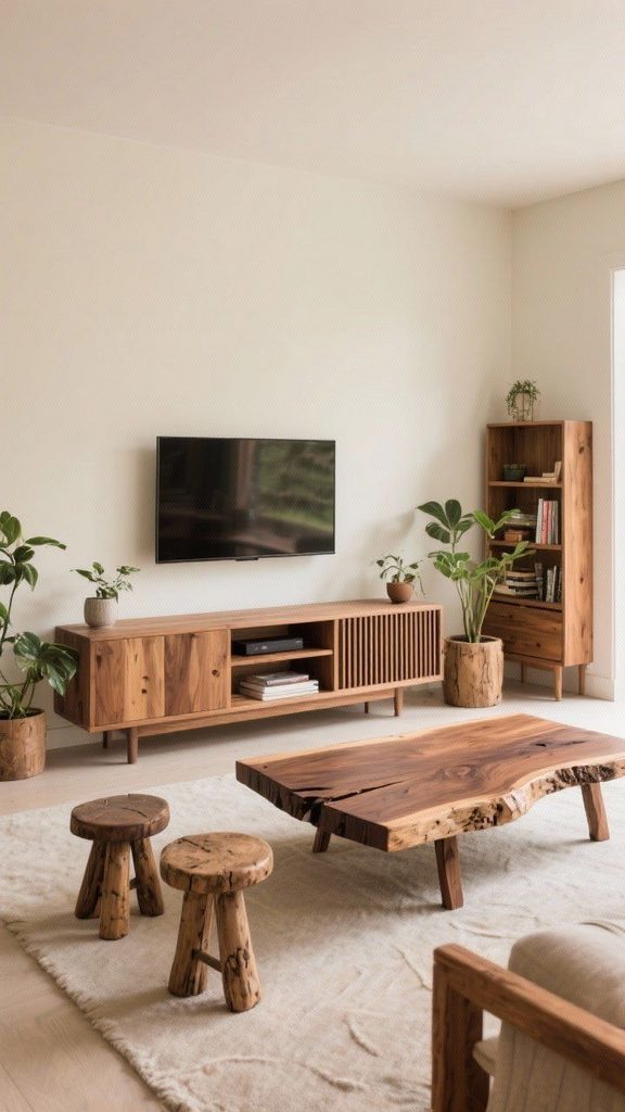
    This is such a simple upgrade but it makes a corner feel intentional instead of leftover.

    Practical tip: mount the shelf at 26 to 28 inches from the seat of the chair, roughly the same height as a side table.

    This idea fits cozy traditional and cottage-style rooms especially well, but a floating shelf in matte black also works for a more modern reading corner.

    Let’s shift gears and talk about symmetry versus asymmetry in shelf layouts.

    11. Try an Asymmetrical Shelf Cluster for a Modern Look

    Story Pin image
    Credit: IDYLL

    Not every shelf setup needs to be perfectly matched. An asymmetrical cluster, different lengths, different heights, slightly offset, creates a more artistic, modern feel compared to matching symmetrical shelves.

    This works best on a wall that doesn’t have a strict focal point like a fireplace or TV. Think of it as functional wall art.

    Practical tip: use odd numbers, three or five shelves, since odd groupings tend to look more natural to the eye than even ones.

    Modern, industrial, and eclectic homes love this approach. Traditional homes usually stick with symmetry, but you could try a subtle asymmetrical version with matching wood tones to keep it from feeling too chaotic.

    Now, let’s talk about a material choice that changes everything: floating shelves made from non-wood materials.

    12. Swap Wood for Glass Shelves in a Small Space

    Story Pin image
    Credit: Vikore Vana

    If your living room is small or dark, glass floating shelves can help it feel bigger and lighter. They reflect light instead of blocking it, which matters a lot in rooms with limited windows.

    Glass works especially well for displaying items you want to see fully, like colored glass vases or sculptural decor pieces.

    Practical tip: choose tempered glass shelves at least 3/8 inch thick for safety and durability.

    Modern and glam living rooms use glass shelves most often, but even a coastal room can use one glass shelf to display beach glass or shells for a light, airy touch.

    Let’s move into something practical now: shelves built specifically for storage instead of just display.

    13. Dedicate a Shelf Section to Hidden Storage Baskets

    Credit: PrincessHadrea

    Floating shelves don’t have to be all about pretty display. Use small woven baskets or fabric bins on one or two shelves to hide remote controls, chargers, or kids’ toys while still keeping an open-shelf look.

    This is a great middle ground between fully open shelving and a closed cabinet. You get storage without losing the airy feel floating shelves are known for.

    Practical tip: measure basket height before buying, leave at least an inch of clearance so baskets slide in and out easily.

    Farmhouse and boho rooms use woven baskets naturally, while modern rooms can use sleek fabric bins in solid neutral colors instead.

    Now for something a little different: using shelves to separate rooms instead of just decorating a wall.

    14. Use Floating Shelves as a Room Divider Feature

    Story Pin image
    Credit: Small Space Organize

    In open-concept homes, floating shelves can act as a soft divider between the living room and a dining or entry area. Mount them on a half-wall or even freestanding partition to create visual separation without a solid wall.

    This gives you storage and display space while still letting light and sightlines flow through the room.

    Practical tip: keep items below eye level on lower shelves so the divider doesn’t feel like a solid blocked wall.

    This works especially well in modern and industrial open floor plans where full walls would feel too heavy.

    Next, let’s talk about a fun seasonal use for floating shelves that a lot of people overlook.

    15. Rotate Seasonal Decor on a Dedicated Display Shelf

    Story Pin image
    credit: Delviora

    Pick one shelf, just one, and use it as your rotating seasonal spot. Swap out decor for fall, winter holidays, spring, and summer without redoing your whole living room every few months.

    This keeps your main decor stable while still letting you have fun with seasonal touches like pumpkins, string lights, or fresh flowers.

    Practical tip: keep a small bin in a closet with your seasonal shelf items pre-organized by season so swaps take five minutes, not an hour.

    Every home style can use this trick. It’s more about function than aesthetic, though the items you choose will naturally reflect your style.

    Finally, let’s end with a setup for people who want shelves that do double duty as a home bar.

    16. Turn a Shelf Set Into a Mini Home Bar Display

    credit: Apartment Therapy

    If you like entertaining, dedicate a small cluster of shelves to a mini bar setup, glasses, a few bottles, a small tray. This works especially well near a living room’s seating area so it’s easy to grab a drink during game night or a get-together.

    Add a small mirror behind the shelves to make bottles and glassware catch the light.

    Practical tip: use a shelf with a raised lip or non-slip liner so glasses don’t slide when the shelf gets bumped.

    Modern and glam living rooms lean into this with metallic accents, while traditional homes can do it with brass fixtures and cut glass.

    Tips for Success

    • Always find your studs before drilling, even for “lightweight” shelves, since decor adds up fast.
    • Stick to a weight limit chart for your specific shelf brand instead of guessing.
    • Leave breathing room between objects on a shelf. Cramming everything together makes it look cluttered, not curated.
    • Vary the height of objects on each shelf, tall candle next to a short stack of books, to keep the eye moving.
    • Use a stud finder AND a level every single time, don’t eyeball it.
    • Step back and view your shelf setup from across the room before committing to final placement.
    • Repaint or refinish old shelves instead of buying new ones if you’re on a budget, it saves money and still looks fresh.

    Common Mistakes and How to Avoid Them

    Hanging shelves too high above furniture
    : Keep shelves within 6 to 10 inches of the furniture below them so the eye reads them as connected, not floating randomly in space.

    Overloading shelves with too many small items
    : Group items in threes and leave at least a few inches of empty space on each shelf for breathing room.

    Ignoring weight limits
    : Check the manufacturer’s weight rating and always round down your estimate to stay safe, especially with books.

    Using the wrong anchor for your wall type
    : Drywall anchors work for light loads, but anything heavy needs to hit a wall stud or use heavy-duty toggle bolts.

    Making every shelf the exact same style of decor
    : Mix textures and shapes, wood, ceramic, glass, fabric, so the display doesn’t feel flat or one-note.

    Forgetting to plan cord management for TV shelves
    : Use cord covers or in-wall channels before hanging the TV, not after, since it’s much harder to fix later.

    Similar Variations

    • Floating Bookshelves: A version focused entirely on book storage, often deeper and reinforced for heavy loads.
    • Ledge Shelves: Shallow shelves designed for leaning frames and art instead of stacking objects.
    • Cube Floating Shelves: Boxed-in shelves that add depth and a more sculptural, geometric look.
    • Corner Floating Shelves: Angled shelves built specifically to fit unused corner spaces.
    • Industrial Pipe Shelves: Floating-style shelves supported by exposed metal pipe brackets for a raw, warehouse look.
    • Backlit Floating Shelves: Shelves with built-in LED strips for a glowing display effect at night.

    Floating shelves are honestly one of the easiest ways to change how a living room feels without a full renovation. Whether you go simple with one long shelf or get creative with a plant ladder or mini bar setup, the key is planning spacing, weight, and style before you start drilling. Once you find the combo that fits your space, you’ll wonder why you didn’t try 16 floating shelves living room ideas sooner.

  • 20 Organic Modern Living Room Ideas That Actually Feel Like Home

    20 Organic Modern Living Room Ideas That Actually Feel Like Home

    If you’ve been scrolling for hours trying to figure out how to pull off 20 Organic Modern Living Room ideas without your space looking like a furniture showroom, you’re in the right spot. I’ve spent way too many weekends testing this stuff in my own house, so I know what actually works and what just looks good in a photo.

    Organic modern living room design combines clean, minimal furniture lines with natural materials like wood, stone, and linen. The result is a space that feels calm, warm, and current without feeling cold or overly styled.

    Stick around, because I’m about to walk you through 20 real ideas, plus some mistakes I made so you don’t have to repeat them.

    What Is Organic Modern Style, Anyway?

    Okay, so here’s the deal. Organic modern is basically what happens when minimalism and nature have a baby. You get the simple shapes and clutter-free feel of modern design, mixed with earthy textures and colors that make a room feel lived in instead of sterile. Think raw wood coffee tables, linen sofas, and lots of curves instead of harsh angles.

    I love this style because it doesn’t feel trendy in a way that’ll look dated in five years. It feels timeless. Natural. Like your house is breathing instead of just sitting there looking pretty.

    Now let’s get into the good stuff.

    1. Choose a Neutral Base Palette First

    Credit: My Style Trends

    Before you buy a single throw pillow, pick your wall color and main furniture tones. Organic modern rooms lean heavily on warm neutrals like greige, oatmeal, sand, and soft white. These colors act like a blank canvas that lets your natural materials do the talking.

    Practical tip: paint a large sample swatch on your wall and check it at different times of day before committing.

    This works in almost any home style, from farmhouse to coastal, because neutral walls never fight with your furniture choices.

    Once your palette is locked in, it’s time to think about the furniture that’ll sit on top of it.

    2. Pick a Low-Profile Sofa With Curved Arms

    Story Pin image
    Credit: HadrianaNg

    Organic modern furniture usually sits lower to the ground and avoids sharp corners. A sofa with soft, rolled arms and a boucle or linen cover instantly signals this style. Skip the tufted leather stuff. It’s too formal for this vibe.

    Cover: heavy linen or boucle in oatmeal, sand, or sage
    Shape: rounded arms, low back, block or tapered wood legs

    Tip: measure your room width and leave at least 30 inches of walking space around the sofa so it doesn’t feel cramped.

    Traditional homes can soften this look with a slightly higher back, while coastal spaces might add a slipcover in white or light blue.

    Next up, let’s talk about what goes under that sofa.

    3. Layer a Chunky Jute or Wool Rug

    Credit: Rugs

    A good rug grounds the whole room. Organic modern spaces love natural fiber rugs like jute, sisal, or wool because they add texture without adding pattern overload. The weave itself becomes the design.

    Actionable tip: size your rug so all four legs of your sofa sit on it, not just the front two.

    Bohemian rooms can layer a smaller printed rug on top for extra personality, while modern farmhouse spaces might stick with a plain jute for simplicity.

    Now that your floor is sorted, let’s move up to the walls.

    4. Add Texture With Limewash or Venetian Plaster Walls

    Credit: Ivy Rose Decor

    Flat paint is fine, but if you really want that organic feel, try limewash paint or plaster finish on one accent wall. It creates a soft, cloudy texture that catches light differently throughout the day. It’s subtle but it makes a huge difference in person.

    Tip: hire a pro for plaster if you’ve never done it before. It’s not as forgiving as regular paint.

    This technique works beautifully in Mediterranean and Spanish-style homes too, not just modern ones.

    Speaking of walls, let’s talk about what you hang on them.

    Material Comparison for Organic Modern Accents

    MaterialBest UsePrice RangeMaintenance
    RattanChairs, lighting$$Low, dust occasionally
    LinenSofas, curtains$$Medium, needs steaming
    Solid OakTables, shelving$$$Low, oil yearly
    BoucleAccent chairs$$$Medium, spot clean only
    JuteRugs$Low, vacuum regularly
    Limewash PaintAccent walls$$Low, wipe gently

    5. Hang Woven Wall Art Instead of Framed Prints

    Story Pin image
    Credit: Neutral Home Studio

    Skip the typical framed canvas art for a bit. Woven wall hangings, macrame pieces, or textured fiber art fit the organic modern look way better. They add dimension without adding visual noise.

    Tip: choose one large piece instead of several small ones. It creates more impact and less clutter.

    Bohemian and coastal homes already love this trend, so it’s an easy crossover if you’re blending styles.

    Once your walls have texture, your lighting needs to match that same soft, natural energy.

    6. Use Warm, Layered Lighting Instead of One Overhead Fixture

    Credit: Learn California

    Nothing kills an organic modern vibe faster than one harsh overhead light. Instead, layer your lighting with floor lamps, table lamps, and maybe a statement pendant with a natural shade like rattan or linen.

    Tip: use bulbs rated around 2700K. Anything higher gets too clinical and blue-toned.

    Traditional and rustic homes can swap in wrought iron fixtures for the same layered effect with a different texture.

    Good lighting sets the mood, but furniture placement matters just as much.

    7. Float Your Furniture Away From the Walls

    Credit: Inspiration For Home

    A common mistake is pushing every piece of furniture against the wall. In organic modern design, floating your furniture, especially your sofa, creates a cozier, more intentional layout. It also helps define separate zones in an open floor plan.

    Tip: leave at least 14 to 18 inches between your coffee table and sofa for comfortable legroom.

    This trick works in small apartments too, not just big open living rooms.

    Now let’s fill that new open space with something natural and alive.

    8. Bring In Real Plants, Not Fake Ones

    Credit: lawson

    I know silk plants are tempting because they’re low maintenance, but real greenery is a huge part of what makes organic modern rooms feel, well, organic. Fiddle leaf figs, snake plants, and olive trees are popular choices because they’re sculptural and hardy.

    Tip: start with one or two low-maintenance plants like a pothos or snake plant if you’re not confident with plant care yet.

    Scandinavian and Japandi homes also lean on greenery to soften their minimal furniture choices.

    Once you’ve got some life in the room, think about how your coffee table ties everything together.

    9. Choose a Live Edge or Organic Shaped Coffee Table

    Story Pin image
    Credit: DecorFunky

    A coffee table with a live edge, curved silhouette, or raw wood grain becomes a natural focal point. It’s functional but also acts like a piece of art in the middle of your room.

    Tip: pair a wood table with metal legs if you want a slightly more industrial edge without losing the organic feel.

    Rustic and cabin-style homes already embrace this look, so it transitions easily if you’re renovating an older space.

    Speaking of focal points, let’s talk about your walls again, this time with shelving.

    10. Install Open Wood Shelving Instead of Closed Cabinets

    Story Pin image
    Credit: Dionisis Evangelatos

    Open shelves made from raw or lightly stained wood let you display books, ceramics, and woven baskets without hiding everything behind cabinet doors. It keeps the room feeling open and breathable.

    Tip: stick to the rule of three when styling shelves, group items in odd numbers for better visual balance.

    Mid-century modern homes use this same idea but usually with sleeker, more angular shelf brackets.

    Now that your storage looks good, let’s talk about softening things up with textiles.

    11. Mix Linen and Wool Throw Pillows in Varying Textures

    Story Pin image
    Credit: Restore Decor & More

    Instead of matching pillow sets, mix different natural textures like linen, wool, and boucle in similar tones. This creates depth without looking busy. Stick to two or three colors max so it doesn’t feel chaotic.

    Tip: choose pillow covers with removable zippers so you can wash them easily.

    Coastal homes might swap in a linen with subtle stripe patterns for a beachy twist.

    Once your pillows are sorted, don’t forget about the humble throw blanket.

    12. Drape a Chunky Knit Throw Over Your Sofa Arm

    Story Pin image
    Credit: Restore Decor & More

    A thick, cable-knit or waffle-weave throw adds instant warmth and texture. It’s a small detail, but it makes the whole room feel more inviting and less staged.

    Tip: fold it in thirds and drape it over one arm instead of balling it up, it looks more intentional.

    Farmhouse and cottage-style rooms use the exact same trick for that cozy, welcoming feel.

    Now let’s zoom out and talk about your window treatments.

    13. Hang Linen Curtains That Puddle Slightly at the Floor

    Credit: Home Decor Bliss Blog

    Skip heavy blackout curtains for your main living space if you can. Light, airy linen curtains let natural light filter through while still adding softness to your windows. Letting them puddle just an inch or two on the floor adds a relaxed, expensive-looking touch.

    Tip: hang your curtain rod about 4 to 6 inches above the window frame to make ceilings feel taller.

    Traditional homes can use the same puddle trick with heavier fabrics like velvet for a more formal look.

    Now let’s talk about pulling in some contrast with darker, richer materials.

    14. Add Black Metal Accents for Subtle Contrast

    Story Pin image
    Credit: 100XHub

    Organic modern doesn’t mean everything has to be beige and wood. Adding black metal accents, think window frames, lamp bases, or picture frames, creates contrast that keeps the room from feeling flat.

    Tip: repeat the black accent at least three times around the room so it feels intentional, not random.

    Industrial and modern farmhouse styles already use this trick heavily, so it’s an easy crossover.

    Let’s shift gears now and talk about stone and ceramic decor pieces.

    15. Style Your Shelves With Handmade Ceramics and Stone Bowls

    Story Pin image
    Credit: Home Finds Studio

    Skip the mass-produced decor pieces and look for handmade ceramic vases, stone bowls, or unglazed pottery. These pieces have slight imperfections that actually add to the organic feel. They look collected over time, not bought all at once.

    Tip: thrift stores and local pottery markets are goldmines for this kind of decor at a fraction of retail price.

    Japandi and minimalist homes use this same styling trick but usually stick to monochrome color palettes.

    Now let’s talk about a bigger structural element, your ceiling.

    16. Expose or Fake Wood Beams on the Ceiling

    Story Pin image
    Credit: Home Decor

    If your home already has exposed beams, lucky you. If not, faux wood beams are a popular way to bring that same organic warmth to a flat ceiling. They add architectural interest without needing a full renovation.

    Tip: choose beams in a lighter wood tone if your ceilings are under 9 feet, dark beams can make low ceilings feel heavier.

    Rustic and Mediterranean homes have used exposed beams for decades, so this idea has serious staying power.

    Budget Tiers for an Organic Modern Living Room Makeover

    Budget LevelWhat You Can DoEstimated Cost
    StarterNew throw pillows, a jute rug, plants$150 to $400
    Mid-RangeSofa reupholster, wood coffee table, lighting swap$800 to $2,500
    Full RoomNew sofa, plaster wall, custom shelving, rug$3,000 to $8,000+

    17. Choose Furniture With Visible Wood Grain

    Credit: Cozy Home Oasis

    Instead of painted or lacquered furniture, look for pieces that show off natural wood grain. Oak, walnut, and ash are popular because their grain patterns add texture even in a simple, unfussy design.

    Tip: ask for a wood sample before buying online so you can check the grain and tone in your actual lighting.

    Scandinavian design has built its whole identity around this idea, using pale woods like birch and ash almost exclusively.

    Let’s move on to something a lot of people forget about, your ceiling fan or vents.

    18. Swap Standard Ceiling Fixtures for Natural Fiber Shades

    Story Pin image
    credit: SerovaHome-USA

    A boring white ceiling fan or basic light fixture can throw off your whole design. Swapping in a fixture with a rattan, wood, or linen shade ties the ceiling into the rest of your room’s material palette.

    Tip: measure your ceiling height first, low ceilings need flush mount fixtures, not hanging pendants.

    Bohemian and coastal homes rely heavily on rattan pendant lighting for this exact reason.

    Now, let’s talk about one final furniture piece that often gets overlooked.

    19. Add an Accent Chair With a Sculptural Silhouette

    Story Pin image
    Credit: CHIC CART

    A single accent chair with an interesting shape, think curved backs or asymmetrical arms, can act as the artistic anchor of your room. It doesn’t need to match your sofa exactly. In fact, a little contrast makes the room feel more curated.

    Tip: choose a chair in a slightly bolder texture, like boucle or chunky wool, to make it stand out without adding color.

    Mid-century and eclectic homes both use statement chairs the same way, as a functional piece of art.

    Finally, let’s wrap things up with one last easy addition.

    20. Use Dried or Preserved Botanicals as Low-Maintenance Decor

    Credit: Bambrise

    If live plants aren’t your thing, dried pampas grass, preserved eucalyptus, or dried florals in a ceramic vase give you that same organic texture without any watering schedule. They last for months and add movement to an otherwise still room.

    Tip: fluff dried stems gently before placing them, they compress during shipping and need a little life shaken back into them.

    Boho and rustic homes have used dried botanicals for years, proving this trick never really goes out of style.

    Tips for Success

    • Start with your rug and sofa first, everything else builds around those two anchor pieces
    • Stick to a color palette of no more than four tones to avoid visual chaos
    • Buy one statement piece at a time instead of a whole room set at once, it looks more collected
    • Keep at least one plant in every seating area, even a small one makes a difference
    • Don’t ignore ceiling height when choosing furniture scale, tall rooms need bigger pieces
    • Shop secondhand for wood furniture, vintage pieces often have better grain and craftsmanship
    • Test paint and fabric samples in your actual room lighting before buying full amounts

    Common Mistakes and How to Avoid Them

    Overloading with too many textures at once
    : Pick three main textures max (wood, linen, jute, for example) and repeat them throughout the room instead of adding a new one everywhere you look.

    Choosing furniture that’s too glossy or reflective
    : Stick to matte finishes on wood and metal pieces, high shine breaks the calm, natural feel of the style.

    Forgetting a focal point
    : Every room needs one main thing to look at, whether it’s a fireplace, a large piece of art, or a statement chair. Without it, the room feels flat.

    Using cool-toned white paint
    : Cool whites clash with warm woods and neutrals. Stick to warm whites or soft off-whites instead.

    Skipping window treatments entirely
    : Bare windows feel unfinished. Even simple linen curtains add softness and complete the look.

    Buying matching furniture sets
    : Matching sets look showroom-staged. Mix pieces from different sources for a more collected, lived-in feel.

    Similar Variations

    • Japandi – blends Japanese minimalism with Scandinavian warmth, using darker woods and more negative space
    • Coastal Organic – adds light blues and whites to the natural material base for a beachier feel
    • Desert Modern – leans into terracotta tones, cacti, and sun-bleached wood finishes
    • Modern Farmhouse – combines organic modern textures with shiplap, black accents, and cozier, country touches
    • Wabi Sabi – celebrates imperfection even more heavily, using cracked pottery and raw, unfinished materials
    • Boho Organic – adds more pattern, color, and global-inspired textiles to the same natural material foundation

    Pulling off an organic modern look really just comes down to picking natural materials, keeping your color palette calm, and not being afraid to mix textures like wood, linen, and jute throughout the room. It’s less about following strict rules and more about layering things that feel warm and real. Once you start noticing how these small changes add up, you’ll see why so many people are obsessed with this style right now, and hopefully these 20 Organic Modern Living Room ideas gave you a clear starting point for your own space.

  • 17 TV Stand Decor Ideas That’ll Make Your Living Room Look Way More Put Together

    17 TV Stand Decor Ideas That’ll Make Your Living Room Look Way More Put Together

    I’ve spent way too many weekends staring at my own TV stand wondering why it looks so blah, so I put together this list of 17 TV stand decor ideas that actually work in real homes, not just magazine shoots.

    A TV stand is the furniture piece that holds and displays a television, often paired with shelves, drawers, or open cubbies for storage. Decorating it well means balancing function (cords, remotes, media boxes) with style (color, texture, height, and personal objects) so the area looks intentional instead of cluttered.

    Stick around, because by the end of this you’ll have more ideas than you’ll actually need, and that’s a good problem to have.

    Why Your TV Stand Deserves More Attention Than You’re Giving It

    Here’s the thing. Your TV stand is usually the biggest piece of furniture in your living room after the couch. It’s basically a stage. But most of us just plop the TV on top, toss the remote somewhere, and call it done.

    I get it. It’s easy to treat this spot as purely functional. But when you dress it up even a little, the whole room feels finished. It’s like putting on shoes with an outfit. You could skip it, but everything looks better when you don’t.

    The good news? You don’t need a designer’s budget or eye. You just need a few smart moves.

    1. Anchor the Space With a Statement Rug

    Credit: Restore Decor & More

    Putting a rug under your TV stand and seating area pulls the whole zone together. It gives your eyes a visual boundary, so the space feels like a “room” instead of furniture scattered on bare floor.

    Pick a rug with texture, like jute or a low pile wool, so it doesn’t compete with what’s happening on your shelves. Neutral tones work almost everywhere, but a patterned rug can add personality if your walls are plain.

    Tip: Make sure the rug extends at least a foot past the edges of your TV stand and sofa for a balanced look.

    This works in modern spaces with geometric patterns, or in coastal rooms with a sisal weave. Once your foundation is set, it’s time to think about what goes on top of the stand itself.

    2. Group Objects in Odd Numbers

    Story Pin image
    Credit: Restore Decor & More

    Designers swear by grouping decor in threes. It’s not a myth. Odd numbers just look more natural to the human eye than even, matchy pairs.

    Try a small plant, a stack of books, and one ceramic vase. Vary the heights so your eye moves around instead of stopping flat. This tiny trick instantly makes shelves look curated instead of thrown together.

    Actionable tip: If you only have two items, add a small candle or a little dish to make it three.

    Traditional homes might use brass candlesticks and leather books. Modern homes might swap in a matte black vase and a single sculptural object. Once you’ve got your groupings figured out, the next move is adding some life to the mix.

    3. Add a Real or Faux Plant for Life

    Credit: Oh Curiosity

    A little greenery next to your TV changes everything. It softens the hard lines of the screen and the furniture, and it adds a pop of color that photos and books can’t give you.

    Snake plants and pothos are nearly impossible to kill, so they’re great if you’re not naturally green-thumbed. If you’d rather skip the maintenance, a good faux fiddle leaf fig looks surprisingly real these days.

    Tip: Place the plant slightly to the side of the TV, never directly behind it, so the leaves don’t block the screen or cast weird shadows.

    Boho rooms love an oversized plant in a woven basket. Minimalist spaces do better with one small succulent in a plain white pot. Speaking of pots and vases, let’s talk about how to actually pick the right ones.

    4. Mix Vase Heights and Textures

    Story Pin image
    Credit: Restore Decor & More

    A single vase is fine. Three different vases at different heights is way more interesting. Think tall and skinny next to short and round. Add in different materials too, glass, ceramic, and maybe a woven basket-style vase.

    This creates visual rhythm without you having to think too hard about “design rules.” Your eye just naturally enjoys the variation.

    Tip: Stick to a two or three color max across all your vases so it still feels cohesive and not random.

    StyleVase Color PaletteMaterial Suggestion
    ModernWhite, black, tanMatte ceramic
    CoastalSea glass blue, sandy whiteFrosted or clear glass
    TraditionalCream, gold, burgundyPorcelain
    BohoTerracotta, rust, ivoryWoven or unglazed clay
    ScandinavianWhite, light gray, pale woodSmooth ceramic

    Once your vases are sorted, it helps to bring in something with a little shine.

    5. Bring in Metallic Accents for Contrast

    Story Pin image
    Credit: Patricia Williams

    A flat-screen TV is basically a big black rectangle. That’s a lot of one tone in one spot. Metallics break that up nicely. Think a brass tray, a silver photo frame, or a small gold sculpture.

    Metallics catch the light and add a bit of sparkle without being loud. They also tie in nicely if you’ve got metal lamp bases or picture frames elsewhere in the room.

    Tip: Pick one metal finish (brass, gold, silver, or black) and repeat it in at least two spots on your stand for consistency.

    Industrial and modern spaces lean toward black or brushed nickel. Traditional and glam spaces do better with warm gold or brass tones. Now let’s talk about something a lot of people forget: what’s happening on the wall above the stand.

    6. Layer in Wall Art Above the TV

    Story Pin image
    Credit: CharmyDecor

    I know what you’re thinking, won’t art compete with the TV? Not if you do it right. A piece of art hung slightly above and to the side, or a gallery wall that frames the TV like it’s just another “picture,” makes the whole wall feel designed instead of accidental.

    Choose art with colors that echo something else in the room, like your throw pillows or rug. That repetition ties everything together.

    Tip: Hang art so the TV feels like it’s part of a grouping, not the lone focal point fighting for attention.

    Modern homes go for abstract prints or black and white photography. Farmhouse styles love vintage-style signs or botanical prints. Once your walls are handled, let’s get into hiding those annoying cords.

    7. Hide Cords With Cable Boxes or Raceways

    Story Pin image
    Credit: Active Aesthetic

    Nothing kills a good TV stand vibe faster than a tangle of black cords hanging like spaghetti. A simple cord cover or a small decorative box can hide the mess completely.

    You can buy paintable cord raceways that match your wall color, or a woven basket that tucks cords out of sight while still letting you access them.

    Tip: Bundle cords with velcro straps before hiding them so they don’t tangle up again in a few weeks.

    This trick matters in every style of home, because messy cords ruin the look no matter how nice your decor is otherwise. Speaking of hiding things, let’s talk storage baskets next.

    8. Use Woven Baskets for Sneaky Storage

    Story Pin image
    Credit: Farmsteadra

    Baskets are the unsung hero of TV stand decor. They hide remotes, gaming controllers, and random cables while still looking intentional and pretty.

    Choose two or three baskets in slightly different sizes and tuck them into open shelving. They add texture too, which is great if your stand is a smooth material like glass or laminate.

    Tip: Label baskets on the inside lid or lip with a small tag so kids (or you) know what’s supposed to go where.

    Boho and coastal homes practically require baskets, they’re a signature texture. Modern homes can use sleek fabric bins instead for the same effect with cleaner lines.

    9. Stack Books Sideways and Upright

    Credit: Hearth & Petals

    Books aren’t just for the shelf. Stack a few sideways and let one lean upright against them. This creates a mini landscape of height changes that looks effortless, even though you totally planned it.

    Pick books with covers or spines in colors that match your room. If your books are all mismatched and loud, turn some of them backward so the pages face out for a calmer look.

    Tip: Top a stack of books with a small object like a stone or mini sculpture to finish the look.

    Book Stack StyleBest ForExtra Touch
    Color-coordinated stackModern, minimalistSmall geometric object on top
    Vintage leather-boundTraditionalBrass bookend
    Mixed heights, spines outEclectic, bohoSmall plant tucked beside
    All white or cream coversScandinavianSingle black accent piece

    Now that your books are working for you, let’s think about lighting.

    10. Add a Small Lamp for Warm Ambient Light

    Story Pin image
    Credit: Luma Studio

    A tiny table lamp on one side of your TV stand adds warmth that overhead lighting just can’t match. It’s especially nice for movie nights when you want soft light instead of a bright overhead glare.

    Go for a lamp with a warm bulb, not a cold white one. Warm light makes everything, including your decor, feel cozier.

    Tip: Put the lamp on a smart plug so you can turn it on with your phone without getting up from the couch.

    Traditional rooms love a ceramic lamp base with a fabric shade. Modern spaces do better with a slim metal or matte black lamp. Lighting sets the mood, but let’s not forget about balance and symmetry next.

    11. Balance the Stand With Symmetry (Or Break It on Purpose)

    Story Pin image
    Credit: Sofi Perillo

    You’ve got two choices here. Symmetrical decor, like matching lamps or matching plants on either side of the TV, feels calm and formal. Asymmetrical decor, like a tall plant on one side and a stack of low books on the other, feels more relaxed and lived-in.

    Neither is wrong. It depends on the vibe you want.

    Tip: If your room already has a lot of straight lines and structure, go asymmetrical on the stand to soften things up.

    Formal or traditional homes usually go symmetrical. Boho and eclectic homes almost always lean asymmetrical. Once you’ve picked your balance style, think about adding something with a story.

    12. Display a Meaningful Collection

    Story Pin image
    Credit: Restore Decor & More

    Whether it’s vintage cameras, small pottery pieces, or travel souvenirs, a small curated collection on your TV stand adds personality that store-bought decor just can’t fake.

    The trick is editing. Don’t put out fifteen shot glasses from every trip you’ve taken. Pick your five favorites and rotate the rest into storage.

    Tip: Group your collection on a tray so it reads as one intentional display instead of clutter.

    This idea genuinely works in any style home because it’s about you, not a design trend. Now, let’s talk about a design element people always forget: negative space.

    13. Leave Some Empty Space on Purpose

    Credit: CharmyDecor

    This might be the hardest tip to follow because it feels backwards. But empty space, what designers call negative space, makes everything else on your stand look more special.

    If every inch is packed with stuff, nothing stands out. Leave at least 20 to 30 percent of your surface totally clear.

    Tip: After you style your stand, step back ten feet and see if your eye has anywhere to “rest.” If not, remove one item.

    Minimalist and Scandinavian homes rely heavily on this. Even maximalist homes need pockets of breathing room so the eye doesn’t get overwhelmed. Next, let’s talk texture layering.

    14. Layer Textures Like Wood, Glass, and Fabric

    Story Pin image
    credit: P.S.decorates

    A TV stand made of one material with decor of one material looks flat. Mixing wood, glass, metal, and fabric adds depth that photographs (and real life) respond to.

    Try a wood stand, a glass vase, a woven basket, and a small fabric-covered box. Each texture catches light differently, which keeps the eye interested.

    Tip: If your TV stand is already busy in texture (like a heavily grained wood), keep your decor simpler in material to balance it out.

    Texture ComboVibe CreatedBest Home Style
    Wood + glass + metalClean, modernModern, industrial
    Wood + woven + ceramicWarm, earthyBoho, farmhouse
    Glass + marble + goldElegant, glamTraditional, glam
    Painted wood + linenSoft, casualCoastal, cottage

    Texture is a big deal, but color coordination matters just as much. Let’s get into that.

    15. Pick a Cohesive Color Story

    Credit: Oliver’s Finest Home Furniture

    Random colors scattered across your TV stand read as messy, even if each individual item is pretty. Pick two or three colors max and repeat them across your vases, books, art, and accessories.

    A simple trick is choosing colors already in your rug or throw pillows, so the stand feels connected to the rest of the room instead of its own separate zone.

    Tip: Use the 60-30-10 rule. Sixty percent one dominant color, thirty percent a secondary color, ten percent an accent pop.

    This rule works no matter your style, whether you’re doing moody dark tones or bright coastal whites. Once color is locked in, let’s talk about scale.

    16. Vary the Scale of Your Objects

    Credit: Aestora

    If everything on your TV stand is roughly the same size, it looks boring, even if the colors and textures are great. Mix big, medium, and small objects so your eye has levels to travel through.

    A tall plant, a medium stack of books, and a tiny dish of trinkets creates a visual staircase that feels balanced without being matchy.

    Tip: The tallest item should be no more than two-thirds the height of your TV screen, so it doesn’t compete for attention.

    Every style benefits from scale variation, it’s one of those universal design rules that just works. Last but not least, let’s talk seasonal swaps.

    17. Rotate Decor With the Seasons

    Story Pin image
    Credit: RABBIA BILAL

    Your TV stand doesn’t have to look the same all year. Swap in a few pinecones and warm candles for fall, then switch to fresh greenery and pastels for spring. It’s a small change that keeps your space feeling fresh without a full redecorating project.

    Keep a small bin of seasonal items so swapping takes five minutes, not an hour of searching.

    Tip: Change just two or three items each season rather than the whole display. It keeps things simple and still feels intentional.

    Coastal homes might rotate in shells for summer. Traditional homes might bring out richer colors for winter. However you approach it, seasonal swaps keep your TV stand from ever feeling stale.

    Tips for Success

    • Measure your TV stand’s surface before shopping so you don’t end up with decor that’s too big or too small for the space.
    • Use risers or small stands to add height variation without buying new furniture.
    • Keep a “decor box” in a closet with extra pieces you can rotate in when you want a refresh.
    • Dust and wipe down decor weekly, glass and ceramic show dust fast and it kills the clean look.
    • Take a photo of your finished stand and look at it later, it’s easier to spot what’s off in a picture than in person.
    • Don’t decorate directly in front of remote sensors or speaker vents on your TV or soundbar.

    Common Mistakes and How to Avoid Them

    Overcrowding the surface
    : Pack too many objects on the stand and it reads as clutter instead of style. Stick to small groupings with breathing room between them.

    Ignoring cord management
    : Visible tangled cords ruin an otherwise nice setup. Use cord covers, boxes, or baskets to hide them completely.

    Matching everything too perfectly
    : A stand where every item is the same color and shape feels stiff and fake. Mix textures and slightly different tones for a natural look.

    Placing decor that blocks the remote sensor
    : Tall decor items directly in front of the TV can block infrared signals. Keep a clear path between your remote and the sensor.

    Forgetting scale variation
    : Same-sized objects across the whole stand look flat and boring. Add at least one tall piece and one short piece to every grouping.

    Skipping the rug or floor treatment
    : A bare floor under the stand makes the whole setup feel unfinished. A rug or runner grounds the space visually.

    Similar Variations

    • Floating Media Wall Decor: Skip the stand entirely and mount the TV with floating shelves on either side for a sleek, minimal look.
    • Console Table Styling: Apply these same tricks to a console table in an entryway or behind a sofa.
    • Bookshelf Media Center Decor: For stands built into bookshelves, focus on filling vertical space with books and objects instead of just the horizontal surface.
    • Fireplace and TV Combo Decor: When your TV sits above or beside a fireplace, balance mantel decor with stand decor so neither area feels neglected.
    • Small Apartment TV Corner Styling: Scaled-down version of these ideas for tight spaces where every inch of the stand needs to multitask as storage.

    Decorating a TV stand isn’t about buying a bunch of new stuff. It’s about arranging what you already like in a smarter, more intentional way. Try even three or four of these ideas and I promise your living room will feel more finished by the weekend. That’s really the whole point behind these 17 TV stand decor ideas: small changes, big difference.

  • 23 Coffee Table Decor Ideas That’ll Make Your Living Room Look Pulled Together

    23 Coffee Table Decor Ideas That’ll Make Your Living Room Look Pulled Together

    If you’ve been searching for 23 coffee table decor ideas that actually work in real homes (not just magazine shoots), you’re in the right spot. I’ve spent way too many hours rearranging trays, books, and candles on my own coffee table, so I know what actually sticks and what just looks cluttered after a week.

    A coffee table is the small horizontal surface, usually placed in front of a sofa, used to display decorative objects and hold everyday items like drinks or remotes. Good coffee table decor balances function with visual interest through layering, varied heights, and a cohesive color story.

    Stick around, because I’m about to walk you through way more ideas than you’ll find in most articles, plus real tips on sizing, color, and mistakes to skip.

    What Makes Coffee Table Styling So Tricky (And Fun)

    Here’s the thing about coffee tables. They sit right in the middle of your living room, so everyone sees them. That means whatever you put there becomes a mini centerpiece for the whole room. But it’s also a working surface. People rest their feet on it, set down coffee mugs, and pile up remote controls.

    So the trick is finding that sweet spot between “looks nice” and “still usable.” I think of it like building a tiny stage. You want a few strong pieces, some breathing room, and nothing that’ll topple over when someone bumps the table. Once you get the rhythm down, it’s honestly kind of addictive to restyle.

    1. Stack Books by Color, Not Size

    Credit: Jane Jackson

    Grabbing three or four hardcover books and stacking them is the easiest coffee table trick out there. But most people stack by height. Try stacking by color instead. Group warm tones together, or go monochrome with all white or black spines.

    This creates a little pop of color that ties into your room’s palette. Top the stack with a small object like a stone coaster or a mini plant.

    Tip: Remove the paper dust jackets for a cleaner, more solid-color look.

    This works in almost any style. Modern homes look great with bold, graphic covers. Traditional spaces feel right with leather-bound classics.

    Once your books are stacked, you’ll want something to balance them out on the other side of the table.

    2. Add a Textured Tray to Corral Small Items

    Story Pin image
    Credit: Suite 101

    A tray does double duty. It keeps loose items like coasters or matchboxes from sliding around, and it visually “contains” a cluster of decor so the table doesn’t look messy.

    Go for a material that adds texture, like woven rattan, hammered brass, or marble. Fill it with two or three small objects, not ten.

    Practical tip: Measure your table first. A tray should take up no more than a third of the surface.

    Coastal homes love rattan trays. Industrial lofts do better with blackened metal. Either way, this step makes your next layer of decor look intentional instead of scattered.

    3. Bring In a Live Plant for Instant Freshness

    Story Pin image
    Credit: makecashly

    Nothing wakes up a coffee table like something green and alive. A small potted plant, like a succulent or pothos cutting in a simple pot, adds color and life without much upkeep.

    Choose a pot that matches your metal finishes elsewhere in the room. Brass pots pair with brass lamp bases. Ceramic works with almost anything.

    Tip: If you travel a lot or forget to water things, go with a faux plant that has realistic texture. Nobody will know unless they touch it.

    Boho and Scandinavian rooms practically require a plant on the table. Traditional rooms can use a small orchid instead for a more polished look.

    Next, let’s talk about height, because plants are usually your tallest element and everything else should build around them.

    4. Vary Your Heights Like You’re Building a Skyline

    Story Pin image
    credit: NESTORA

    This is the single biggest styling secret for any flat surface. If everything on your table sits at the same height, it looks flat and boring. Mix tall, medium, and short objects.

    A tall vase, a medium stack of books, and a low dish creates visual rhythm. Your eye moves around instead of getting stuck in one spot.

    Actionable tip: Use the “rule of three” heights. Pick one item at least 10 inches tall, one around 5-6 inches, and one under 3 inches.

    This principle works no matter your style, from farmhouse to mid-century modern. It’s really just about physics and how our eyes scan a room.

    Once your heights are sorted, you can start thinking about what story your objects are telling together.

    Height and Object Pairing Guide

    Height TierExample ObjectsTypical Size Range
    TallVase, small sculpture, tall candle10-16 inches
    MediumBook stack, small plant, decorative box5-9 inches
    ShortCoasters, trinket dish, matchbox1-4 inches

    5. Use a Sculptural Bowl for Catch-All Storage

    Credit: Old World Design

    A ceramic or wood bowl gives you a spot to toss keys, remotes, or that random hair tie without it looking like clutter. The trick is choosing a bowl with an interesting shape or texture, not just a plain dish.

    Look for organic curves, unusual glazes, or carved wood grain. This object should feel like art even when it’s empty.

    Tip: Keep the bowl mostly empty. One or two items inside looks curated. A pile looks messy.

    Mid-century modern homes love a walnut bowl with clean lines. Traditional spaces do well with a footed ceramic bowl in a muted glaze.

    Now that you’ve got storage covered, let’s add something that smells as good as it looks.

    6. Light Up the Table With a Simple Candle Duo

    Story Pin image
    Credit: Velora Living

    Two candles, different heights, same scent family. That’s it. Candles add warmth and a soft glow for evening hangouts, and they smell nice too.

    Choose a neutral scent like sandalwood or vanilla so it doesn’t clash with other scents in your home. Stick to matching holders or a shared tray so the pair feels connected.

    Practical tip: Trim wicks after every burn so the flame stays small and controlled looking.

    Coastal homes might go with driftwood-colored candles. Industrial spaces look sharp with black metal holders. Either way, candles bring softness that hard objects can’t.

    Speaking of texture, let’s talk about what’s underneath all these objects.

    7. Layer a Coffee Table Book as a Base Platform

    Credit: Kewnique

    Instead of just stacking books randomly, use one oversized coffee table book as a flat platform for other objects. Think of it like a mini pedestal.

    Set a small plant or candle right on top of the book’s cover. This creates that varied height we talked about earlier, and it uses the book as functional decor instead of just a stack.

    Tip: Choose a book with a spine color that complements your rug or throw pillows.

    This trick works beautifully in almost every style because it’s really just about proportion, not aesthetic.

    Now let’s zoom out and think about your table’s overall shape, because that changes everything.

    8. Match Your Decor Density to Your Table Shape

    Story Pin image
    Credit: Solia Avenue

    Round tables want decor grouped toward the center. Rectangular tables can handle a linear arrangement, like a runner-style layout down the middle. Square tables often look best with a symmetrical, four-corner approach or one bold centerpiece.

    Getting this wrong is why some styled tables feel off, even when the objects themselves are nice.

    Tip: Take a photo of your empty table from above. It’s way easier to plan layout on a photo than in person.

    Modern rooms tend to favor round or oval tables with minimal, centered decor. Traditional rooms often have rectangular tables that can support more layered groupings.

    Once you’ve nailed the shape logic, color becomes your next big decision.

    Coffee Table Shape and Styling Approach

    Table ShapeBest Layout StyleIdeal Number of Objects
    RoundCentered cluster3-4
    RectangularLinear runner4-6
    SquareSymmetrical corners4
    OvalLoose asymmetrical grouping3-5

    9. Pick a Two-Color Palette and Stick to It

    Credit: Bloom and Boughs

    Random colors scattered across a table feel chaotic. Instead, choose two main colors, maybe sage green and cream, or terracotta and charcoal, and let every object pull from that palette.

    This doesn’t mean everything matches exactly. It means everything feels related, like they belong to the same family.

    Tip: Pull your two colors from something already in the room, like a pillow or piece of art.

    Coastal homes often use blue and white. Boho spaces lean into terracotta and rust. Whatever you choose, consistency is what makes a table look designed instead of thrown together.

    Once your palette is locked in, texture is what keeps things from feeling flat.

    Popular Coffee Table Color Palettes

    Palette NamePrimary ColorsBest Style Match
    Coastal CalmNavy, white, sandy beigeCoastal, beach
    Earthy WarmthTerracotta, rust, creamBoho, Southwestern
    Modern NeutralBlack, white, grayMinimalist, modern
    Botanical FreshSage, forest green, natural woodScandinavian, Japandi

    10. Mix at Least Three Textures on Every Table

    Credit: Regina

    A table with only smooth, shiny objects feels cold. A table with only rough, matte objects feels heavy. Mix it up. Try glass, wood, and woven fiber together.

    For example, pair a glass vase with a wooden bowl and a small woven basket for coasters. The contrast is what makes each material stand out.

    Tip: If you’re not sure where to start, add one metal object, one natural fiber object, and one ceramic object. That combo almost always works.

    Farmhouse style leans on wood and cotton. Glam style leans on glass and metal. Either way, texture variety is non-negotiable for a table that doesn’t feel flat.

    Now let’s talk about something people forget entirely: scale relative to your sofa.

    11. Size Your Decor to Match Your Sofa’s Scale

    Story Pin image
    Credit: Jullys Place

    A tiny table with tiny decor in front of a giant sectional looks lost. A huge, chunky arrangement on a small table looks cramped. Your decor scale should relate to your seating.

    Big sectional, go slightly bigger with your centerpiece vase or bowl. Petite loveseat, keep objects smaller and more delicate.

    Tip: As a rule, your tallest decor item shouldn’t be taller than the arm height of your sofa.

    This rule holds true whether you’re doing modern minimalist or maximalist traditional. It’s proportion, not style, that matters here.

    Once scale feels right, let’s bring in something with a little personal history.

    12. Display One Meaningful Object as a Conversation Piece

    Story Pin image
    Credit: Aba Inspired

    Every table benefits from one item that has a story, maybe a small sculpture from a trip, a vintage box from your grandmother, or a piece of pottery you made yourself.

    This object doesn’t need to be expensive. It just needs to mean something. It’s usually what guests ask about first.

    Tip: Give this piece its own small space on the table. Don’t crowd it with other objects.

    Eclectic and boho homes thrive on this kind of personal touch. Even strict modern homes can include one meaningful item without breaking the clean aesthetic.

    Speaking of personal touches, let’s add something soft to the mix.

    13. Fold a Small Throw or Textile Runner Under Your Objects

    Story Pin image
    Credit: Restore Decor & More

    Laying a small textile, like a woven table runner or a folded scarf, under your decor grouping adds a layer of softness and color. It also helps visually anchor the objects so they don’t look randomly placed.

    Choose a fabric with texture, like linen or a light wool blend. Keep the pattern subtle so it doesn’t compete with your other decor.

    Tip: Fold the runner so it only covers about half the table length, leaving room for practical use.

    Boho and Scandinavian homes use this trick constantly. Traditional homes can use a lace or embroidered runner for a more formal feel.

    Let’s move from soft textures to something with a bit more shine.

    14. Add a Small Mirrored or Metallic Object for Light Bounce

    Story Pin image
    credit: Artify

    A small mirrored tray, brass dish, or glass sculpture reflects light around the room. This is especially useful in darker living rooms or ones without much natural light.

    Position this piece where it’ll catch light from a window or lamp. Even one reflective object makes the whole table feel brighter.

    Tip: Avoid placing mirrored objects directly under a bright overhead light, since the glare can be distracting.

    Glam and art deco spaces use this constantly. Modern farmhouse can use a single brass candle holder for the same effect without feeling too flashy.

    Now, let’s think seasonally, because coffee tables shouldn’t stay static all year.

    15. Rotate a Seasonal Element Every Few Months

    Story Pin image
    Credit: Maya Serr

    Swapping in small seasonal touches keeps your table feeling fresh without a full redesign. Think a small bowl of pinecones in winter, a bud vase with a single tulip in spring, or dried citrus slices in fall.

    This is the cheapest, easiest refresh you can do. It costs almost nothing and takes five minutes.

    Tip: Keep a small basket of seasonal items in a closet so you can swap them quickly.

    Every style benefits from this, since it’s more about timing than aesthetic. Even a strict minimalist table can handle one small seasonal accent.

    Let’s wrap up the main ideas with a few more that focus on function alongside form.

    16. Use a Stack of Coasters as a Design Element, Not an Afterthought

    Credit: Lizzy Designs Blog

    Instead of hiding your coasters in a drawer, stack four or five attractive ones right on the table. Choose a material like cork, marble, or leather that matches your other decor.

    This keeps them handy for guests and adds another small textural layer.

    Tip: Look for coasters with a lip or holder so they don’t slide apart when the table gets bumped.

    Modern homes like clean marble coasters. Rustic homes look better with wood-slice coasters.

    17. Keep One Zone Completely Empty for Actual Use

    26 Long Living Room Ideas With Zero Tolerance for Dead Zones and Empty Walkways
    Credit: Trendir

    This might be the most overlooked tip. Leave one corner or side of your table totally clear. This is where people set down drinks or rest their feet.

    Styled tables that use every inch look nice for photos but get frustrating fast in real life.

    Tip: Aim to keep at least a quarter of your table surface decor-free.

    This matters most in homes with kids or frequent guests, regardless of style.

    18. Add a Small Stack of Coffee Table Games

    41 Best Coffee Table Decor Ideas - How To Decorate a Coffee Table
    Credit: Elle Decor

    A small stack of card games or a compact puzzle box adds a playful, lived-in feel and doubles as entertainment for guests.

    Choose games with nice box design since they’ll be visible.

    Tip: Rotate games seasonally along with your other decor for variety.

    19. Use Dried or Preserved Botanicals Instead of Fresh Flowers

    Preserved botanical décor is taking off across Southeast Asia, and the latest trend shift is all about longevity with a premium, low-maintenance finish. At GiftsN, we're seeing more florists, hotels, and interior
    Credit: @giftsnsg

    Dried pampas grass, preserved eucalyptus, or dried lavender in a small vase gives you color and texture without the upkeep of fresh flowers.

    Tip: Fluff dried stems gently every few weeks to keep them looking full instead of flat.

    Boho and farmhouse styles use this constantly, but even modern spaces can use one clean stem in a simple vase.

    20. Incorporate a Small Framed Print Leaning Against Something

    How to Secure a Leaning Picture Frame | Hope Miriam Designs
    Credit: Hope Mirium

    A tiny framed print, leaned rather than hung, adds an art gallery feel right on your table. Lean it against a taller object like a stack of books.

    Tip: Choose a print with colors that echo your two-color palette from earlier.

    21. Add a Decorative Box for Hidden Storage

    19 Hidden Living Room Storage Ideas | Extra Space Storage
    Credit: Extra Space Storage

    A small lidded box, wood, lacquer, or woven, gives you a spot to hide remote controls or chargers while still looking decorative.

    Tip: Pick a box slightly larger than what you need to store, so the lid closes easily.

    22. Group Odd Numbers of Objects Together

    The Power of Odd Numbers: Why Styling in Threes and Fives Works - Design Hunter
    Credit: Design Hunter

    Groups of three or five just look more natural to the eye than groups of two or four. This is a basic design principle that applies to coffee tables perfectly.

    Tip: When in doubt, count your objects. Adjust to land on an odd number.

    23. Swap Your Centerpiece Seasonally With a Statement Vase

    How To Decorate With What You Have: 20 Smart Ideas That Work - StoneGable
    credit: StoneGable

    Keep one striking vase as your anchor piece, and change what’s inside it throughout the year, branches in fall, faux blooms in spring, dried grasses in winter.

    Tip: Choose a vase shape that works empty too, since there will be moments between swaps.

    This wraps up our full list, but let’s cover a few more things that’ll help everything come together.

    Tips for Success

    • Start with your largest object first, then build smaller pieces around it instead of adding big things last.
    • Step back and view your table from where you actually sit, not just from standing above it.
    • Keep a “decor drawer” nearby with backup items so refreshing your table takes minutes, not hours.
    • Don’t buy everything at once. Collect pieces over time so your table feels curated instead of matched from one store trip.
    • Dust and wipe down your table weekly, since busy surfaces show dust fast.
    • Test arrangements with your phone camera. Photos reveal imbalance that’s hard to see in person.

    Common Mistakes and How to Avoid Them

    Overcrowding the surface
    : Fix this by removing items until only three or four groupings remain, leaving clear space for actual use.

    Matching everything too perfectly
    : Fix this by choosing a shared color palette instead of identical pieces, so the table feels curated rather than store-bought as a set.

    Ignoring table shape when arranging decor
    : Fix this by grouping items toward the center for round tables and using a linear layout for rectangular ones.

    Skipping height variation
    : Fix this by always including one tall, one medium, and one short object in every grouping.

    Choosing decor that’s too fragile for daily life
    : Fix this by keeping delicate items toward the back or corners, away from where hands and feet naturally land.

    Forgetting to refresh seasonally
    : Fix this by setting a calendar reminder every few months to swap one or two small elements.

    Similar Variations

    • Coastal Coffee Table Styling: Leans on blues, whites, and natural fibers like rattan and jute.
    • Minimalist Coffee Table Styling: Uses only two or three objects total, focused on clean lines and negative space.
    • Boho Coffee Table Styling: Mixes warm earth tones, dried botanicals, and layered textures like macrame or woven trays.
    • Industrial Coffee Table Styling: Relies on blackened metal, concrete textures, and fewer soft or fabric elements.
    • Japandi Coffee Table Styling: Combines Japanese simplicity with Scandinavian warmth, using natural wood and muted tones.
    • Glam Coffee Table Styling: Focuses on mirrored surfaces, metallics, and a single luxurious statement piece like a marble tray.

    Styling a coffee table really comes down to balance. Mix heights, keep a tidy color story, leave room for real life, and swap things out when the seasons change. That’s the whole formula, and once you get the hang of it, it becomes second nature every time you walk past your living room. I hope this list of 23 Coffee Table Decor Ideas gave you enough inspiration and practical direction to finally make that table feel like it belongs in your home.

  • 15 Wood And Cream Kitchen Ideas for a Warm, Timeless Home

    15 Wood And Cream Kitchen Ideas for a Warm, Timeless Home

    15 Wood And Cream Kitchen ideas can help you create a space that feels warm, bright, and easy to live with. I’ll show you how to mix wood tones, cream finishes, lighting, hardware, and decor without making the room look flat or dated.

    A wood and cream kitchen combines natural wood surfaces with cream cabinets, walls, counters, or furnishings. The pairing creates a warm, balanced room that suits modern, traditional, farmhouse, coastal, and transitional homes.

    Keep reading for practical layouts, color combinations, material tips, and small details that make this kitchen style work beautifully.

    What Makes a Wood and Cream Kitchen Work?

    I love this kitchen style because it feels calm without looking plain. Cream adds softness and light, while wood brings texture and a natural sense of warmth. The two materials also give you plenty of room to change your decor later.

    The key is balance. Too much pale cream can make the kitchen feel washed out. Too much dark wood can make it feel heavy. I usually choose one main wood tone, one cream shade, and one small accent color. Black, brass, olive green, terracotta, and soft blue all work well.

    Before choosing finishes, look at your natural light, flooring, cabinet layout, and nearby rooms. A kitchen should feel connected to the rest of the home.

    1. Pair Cream Cabinets With a Warm Oak Island

    20 Cream Kitchen Cabinets That Feel Fresh and New
    Credit; TheSpruce

    Cream perimeter cabinets and a warm oak island create an inviting focal point. The cream cabinets keep the walls looking open, while the wood island adds contrast and gives the room a sturdy, furniture-like center.

    Choose oak with a clear or lightly tinted finish so the grain remains visible. For the cabinets, try a creamy white with a yellow, beige, or soft gray undertone. Avoid pairing a very cool white with orange-toned wood, since the contrast can feel accidental.

    Add simple stools with woven seats or leather cushions. A ceramic bowl, cutting board, and small vase can soften the island without cluttering it. If you have a small kitchen, use wood on the island front and countertop instead of the full island structure.

    This idea fits farmhouse and traditional homes, but slab cabinet doors can make it feel modern. Next, let’s look at a more dramatic way to use wood.

    2. Use Full-Height Wood Cabinets on One Wall

    14 Kitchen cabinet ideas that are both practical and stylish | Ideal Home
    Credit: IdealHome

    A full wall of wood cabinetry can make a kitchen feel rich and custom. It works especially well when the opposite cabinets, walls, or backsplash are cream. The wood wall can hold a refrigerator, pantry, oven, and small appliances, giving the room a clean visual line.

    Walnut creates a deeper, moodier look. White oak feels lighter and more casual. Rift-cut oak has a straighter grain that suits modern kitchens, while knotty oak works well in rustic spaces.

    To keep the wall from looking too solid, add open shelving, glass doors, or a cream range hood. Use one type of hardware throughout, such as aged brass or matte black pulls. Before ordering cabinetry, ask for a full door sample and view it in morning and evening light.

    This approach suits contemporary, mid-century, and rustic homes. If a full wood wall feels like too much, the next idea offers a smaller dose.

    3. Add a Wood Hood Over a Cream Range

    26 Wood Range Hood Ideas for Custom Kitchens - decorcabinets.com
    Credit: decorCabinets

    A wood range hood adds character without requiring many wood cabinets. Place it above a cream, white, or stainless steel range, then repeat the wood tone in shelves, stools, or a nearby island.

    The hood should feel connected to the room. If your floor is medium oak, match or closely relate the hood finish to it. If you use a contrasting wood, keep the rest of the room simple. A smooth plaster-style hood with a wood trim band can look elegant, while a paneled hood feels more traditional.

    Check the hood’s ventilation requirements before choosing its shape. Decorative details should never block proper airflow. I also recommend using a washable finish, especially if the hood sits over a frequently used cooktop.

    This idea adapts easily to farmhouse, English country, modern, and transitional kitchens. Once the main wood feature is in place, the right color palette will bring everything together.

    Wood and Cream Color Palette Guide

    Wood finishCream shadeAccent colorOverall effectBest home styles
    Light white oakWarm ivorySage greenAiry and relaxedScandinavian, coastal
    Natural oakSoft almond creamAged brassComfortable and classicTransitional, farmhouse
    Medium walnutPale linen creamCharcoal blackRich and tailoredModern, mid-century
    Honey oakButtercreamTerracottaSunny and welcomingRustic, Mediterranean
    Dark-stained oakMushroom creamAntique bronzeMoody and elegantTraditional, English country

    4. Choose Cream Quartz With Subtle Veining

    Cream Quartz Countertop | View Our Current Slab Inventory
    Credit: NovTileandStone

    Cream quartz countertops give you a practical surface while keeping the kitchen soft and warm. Look for backgrounds in ivory, biscuit, or light taupe rather than bright white. Gentle beige or gray veining can connect the counters to wood cabinets and flooring.

    Avoid choosing a pattern with too many large, sharp veins if your wood already has strong grain. The room may start to look busy. A quieter countertop lets the natural material stand out.

    For a small kitchen, use the same quartz on the counter and backsplash. This creates a continuous look and can make the room appear larger. Ask to see a large sample beside your cabinet door, since small samples often hide the full pattern.

    This countertop idea works in modern, farmhouse, and traditional rooms. With the surfaces selected, you can add texture through the backsplash.

    5. Install a Handmade-Look Cream Tile Backsplash

    25+ Cream Kitchen Backsplash ( SOFT & WARM ) - Backsplashes
    Credit: backsplash

    A handmade-look cream tile adds gentle texture behind the range and counters. Slight variations in shape, color, and glaze keep the wall from feeling flat. Choose rectangular tile for a calm look, square tile for a classic feel, or narrow zellige-style tile for more movement.

    Use cream grout when you want a blended appearance. A light beige grout gives the tile more definition and is often easier to maintain than bright white grout. For a budget-friendly update, tile only the main work wall and paint the remaining walls a washable warm cream.

    Before installation, lay several tiles together to check the color variation. Some tiles look subtle in a box but much stronger across a full wall.

    This backsplash suits coastal, cottage, farmhouse, and modern kitchens. Next, we’ll use lighting to show off the wood and cream contrast.

    6. Hang Woven Pendants Over the Island

    The heart of the home! 🤍 You can never go wrong with a natural light wood island paired with crisp white shaker cabinets., Question for the comments: Are you a fan of pendant lights over the island, ...
    Credit: Instagram

    Woven pendant lights bring a relaxed, natural layer to a wood and cream kitchen. Rattan, cane, seagrass, and paper cord all work well with pale cabinets and warm wood. Their open texture also casts gentle shadows across the ceiling and island.

    For an island, two or three smaller pendants usually look more balanced than one oversized fixture. Leave enough space between the lights and keep the bottom of the pendants high enough for clear sight lines. A dimmer switch helps you move from bright task lighting to a softer evening mood.

    Choose woven shades with a shape that suits your room. Round shades feel casual, while cone shapes look more tailored. Use warm bulbs around 2700K to keep cream finishes from appearing gray.

    This lighting choice fits coastal, boho, Scandinavian, and farmhouse interiors. Lighting helps, but the floor can make the strongest overall statement.

    Kitchen Lighting and Pendant Size Guide

    Island lengthRecommended pendant countTypical pendant widthSuggested spacing
    48 to 60 inches210 to 14 inches18 to 24 inches apart
    72 inches2 or 312 to 16 inches20 to 26 inches apart
    84 to 96 inches312 to 18 inches22 to 28 inches apart
    108 inches or longer3 to 414 to 20 inchesKeep equal spacing

    These are starting points, not strict rules. Always check the fixture’s installation instructions and the ceiling height.

    7. Continue Wood Flooring Into the Kitchen

    10 wooden kitchen floor ideas that are classic and demure | Ideal Home
    Credit; idealhome

    Wood flooring creates a smooth connection between the kitchen and nearby living spaces. It also makes cream cabinetry feel grounded. If you are installing new flooring, choose planks that work with the cabinet color but do not match it too perfectly.

    For example, pale oak cabinets can pair with medium natural oak floors. Cream cabinets can pair with warm walnut flooring. Matching every wood surface can make the room look like a showroom, so some contrast is helpful.

    Use a durable finish designed for busy areas. Place a washable runner near the sink and cooking zone to catch splashes. If real wood is not practical, quality wood-look porcelain tile can offer a similar appearance with different care needs.

    This flooring approach works across modern, traditional, and open-plan homes. Once the floor is set, a few painted details can add useful contrast.

    8. Paint the Lower Cabinets a Soft Mushroom Cream

    The Best Mushroom Paint Colors for Your Kitchen - The Interior Collective | White countertops with backsplash,
    Credit: Pinterest

    Mushroom cream sits between beige, gray, and ivory. It gives lower cabinets a grounded look while keeping the kitchen bright. Pair it with natural wood shelves, a wood island, or a butcher block work surface.

    This color is especially helpful in kitchens with strong sunlight. Very pale cream can look harsh in bright rooms, while mushroom cream stays softer. In darker rooms, choose a lighter shade with warm undertones.

    Test paint samples on several cabinet doors. Look at them in natural light and under your kitchen lighting. Use a durable cabinet enamel with a satin or semi-gloss finish for easier cleaning.

    Brushed brass hardware adds warmth, while black pulls create a sharper contrast. This look can feel modern with flat doors or traditional with shaker fronts. From here, let’s bring in seating that supports the same natural mood.

    Common Wood Options for Kitchen Details

    Wood typeVisual characterGood usesMaintenance notes
    White oakLight grain, pale tan colorCabinets, shelves, islandsSeal against water near sinks
    WalnutDeep brown, smooth grainIslands, accents, furnitureCan darken slightly over time
    MapleFine grain, light colorCabinets, cutting boardsTakes stains evenly
    AshOpen grain, pale neutral toneShelves, cabinet frontsNeeds a durable clear finish
    Reclaimed woodUneven color and marksShelves, beams, decorSeal carefully and check for pests
    TeakGolden brown and oilyStools, accents, small surfacesWipe spills quickly

    9. Add Cane or Woven-Seat Counter Stools

    Wood And Rattan Upholstered Arm Counter Stools(set of 2) - Bed Bath & Beyond - 44164234
    Credit: BedBath&beyond

    Cane and woven-seat stools add texture without introducing another strong color. Choose frames in oak, walnut, black, or painted cream. A wood frame will blend into the kitchen, while a black frame creates a clear outline against a pale island.

    Comfort matters more than appearance. Select counter-height stools for a standard counter and bar-height stools for a raised bar. Look for a footrest, a stable base, and enough space for knees. Backless stools save visual space, but stools with backs are usually better for long breakfasts and homework sessions.

    Keep the seat material practical. Tight cane, seagrass, and washable woven fabric are easier to live with than delicate open weave near food preparation.

    This idea works in coastal, boho, modern farmhouse, and classic kitchens. Seating adds comfort, and the next detail adds display space.

    10. Style Open Shelves With Cream Ceramics

    The Complete Guide to Design Cream Kitchen Cabinets | George Cabinetry
    Credit; GeorgeCabinetry

    Open wood shelves are a simple way to repeat the kitchen’s natural material. Fill them with cream plates, stoneware mugs, cutting boards, glass jars, and one or two plants. The mix feels collected instead of overly decorated.

    Use items in different heights, but do not fill every inch. Leave some open space so the shelves can breathe. I like grouping three objects together, then leaving a small gap before the next group. Put daily-use items within easy reach and keep fragile pieces higher up.

    Install shelves into wall studs or use proper anchors. Near the stove, remember that grease and dust will collect faster. A shelf farther from the cooktop may be easier to maintain.

    This concept suits Scandinavian, cottage, farmhouse, and modern interiors. For another way to add personality, use the wall behind the shelves as a color feature.

    11. Add a Muted Green or Blue Accent Wall

    Kitchen Accent Color Ideas That Go Beyond White and Gray
    Credit: KitchenCabinetKings

    Wood and cream do not need to stay neutral. A muted sage, dusty blue, olive, or gray-green wall can give the kitchen a gentle point of interest. These colors work because they echo nature and sit comfortably beside warm wood.

    Use the accent color on one wall, the pantry door, the island base, or the inside of glass-front cabinets. Keep the shade slightly gray or dusty if you want a calm appearance. Bright primary colors may overpower the soft materials.

    Test the paint next to your cream cabinet sample and countertop. Some greens turn yellow beside warm cream, while some blues can make cream look tan.

    This idea adapts to coastal, cottage, modern, and Mediterranean homes. A small color accent can set the mood, while the right hardware sharpens the design.

    Hardware Finish Comparison

    Hardware finishWorks best withMood createdCare level
    Aged brassWarm cream, oak, walnutSoft and classicShows some patina
    Polished brassIvory, marble-look quartzBright and decorativeNeeds regular polishing
    Matte blackPale cream, light oakCrisp and modernEasy daily care
    Brushed nickelGray cream, mapleQuiet and practicalResists visible fingerprints
    Oil-rubbed bronzeMushroom cream, dark woodTraditional and richCan show dust
    Antique pewterBeige cream, rustic woodCasual and timewornLow-key appearance

    12. Use a Wood Pantry Door as a Focal Point

    Wood Pantry Doors: Add Warmth and Rustic Charm to Your Kitchen
    Credit: DoorsPlusWindows

    A wood pantry door can add warmth without changing the entire kitchen. Choose a slab door for a modern room, a five-panel door for a traditional kitchen, or a simple glass-and-wood design for a farmhouse look.

    If the kitchen already has several wood tones, stain the door to match the most visible one. If not, let the door introduce a slightly darker tone and repeat it with a cutting board, frame, or stool legs.

    Use a strong hinge and a handle that feels comfortable in your hand. A pocket door can save space in a narrow kitchen, while a sliding barn-style door adds rustic character but needs wall clearance.

    This feature works in compact apartments as well as large open kitchens. Now let’s look at a practical surface that also acts as decor.

    13. Display a Thick Wood Cutting Board Collection

    7 Ways to Style Cutting Boards in the Kitchen
    Credit: betterhomes&gardens

    Large wood cutting boards can make a cream kitchen feel useful and lived in. Lean two or three boards against the backsplash or place them upright in a counter basket. Choose boards with different shapes, such as round, rectangular, and paddle styles.

    Keep the display away from direct heat and areas where raw meat is prepared. Use separate boards for cooking and decoration if you want to avoid frequent washing. Food-safe mineral oil helps protect active boards, but decorative boards may need a different care routine based on their finish.

    Do not crowd the counter. One small ceramic crock, a cutting board stack, and a plant may be enough.

    This detail fits rustic, farmhouse, modern, and traditional kitchens. Small accessories matter, and a simple runner can add another layer without taking up counter space.

    Useful Kitchen Runner Sizes

    Kitchen locationCommon runner sizeBest purpose
    In front of a single sink2 by 3 feetSmall splash and standing zone
    Along a standard counter2.5 by 6 feetDaily cooking comfort
    Galley kitchen walkway2.5 by 8 feetLong visual connection
    In front of a large island3 by 8 feetDefines the work area
    Beside an island with stools2.5 by 6 feetAdds softness without blocking stools

    Use a low-profile, washable rug with a nonslip pad. Make sure doors and drawers open freely above it.

    14. Layer a Neutral Runner With a Subtle Pattern

    The Best Kitchen Runner Rugs: Designs, Colours, Trends & More
    Credit: FCILondon

    A runner can make a wood and cream kitchen feel warmer and more finished. Choose a pattern in cream, tan, faded blue, olive, or charcoal. Small geometric designs work in modern spaces, while faded floral or Persian-inspired patterns suit traditional rooms.

    Avoid a rug that matches the cabinets exactly. A little contrast helps define the floor and keeps the room from blending into one pale block. Flatweave cotton, wool, and washable synthetic rugs are useful choices for busy kitchens.

    Place the runner where you stand most, such as along the sink or island. Add a nonslip pad and check that the edges stay flat. Clean spills quickly, especially on natural fibers.

    This idea works in nearly any home style. For the final design idea, we’ll use greenery to soften the hard surfaces.

    15. Bring in Greenery and Natural Decor

    30 Best Open Shelving Kitchen Ideas for Your Home
    Credit; ThePioneerWoman

    Plants make a cream and wood kitchen feel fresh. Try a small herb pot near a bright window, a trailing plant on an open shelf, or a taller plant in a woven basket at the edge of the room. Green leaves look natural beside oak, walnut, and creamy paint.

    Choose plants based on your light and routine. Rosemary, basil, and thyme need strong light and regular care. A pothos or snake plant may be easier for a busy household. Keep plants away from hot burners and avoid placing soil where it can spill into food preparation areas.

    Add other natural pieces, such as stone bowls, linen towels, ceramic vases, and rattan baskets. Use a few items with purpose rather than filling every surface.

    This finishing layer suits coastal, boho, farmhouse, Scandinavian, and modern kitchens. With the main elements chosen, these final tips will help you keep the design balanced.

    Tips for Success

    • Order large samples of cabinet, countertop, flooring, and backsplash materials before making final choices.
    • Compare wood tones in both daylight and artificial light.
    • Keep the undertones consistent. Warm cream usually works best with warm wood.
    • Repeat each major material at least twice so it feels intentional.
    • Use dimmable lighting with warm bulbs for a softer evening atmosphere.
    • Choose washable rugs and easy-care finishes for busy cooking zones.
    • Leave clear work paths around the island, sink, refrigerator, and range.

    Common Mistakes and How to Avoid Them

    Using too many wood tones
    Choose one main wood and one supporting wood. If you use a third, keep it limited to a small accessory.

    Picking a bright white beside warm cream
    Compare both colors in the same light. Choose creams with related undertones so the difference looks planned.

    Making every surface beige
    Add contrast through black hardware, green paint, darker wood, patterned rugs, or aged metal.

    Ignoring countertop patterns
    Strong veining can compete with noticeable wood grain. Pair bold grain with quieter counters.

    Installing open shelves without considering grease
    Place shelves away from the range when possible. Store washable or frequently used items on them.

    Choosing style over comfort
    Test stools, check lighting glare, and protect standing areas with a supportive runner. A kitchen should be easy to use every day.

    Similar Variations

    • Modern Organic Kitchen: Combines light wood, creamy slab cabinets, simple lighting, and soft natural textures.
    • Warm Scandinavian Kitchen: Uses pale oak, off-white surfaces, clean lines, and minimal decoration.
    • Modern Farmhouse Kitchen: Blends cream shaker cabinets, a wood island, black hardware, and practical vintage accents.
    • Coastal Wood and Cream Kitchen: Adds pale blue, woven lighting, light oak, and relaxed linen details.
    • English Country Kitchen: Uses mushroom cream, painted wood, aged brass, open shelves, and traditional patterns.
    • Desert-Inspired Kitchen: Pairs warm cream and wood with terracotta, clay pottery, woven baskets, and muted olive.

    The best wood and cream kitchen is not the one with the most expensive finishes. It is the one with a clear balance of light, texture, warmth, and practical choices. Start with your cabinet and wood tones, then add lighting, hardware, textiles, and personal pieces slowly.

    When the materials support one another, the room feels welcoming from the first step inside, and these 15 Wood And Cream Kitchen ideas give you a strong place to begin.

  • 23 Popular Kitchen Cabinet Colors

    23 Popular Kitchen Cabinet Colors

    23 Popular Kitchen Cabinet Colors can help you narrow down a renovation choice without guessing how each shade will look at home. I’ll walk you through the best options, where they work, and how to pair them with floors, counters, hardware, and wall colors.

    The most popular kitchen cabinet colors include white, cream, light gray, charcoal, black, navy, blue-gray, sage, olive, forest green, mint, pale blue, teal, greige, beige, taupe, natural oak, walnut, espresso, terracotta, yellow, blush, and two-tone combinations. The best choice depends on light, room size, style, and countertop color.

    Keep reading, because the right cabinet shade can change the whole mood of your kitchen. I’ll also share simple pairing tips that make the final decision easier.

    Understanding Kitchen Cabinet Color Choices

    Choosing a cabinet color is about more than picking a shade you like. Cabinets cover a large part of the room, so their color affects how big, bright, warm, or modern the kitchen feels.

    I always look at three things first: natural light, countertop tone, and the finish of nearby furniture. A small kitchen may benefit from pale colors, while a large room can handle deep green or black. Wood cabinets bring texture, painted cabinets create a cleaner block of color, and two-tone designs add contrast without making the room feel busy.

    Before you choose, order samples. Look at them in morning light, afternoon light, and under your kitchen bulbs. A color that looks soft in a store may look much darker at home.

    1. Crisp White Cabinets for a Bright, Clean Kitchen

    29 Trendy Kitchen Cabinet Colors for Every Style
    Credit: pinterest

    White cabinets remain popular because they make a kitchen look fresh and open. They reflect light well, which is helpful in a small room or a kitchen with limited windows. Bright white works nicely with marble-look quartz, stainless steel appliances, and chrome or black hardware.

    For furniture, choose warm wood stools or a simple dining table so the room does not feel too cold. Add color through rugs, dishware, plants, or upholstered seating. If you prefer a softer look, select a warm white with a cream or beige undertone instead of a sharp blue-white.

    Use a satin or semi-gloss finish for easier cleaning, but test the sheen before ordering. White cabinets suit modern, farmhouse, Scandinavian, coastal, and traditional homes. Once you decide between cool and warm white, cream offers another gentle option.

    2. Soft Cream Cabinets for a Welcoming Feel

    Best Cream Color for Kitchen Cabinets: Top Cabinet Paint Colors
    Credit: Southwestkitchen

    Cream cabinets add warmth without becoming heavy. They are a good choice if you like the brightness of white but want a softer, more lived-in look. Cream pairs beautifully with butcher block counters, warm quartz, brass pulls, and natural wood floors.

    I like cream in kitchens with older homes because it feels timeless rather than overly new. Add woven baskets, linen window shades, or a wood island to support the relaxed color scheme. Be careful with yellow-heavy cream, especially under warm light. It can look dated or overly golden.

    A practical tip is to compare the cabinet sample beside your backsplash. Cream can clash with blue-white tile, while it blends easily with ivory, tan, beige, and warm gray. This shade works in cottage, traditional, farmhouse, Mediterranean, and transitional kitchens. If cream feels too warm, light gray gives you a cooler alternative.

    3. Pale Gray Cabinets for Calm Contrast

    35 grey kitchen ideas for cabinets, worktops and walls | Ideal Home
    Credit: idealhome

    Pale gray cabinets create a quiet, balanced background. They are less stark than white and usually feel more modern than beige. Pair them with white quartz, light oak floors, brushed nickel hardware, and a simple subway tile backsplash.

    In a gray kitchen, I like adding one warmer element. Try a walnut cutting board, rattan counter stools, or a wood dining table. Without that contrast, the space may feel flat, particularly if the floor and walls are also gray.

    Check the undertone before buying. Blue-gray paint can look crisp in bright daylight but icy at night. Greige-gray shades work better in rooms with warm bulbs. Pale gray adapts well to modern, industrial, coastal, and transitional styles. If you want more drama while keeping the same neutral family, medium gray is the next step.

    4. Medium Gray Cabinets for Balanced Drama

    Grey Kitchen Cabinets Ideas | OPPEIN
    Credit: OPPEIN

    Medium gray cabinets are strong enough to define the kitchen but still easy to live with. They work especially well on a large island, where a deeper color can anchor the room without darkening every wall.

    Pair them with white upper cabinets, pale counters, or a light backsplash. Wood shelves and brass hardware add warmth, while matte black fixtures create a sharper modern look. For furniture, choose natural wood or upholstered stools in oatmeal, tan, or muted blue.

    Use medium gray when you want a noticeable color that will not overpower the room. It looks best when the kitchen has good natural light or lighter flooring. In traditional spaces, choose a warm gray with raised-panel doors. In contemporary rooms, flat-front doors keep the shade sleek. From here, charcoal cabinets bring an even moodier effect.

    Cabinet Color and Light Guide

    Kitchen conditionColors that usually work wellColors to use carefullyHelpful pairing
    Small kitchen with little daylightWhite, cream, pale gray, pale blueBlack, espresso, forest greenLight counters and reflective backsplash
    Large kitchen with strong daylightNavy, charcoal, olive, walnutVery bright white if glare is an issueMatte hardware and warm wood
    Warm southern exposureBlue-gray, sage, soft whiteYellow beige, orange-brownCool stone and brushed nickel
    Cool northern exposureCream, greige, taupe, walnutIcy white, blue-grayBrass, wood, warm lighting
    Open-plan kitchenGreige, natural oak, navy islandHigh-contrast red or bright yellowColors repeated in nearby furniture

    5. Charcoal Cabinets for a Moody Modern Look

    19 Moody and Dramatic Dark Kitchen Cabinet Ideas
    Credit: thespruce

    Charcoal cabinets offer the depth of black without feeling quite as severe. They look polished with white countertops, pale wood flooring, and simple hardware. A charcoal island can also add contrast to an otherwise light kitchen.

    I recommend this color for kitchens with plenty of daylight or strong overhead lighting. In a dark room, use charcoal on the lower cabinets and choose white or light wood above. This keeps the room grounded without making it feel closed in.

    For decoration, add glass doors, open shelving, or a light runner to break up the darker surfaces. Brass handles create a warm, classic touch, while black hardware gives a seamless look. Charcoal works in modern, industrial, transitional, and farmhouse kitchens. If you want the boldest possible neutral, black cabinets make a stronger statement.

    6. Matte Black Cabinets for Strong Contrast

    13 Sophisticated Black Kitchen Cabinet Ideas - Cupboard Ideas
    Credit: ELLEdecor

    Matte black cabinets are dramatic, stylish, and surprisingly flexible. They can make pale counters and light walls stand out while giving the kitchen a tailored appearance. Black works well with white marble-look quartz, concrete counters, oak floors, and warm metal hardware.

    I would not use black on every surface in a small, poorly lit room unless you want a very moody design. Instead, try black base cabinets with white uppers or a black island with natural wood perimeter cabinets. Matte finishes hide some fingerprints, though they still need regular cleaning.

    Add softer elements such as woven stools, plants, wood shelves, or cream-colored textiles. These details keep the room from feeling severe. Black cabinets fit modern, industrial, minimalist, and even traditional kitchens when paired with classic door panels. If you like dark color but want a little more personality, navy is worth considering.

    7. Navy Blue Cabinets for Classic Color

    18 navy kitchen ideas to show how to use this stylish shade | Ideal Home
    Credit; Idealhome

    Navy cabinets bring color while remaining easy to coordinate. The deep blue looks especially attractive with white counters, brass hardware, and warm wood accents. It also works well with light blue or patterned tile when you want a layered color scheme.

    Navy is a smart choice for an island because it creates a focal point without requiring the whole kitchen to be painted. For furniture, use counter stools in tan leather, woven cane, or white-painted wood. Avoid using too many other dark colors, or the room may feel heavy.

    Look at the sample in both sunlight and evening light. Some navy paints turn nearly black at night. In a coastal home, pair navy with white and pale oak. In a traditional kitchen, use framed doors and aged brass. In a modern kitchen, choose slab doors and simple pulls. Blue-gray offers a softer, less formal version of this idea.

    8. Blue-Gray Cabinets for a Relaxed, Airy Room

    Best Blue Gray Kitchen Cabinet Colors | A Blissful Nest
    Credit: ablissfulnest

    Blue-gray cabinets combine the calm feel of blue with the neutrality of gray. The result is restful and easy on the eyes. This shade pairs well with white tile, light counters, nickel hardware, and medium-toned wood floors.

    I especially like blue-gray in kitchens that need color but cannot handle something too intense. Add a cream runner or natural fiber pendant to warm it up. If your counters have strong beige or yellow tones, choose a blue-gray with a little green in it so the colors do not fight.

    Use blue-gray on all the cabinets for a quiet look, or place it on the island for a more subtle update. It suits coastal, cottage, Scandinavian, transitional, and modern homes. A deeper blue with green undertones gives the kitchen a richer, more earthy direction.

    Useful Cabinet Color Pairings

    Cabinet colorCountertop pairingBacksplash pairingHardwareBest accent material
    WhiteCarrara-look quartzWhite subway tileBrass or blackWalnut
    CreamWarm quartz or butcher blockIvory zellige tileAged brassOak
    Pale grayWhite quartzSoft gray ceramicNickelRattan
    NavyWhite marble-look quartzGlossy white tileBrassTan leather
    SageCream quartzHandmade ivory tileAged brassNatural stone
    BlackWhite quartz or concreteWhite, gray, or zellige tileBrass or blackLight oak
    Natural oakSoapstone or white quartzPale green tileBlackLinen

    9. Sage Green Cabinets for Natural Warmth

    Sage green cabinets and warm wood. 🤎🌿 Love the color or too much green? 📸 @royaie_aram_decorative
    Credit: Instagram

    Sage green has become a favorite because it feels colorful but quiet. It brings an outdoor quality into the kitchen without the intensity of emerald or bright lime. Sage looks lovely with cream counters, oak floors, aged brass, and handmade tile.

    I suggest using sage when you want a room that feels relaxed and welcoming. Add a wood island, woven pendant lights, and simple ceramic dishes. For furniture, choose stools in natural cane or warm beige fabric.

    Check the undertone carefully. Some sage shades lean gray, while others lean yellow. The right choice depends on your lighting and flooring. A gray sage suits modern rooms, while a warmer sage fits cottage or farmhouse spaces. It also works in English country, Scandinavian, and transitional homes. Olive green offers a deeper, earthier take on this natural palette.

    10. Olive Green Cabinets for an Earthy Statement

    The Best Olive Green Kitchen Cabinet Ideas and Home Trends
    Credit: decorcabinets

    Olive green cabinets add personality without feeling loud. This muted green pairs beautifully with creamy white, natural stone, terracotta accessories, and dark wood. It is a strong choice for someone who wants color but does not want a bright or trendy look.

    Use olive on the lower cabinets or island if painting the whole kitchen feels like too much. Brass hardware brings out its warmth, while black hardware makes it look more contemporary. Add an oversized cutting board, pottery, or a woven runner to reinforce the organic mood.

    Olive may look muddy in a room with very little light, so test a large sample first. It works well in Mediterranean, modern rustic, traditional, and eclectic homes. Forest green takes this idea further with more depth and a richer jewel-tone effect.

    11. Forest Green Cabinets for Rich Depth

    37 Green Kitchen Cabinet Ideas for a Fresh Start in 2025
    Credit: ELLEdecor

    Forest green cabinets create a bold but grounded kitchen. The color looks striking with pale counters, warm wood, unlacquered brass, and cream walls. It can make a large kitchen feel cozier and give a small island a strong focal point.

    I recommend forest green when the room has good light and enough visual balance. If the cabinets are dark, use a light backsplash and avoid very dark flooring. Glass-front doors or open shelves can also prevent the design from feeling dense.

    For a traditional look, use raised-panel doors and brass knobs. For a modern room, select flat fronts and slim pulls. Forest green suits English country, craftsman, traditional, modern rustic, and eclectic kitchens. If you want something lighter and fresher, mint green brings a softer contrast.

    12. Mint Green Cabinets for a Fresh Vintage Feel

    Light Green Kitchen Cabinet Ideas
    Credit: sweeten

    Mint green cabinets create a cheerful kitchen with a gentle retro touch. The color works best when balanced with warm white, pale wood, cream counters, and simple chrome or brass hardware. It can make the room feel brighter without relying on plain white.

    Mint is especially useful in a breakfast nook, small galley kitchen, or lower cabinet run. Pair it with a white farmhouse table, woven chairs, or painted wood furniture. Keep the backsplash simple so the cabinet color stays in focus.

    Some mint paints look too blue under cool bulbs, so compare samples beside your flooring and lighting. This color works in cottage, vintage, coastal, Scandinavian, and playful modern homes. Pale blue offers a similarly light feeling but with a cooler, more classic character.

    Finish Comparison for Painted Cabinets

    FinishVisual effectCleaning notesBest style match
    MatteSoft, modern, low glareShows some grease; wipe gentlyMinimalist, modern
    SatinMild glow and versatile lookEasier to clean than matteTransitional, family kitchens
    Semi-glossNoticeable shine and strong contrastEasy to wipeTraditional, utility-focused
    High-glossReflective and boldShows smudges and surface flawsContemporary, sleek
    DistressedAged, casual characterTexture can collect dustFarmhouse, cottage
    Natural wood finishShows grain and warmthDepends on protective coatingRustic, Scandinavian, organic modern

    13. Pale Blue Cabinets for Coastal Calm

    Blue kitchen ideas: 10 ways to brighten kitchens with blue | Ideal Home
    Credit: IdealHome

    Pale blue cabinets make a kitchen feel open, relaxed, and airy. They pair naturally with white walls, light oak, marble-look counters, and polished nickel hardware. The color is gentle enough for all the cabinets but also looks lovely on an island.

    To keep the room from looking too themed, skip excessive nautical decorations. Instead, use linen curtains, woven stools, ceramic vases, and a simple striped runner. Choose a dusty blue if you want a more grown-up look, or a brighter powder blue for a cottage kitchen.

    Pale blue works well in coastal, farmhouse, cottage, Scandinavian, and traditional homes. It is also helpful in rooms that need color without visual weight. Teal cabinets create a more saturated and energetic version of blue.

    14. Teal Cabinets for Colorful Character

    5 New Kitchens With Bold, Beautiful Cabinet Colors
    Credit: Houzz

    Teal cabinets combine blue and green for a rich, memorable look. They work best as an island color, a lower cabinet shade, or a feature wall in an otherwise neutral kitchen. White counters and warm wood help keep teal from becoming overwhelming.

    I like teal with brushed brass, matte black, or simple chrome hardware. Use furniture in tan leather, natural oak, or cream fabric to balance the saturated color. Keep other decorative pieces fairly quiet. Too many competing colors can make the kitchen feel restless.

    Teal suits eclectic, modern, mid-century, coastal, and vintage homes. A darker teal can feel elegant, while a lighter teal has a playful quality. If you want a neutral with similar warmth, greige is a reliable next option.

    15. Greige Cabinets for Easy Versatility

    20 Gorgeous Greige Kitchen Cabinets
    Credit: TheSpruce

    Greige blends gray and beige, giving you a neutral that feels both warm and current. It is one of the easiest cabinet colors to pair because it works with white, cream, tan, wood, black, and muted blue.

    Use greige when your kitchen connects to a living or dining room and you need a shade that flows between spaces. Pair it with quartz counters, oak flooring, black window frames, or aged brass fixtures. For furniture, choose a wood table or upholstered stools in oatmeal.

    Greige can look different from room to room. Test it against your backsplash because some versions lean pink, green, or yellow. It suits transitional, modern farmhouse, contemporary, and traditional kitchens. Beige cabinets create an even warmer and softer neutral scheme.

    Cabinet Color Planning by Room Size

    Room size or layoutRecommended cabinet approachCounter and wall suggestionFurniture suggestion
    Small galley kitchenWhite, cream, pale blue, light greigeLight counter and same-color wallsSlim stools, glass pendants
    Medium L-shaped kitchenSage, pale gray, navy islandWhite backsplash with wood accentsTwo-tone wood and painted seating
    Large open kitchenForest green, charcoal, walnut, oliveLight counter to balance depthOversized island stools
    Kitchen with low ceilingsLight upper cabinets, darker lowersVertical backsplash patternLow-profile furniture
    Open-plan kitchen and living roomGreige, oak, cream, soft grayRepeat living-room accent colorMatching wood tones nearby

    16. Beige Cabinets for a Soft, Timeless Base

    Best Beige Kitchen Cabinets | A Blissful Nest
    Credit: ABlissfulnest

    Beige cabinets feel warm, familiar, and easy to decorate around. They pair well with cream walls, limestone-look counters, oak floors, terracotta tile, and bronze hardware. This color is especially useful when you want a comfortable kitchen rather than a sharp, high-contrast one.

    Choose a beige with gray undertones if you prefer a modern look. A golden beige feels more traditional and works nicely with warm wood. Add contrast through black lighting, dark stools, or a patterned backsplash.

    I recommend avoiding beige cabinets with too many yellow accessories. Let the cabinets provide warmth, then add cooler accents such as muted blue dishes or gray textiles. Beige works in traditional, Mediterranean, farmhouse, transitional, and desert-inspired homes. Taupe offers more depth while keeping the same calm neutral feeling.

    17. Taupe Cabinets for Refined Warmth

    The Ultimate Guide to Using Warm Taupe Kitchen Cabinets | George Cabinetry
    Credit: georgecabinetry

    Taupe sits between gray, brown, and beige. It feels understated but has more character than a basic neutral. Taupe cabinets look attractive with creamy white counters, dark bronze hardware, natural stone, and medium-toned wood.

    This shade is a good bridge when your kitchen has both warm and cool features. For example, taupe can connect gray flooring with a walnut dining table. Choose upholstered stools in linen, leather, or textured beige for a polished but comfortable result.

    Taupe may look darker than expected in a room with limited daylight, so order a larger sample. It fits transitional, contemporary, traditional, rustic, and European-inspired kitchens. Natural oak cabinets introduce visible wood grain and a more organic feel.

    18. Natural Oak Cabinets for Texture and Light

    Natural Wood Kitchen Cabinets Design Guide for 2026 | OPPEIN
    Credit: OPPEIN

    Natural oak cabinets bring warmth, grain, and movement to the kitchen. Light oak is especially popular in Scandinavian, modern, and organic designs. It looks fresh with white counters, soft green tile, black pulls, and simple furniture.

    The grain means the cabinets already provide visual texture, so I would keep the backsplash fairly calm. Add linen shades, woven stools, ceramic dishes, or a stone pendant to support the natural mood. Avoid matching every wood item exactly. A little variation makes the room feel collected instead of staged.

    Choose a clear or lightly tinted finish if you want the pale wood to remain visible. Natural oak works in Scandinavian, modern farmhouse, coastal, minimalist, and organic modern kitchens. Walnut brings a darker, richer wood tone for rooms that need more contrast.

    Wood Cabinet Comparison

    Wood colorOverall moodBest counter pairingHardwareGood style matches
    Light oakAiry and naturalWhite quartzBlack or nickelScandinavian, coastal
    Honey oakWarm and familiarCream quartzBrass or bronzeTraditional, farmhouse
    WalnutRich and refinedWhite or soapstoneBrass or blackModern, mid-century
    EspressoDramatic and formalLight quartzSilver or brassContemporary, traditional
    Reclaimed woodRustic and texturedConcrete or stoneBlack ironIndustrial, rustic
    Painted woodClean and flexibleDepends on paint colorCoordinates with shadeNearly any style

    19. Walnut Cabinets for Rich Natural Contrast

    Walnut Kitchen Cabinets: Ideas and Design Tips for 2026 – Emily's Interiors, Inc
    Credit; emily’sinteriors

    Walnut cabinets add depth without the flat look of dark paint. Their natural grain creates interest, while the brown tone makes the kitchen feel warm and substantial. Pair walnut with white quartz, pale stone, cream walls, or muted green tile.

    I like using walnut on a full cabinet wall or island, then keeping the remaining finishes simple. Choose furniture in leather, black metal, or woven materials. Too many dark woods can make the kitchen feel heavy, so balance walnut with light flooring or a bright backsplash.

    A clear finish preserves the grain and lets the wood remain the star. Walnut works in mid-century modern, contemporary, organic modern, and transitional homes. Espresso cabinets provide a darker, more uniform look if you prefer painted-style depth.

    20. Espresso Cabinets for Traditional Drama

    Everything You Need to Know About Espresso Cabinets - CabinetCorp
    Credit: CabinetCorp.

    Espresso cabinets have a deep brown finish that feels formal, cozy, and classic. They pair well with cream counters, beige walls, bronze hardware, and warm tile. This color can make a large kitchen feel more intimate.

    Because espresso absorbs light, use it carefully in small rooms. A lighter backsplash, glass cabinet doors, and under-cabinet lighting help open up the design. Add furniture in cream fabric, medium wood, or tan leather to avoid a completely dark palette.

    Espresso suits traditional, Tuscan, transitional, and lodge-inspired kitchens. It is less flexible than walnut because it offers less visible grain, but it can create a very polished look. Terracotta cabinets are a more unusual option if you want warmth with a clear color statement.

    21. Terracotta Cabinets for Earthy Personality

    The terracotta kitchen trend is the 'it' shade for 2024 | Ideal Home
    Credit: IdealHome

    Terracotta cabinets bring the warm color of clay into the kitchen. The shade can range from dusty orange to deep baked red, so sample testing is essential. It pairs well with cream, olive green, natural wood, aged brass, and handmade tile.

    Use terracotta on an island or lower cabinets if you want a controlled dose of color. Keep the walls and counters quiet, then add pottery, woven baskets, and linen textiles. A pale terracotta feels soft and modern, while a deeper version suits Mediterranean or rustic spaces.

    This color works in Mediterranean, desert modern, eclectic, bohemian, and modern rustic homes. It may not suit every resale plan, but it can make the kitchen feel personal and memorable. Yellow cabinets offer another cheerful direction with a lighter, sunnier mood.

    Color Intensity Guide

    Color intensityCabinet examplesHow to balance itBest use
    Very lightWhite, cream, pale blueAdd wood or dark hardwareSmall or dim kitchens
    Light-mediumSage, pale gray, beigeUse a contrasting islandFull cabinet runs
    MediumGreige, taupe, olive, blue-grayKeep backsplash calmOpen-plan kitchens
    DeepNavy, forest green, charcoal, walnutUse light counters and floorsIslands or large kitchens
    SaturatedTeal, terracotta, yellowRepeat color in small accents onlyFeature cabinets
    High contrastBlack, two-tone combinationsLimit competing patternsModern focal points

    22. Yellow Cabinets for a Cheerful Kitchen

    14 Yellow Kitchen Design Ideas to Brighten Up Your Home
    Credit; betterhomes&gardens

    Yellow cabinets create an upbeat, welcoming atmosphere. Soft buttery yellow works better for everyday kitchens than a bright primary shade. Pair it with white counters, light wood, cream walls, and simple brass or black hardware.

    Use yellow on a small cabinet section, island, or breakfast nook if a full application feels too strong. Balance it with neutral furniture and natural textures. Woven stools, a pale wood table, and plain ceramic dishes keep the room from looking overly playful.

    Test yellow in every kind of light. Warm bulbs can make it appear much stronger at night. This shade works in cottage, farmhouse, vintage, eclectic, and cheerful contemporary homes. Blush cabinets create a softer color statement with a more muted, romantic feeling.

    23. Blush and Two-Tone Cabinets for a Personal Finish

    Two-Tone Kitchen Cabinet Ideas to Inspire Your Renovation
    Credit: blockrenovation

    Blush cabinets add a gentle pink tone that can feel modern, vintage, or surprisingly neutral when kept dusty and muted. Pair blush with white counters, pale oak, cream walls, brass hardware, or soft gray accents. It works best when the rest of the room remains simple.

    A two-tone cabinet design is another smart way to use color. Try white uppers with navy lowers, natural oak with sage, or cream cabinets with a walnut island. This approach gives you contrast without committing every surface to one strong shade.

    Repeat one cabinet color in a rug, vase, artwork, or dining chair so the room feels connected. Blush suits vintage, Parisian, eclectic, and contemporary homes, while two-tone layouts work across modern, farmhouse, coastal, and traditional styles. After comparing samples and lighting, your final choice should feel both attractive and practical.

    Tips for Success

    • Order large paint or laminate samples before making a cabinet decision.
    • View samples beside the countertop, backsplash, floor, and appliance finishes.
    • Check the color in morning, afternoon, and evening light.
    • Use lighter cabinets in dark kitchens unless you intentionally want a moody room.
    • Balance deep colors with bright counters, pale walls, or reflective lighting.
    • Repeat the cabinet color in small accessories, but do not match every item.
    • Choose durable hardware and a wipeable finish, especially for busy family kitchens.

    Common Mistakes and How to Avoid Them

    Choosing from a tiny sample:
    Small chips can hide undertones and make a color seem more neutral than it really is. Test a large sample on more than one wall or cabinet surface.

    Ignoring the countertop undertone:
    A cool gray cabinet may clash with a yellow-beige counter. Place the samples together before deciding.

    Using too many dark finishes:
    Dark cabinets, dark floors, and dark counters can shrink the visual space. Keep at least one major surface light.

    Matching every wood tone:
    Perfectly identical wood can make a room look flat. Mix related tones while keeping the undertones compatible.

    Following a trend without considering the home:
    A color may look great online but feel wrong beside your architecture and furniture. Choose a shade that supports the whole house.

    Forgetting the lighting plan:
    Cabinet color changes under warm bulbs, cool LEDs, and daylight. Install or test your intended bulbs before final approval.

    Similar Variations

    • Coastal Kitchen: Uses white, pale blue, navy, and light oak for an airy, relaxed feel.
    • Modern Farmhouse Kitchen: Blends white, cream, sage, black, and natural wood with practical finishes.
    • Organic Modern Kitchen: Focuses on oak, walnut, greige, olive, stone, and woven materials.
    • English Country Kitchen: Pairs sage, forest green, cream, and warm wood with classic cabinet details.
    • Mediterranean Kitchen: Uses terracotta, beige, olive, walnut, and handmade tile for earthy warmth.
    • Scandinavian Kitchen: Keeps the palette light with white, pale gray, soft blue, and natural oak.

    The best kitchen cabinet color is the one that works with your natural light, counters, flooring, and daily habits. Trends can offer ideas, but your home should guide the final choice.

    Whether you prefer a bright neutral, deep blue, natural wood, or a colorful two-tone design, these 23 Popular Kitchen Cabinet Colors give you a practical place to start.

  • 14 Natural Wood Kitchen Cabinets

    14 Natural Wood Kitchen Cabinets

    14 Natural Wood Kitchen Cabinets can make a kitchen feel warm, useful, and connected to the rest of your home. I’ll walk you through 14 practical design ideas, plus color tips, hardware choices, layout advice, and mistakes to avoid.

    What are 14 Natural Wood Kitchen Cabinets? They are fourteen design approaches using wood cabinetry as the main feature, from light oak and walnut to rustic pine. Each approach pairs natural grain with suitable colors, hardware, lighting, and decor.

    You’ll see how small choices can change the whole mood of the room. I’ll also share simple ways to make wood cabinets work in modern, traditional, coastal, and small kitchens.

    What Makes Natural Wood Kitchen Cabinets So Appealing?

    Natural wood cabinets bring texture that painted cabinets cannot quite copy. You can see the grain, knots, and gentle color shifts. That detail makes the kitchen feel less flat and more lived-in.

    I like wood because it can look polished without feeling cold. Light oak creates an airy room, while walnut feels rich and calm. Maple, cherry, ash, and alder each bring a different personality.

    The key is balance. Too much wood can make a room feel dark or busy. The right backsplash, wall color, countertop, lighting, and hardware keep the cabinets looking intentional. Before choosing a finish, look at your kitchen’s natural light and the colors already in nearby rooms.

    1. Pair Light Oak Cabinets With Soft White Walls

    Natural Wood Kitchen Cabinets Design Guide for 2026 | OPPEIN
    Credit: OPPein

    Light oak cabinets are a strong choice when you want a bright kitchen with natural warmth. Their pale golden grain looks clean beside soft white walls, warm ivory tile, or creamy quartz countertops. This combination keeps the room open without making it feel stark.

    I would choose brushed brass or matte black hardware depending on the mood. Brass adds a gentle glow, while black creates sharper contrast. A simple runner in tan, gray, or faded blue can connect the floor to the cabinets.

    For an easy update, paint a sample board before committing to the wall color. Whites can look yellow, gray, or blue next to wood.

    This idea suits Scandinavian, modern farmhouse, minimalist, and coastal homes, and it leads naturally to a slightly moodier wood-and-white pairing.

    2. Create Contrast With Walnut and Pale Counters

    8 Walnut Kitchen Cabinet Ideas 2026
    Credit: BkClandre

    Walnut cabinets have deep brown tones and a noticeable grain. They look especially handsome with pale countertops in marble, quartz, or light soapstone. The bright surface breaks up the darker cabinetry and helps the kitchen feel balanced.

    I like flat-panel walnut doors for a modern kitchen. In a traditional room, raised-panel doors and crown molding make the same wood feel more classic. Keep the backsplash quiet. White handmade tile or a pale stone slab lets the walnut remain the star.

    Choose warm white bulbs so the cabinets do not look gray at night. You can also add open shelves in the same wood, but use them sparingly.

    This approach works in contemporary, mid-century, transitional, and traditional spaces, and the next idea shows how two wood tones can work together.

    3. Mix Two Wood Tones With a Clear Plan

    Mixing Natural Wood and Painted Kitchen Cabinets
    Credit: blockrenovation

    Mixing wood tones can give a kitchen more depth, but random choices may look accidental. I suggest using one main wood for the cabinets and a second, clearly different wood for the island, stools, or shelves. For example, pair pale ash cabinets with a medium walnut island.

    Repeat each tone at least twice. A walnut island can connect to walnut cutting boards or dining chairs. Light oak cabinets can repeat in floating shelves or a nearby console.

    Keep the undertones compatible. Warm woods usually work best with cream, beige, terracotta, and muted green. Cool gray-brown woods pair well with soft gray and blue.

    This method fits modern, rustic, Scandinavian, and collected kitchens, and it sets up the next idea, where the island becomes the room’s visual anchor.

    4. Make a Wood Island the Main Focal Point

    Kitchen Island Live Edge - A Stunning Focal Point for Your Kitchen – ET Woodcrafts
    Credit; ETWoodcrafts

    If full wood cabinetry feels like too much, use natural wood on the island only. This gives you the warmth of wood without covering every wall. A walnut, oak, or reclaimed wood island can become the center of the kitchen.

    Pair it with painted perimeter cabinets in cream, sage, charcoal, or dusty blue. Choose a countertop that bridges both finishes. Warm white quartz often works well, while butcher block creates a more casual look.

    Add comfortable stools with backs if people use the island for meals. Leave enough room for movement, ideally about 36 to 48 inches between the island and surrounding cabinets.

    This design adapts well to farmhouse, transitional, modern, and industrial homes, and the table below can help you choose a balanced wood and paint combination.

    Wood and Paint Pairing Guide

    Main wood cabinet or islandHelpful paint colorsCountertop directionBest overall mood
    Light oakWarm white, pale sage, soft beigeCream quartz or light woodAiry and relaxed
    WalnutIvory, muted blue, warm grayWhite marble-look quartzRich and refined
    MapleMushroom, dusty green, soft navyLight gray quartzCalm and tailored
    Reclaimed pineCream, clay, faded blueHoned soapstone or butcher blockRustic and casual
    White oakSand, charcoal, muted oliveConcrete-look quartzModern and earthy

    5. Add Matte Black Hardware for Clean Contrast

    Ultimate Guide for Wood Cabinets with Black Hardware
    Credit: DecorCabinets

    Natural wood cabinets can look very different when you change the hardware. Matte black pulls and knobs create a crisp outline around each door. They are especially useful when the wood has warm orange or honey tones.

    For a simple look, use straight bar pulls on drawers and small round knobs on doors. In a larger kitchen, longer pulls can make wide drawers easier to use. Keep the finish consistent on the faucet, cabinet hardware, and light fixtures.

    Before drilling, tape paper templates to the doors. Check the spacing from several angles and test the grip with your hand.

    This idea works in modern farmhouse, industrial, contemporary, and transitional kitchens, and the next option offers a softer metal finish.

    6. Warm the Room With Aged Brass Details

    Warm Kitchen Trends 2026: Colors, Woods, and Why White Is Out
    Credit: KitchenCabinetKings

    Aged brass brings a soft, golden glow to natural wood cabinetry. Unlike bright polished brass, it has a quieter finish that hides small fingerprints and blends well with changing wood tones.

    I would use aged brass on cabinet pulls, a faucet, and perhaps two or three pendant lights. Avoid placing brass on every object. The kitchen can start to look overly matched. Add small touches of cream, tan, or muted green to support the warm palette.

    If your cabinets are dark walnut, choose a medium or antique brass. If they are pale oak, a lighter brushed brass may look fresher.

    This approach suits traditional, eclectic, vintage, and modern kitchens, and it flows into the use of handmade surfaces and natural texture.

    7. Use Handmade Tile to Highlight the Wood Grain

    How to Pair Wood Kitchen Cabinets With Tile - StoneImpressions Natural Stone Tile
    Credit; StoneImpressions

    Handmade-look backsplash tile adds gentle variation beside smooth cabinet doors. A cream subway tile, zellige-style tile, or softly irregular square tile can make the kitchen feel crafted rather than mass-produced.

    Keep the grout color close to the tile for a calm surface. A contrasting grout creates more pattern and may compete with a strong wood grain. If the cabinets have knots or dramatic lines, I would choose a simple backsplash shape.

    Install the tile from the countertop to the underside of the upper cabinets. If you have open shelves, continue the tile behind them for a finished appearance.

    This idea fits cottage, Mediterranean, farmhouse, coastal, and transitional homes, and the next design uses stone to create a stronger natural connection.

    8. Combine Wood Cabinets With Natural Stone

    52+ Natural Wood Kitchen Cabinets ( NATURAL LOOK ) Wood Cabinets
    Credit: backsplash

    Wood and stone share an earthy quality, so they often feel right together. Soapstone, limestone, marble, and quartzite can all complement natural wood cabinets. The best choice depends on how much maintenance you are comfortable with.

    For busy kitchens, quartzite or a durable engineered surface may be easier to manage. Soapstone has a soft, dark look and can be oiled for a deeper finish. Marble offers beautiful movement but can stain or etch, so it needs more care.

    Ask to see the full slab beside a cabinet sample. Small samples do not show the full pattern.

    This pairing works in rustic, classic, organic modern, and Mediterranean kitchens, and the chart below compares common countertop choices.

    Countertop Comparison for Wood Cabinets

    MaterialVisual effect beside woodMaintenance levelGood fit for
    QuartzConsistent and easy to coordinateLowBusy family kitchens
    QuartziteNatural movement with strong durabilityMediumHigh-use kitchens
    SoapstoneSoft, dark, and relaxedMediumFarmhouse and rustic rooms
    MarbleBright and richly veinedHighClassic and elegant kitchens
    Butcher blockWarm and casualMedium to highCottage and country kitchens
    Concrete-look surfaceEarthy and modernLow to mediumIndustrial and contemporary rooms

    9. Install Open Shelves Without Making the Room Cluttered

    Style Your Open Kitchen Shelving Like a Pro
    Credit: Houzz

    Open shelves can make natural wood cabinetry feel lighter. They also give you a place to display bowls, mugs, cookbooks, and plants. The trick is to treat the shelves as useful storage, not a place to keep everything.

    Use two or three shelf levels near the sink, coffee station, or range. Store daily items within easy reach. Group objects by color so the display looks calm. Cream ceramics, clear glass, and woven baskets usually work well with wood.

    Choose shelves that match the cabinets or provide a deliberate contrast. Leave some empty space. Crowded shelves make even a large kitchen look messy.

    This works in Scandinavian, cottage, boho, and modern farmhouse spaces, and the next idea adds texture through lighting.

    10. Layer Warm Lighting Against Wood Surfaces

    Pairing Flooring with Cabinetry: How to Avoid Undertone Clashes in Your Design - Fuzion Flooring
    Credit: FuzionFlooring

    Lighting can change the color of wood more than you might expect. Cool bulbs may make warm cabinets look dull, while very yellow bulbs can make honey oak look orange. I usually recommend warm white light around 2700K to 3000K for a comfortable kitchen.

    Use three layers: ceiling lighting for general brightness, under-cabinet lights for work areas, and pendants or wall lights for style. Place under-cabinet strips toward the front edge so they illuminate the counter instead of shining into the backsplash.

    Choose fixtures with finishes that repeat your cabinet hardware. Glass, linen, aged metal, and ceramic shades all work well.

    This lighting plan adapts to nearly any home style, and it prepares the room for the softer textures in the next idea.

    11. Layer a Woven Runner for Warmth and Comfort

    The Best Kitchen Runner Rugs: Designs, Colours, Trends & More
    Credit: FCIlondon

    A woven runner can soften the hard surfaces around a sink or island. It also adds color without changing the cabinets. Look for flatweave wool, washable cotton, or indoor-outdoor fabric if the kitchen gets heavy traffic.

    Choose a pattern that repeats one cabinet or wall color. A faded blue runner works with pale oak and white walls. Terracotta, rust, and cream look good beside walnut or honey-toned wood.

    Measure the walkway first. The rug should sit flat and leave enough visible flooring around the edges. Add a nonslip pad to prevent sliding.

    This idea suits boho, farmhouse, coastal, and traditional kitchens, and the next approach brings in plants and other living details.

    12. Add Greenery and Natural Accessories

    What Color Countertops Goes With Oak Cabinets? 10+ Ideas
    Credit; countryfloors

    Plants make wood cabinets feel even more connected to nature. A small herb pot near a window, a trailing plant on an open shelf, or a large leafy plant in an empty corner can add life without much effort.

    Use containers made from terracotta, stone, ceramic, or woven fiber. Avoid filling every counter with decor. Keep the sink and main prep area clear so the room remains practical.

    If your kitchen has little sunlight, choose a realistic faux plant or place low-light varieties away from the stove. Herbs need enough light and regular watering, so keep them where you will remember them.

    This works in organic modern, cottage, coastal, and rustic homes, and the guide below helps match accessories to common wood finishes.

    Accessory Color Guide by Wood Finish

    Wood finishHelpful accent colorsMaterials that pair wellColors to use carefully
    Pale ashSage, dusty blue, creamLinen, ceramic, light rattanBright orange
    Honey oakOlive, clay, warm whiteTerracotta, aged brass, woolIcy gray
    WalnutIvory, muted teal, blackStone, leather, aged metalToo many dark browns
    CherryCream, olive, soft taupeBrass, marble, woven cottonStrong red accents
    Reclaimed pineFaded blue, charcoal, rustIron, galvanized metal, juteGlossy plastic finishes

    13. Choose Glass Doors for Selective Display

    8 ways to style glass fronted kitchen cabinets | Homes and Gardens
    Credit: HomesAndGardens

    Glass-front cabinet doors can break up a long run of solid wood. They work best on upper cabinets where you want to display attractive dishes, glassware, or cookbooks.

    Clear glass gives the most open look, while seeded or reeded glass hides clutter better. I prefer using glass on only one or two cabinet sections. Too many display doors create visual noise and make cleaning more demanding.

    Keep the contents simple. Group white dishes together, or use one color family with a few wooden boards for contrast. Add interior lighting if the cabinet is deep or dim.

    This idea fits traditional, transitional, English cottage, and modern kitchens, and it leads to a final storage-focused option for smaller spaces.

    14. Use Vertical Storage to Make Wood Cabinets Work Harder

    26 Wooden Kitchen Cabinet Ideas With Natural Charm
    Credit: southernliving

    Natural wood looks best when the kitchen is not overloaded with loose items. Vertical storage helps keep counters clear while making use of narrow wall space. Add a tall pantry cabinet, tray divider, pullout spice rack, or full-height shelf beside the refrigerator.

    In a small kitchen, store baking sheets upright and use drawer organizers for utensils. A narrow cabinet can hold oils, cutting boards, and cleaning supplies. Keep everyday appliances behind doors when possible.

    Choose storage inserts that match your routine instead of buying organizers first. I would list what you use each day, then assign each item a home.

    This practical approach suits small, modern, traditional, and apartment kitchens, and it brings all 14 natural wood cabinet ideas back to daily function.

    Tips for Success

    • Order large wood samples and view them in morning, afternoon, and evening light.
    • Check the cabinet undertone before choosing paint, tile, or countertop colors.
    • Seal or maintain wood surfaces according to the manufacturer’s instructions.
    • Use a vent hood that properly matches the size and power needs of your range.
    • Leave clear walking space around islands, cabinet doors, and appliance handles.
    • Repeat important finishes at least twice, such as using brass on both the faucet and lighting.
    • Keep high-use counters open so beauty does not get in the way of cooking.

    Common Mistakes and How to Avoid Them

    Choosing wood from a tiny sample

    Use a larger door sample or board. Grain and color can look very different across a full cabinet run.

    Mixing too many undertones

    Compare wood, flooring, countertop, and paint chips together. Choose warm or cool supporting colors that agree with the wood.

    Using only one type of lighting

    Add ceiling, task, and accent lighting. A beautiful kitchen can feel dark if the work zones are poorly lit.

    Overfilling open shelves

    Display useful pieces in small groups and leave open space between them. Store less attractive items behind closed doors.

    Ignoring cabinet maintenance

    Ask how the finish handles moisture, heat, and cleaning products. Use soft cloths and avoid harsh cleaners unless the maker approves them.

    Making every feature a focal point

    Let one element lead, such as the island, backsplash, or range hood. Keep the other finishes quieter so the room feels organized.

    Similar Variations

    • Scandinavian Natural Wood: Light oak, simple doors, pale walls, and minimal hardware create a clean, relaxed look.
    • Organic Modern: White oak, stone counters, soft curves, and plants bring in a calm nature-inspired feel.
    • Coastal Wood Kitchen: Pale wood, sandy whites, soft blue, and woven accents create an easy seaside mood.
    • Rustic Farmhouse: Reclaimed timber, apron-front sinks, aged metal, and handmade tile add comfort and character.
    • Mid-Century Wood Kitchen: Walnut or teak, flat doors, simple lighting, and vintage-inspired furniture create a strong retro profile.
    • English Cottage Wood Kitchen: Painted and stained cabinets, glass doors, brass hardware, and floral textiles make the room feel collected.

    Natural wood cabinets give you a flexible foundation, but the surrounding choices determine whether the kitchen feels bright, moody, rustic, polished, or relaxed. Start with the wood tone, then build out the countertop, wall color, lighting, hardware, and textiles one layer at a time.

    I find the best kitchens are not the ones with the most decoration. They are the ones where every material supports the way people live, and that is the real strength of 14 Natural Wood Kitchen Cabinets.